It is ironic how the Chevrolet logo is one of the most recognized worldwide, but few know what it represents. The design is elegant and has very few lines, being easily reproducible anywhere. In fact, it has been in the market for 100 years, is a pride for General Motors.
Chevy, the name with which it is known for short, is one of the six subsidiaries currently owned by GM, being the most famous of all, in addition to the most sold during the twentieth century.
Within the United States, since 2005 Chevrolet was once again the bestselling brand in the country, surpassed until then by Ford. It took 19 years to regain this leadership to General Motors.
Having these achievements in the brand’s curriculum, it is strange to think that people don’t know what their logo is about. And, the Chevy logo is one of the most mysterious marketing strategies in the world. However, as everything has an explanation, today we help you understand the success story behind this brand.
A history of ups and downs
The history of Chevrolet and General Motors did not happen very pleasantly, especially for one of its founders, Willian Crapo Durant. Durant, along with Charles Stewart Mott, founded General Motors in 1908. However, in 1910, due to some bad business decisions, Durant would be expelled from GM’s administration.

This did not stop the executive, who in 1911 would ally with Louis Chevrolet to found the current Chevrolet. This business proved so fruitful that in 1918 he would take control of General Motors again. But in a cruel twist of history, Durant would be expelled in 1919 from the company, this time forever.
Durant tried one last time to enter the automotive industry, but it was unsuccessful, so he would end up managing a small bowling alley until the day of his death.
The strange shape of the Chevy symbol
Undoubtedly, the Chevrolet logo is one of the most recognized worldwide. With its century of history, it is easy to think that everyone already knows what it is based on, but the reality is that they mostly have wrong ideas. In the USA many know it as the bowtie, while others believe that it is a cross.

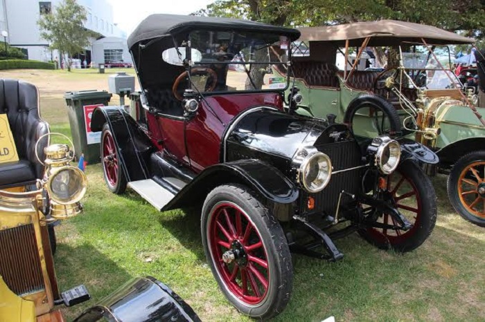
Later we will explain the possible theories of its origin, but for now, we must know that this intersection of a parallelepiped and a square painted in gold appeared for the first time in 1913. This was the badge of the H-2 Royal Mail vehicles of the 14 and H-4 Baby Grand.
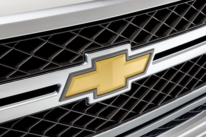
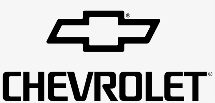
The Shape: Two overlapping geometric pieces that give it the appearance of a cross, with the longest and horizontal being slightly rhomboidal, and the smallest one square. Due to these characteristics, it has been nicknamed as the Chevy bowtie logo, a name that also makes it look very elegant.
The Colors: originally the Chevrolet logo carried white, black and blue colors, however, with the arrival of the new millennium, the color palette was updated to be gold (or yellow) and silver. These colors combine very well in the world of motor racing, where the emblems tend to be chrome. The color of the name Chevrolet has remained black.
The Font: to finish with the design section, the letter used in the logo is not a common font. A custom style of straight lines with slight curves has been used.
The name bowtie is a classic that has been used since before the Second World War. All Chevrolet vehicles were identified with this nickname. It is the most accepted comparison worldwide, although it does not have a definite origin as to why it was named like this in the first place.
Possible origin of the bowtie logo

The most accepted theory about how the Chevrolet logo was born is that it was a creation of Durant himself. In 1913, he was inspired to create this logo from a wallpaper that he would see in a hotel during a trip to Paris.
The story was backed by the company, who published it as a way to commemorate the 50 years of the brand in 1961. His fascination with this pattern of the paper was so great that he even took a piece of the paper to show it to other people who gave him their opinions of whether it would work for a logo.

Although this is the accepted story, there are other variants. One of them comes from Durant’s wife, who says that the inspiration came from a newspaper they got during their vacations. A Chevrolet historian got the newspaper where you can see a logo similar to Chevy’s one, being this from Coalettes, company of the time specialized in coal.
Finally, there is a theory that says the logo was designed by Louis Chevrolet. Due to its Swiss origins, it is possible that this pilot made a tribute to the flag of his country with the now-famous cross.
Logo changes throughout history

Regardless of its origin, the Chevrolet logo is very important for today’s automotive world. Despite having undergone so many management changes and some financial problems, the logo has remained virtually similar, demonstrating the brand’s commitment to its products.
The shape of the logo has remained intact since 1913, although it has undergone some changes in the internal part to modernize it. Only one major change is counted from its conception.

In the late 70s, the logo came to include the name Chevrolet within the rectangles. Additionally, the colors of the logo were black and white. Later, in 1982, the name would be removed from the interior and the colors would turn golden and yellow, adapting better to the bodies of the different vehicles that the company would produce.

In 2013, the logo was slightly modified so that the silver strip had a little more prominence, but it is almost the same image.
It makes no sense to change what has not stopped working, and the Chevrolet logo is proof of that. This has gone through the different economic problems that the brand and General Motors has had, and has always been well received by motor fans all over the world.
The number of brands that Chevrolet has under its belt makes it one of the most successful worldwide, along with Toyota, Ford, and Volkswagen. Besides, although its icon does not have a deep meaning, it serves to honor its founders, bearing its legacy for more than a century.
If you enjoyed reading this article about the Chevrolet logo, you should read these as well:
- Best free fonts for logos: 72 modern and creative logo fonts
- Animal logo design ideas and guidelines to create one
- Coca Cola And Pepsi Print Ads (37 Advertisements)
- Personal Logo Design Ideas: How to Create Your Own
The post The Chevrolet logo history and how it evolved in the past century appeared first on Design your way.
Source: https://ift.tt/3fvYroD

No comments:
Post a Comment