Material Design is a visual language that synthesizes the base principles of good design and combines them with the innovation of modern science and technology.
Here are some Material design examples we loved. Each one of these follows the Material design trends and principles and has something unique to teach you.
If you’re a fan of the cleanliness of Material design user interfaces, then you’ll love this list. We gathered here concepts for both apps and websites, with different color palettes, structures and layouts. Enjoy!
Want more? Check out these Material design resources, Material design color tools and free Material design backgrounds.
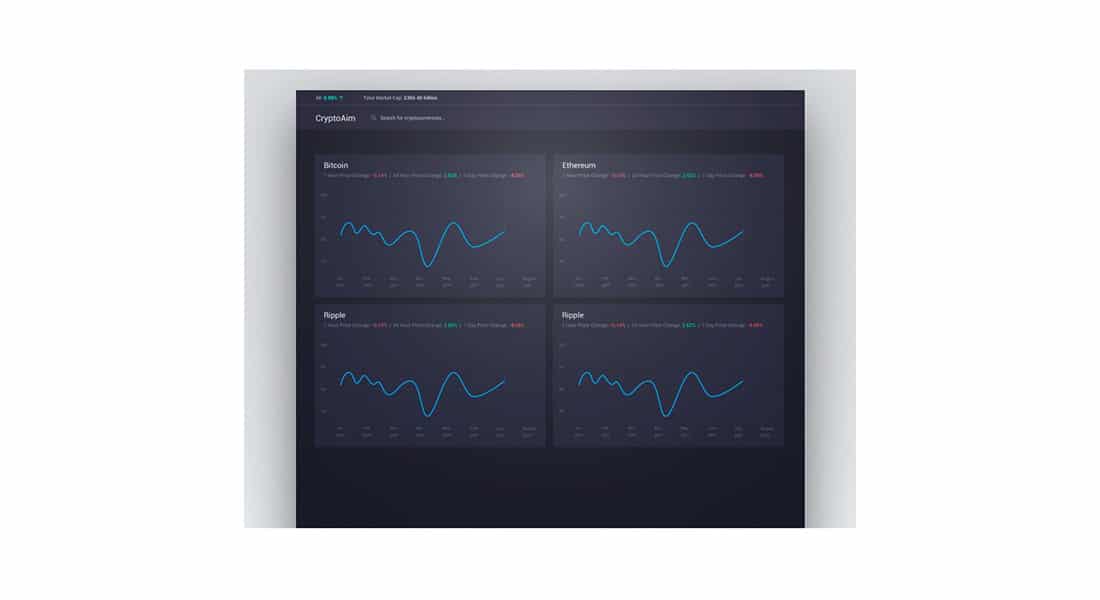
CryptoAim Dashboard
CryptoAim is a cool Material design project for an app that allows you to check the search trends of many different cryptocurrencies. It has a dark user interface with modern and clean details.
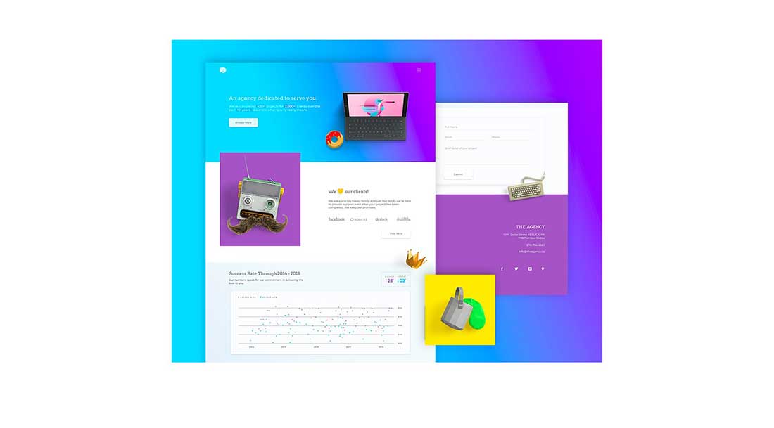
The Agency
Here is a mock-up website based on the Material design trends. It successfully combines vibrant neon colors in an innovative way. Who would have thought yellow, blue and purple go so well together in the same color palette?!
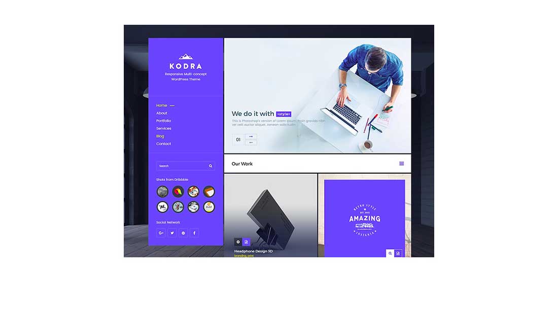
Vertical Menu Concept
Check out this vertical menu concept that follows the Material design trends. When close to a screen edge, this simple menu vertically realigns to make all menu items completely visible.
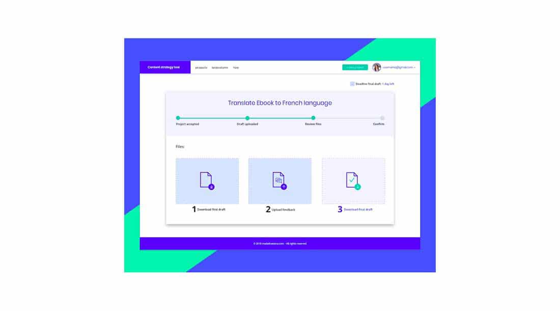
Content strategy tool
This is the design of a content strategy tool. It has a vibrantly colored user interface with simple and carefully detailed elements. It contains a progress and activity indicator that is a visual indication of steps the user needs to take in order to use the app.
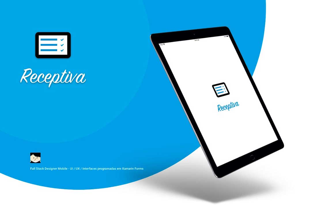
Receptiva – Mobile
This is a cool system created for the Tec Mobile company. Its purpose is to provide a clean event management experience, making it easy and fast, both for the event organizer and for the employees who are working there. The design follows the Material trends and includes an administrative web system and apps for tablets and mobiles.
CasualTrack app
This is the design of an Android application called CasualTrack. This structure includes a permanent app bar at the top and a floating action button on the bottom right site.
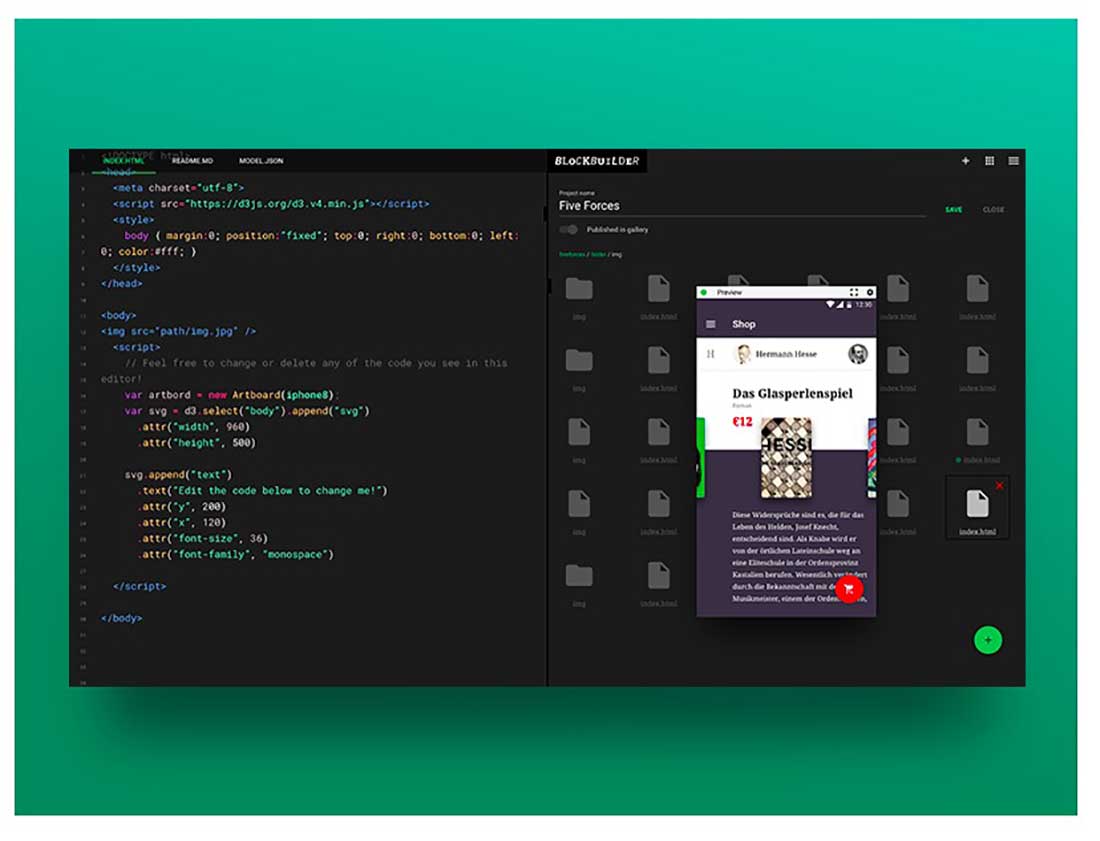
Online Editor
Here is a great looking online editor design created with the help of the Material design principles. It includes dialogs that inform users about specific tasks.
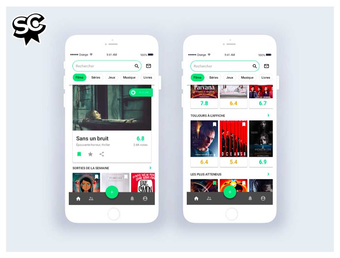
Sens Critique
This is the redesign concept for Sens Critique, a French cultural app you can use to discover, rate and comment movies, series, music, books, and more. It contains grid lists – an alternative to standard list views, which improve the visual understanding of the content they offer.
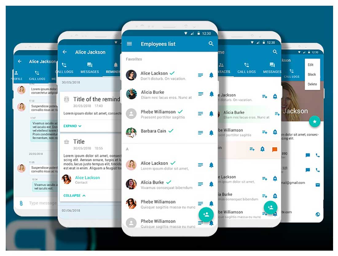
Mobile SDK – Ticketing, Chat, Articles on Android
Here are some screens examples for the Zendesk Mobile SDK on Android. It contains a floating action button that represents the primary action in the app. it is circle-shaped, with an icon in the middle, floating above the UI on the bottom right corner of the screen.
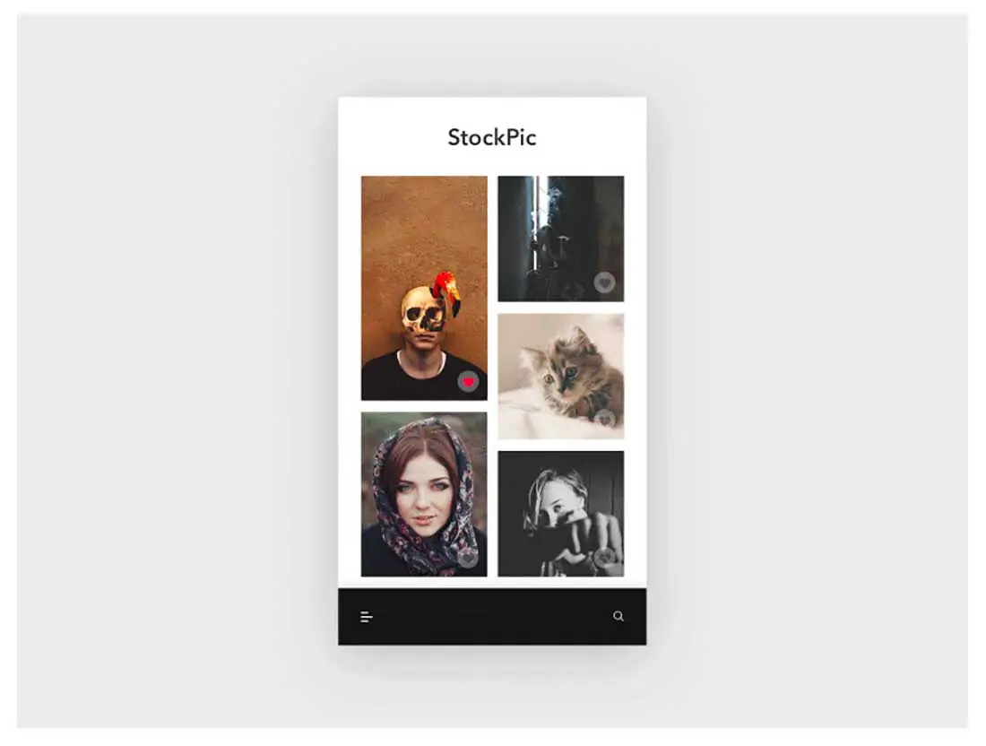
Trending – Daily UI challenge 069
Here is the design of a stock images app that shows the trending image on top. It offers a unified experience across all platforms and devices and includes some essential mobile precepts.
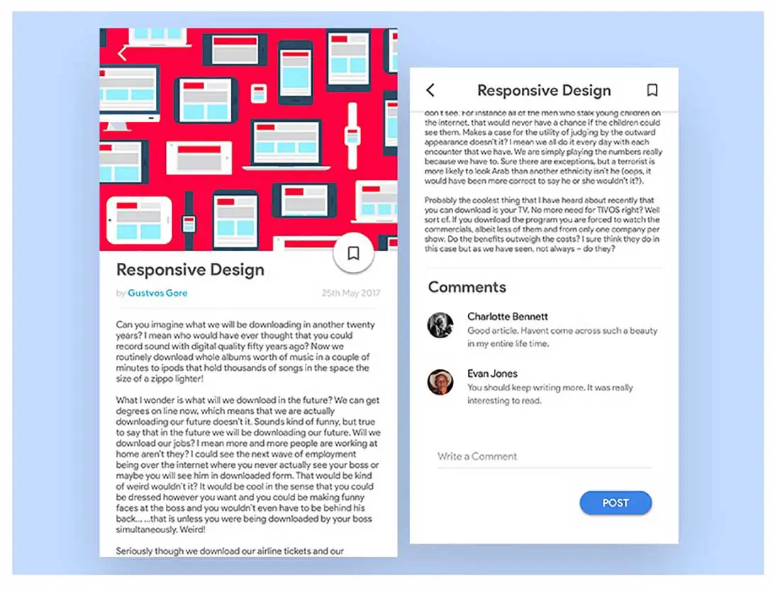
Blog post UI design
There’s a great use of typography in this material design concept for a blog post, however the size of the font should be slightly increased.
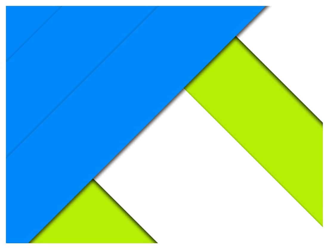
Material Design Wallpaper
Are you a fan of Material Design? Download this free wallpaper and use it for your phone or desktop screen.
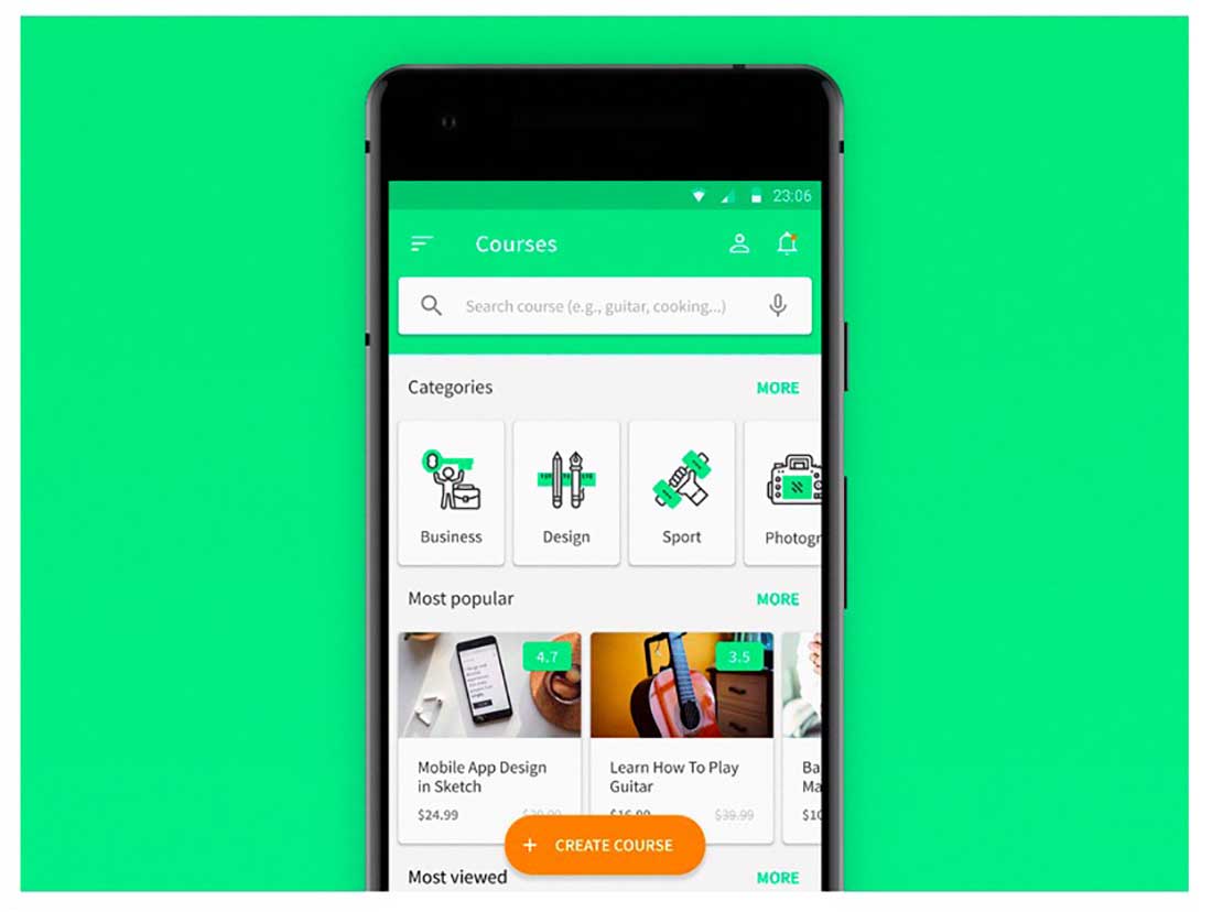
E-learning app UI concept
This is a small UI concept for an e-learning courses app that uses Material Design 2.0 principles. Check out the carefully crafted icons!
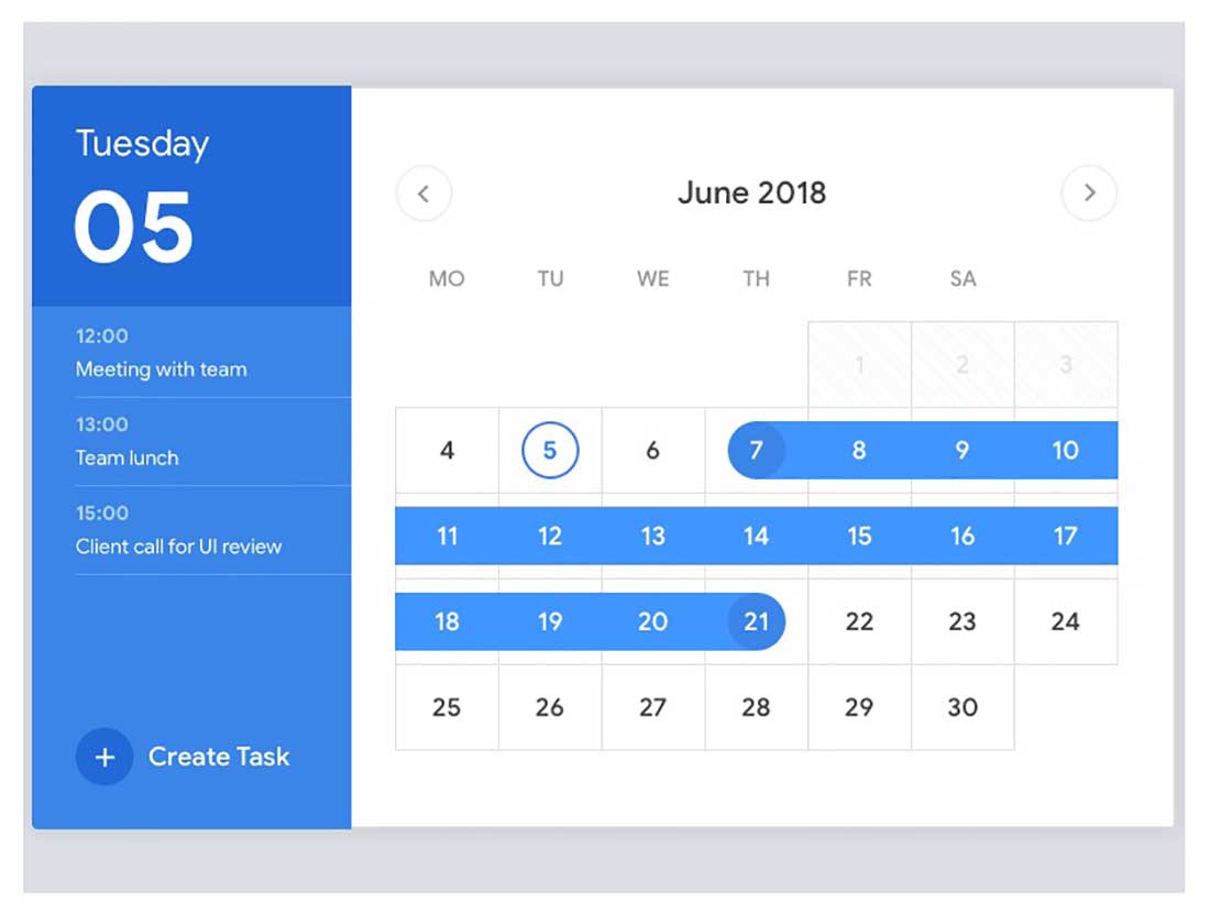
Calendar
This is a calendar screen design for an application used for managing all your important stuff. The app includes this built-in calendar that allows you to see all your events.
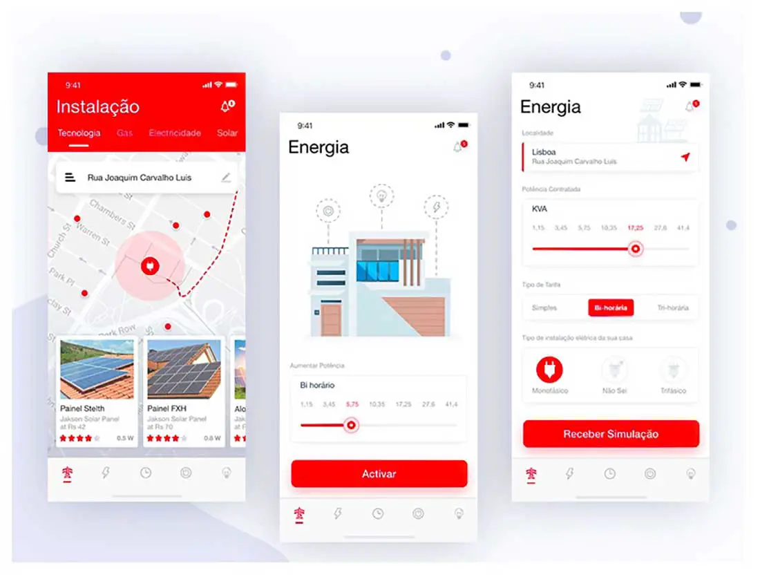
SmartEnergy Ios App
Here is the design for the SmartEnergy IOS App which offers you the easy way to connect to your home energy mainboard from your smartphone.
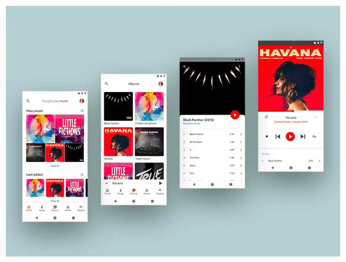
Google play music redesign concept
This is a Google play music redesign concept that follows all the Material design 2.0 principles. Check it out in detail.
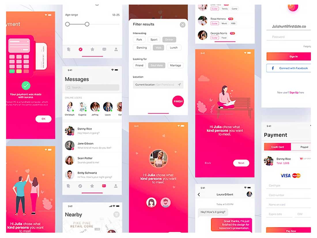
Firstdate app
These are some Material design visuals for the Firstdate iOS app onboarding. It includes lovely illustrations and a clean and user-friendly flow.
Application Design
Color in Material Design is inspired by bold colors placed on neutral environments. It also contains deep shadows and bright highlights, which are two other characteristics of the design below.
Field Inspector app
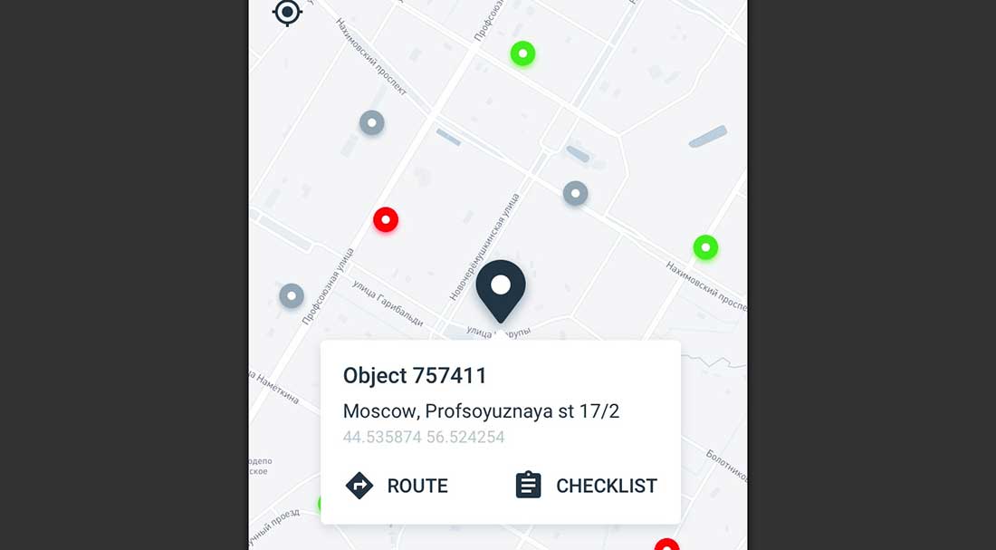
Here is a Field Inspector mobile app concept used for monitoring and auditing objects. These are the screens that show the main menu, objects on the map and list of parameters that need to be checked.
Login/Register Animation
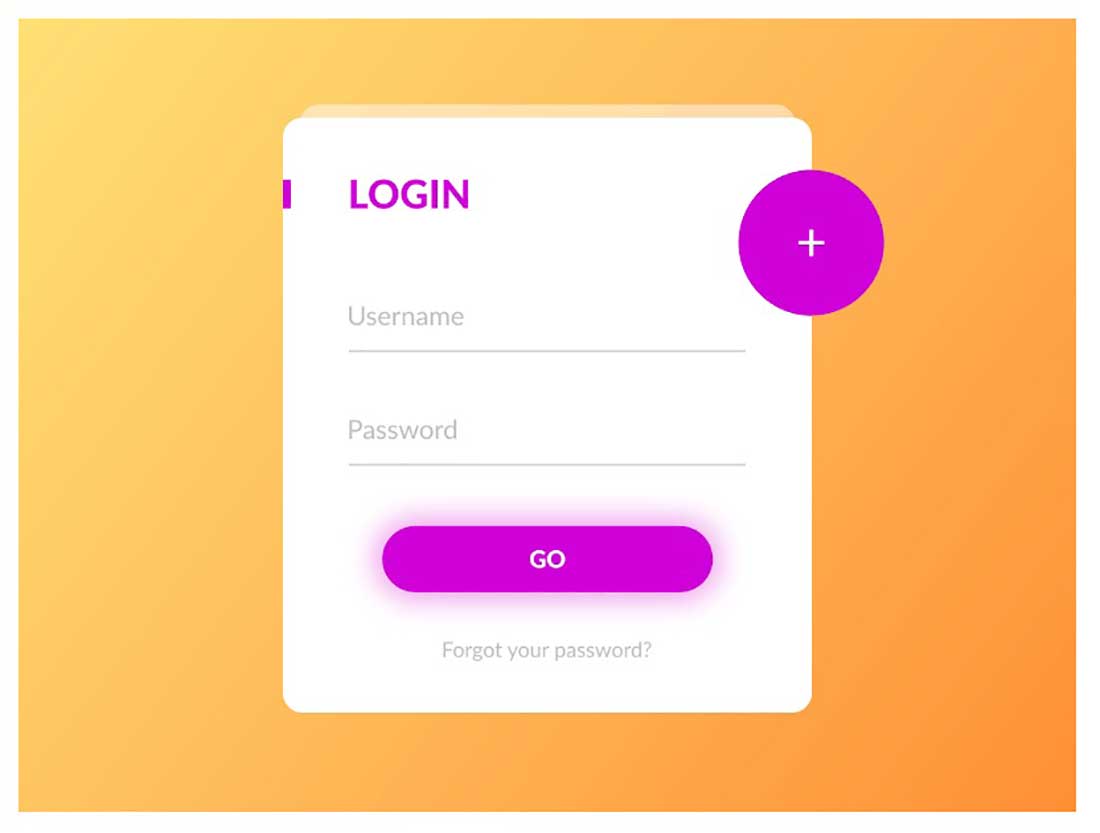
This color palette is made of primary and accent colors that have been designed to work harmoniously together. This design concept also has a smooth animation worth checking out.
Hotel Booking – Daily UI challenge 067
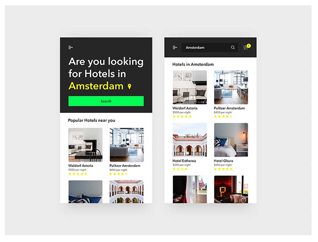
Material design takes its inspiration from print-based design elements – such as typography, color, and imagery – and adapts it to the web to create hierarchy and focus. This is exactly what the design below does, with its baseline grids and structural templates. It offers a consistent solution by repeating visual elements and structural grids.
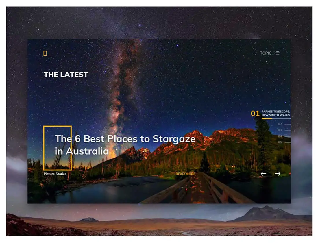
Natgeo Website Layout
In Material design, paper’s physical properties, such as flatness and opaqueness, are translated to the screen. Here’s an example of this principle below.
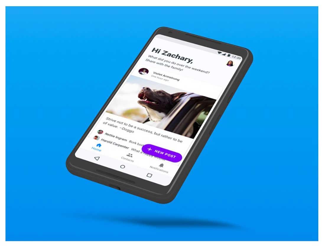
GrandPad Android App – Redesign
This is the redesign of GrandPad’s Android companion app. This iOS app redesign takes advantage of the flexibility of Material Design and the new Extended FAB material component.
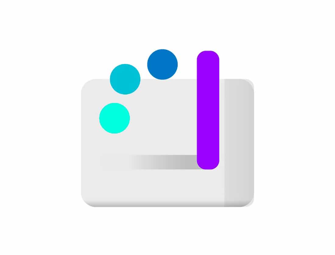
Service: Graphic
Material design creates a visual language for the users that synthesizes the base principles of good design and modernizes them. Here is an example of an icon graphic that does just that.
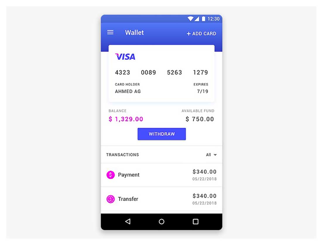
Wallet Design
In Material design used on apps, menus usually appear upon the interaction with a button and then display a list of options. Here is a great example of that!
The post 25 Material Design Examples You’ll Love appeared first on Web Design Blog | Magazine for Designers.
via https://ift.tt/2znlkdT


No comments:
Post a Comment