An ‘about us page’ is critical for any website. It serves the same purpose as an introduction, an ‘elevator speech’, and allows you to lay out your company’s foundational values for all to see.
Of course, about pages are quite tricky to write. You can sit staring at a blank screen for hours, trying to figure out just what you want to say on the about page and how you want to say it. You don’t want to give too much or too little information.
You want to be professional and charming, hitting just the right tone for your target audience and your product or service. All of this is in tall order, especially if you aren’t used to writing about yourself. Even professional writers have a very difficult time doing it.
This is true for B2B or B2C companies alike. You need to use your about us page to build an understanding and trusting relationship with your customers. Unfortunately, there is no exact formula that creates the best about pages.
There are, however, some crucial points to focus on and some guidelines you can use to make sure you hit all the points you need to in order for your customers to know who you, what you do, and what you are all about.
What an ‘About Us’ Page that Converts Should Actually Include:
- Focus on the target buyer persona and the value they get from your product or service
- Providing case study data testimonials, and other facts that prove and support your product or service’s value
- Visual appeal that makes smart use of photos and videos
- A clear demonstration of real human personality
With all these core principles in mind, you should know that every business and buyer persona is still different. The best about us pages are more than just giving site visitors a bio and a selfie photo of your face. It requires a lot more thought and care than that.
Here is our step-by-step guide to creating an about page. This walkthrough provides an overview of how the page should look, what it should include, and covers some major considerations that you should think about.
Writing about yourself is very hard. This guide will make it much easier to put together an about page that not only fills up that ‘about’ tab on your website but also draws customers in and helps converts leads into sales.
Highlight the Value You Bring to Your Potential Buyers
This can’t be emphasized enough. The About page on your website should be all about what value you bring to those interested in your product or service. People do want to learn about you, which we’ll cover later, but they also really need to know how you are going to help them.
Take the time to think over what the value you bring is before you start writing your about us page. Make it clear what you are bringing to the table and why site visitors should pay attention to you.
It can help to write these ideas down in crude bullet point format first. You don’t need to make it look all nice, you just need to understand what you’re trying to convey with your about page about your value.
Grab Readers’ Attention
There are many ways to go about making sure you have site visitors’ attention when they read your about page. These are only a few tips and tricks you can use. Look at other successful websites to find even more.
Try opening with a punchy statement that conveys your style and attitude. It should communicate what about you makes you who you are. It should be quick and to the point for maximum impact.
Use a bold and benefit-driven headline. Site visitors already know this is your About page since they clicked the link. Don’t waste their time and your effort by repeating info they already know in your headline. Instead, open with a really interesting or unexpected statement.
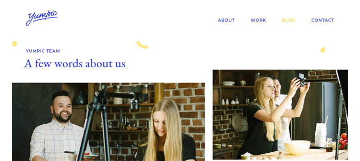
Include videos and pictures. Photos always add a pleasant personal touch and make you seem more human and relatable. There are all kinds of great ways videos can be used for similar purposes, as well.
Prescriptive videos can be used to describe your process. Snapshots of the ‘behind the scenes’ of how a product is made or a service is done can help increase the trust of potential customers.
Make sure you’re not always pushing your sales pitch. This is quite likely to drive customers away. People respond better to other people who are looking to reach out in human ways, not a machine that is just looking for the next sale and only cares about the bottom line. Make sure site visitors know that there is a human being running the site and that this person is worth paying attention to.
Keep a Narrow and Relevant Scope
The about page of your website is emphatically not your autobiography. It’s also not the place to share the long and storied history of your company, either.
Occasionally there are companies that make good use of their long lineage, like whiskey distilleries or upscale fashion companies. That is good for them and can work very effectively for sales. However, detailed histories do not always add to a company’s image and instead just bore almost everyone who reads them.
Laying out your company’s history in excruciating detail is quite a common mistake on about us pages. It can cause a company to fail to address a customer’s actual problems or interests. They often also fail to include any kind of call to action because they’re so absorbed in telling their tale.
Only tell your history if it builds up to an interesting and intriguing story of where you are now, or is something that your target audience can relate to. If it doesn’t do these things, don’t bother.
Two important factors to help you out here: know your audience and emphasize your selling points.
You selling points should be unique to you and will be what help drive leads. These selling points are small details that set you apart from competitors. They are the reason you are the best solution your site visitors can find out there. They should be highlighted extensively. They are what visitors to your website want to hear.
Knowing your audience means that you’ll know how to present your selling points effectively to them as well as what those selling points are. Your about us page should be addressing your audience and explaining why your mission is so important to them. If you don’t know who they are, this becomes much harder.
Your Website’s Bio
Now you should be getting enough of the idea to write down a few sentences that are geared toward your target audience. Where to go from here? A lot of about us pages start off by talking about themselves, but this is not what site visitors are really interested in. As we’ve discussed, they want to know what you can offer them.
How do you know how to do that, though? This is a challenge because you need to start thinking like your target customer and answering any questions they might have before they ask them.
This can be much harder for some people than others, especially if you know all about your product, service, or topic, because it’s hard to separate all the information out. Use these questions as an ‘about us’ template to really get the ball rolling:
Why should someone read your blog/visit your website/browse through your catalog? Use a sentence structured like “If you love X, X, and X, you’ll love it here!”
What will they get from your site? Is it going to be artistic inspiration? Business advice? An encouraging community? Solutions to their problems? Make it clear for site visitors to know what to expect.
What types of posts do you have? What kinds of products are you selling? Is there an amazing series of blog posts that visitors should know about? Do you have a particular product or service that’s won a lot of awards or garnered a lot of praise? What’s a good starting point?
Why is your business credible? There are a lot of ways you can communicate this. List big-name sites that have shared your content or praised what you’re selling. Discuss how you have years of experience in a particular field.
Also feel free to let readers know that you’re still learning and growing, especially if your site is a blog or otherwise informationally focused. Let them know that you love to share things as you discover them.
How did your site get started? Feel free to be personable in this story. Let site visitors know how this website came into existence. Was it inspired by a certain event? Did you start having a passion for something as a kid? Did you stumble upon a great idea one day? Tell a story. Keep it relevant, keep it brief, and keep it interesting.
Your Personal Bio
Here’s your chance to talk all about you. It will seem really hard when you start writing it but don’t worry, soon enough it will become very easy.
All too easy, usually. The trick with personal bios is learning to keep the information relevant. You should limit it to facts about yourself that relate to your business. It shouldn’t be a collection of 30 random facts and little else.
Think of your about page as an interview. You don’t; go into a job interview and start babbling random facts about yourself. You focus on the subject at hand and make sure your potential employers know how you are the best fit for the position. The same is true for your about us page.
Think of it in terms of answers to relevant questions: Why did you start doing this? When did your love for X all being? What great and unique idea do you have to offer? Write the answers down like you would if you were preparing for an interview. In many ways, your about us page is an interview with your potential customers to see if what you offer is the right fit for them.
Of course, you can and should include random and relatable information in this section of the about page, too. What city you live in, what your hobbies are, and other facts that make you who you are helpful in making you look more relatable. Just be careful. The about page should not only contain this kind of information.
Try to limit it and keep it simple, quick, and witty. The addition of these kinds of personal facts will help site visitors understand that they’re dealing with an actual human being, but they can quickly grow bored if you’re regurgitating every detail about your hobbies for them.
Remember, Even Though it is Called “About Me’, It is Really About Them
The most important thing about your about us or about me page is that it should be building empathy with your customer. Customers really are looking to see themselves in your mission statement. They want to know what kind of problems you offer solutions for and how they fit into those solutions.
People are rarely stumbling onto your site blindly. They’re coming to you for a reason. They have problems they need to be solved. You need to make it clear in your about us page that you have solutions to offer.
People do not spend very long on websites that don’t offer them what they’re looking for. You have only seconds to make clear that you have something to offer a site visitor.
You need to carefully think through your about us page and make sure it communicates what it needs to in an interesting and clear way. Read it over several times yourself and have other people read it as well. Make sure they understand the kind of audience you’re looking to reach and what you have to offer them.
Some Important Considerations
Include a Call to Action
A call to action is one of the most important things on any commercial website. It is what you spend the entire page design leading readers towards. Just like with your landing page or any informational page on the site, you should make sure your about us page includes a clear and effective call to action.
You don’t; want someone to read the about page, enjoy it, and then forget it exists. You want to make sure they do something because of what they read on the about page. Be sure to include your call to action!
Use Facts and Avoid Hype
Your about us page is a great place to brag. Show off what you’ve done. Demonstrate why you are the best at what you do. Make it clear that you really live up to your principles and ideals.
Do all this but avoid going too far. Hype turns people off. Don’t offer what you can’t deliver. Avoid using superlatives. Present facts in a good light, but don’t skew them. Hard data and real events are really good for this. Case studies are even better.
Quantify benefits, i.e. say a product increases productivity by 10%. Explain exactly what problems you solve. Why are you uniquely qualified to offer a product or service? What exactly makes it better than your competitors?
Explain exactly how long you’ve been in business and what experience you bring to the table. Make mention of key milestones. Have you moved to larger and/or more upgraded facilities? Do you shift your focus to make better use of your skills? This kind of info is very helpful for showing that you are the top solution to your site visitor’s problems.
Be Interesting
While your about us page resembles a resume in many respects, it should not read like one. It should not be a long list of dry, boring facts that have been stripped down the most minimal core details. You want to present potential customers with something more interesting. You need to capture and hold their attention.
For example, why is your company named what it is? Tell the story and what the name means to you today. If your logo has a particular meaning, do the same. These stories are often very revealing, explaining that your company has a human touch and what your core principles really are, as well as how you put them into action.
Consider drawing analogies to your hobbies, like marathon running or flying. By doing this, it makes it clear just how dedicated you are to your business and the kind of mentality you bring to it. It also humanizes everything, making you more relatable and even inspiring.
Use images to add credibility and increase interest even more. Make sure they are relevant and interesting, as well as featured in the appropriate area. Stock photos are really not what you want for this sort of thing, as people can usually start spotting those pretty quick, especially if they’ve been visiting lots of websites on the same subject. Get candid or professional photos to use instead.
Use Subheaders, Bullets, and Other Graphical Elements
Use graphical elements to keep your about us page from becoming one long wall of text. This will make it more interesting, add more personality, and also help keep the whole thing organized.
Numbers and bullets are a great way to highlight items you want to make sure that people see and take away from your about page. They convey a lot of information very quickly but do not overwhelm readers.
Charts, logos, and infographics can generate interest and also communicate important data. You need to make sure that they support whatever your text is saying and that appropriate explanation and/or captions are included.
Include relevant links where you can. If you make reference to some specific product or service, link to their pages where viewers can get more detail. At the end of the about us page, include a link to your contact page so people can get more info if they want or take the next step in the buying process.
Ending thoughts on designing an about us page
An about us page is a useful tool for helping you promote what your company is all about and what it had to offer. Use this guide to develop one that can help your business grow into what you’ve always dreamed it would be.
If you enjoyed reading this article about About us page, you should read these as well:
- Horizontal scrolling website examples to use as inspiration
- Top advertising agencies and their great work
- Focus On Usability When Designing 404 Error Pages
The post About us page design: Tips and best practices to create one appeared first on Design your way.
Source: https://ift.tt/2mTnb0K



No comments:
Post a Comment