You’ve finished a project, you go through it once more, and you find a few odds and ends that need some fixing. There might be even the need for a major improvement.
That’s how it should be, but there are also times when a project goes online, and you wish it hadn’t. You finished it in a rush and it looks more like a first draft than a finished piece of work.
That’s not a nice feeling to have when you know you could have done better.
We’ve put together a checklist of 5 ways to improve your designs using pre-built websites.
Be Theme & Its Pre-built Websites Offer a Better Way
Do you have any doubts about how pre-built websites can help you? Then, you should absolutely read further. They are not a substitute for your creativity nor do they do the entire project for you. What pre-built websites do is help you to get a project off to a good start. They provide inspiration and get your creative juices flowing. They also help to improve the quality of your designs.
Be Theme has a huge library of 390+ pre-built websites, with many more to come, and they can be yours for a one-time cost of $59.
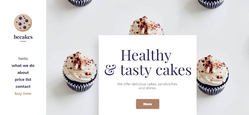
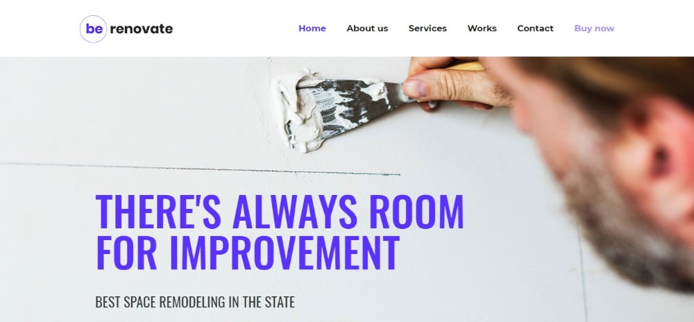
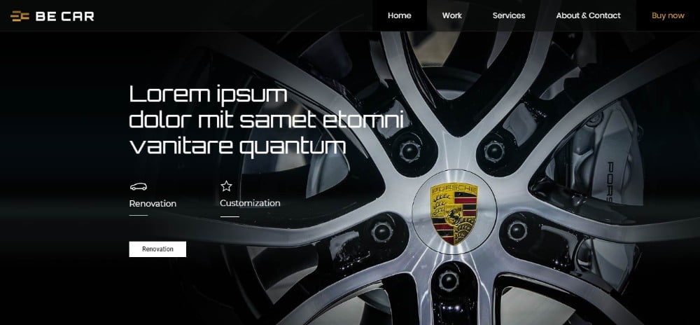
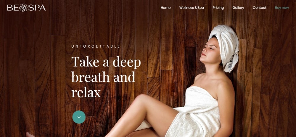
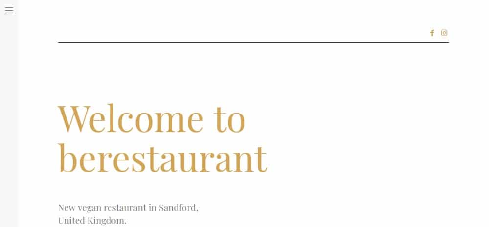
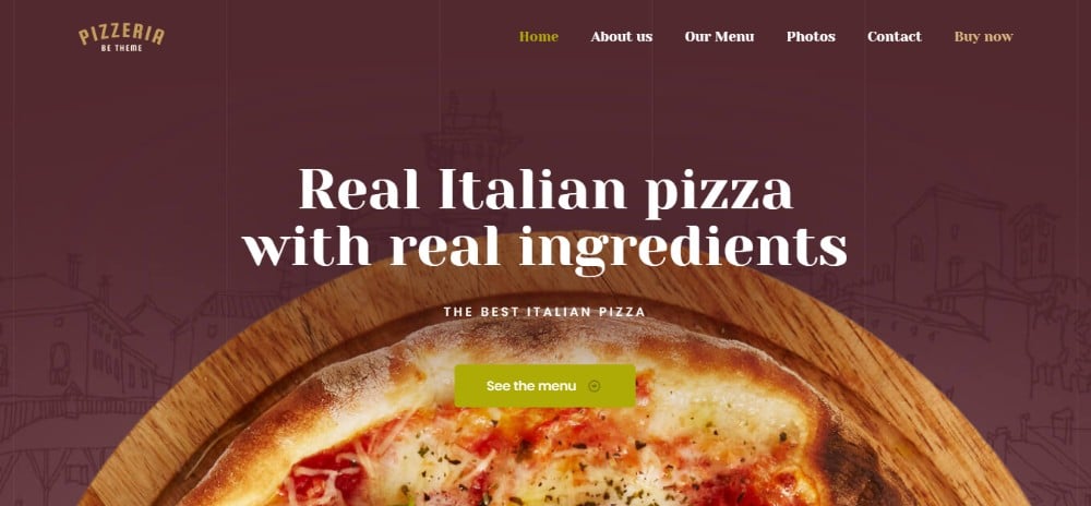
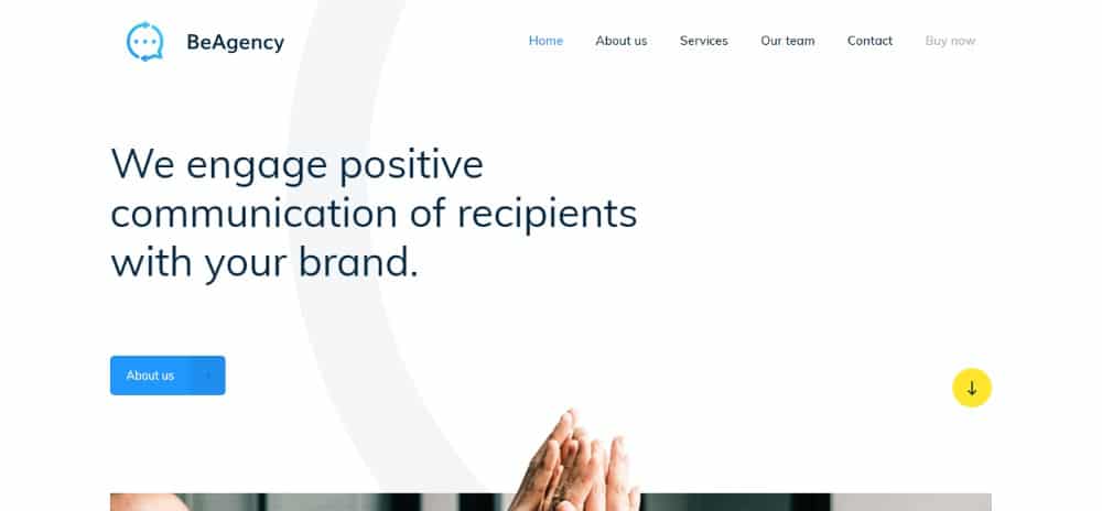
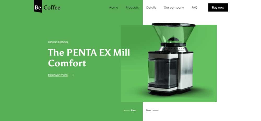
These pre-built websites are organized by industry and content type. This makes it easy for you to find the match you need. Better yet, they stay on top of the latest trends, as the following examples aptly demonstrate.
Checklist: 5 Ways Pre-Built Websites Will Improve Your Design
- Am I in sync with this industry’s specific trends?
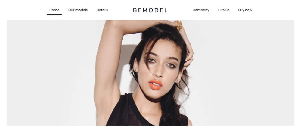
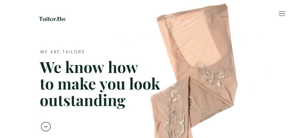
The fashion industry is a good place to start. Typically, fashion-oriented websites are characterized by rich textures. They have rich colors and an overabundance of bold visuals.
Not this year. Today’s fashion websites follow a trend that includes the use of black and white sketches. They feature plenty of white space and minimalistic menus. Be Theme’s designers can be counted on to keep pace with changing trends. They’ve just launched a new series of fashion templates.
Take a look.
- Do I know for certain what NEEDS to be on the Homepage?
Wants versus needs can make or break the design of a homepage, any other page, or an entire website for that matter. Attempting to distinguish between the two is an ongoing challenge.
The fact that homepage design involves a subtle mix of art and science doesn’t make things any easier. This is given the importance of creating the right structure for a specific website.
Pre-built websites help you design the structure users will be looking for.
- Should I Follow or Disrupt?
Should I follow other designers or strike out on my own? Being a follower is usually much easier. This leads some to think there’s something wrong with being that way. The fact is, you’re much more apt to enjoy success when you stick to tried and tested design approaches.
Experimenting is to be encouraged. You might be working with rather “stiff” clients like large corporations and professionals. Then, it’s best to stick to what’s always worked for you and for other designers.
Pre-built websites offer well-structured, highly documented templates (follow) that you can customize. Do so with your own creative touch (disrupt) to produce a perfect mix.
- Which of these 5 different ideas goes best with this project?
You can often get good results with one good idea, and sometimes you can get a good design by combining two. Add a few more good ideas and you’ll most likely end up creating an unholy mess. The problem of having too many ideas (TMI) is common, but in the design world, it’s not a nice problem to have.
Try this great idea instead:
- Browse through Be Theme’s huge collection of pre-built websites.
- Conduct a search by industry or website type.
- Select a pre-built website that’s a good match for your project.
- Customize it.
When you’re done, you’ll have implemented your creative vision on a time-tested structure. It also offers a great UX.
- Is the client right or should I stick to my ideas?
Many if not most clients tend to be experts at what they do. They use that as an argument to make sure that what they want goes into the design. What they want may be 100% correct, but that’s not always the case.
The best way to handle either situation is to use a pre-built website. It should be specific to your client’s business or industry type. That way, you’ll be able to deliver a well-structured and high-quality product. It will conform to the latest design trends and standards for the industry. You aren’t apt to get an argument.
Conclusion
Pre-built websites are definitely the way to go if you’re looking for a fast and proven way to improve your designs. You’ll always be in sync with the latest design trends without having to spend hours of research. You can always count on delivering a proven UX.
Pre-built websites get you off to a great start. They will offer plenty of room for creative customizing. Your clients will be highly pleased with the final design.
There’s a bonus too. Pre-built websites help you improve your designs. They are a good reason for checking out our 390+ library for only $59.
The post Checklist: 5 Ways to Improve Your Design Using Pre-Built Websites appeared first on Web Design Blog | Magazine for Designers.
via https://ift.tt/2qNsBME



No comments:
Post a Comment