We can all agree that the legal industry is quite rigid. Not that it is a bad thing; it simply means there are certain industry standards that have to be met.
Legal website users are used to seeing a specific type of site and it is important to meet their expectations when building your own legal website. There are certain rules that have to be followed if you don’t want to ruin their experience on the site.
However, trends and standards change constantly and not even legal websites are immune to change. A dose of warmth and a touch more personality are now commonly a part of the online legal libraries and legal websites.
So how do you dose it just right? Stay with us to learn how to build a legal website that follows the industry standards.
5 rules Legal Websites need to follow
There are 5 basic rules one should keep in mind when building a legal website.
Organize your Content clearly
When it comes to organizing content, you should stick to the basics. Create well-organized categories with clear labels and don’t go overboard with creativity.
If you are building a legal information library that hosts lots of content, you should avoid anything that may distract users. You want their focus on the content itself and you need to make it as simple as possible for the users to find exactly what they are looking for.
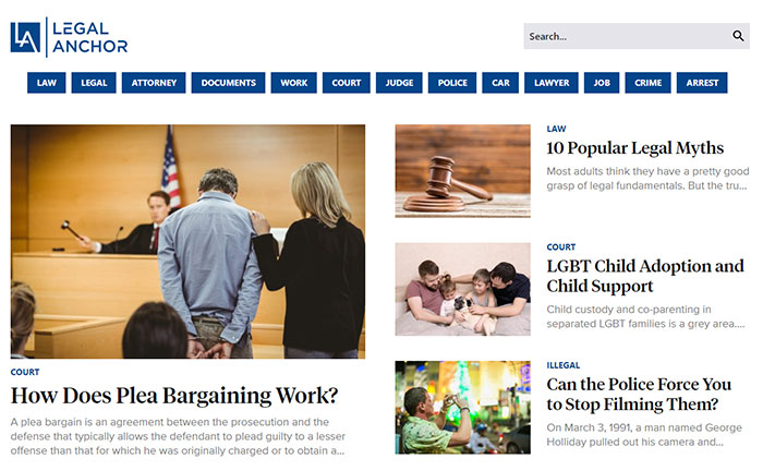
A good example of crystal-clear content architecture is Legal Anchor, an online library of legal content.

Add a warm Touch to the Color Palette
This is one of the newest standards that not only makes the users feel more welcome but it also helps them differentiate between legal pages that used to look pretty much the same a while back.
We all remember the gray-navy-black legal websites with little to no personality. However, if you add a little bit of warmth in the form of some “disruptive” color, your website will be easily recognizable in the crowd.
Of course, keep things classy and don’t go overboard but, for example, a simple touch of yellow can get you a long way. Take a look at this website and try to imagine it without the yellow. It makes all the difference, doesn’t it?

Use Images that show the Human Side
While the right color combination adds some personality to your website, photos that tell the story do it even better!
Instead of simply using an image of Lady Justice, consider putting up some pictures of your team to show the human side of teamwork. Let the users know what is happening behind the curtains and remember that people like to work with people.
If you aren’t sure how to incorporate those images into your website, take a look at this example. You can also display images that capture client meetings similarly like here.

Have at least one Dynamic Factor
One of the newest trends when it comes to designing websites is incorporating dynamic factors such as videos.
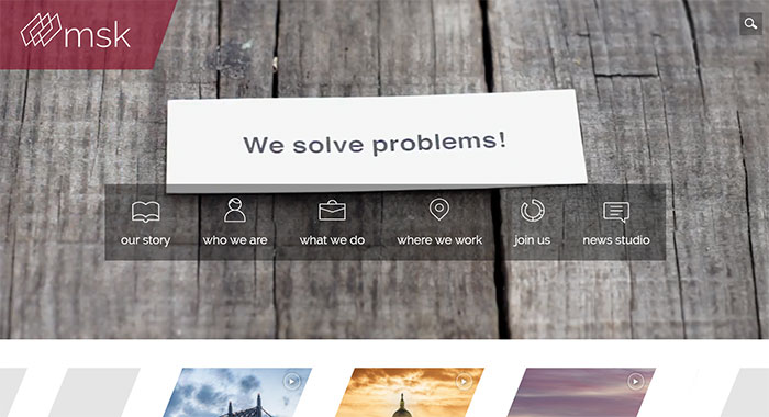
Having a nice presentation video on your homepage is great to attract new users and grab their attention from the very first moment they open your site. Sites like msk did it successfully and are a great example.

Consider using a video filmed in the company’s HQ but if you aren’t able to do that, you could always use a stock video with VO.
Another great option is to use animated 3D elements to make the website more dynamic. From 3D animated logo to animated taglines, all these elements will make your website seem more alive and interesting.

Use plenty of White Space
The key to creating a good legal website is to avoid overwhelming the users with all that legal content. Luckily, with a few simple techniques, you can really improve the user experience and make the site seem more welcoming.
First of all, stick to the minimalistic approach and keep the site simple. Use plenty of white space to take the pressure of the user, stick to centered content, and use a lot of mind-maps or simple bullet points.
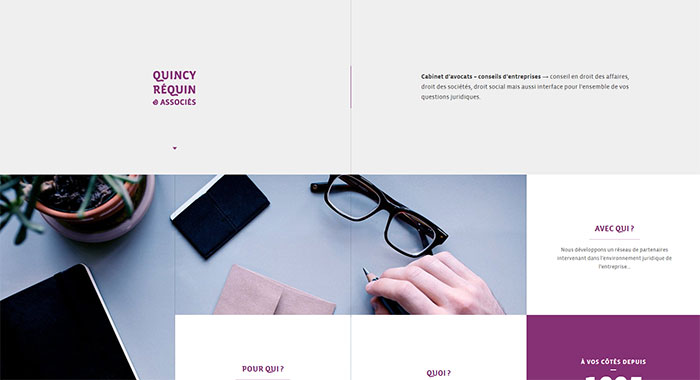
Here is an example of a good website layout.

If you have too much content to show off and you can’t really incorporate as much white space as you would want, consider using other smart ways to keep the website well-organized yet not too overwhelming. For example, using blocks is a good technique to achieve that.

Conclusion
If you are a creative type, it might be a real challenge for you to create a functional legal website, especially if you are not particularly familiar with the legal industry.
Luckily, once you get familiar with the latest standards, you will be able to express your own creativity in the ways that both fulfill the users’ expectations as well as your own ideas.
Even though there are certain rules to follow, you are allowed to give a personality to your website that will make it stand out from the competition in all the right ways. Just follow the above-mentioned 5 simple steps and you will be all set to create legal websites that follow the industry standards yet are entirely unique.
The post How to build a legal website that follows industry standards appeared first on Design your way.
Source: https://ift.tt/2RLTlsu

No comments:
Post a Comment