There’s always room for improvement. You know that, and you’ve experienced the feeling that the work you put out could have been better. We’ve all been there, looking at a project we’ve delivered in the past. Have you ever wished you could take another crack at it?
It’s not a fun feeling to know you could have done better. Having a checklist can help. With that in mind, we’ve put together this checklist of 5 ways to improve your designs. You can do so by using pre-built websites.
We’ve even provided examples to show you what pre-built websites can do for you.
Pre-built websites & Be Theme Intro
“OK,” you say. “Maybe pre-built websites will be of some help. But how much?”
Read further, as you’re about to find out. The answer is somewhere between more than you might think and one heck of a lot.
Don’t be mistaken. These are not the lazy man’s approach to web design. Their an aide, albeit a very powerful one, and Be Theme has more than 390 of them – and at a one-time cost of only $59.
They’re organized by content type or by industry type. They cover almost every website type or use you’re apt to become involved with. And, new ones are added every month.
Here we go, so fasten your seat belt.
Checklist: 5 Ways Pre-Built Websites Can Improve Your Designs
Am I aligned with the trends in this specific industry?
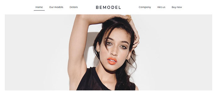
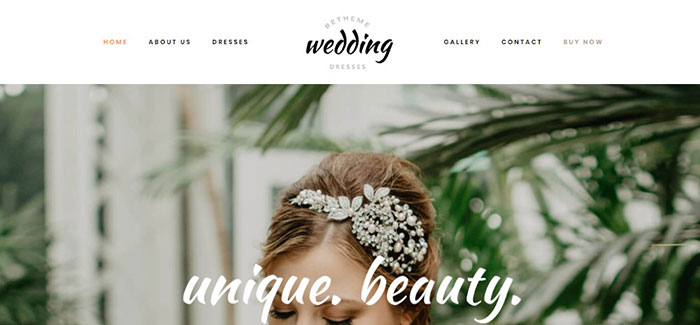
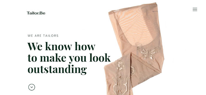
Let’s take the fashion industry, for example. Take a look at these three recently introduced pre-built websites. Fashion websites typically have a luxurious look. They feature rich colors and textures and are loaded with bold visuals.
Times change. This year fashion websites are trending toward the minimalistic menus. These prevail with simple sketches (in black and white for goodness sake!) and plenty of white space.
You want to keep up with the latest trends of course. But with pre-built websites, you’re spared of having to research them.
Just check out these three examples:
Do I know for sure what NEEDS to be on the Homepage?
Trying to decide what should be on the home page can be tough. The decision you make can, in fact, make or break your design, and for that matter your website. Having an artistic bent certainly helps, as will having a scientific background. The problem is, you need a bit of both to achieve the best possible design.
Or, you can simply start with a pre-built website. Here, the basic design work has already been accomplished. It has been proven for the industry or website type in question.
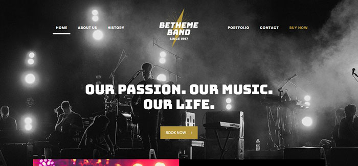
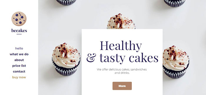
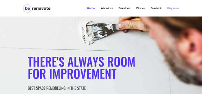
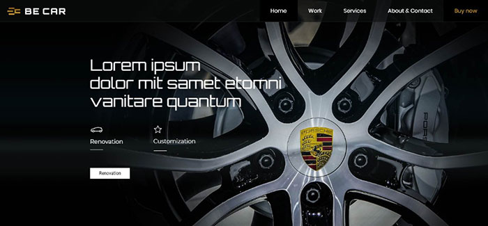
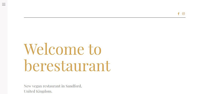
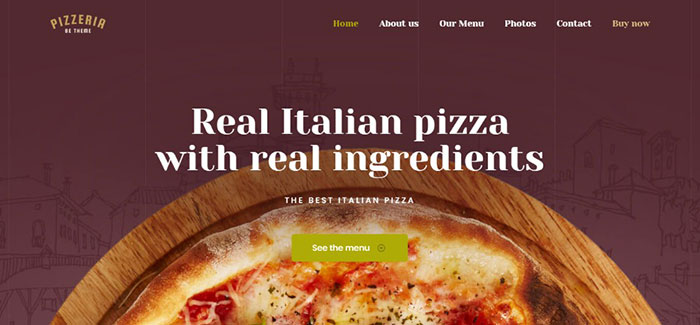
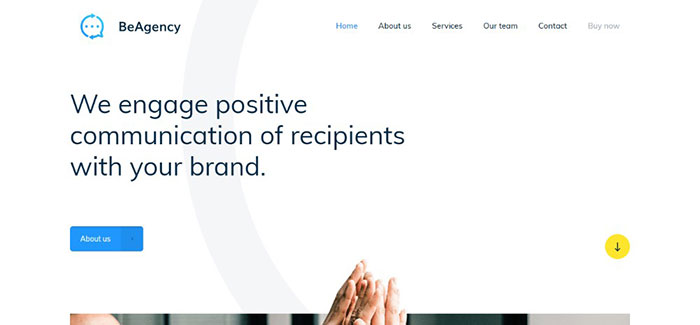
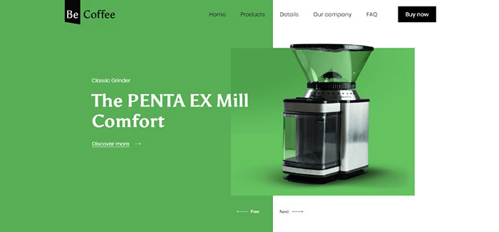
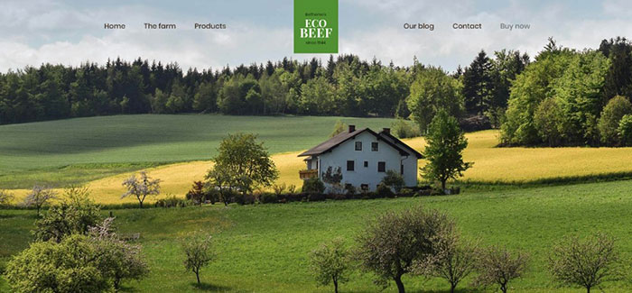
Put another way, the structure users will be looking for and expect to see are already there. This is illustrated in these three diverse website subjects.
Should I Follow or Disrupt?
Follow or disrupt? Following is easier and seemingly safer. You usually want a website that stands out from the others. But for some industries, excessive creativity on your part can do more harm than good. Sameness can be bad, or it can be what a user expects.
This is where pre-built websites are helpful in that they tend to settle the debate once and for all. Their supremely-structured customizable templates provide a perfect mix of Follow and Disrupt. Yet, they allow you to add a creative touch or two without the danger of going overboard.
These 3 get the message across without having to rely on “sameness”.
Which of My 5 Different Ideas Goes Best with This Project?
We’ve addressed a need for creativity (but not too much of it) in a general sense. But when each website project is different from the next, you have to ask all over again when to be creative.
One of the problems associated with creativity is getting more ideas than you can manage. When that happens, it becomes all too easy to make a poor choice.
- Rather than risk having that happen, try this approach:
- Browse Be Theme’s large catalog of pre-built websites.
- Search by industry or content type.
- Pick a template that seems to match your line of thinking.
- Customize it.
The net result: the creative vision you’ve implement rests on a solid, tried and proven structure.
Is the Client Right or Should I Stick to My Ideas?
There’s the old saying in business that “the customer is always right”. Most business owners can accurately say that they know their business better. Especially, when it comes to what should go into a website’s design.
Rather than argue finer points with your clients, you can simply use a pre-built website. It adheres to the online standards for the particular business or industry. When you do so, you deliver the right type of content focus. You also use the right mix of static vs. dynamic. Then, a client will generally be more than satisfied with the results.
There are of course exceptions, but that’s another story.
Conclusion
Pre-built websites are not to be ignored if you’re looking for a fast and effective way to improve your designs. You can rely on them to keep you abreast of the latest design trends. You can also stick to a tried and tested UX approach.
Pre-built websites can serve as guides for selecting the best ideas for a design. They are giving you plenty of opportunities to utilize your creative skills.
You can make it easy for you to show a client what the industry standard calls for. By doing so, you’ll most often avoid like/dislike discussions since the client is more likely than not to “get it”.
You’ll also improve your design skills and find it easier than ever to deliver high-quality work. All this at a cost of only $59 for a library of more than 390 of these professionally-designed gems.
The post 5 Ways Pre-Built Websites can Improve Your Designs FAST appeared first on Design your way.
Source: https://ift.tt/2FrBZ2G




No comments:
Post a Comment