Whether you’re working on a brand new website or a stylish redesign, inspiration and dreaming up the style you want to portray is always the first step. This may sound like a difficult task if you’ve been in an inspo-rut. On the other hand, you could be brimming with inspiration but struggling to organize all of your fun ideas into a cohesive plan.
As you read through this guide, you will realize that it is easy to hone-in-website design inspiration and manage it into digestible concepts and drum up new ideas to make your site its best. This mood boarding process works well whether your website is for your personal brand, your own company, or for a client! Mood boarding is the best way to synthesize everyone’s input, too.
What is Mood boarding?
Mood boarding refers to a creative process used by web designers to collect a wide range of images or pictures as well as other things that define and express a personal or brand identity. If you are thinking to develop a website for yourself, then creating a mood board will help you dream up the color palette, the stylistic elements, and other visual notes. The use of cohesive visual elements on your website is ideal for inspiration, communication, guidance, and affirmation for the ideal target audience. The key purpose of using images/visual elements is to effectively express the mood and position of your inspiration to the target customer – so, by drawing inspiration from a mood or attitude first, will make sure that your audience feels spoken to on every page of your site.
The Purpose of Mood boards in Web Design

There are several reasons why mood boards are created by designers. Typically, the purpose of a mood board is to help you put up an inspiration website that wow clients and drive your work. Plus, establishing a color palette, and ensuring that you stay on-brand with everything you design, can all be driven from the mood or overall visual aesthetic. For example, if you’re creating a website for a bakery and the mood of that bakery is vintage, cozy, and European – you could throw together images that evoke those motifs into a mood board and you’ll know that if your website sticks to those colors, those feelings, and those aesthetics, it will please the client.
How to create a website design mood board

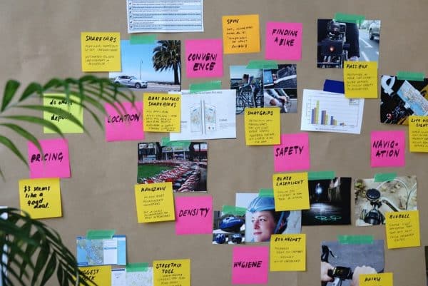
Coming up with a mood board involves a lot of creativity because there’s no right or wrong format for a mood board. You could cut pictures out of magazines to make a collage, doodle together a bunch of different inspirational elements, or make your mood board digitally via Pinterest, in Illustrator, or in an Instagram collection. The process should then be to take the information about what your client wants in a website and translate that into a visual mood with inspiration trimmings. You can decide if it benefits your business to share this mood board with your client or whether it will just drive your internal decisions.
Elements of a Design Mood Board

Since each mood board is unique, a designer has to select what to add on the project. The objective is to include as many elements necessary to put across the look and feel of the design being crafted. Here below are some of the ideas that can guide you through the process:
- Images: Did you know that images woo clients more rapidly than describing your vision through copy? You can get photos from Instagram, Pinterest and other photo sharing platforms. As long as you don’t publish them, you don’t need to worry about their origins. This is just an internal project. Illustrations, vectors, logos, icons and your own sketches are welcome here, too.
- Bits of Text: Choose the quotes, phrases or words that can tie into the message intended to be communicated. Designers ought to slot in specific fonts whenever they are using text in a mood board, to create more visual impact.
- Colors: Use your creativity and mind’s eye to figure out the best colors that define or make your brand stand out. If your client or your own brand already has branded colors, start with those. However, those are not the only 1 to 3 colors your website will employ, so make sure you find those complementary shades to fit the theme of the site. Pair them together on your mood board to get a feel for how they’ll play together online. This way, you can settle on the exact hex codes for the colors that express the mood you want.
- Shapes and Silhouettes: It has been found that natural shapes like leafy vines or ocean waves are ideal in reflecting the sense of tranquility. Angular, geometric silhouettes will bring a modern and urban feel to your site. If you’re looking for a classy and luxurious mood, play with elegant shapes like fleur de lis, filigrees, and other dainty curls.
- Patterns and Textures: Likewise, add swatches of different patterns or textures to your mood board. If you’re looking for a regal mood, use a silk swatch or something in a marble pattern. For casual, comfortable websites – try a woodgrain texture or a familiar, nautical stripe. Recurring patterns play an important role in creating visual energy and familiarity, as well as movement.
Piecing it all Together
After you have gathered and sorted your images, you can arrange them on your mood board to achieve the desired organization and hierarchy. At this stage, it is important to work on key themes with larger pictures and position the smaller images along with texts to make your message visually clear. Once you start layering, feel free to discard any image or bit of text that starts to look out of place, or explore in a new direction if you’re drawn to. The best part of a mood board is its impermanence – since these aren’t final products, there’s no wrong answer and no wasted time creating something that doesn’t work.
Crafting a mood board successfully for your website is an abstract and fluid process. Some designers would find this process excessive or taxing while others will see it is just the kick-off to ensure that the website they design will be on brand, mood-suitable, and inspired.
The post How to Create a Mood Board to Inspire Your Website Design appeared first on Line25.
Source: https://ift.tt/2QwE6DA

No comments:
Post a Comment