Creating a website may seem very challenging when you are at a very initial stage. However, if broken down step by step and understood in totality, the process is relatively simple. Ask the 5Ws (Who, What, Why, When, Who) and 1H (How). This will help you get a clear idea on how to get started.
Once you’re clear on your fundamentals, you should focus on the “How’ element of it. The aesthetic value of your website should complement the service/benefit you’re providing to your visitors. Different types of web designs cater to different purposes. Following is a list of 15 websites you can draw inspiration from for designing your next website.
1. Mint:
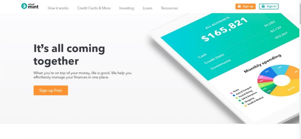
Purpose: Mint helps individuals and companies to manage all their bills and accounts in one place.
Feature: Color Schemes.
The website loads quickly and is easy to navigate. It uses its logo colour schematic throughout the site, which reinforces its identity and looks soothing to the eyes. With the minimalistic and informative approach, the static layout works best as it lays down the needed information in the simplest yet attractive manner possible, making it easier for visitors to comprehend the content. By using the colour schematic of the logo, the company makes the visitor familiar with the brand’s identity. The colour scheme also helps create visual links in the minds of the visitors. E.g., If you think blue, and you think about websites, Facebook would pop up first in your mind. Hence you should consider choosing your colours wisely while designing your next website.
2. Dropbox:
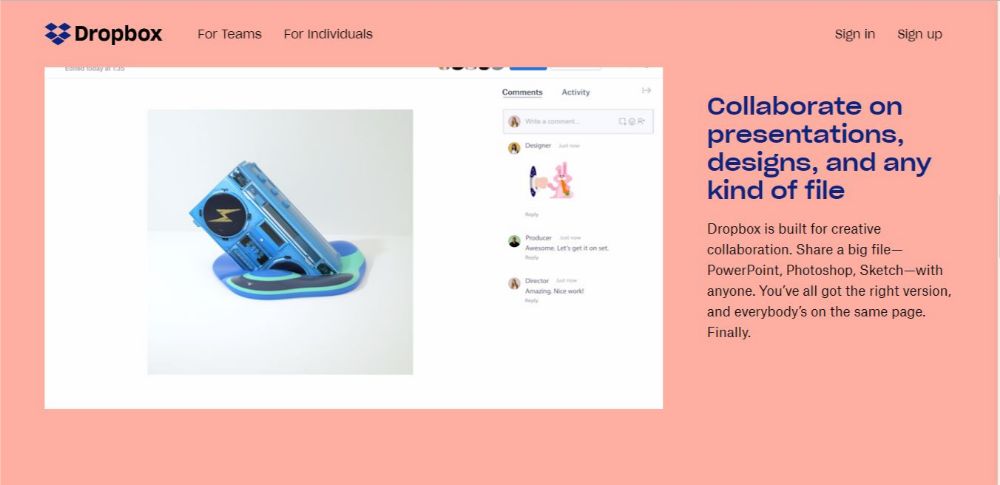
Purpose: Dropbox is known for its file storing and sharing capabilities. It becomes a central place to access and share data for organizations.
Feature: Using tutorial animations.
The website looks dynamic and exciting. It infuses a lot of colours that complement each other well. What’s more compelling about the website is the video tutorials that seamlessly start playing upon scrolling down the site. Each short video shows different abilities of the service provided in real-time use, which help visitors get a preview of the user experience before even subscribing for the service. This can prove of importance, especially if your website is going to be about something technical that your visitors might need a brief about to get comfortable before engaging.
3. Apple:
Purpose: Provides multiple services and devices in the technology field to create a seamless ecosystem for its users.
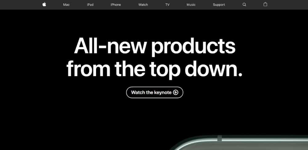
Feature: Cleverly placed CTAs
Apple’s website is one of the most appealing sites there is. Their home page always has the newest product launch displayed entirely with useful CTAs like watch the keynote that provides further information. This is a great way to avoid data clustering that might ruin the aesthetic of the website otherwise. It also makes the content easier to comprehend for the visitors.
The breadcrumbs talk about their products in depth. The design is elegant and premium. Throughout the website, there are CTAs to either learn more or Order for each product available on the site. This shows confidence on their part, that even if you end up wanting to learn more of the product that page will also have an Order CTA, once you’re convinced.
4.Caava Design:
Purpose: It is a Creative company that specializes in branding, interactive and packaging experiences to life.
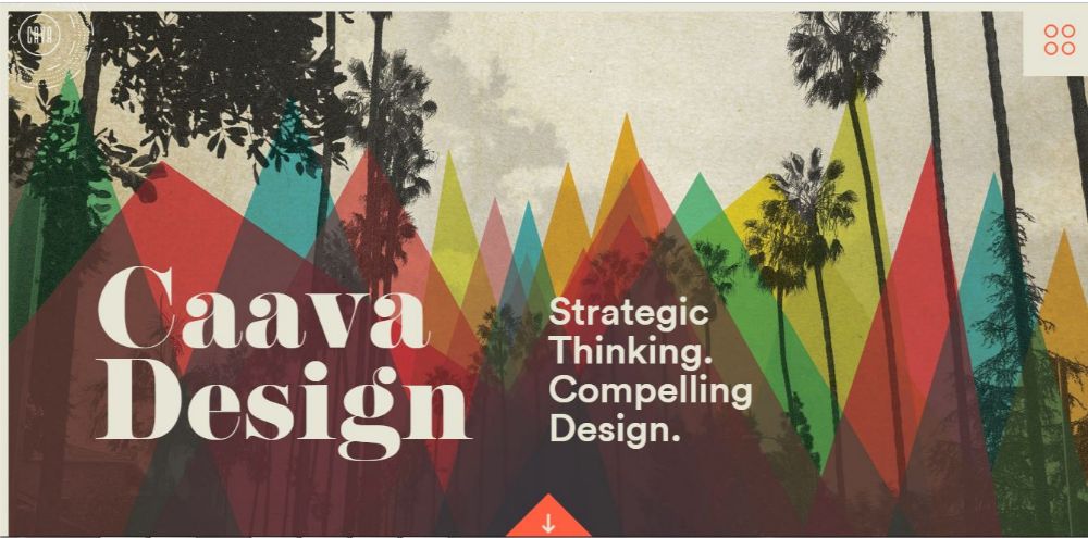
Feature: Typography.
The website has many attractive elements, like the use of different colours with a pleasing background that makes an excellent first impression. Since they are in designing field, they don’t shy away from showing their creativity with the fonts either. The main font that they’ve used for their design is unique and sets them apart from any other firm. They use a mix of different fonts to create a contrast which also helps demarcate the vital information from the less important one, in case the visitor is just skimming through the website.
Typography helps create identity. Good typography helps sustain it in the minds of your visitors. While there are different ways to use typographies to achieve different outputs, you should understand your niche, and make use of typography for designing your website.
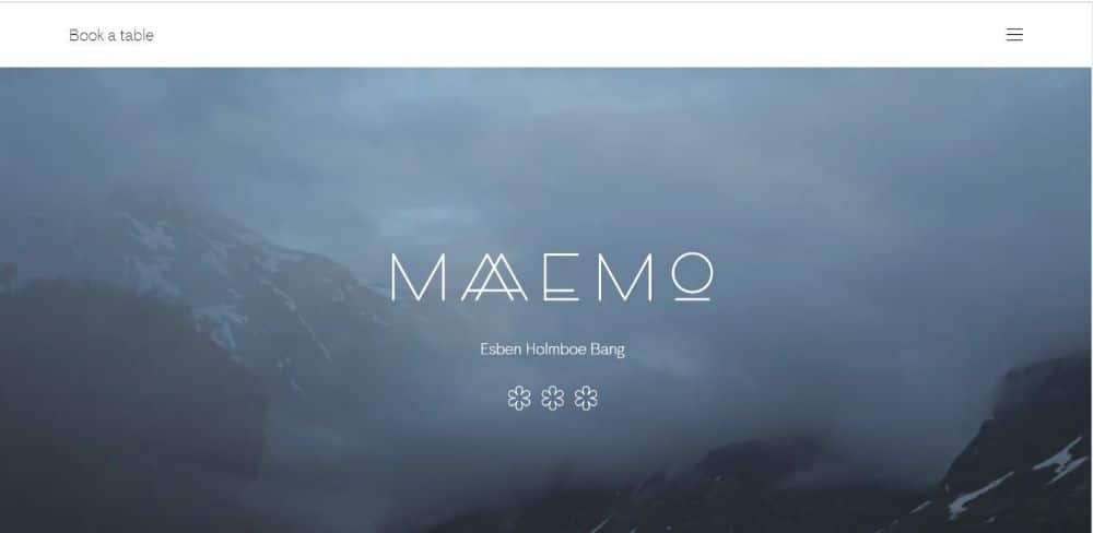
5. Maaemo:
Purpose: website for a restaurant that uses natural, local produce to help people understand local landscape and culture through food.
Feature: Minimalistic approach
The website is very minimal but yet effective in its design. When you first see the site, you’ll only notice the name of the business and a beautiful time-lapse video in the background. After which you’ll see “Book a Table’ option on the top left section of the page. The anticipation of finding out more creates a sense of mystery for the visitors as they try finding the link between the changing landscape and booking a table. This ensures engagement before you’ve even started talking about your service. The overall website follows a pleasing and easy-to-follow transitional effect.
You should think of something along the same lines if your product or service is unique; it gives you an edge.
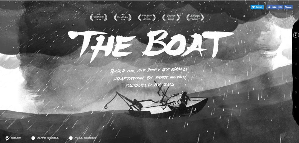
6. The Boat:
Purpose: The boat is an interactive graphic based novel about the struggle and journey of escaping the Vietnam War.
Feature: Parallax Scrolling
The website is a graphic novel adaptation of a story written by Nam Le. Matt Huynh has done an excellent job with the adaptation as the entire website; right from the start to end is very compelling. You feel like you’re on an adventure, and that you are a part of the story. The animations used are spectacular, and it goes on to show how effective Parallax Scrolling can be to make your website more engaging. If you’re a novelist or a poet, you could draw inspiration from this website. You could also use elements of parallax scrolling for certain parts of your site if not entirely to create emphasis on a particular area.
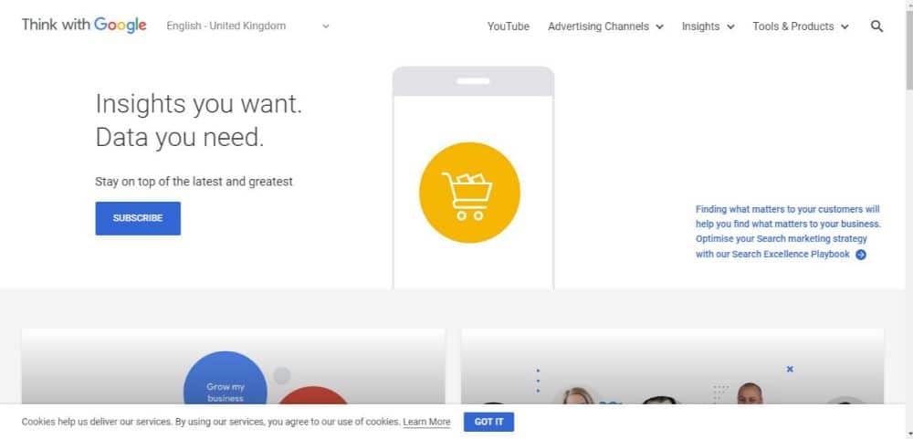
7. Think Quarterly-Google:
Purpose: Think quarterly is Google’s quarterly publication with their take on the movements and trends of the web.
Feature: Whitespace
The website is Google’s publication that happens every quarter. There is a plethora of content on this website as it talks about the on-going trends throughout the web quarterly. This makes it more critical to ensure that the content doesn’t get suffocating or overwhelming for the visitor. To achieve this, you need to use whitespace element of design. The art of leaving breathing space to demarcate one piece of content from other adds to the overall visual appeal of a text-driven website.
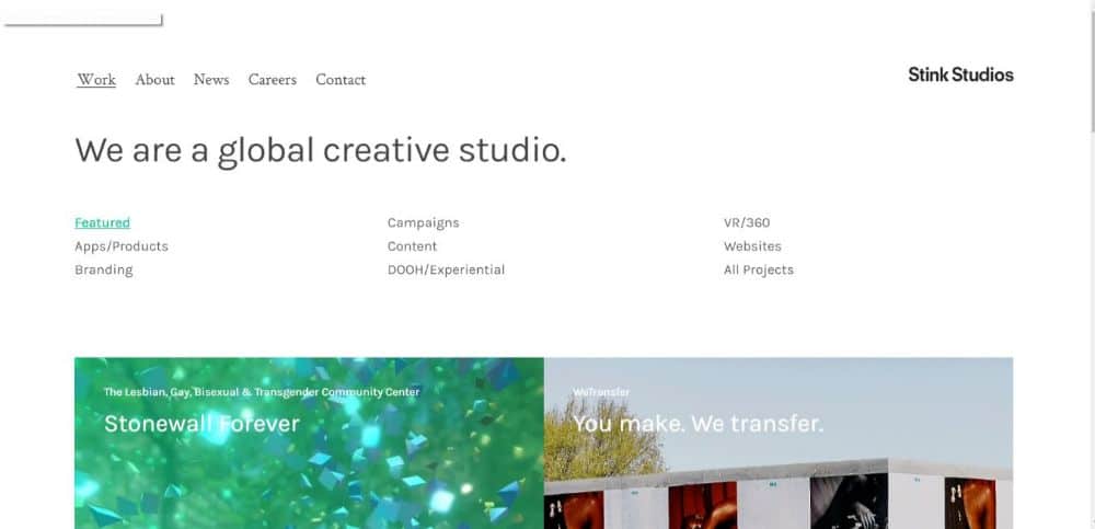
8. Stinks Studios:
Purpose: It is a global creative studio with offices all over the world.
Feature: Mouse-over Text
When there is too much information that needs to be shared, keeping it visually appealing can be a little challenging. Though white spaces are an effective way of handling this problem, at times you could also incorporate other useful features like Mouse-over Text. StinksStudios has made very effective use of the same. Putting all the topics in a close cluster, they’ve managed to keep it organized. By following the minimal text required on each tile, they ensure the reader knows what the topic is at the same time; it doesn’t harm the visual appeal of the page. When you mouse over to different tiles, you get a brief snippet that further explains the topic. This helps the visitor get a short idea without having to go through each tile to reach to the next one. You should especially consider using this feature if your line of work is content-driven.
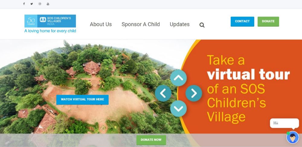
9. SOS Children Villages of India:
Purpose: SOS Children Villages is an NGO that works towards helping those children who don’t have their parents or have lost them in some unfortunate accident or by other cause.
Feature: Virtual Tour
This website uses many design elements to give a seamless browsing experience. Since it’s an NGO, the main aim of the website should be to prove credibility to the visitors. Authenticity is essential for such organizations. By adding a plug-in for a virtual tour, SOS CVI does precisely that. The journey takes you to any of their created spaces you want to tour. There are navigation buttons to aid you to move around the village, also mouse movements to change the direction of the tour. Virtual tours can be a great way to make your visitors familiar with your workplace or the services you offer. It helps calm their nerves and get accustomed to your business which then results in open-mindedness and positivity while surfing your website.
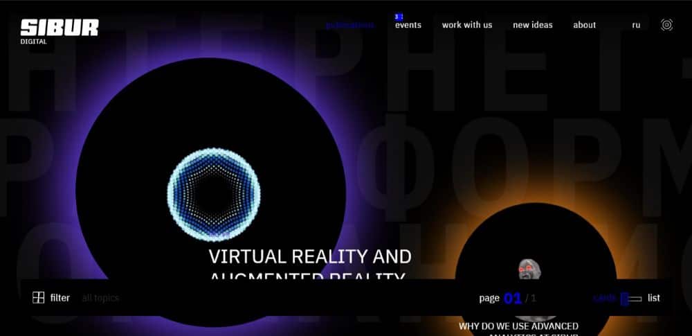
10. SIBUR:
Purpose: SIBUR is a major Russian integrated petrochemical company. It buys and processes hydrocarbons into different elements like plastics, natural rubber etc.
Feature: Animation
The website uses some engaging animations throughout the site. The company is technology-driven in their field, and they want to ensure that their website conveys it. Animations can add a visual appeal to your website as they are different from your everyday content and adds value to the same. They make sure the website is engaging enough for the user and overall better user experience while going through the website.
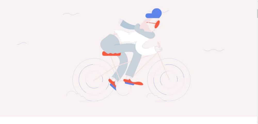
11. BAUNFIRE:
Purpose: Baunfire is a web design and development company that builds websites with good traffic, engagement and conversion as their goal. They make these websites for industry-leading brands and even startups in Silicon Valley.
Feature: Illustrations
The website has an excellent section that recalls all their significant achievements in the year of 2017. The entire page has fun illustrations that use the same set of illustrations to create a story for the visitors to follow. With minimal yet effective illustration, Baunfire makes the story attractive and exciting to the visitor. Using illustrations can help improve the visual aesthetic of the website, and many times on a decent budget too. It enables you to create an identity for your business that makes it easier for people to remember you.
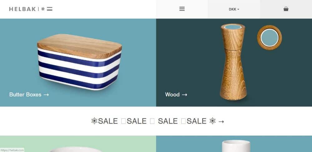
12. HELBAK:
Purpose: Helbak Ceramics is a line of ceramic products by Malene Helbak that combines the simplicity of Scandinavian design with exquisite colours in the ceramics line.
Feature: Product Photography
The website is very soothing. The colour palette is consistent yet not repetitive. Since it’s a business that specializes in a specific product, product photography not only becomes essential but attractive for the visitors. How you implement your product shoot on your website can make a lot of difference to the quality and appeal of your website. You should consider adding proper resolution, well-composed product photos if you’re designing a website to sell or promote your product.
13. Chownow:
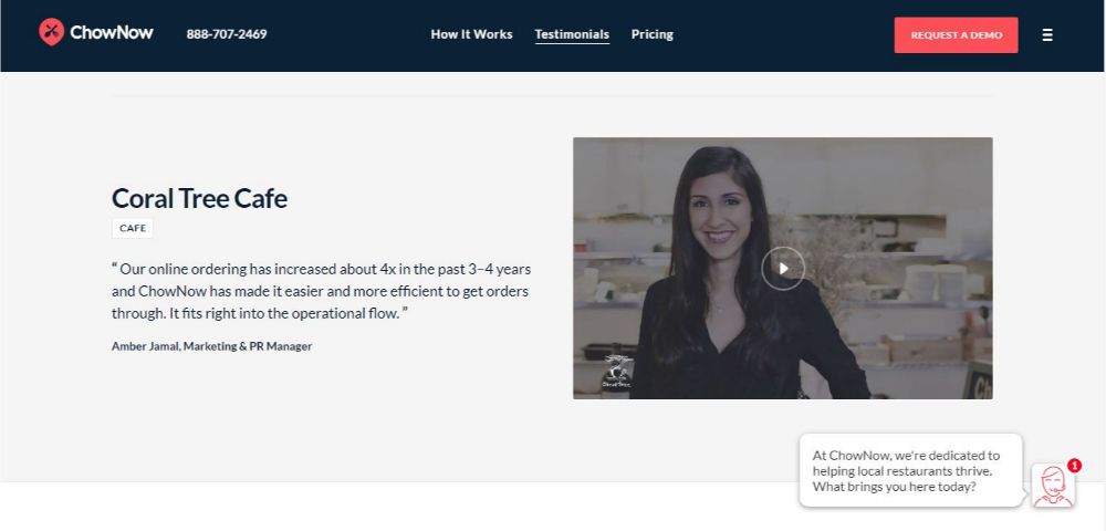
Purpose: ChowNow is an online food ordering platform. It connects the customers to their local restaurant.
Feature: Testimonials
ChowNow is a website that caters to a popular service in today’s time; Food Delivery. This makes it essential for them to gain the trust of their visitors as their interactions with you are generally over a virtual space. Testimonials work best to build trust and comfort virtually with your visitors/customers. The website is laid out beautifully with a sharp and clean design which stays true for their dedicated testimonial page. They have opted for a video format testimony which often seems more genuine and holds more interest of the visitor. Having testimonials on your website is an absolute must, even if you’re in a service industry or have your profile as your site. Testimonies add value to your services/self and make it easier for people to trust you.
14. Goldman Sachs:
Purpose: to provide a wide range of financial services to a diversified and substantial client based which includes corporations, governments and individuals.
Feature: Infographics
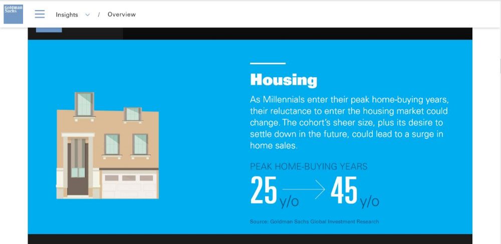
This website is designed in a very elegant manner. The enter user experience is seamless and requires minimum clicks. All the information is displayed and organized well. They have a great overview page, where they use infographics to showcase their facts and figures. Why this helps is because infographics are easy to look at elements that not only looks visually more appealing but also allows visitors to skim through the important data and facts.
15. TN Vacation:
Purpose: The official website for Tennessee Department of Tourist Development which a cabinet-level agency within the Tennessee state government.
Feature: Google Map Plug-in
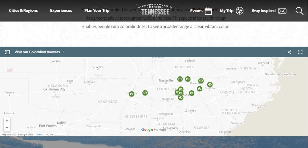
The website is aesthetically pleasing to the eyes. Proper use of typography, relevant images and punchy colours goes in agreement with the travel feel, which is the service provided. They have Google map integration where you can easily see all their properties available in a locality and also navigate your way there. This feature is significant to have on your website if you’re an office-driven company/individual and want to attract visitors to your office. Adding Google maps makes you easier to reach.
And here we are, at the end of our list! The main gist of this article is that you need to take care of two broad elements: UI/UX. Your overall goal is to create a seamless and productive experience for your visitors who visit your site. Using these tips will help tremendously.
The post 15 Website Design Ideas for Your Next Website appeared first on Web Design Blog | Magazine for Designers.
via https://ift.tt/31y8eEa

No comments:
Post a Comment