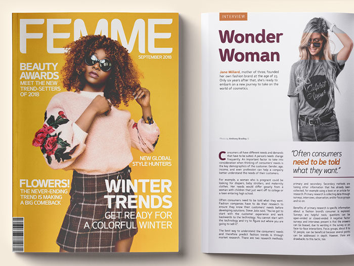
There are many magazine fonts that designers can choose for editorial design. When they are choosing the appropriate font, they have to consider three main factors.
The first is that the font will be in line with the corporate identity, the second is that the magazine font will add some value to the appearance and the third is that the font has to be compatible with the overall design. Based on these three factors, designers have many fonts they can choose from.
Choosing from the sea of magazine fonts is one of the most important choices a designer has to make. It has to complement the overall design of your project. A magazine font can make or break the project, so finding the right one is definitely a challenge. When you think of the Time magazine, you first think of the time magazine font.
The role of a font is to attract attention and to give the whole project a pleasant look. This look can also be achieved using various editing tools which can be found online and many of them are free to use. With them, you can style your chosen font in any way you want.
Not only that, but these tools are flexible so they offer you the choice of morphing several of the fonts together to create a unique font that will be perfect for you. As an editorial designer, you will want to create engaging and unique fonts that will act as bold headings and will attract users’ attention. In this article, we will take a look at some of the best magazine fonts for editorial design.
Best magazine fonts to try out
Butler
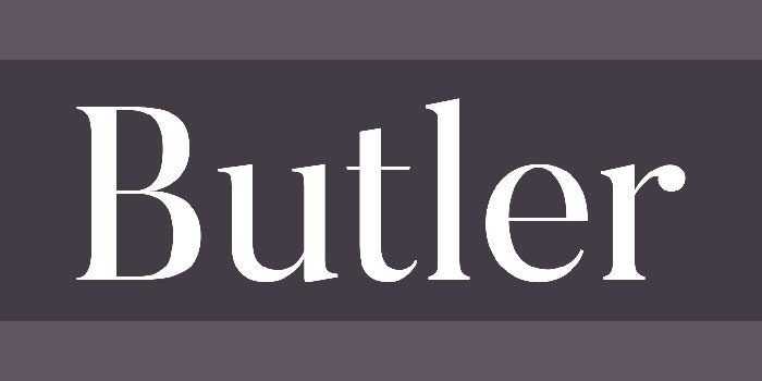
Butler is one of the first fonts that comes to mind. First of all, it is free to use, so that is a massive bonus. It is a serif typeface and it is meant to add a modernistic outlook to classic serif fonts.
The butler magazine font is a very versatile font. It has a lot of characters at its disposal (334), and it supports a large variety of languages due to the size of its character palette. This magazine font is perfect for you if you need a font for posters, books, and big titles and another bonus of the butler typeface is its versatility.
Isidora Sans
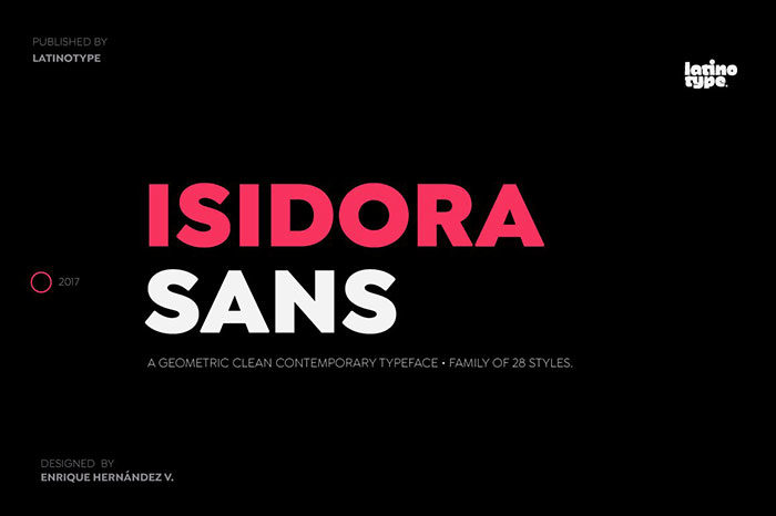
The isidora sans is a sans serif collection of fonts that offers a wide range of typefaces to choose from. You can choose from 28 different fonts, and each and every one of them offers a different quality. This font family is good for experimenting and finding out what works best for you.
It is a mixture of early 20th century fonts and a contemporary design. It has a geometric look to it, and it still manages to remain modern and look classy at the same time. The isidora sans is perfect for you if you are looking for a font for titles, books or magazines and for corporate design.
Mrs. Eaves
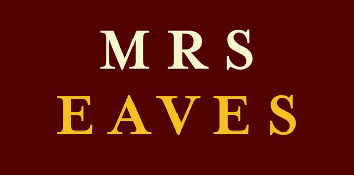
Mrs. Eaves is a serif typeface designed in 1996. It was inspired by Baskerville and it was named after John Baskerville’s wife, Sarah Eaves. This magazine font is free to download, and it offers a more rustic look that can be used in magazines, especially in foodie magazines.
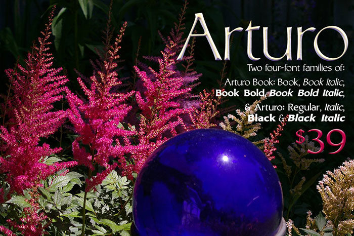
Arturo Font Families: 8-fonts
This font family is a sans font and it is designed to be read easily and clearly. It is a humanist sans font family that is one the most versatile magazine fonts out there and it is also elegant and it gives you a classy taste.
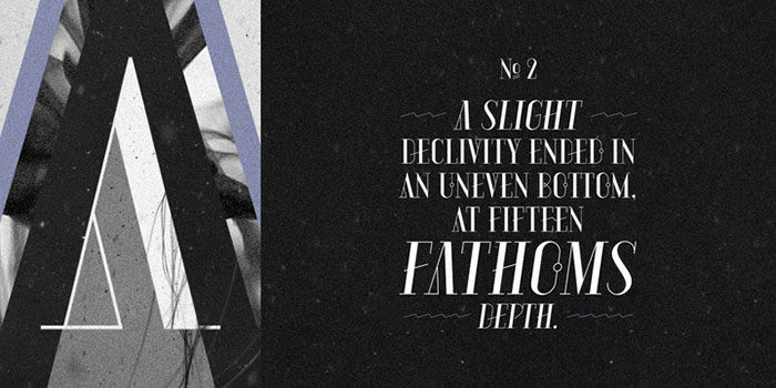
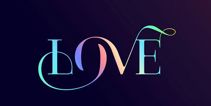
Aquus – packaging or magazine titles
This is a contemporary magazine font that is a combination of a didone font and other experimental fonts. These fonts are all-caps and they all have a geometric quality to them that are connected to ligatures. You are also given plenty of choice with the aquus magazine font, as they can be styled easily and they offer a wide range of options for you to customize. It is also very versatile, but they are mostly used for titles.
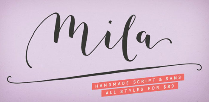
Mila script pro
Mila script pro is a unique magazine font that is made on the basis of handmade brush moves. This gives the font a very round look and the edges are very soft and round. They are compatible with many letters and languages.
It offers support for more than 2600 characters, so this magazine font can be used by pretty much anyone who needs a good magazine font that will add some character to the project.
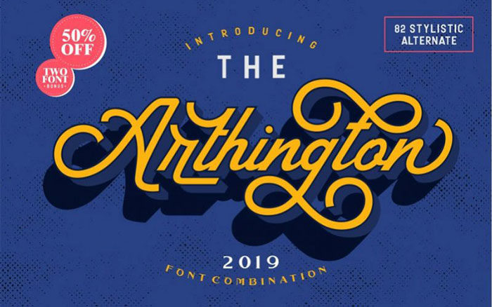
Arthington combination font
The arthington combination font is one of those fonts that can be used for multiple purposes. As a magazine font, it offers a vintage look. If you want your editorial design to have a more vintage feel to it, don’t hesitate to use this font.
It is also good for branding, t-shirt design, books and more.
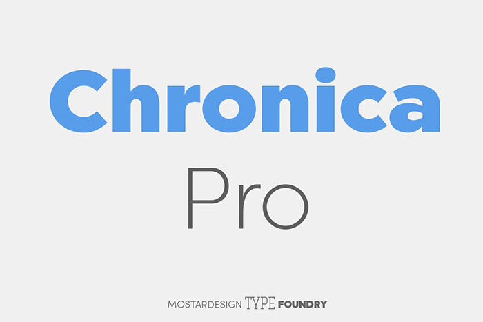
Chronica pro family
This font family consists of 18 different sans serif fonts. All of these fonts look professional and all are designed with the user in mind – they are easily legible and also good for editorial use. It is a combination of geometric moves and a humanist quality. It also offers support for many languages across Europe, so it can be accessed by almost anyone.
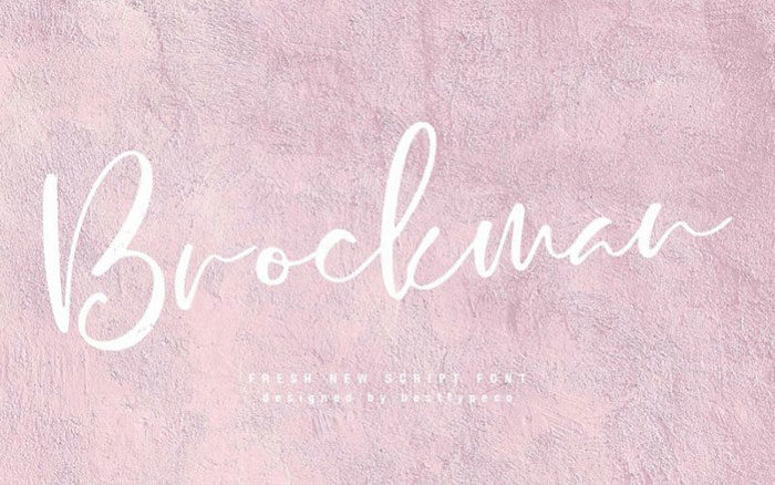
Brockman
Brockman is a fairly new font that is designed from handmade calligraphy. It is perfect for editorial design, as it offers a lot of flexibility when editing. This makes the brockman font one of the best magazine fonts out there if you want to design your own style.
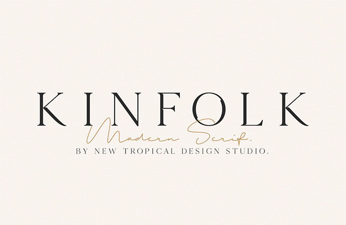
KINFOLK – Modern serif font
This typeface is, in essence, an old font, but it has been refurbished and modernized. This makes for a good combination of modern and classical. It is very unique and this magazine font will make sure that your design will be memorable. It is not only good for magazines, but for logos and monograms as well.
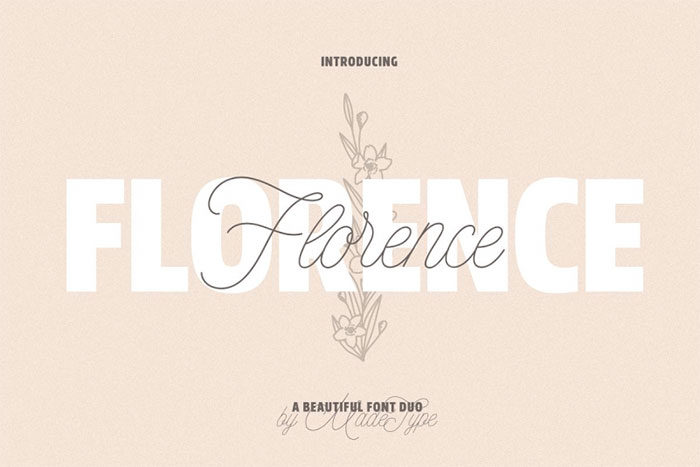
Made Florence – a beautiful font
The made Florence font is a beautiful font that is a great magazine font, but also very good for other uses – posters, wedding invitations, quotes, photography uses and many more uses. The versatility of this font will attract many users.
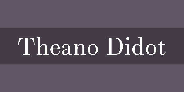
TheanoDidot
TheanoDidot is one of those magazine fonts that will look good in high-end fashion magazines. It will give the titles an elegant look and at the same time luxurious. It is also not a big investment in this font, so if you need an elegant font for high-end and fashion magazines, try this one out.
Paris Pro
This font is another one that is good for fashion magazines. It is unique and it includes unique ligatures and appealing curves while also remaining elegant and stylish.
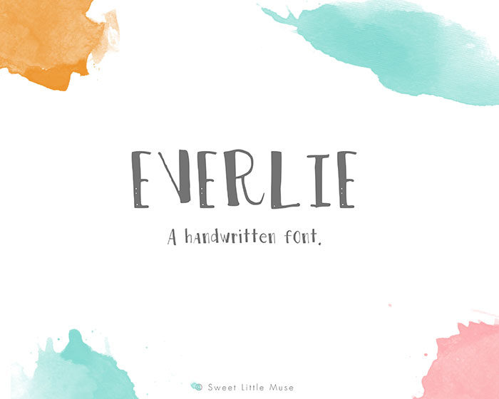
Everlie
This is another handwritten font. These are very popular amongst editorial designers that want to add a personal touch and some character to their projects.
Logos, cards, wedding and birthday invitations, this font has all of those uses and that is why it is so popular.
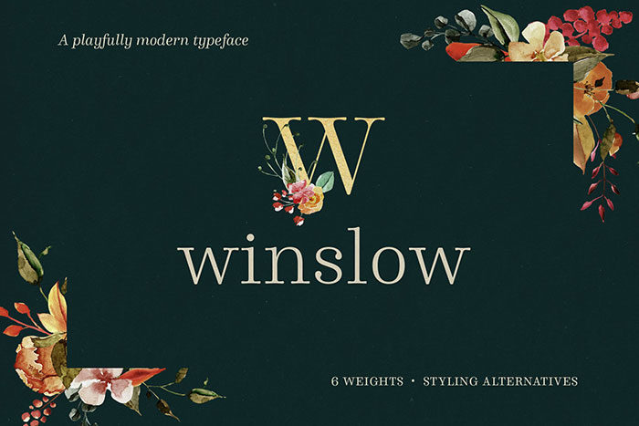
Winslow font family
Winslow was designed to be a playful font with some flair.
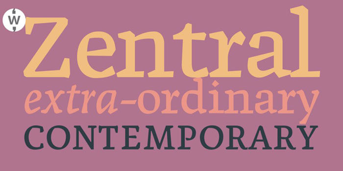
Zentral
The Zentral typeface can be divided into zentral regular and zentral italic font. This offers the font flexibility and it is available for both uppercase and lowercase letters; offering both of them provides a good contrast. The zentral regular is, on one hand, designed to make the text more readable. The zentral italic, on the other hand, is used to emphasize certain words or phrases. This is one of the best magazine fonts you can use.
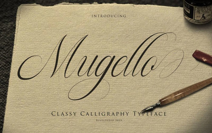
Mugello calligraphy font
The mugello font is suitable for many purposes. From logo design, branding and covers too, of course, magazines and all types of cards.
It is a calligraphic font that looks classy, clean and is modern above all.
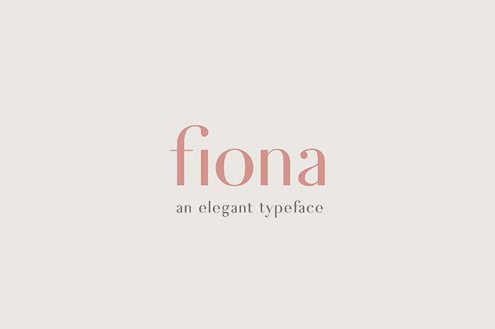
Fiona – an elegant typeface
Fiona is an elegant combination of classical and modern styles. Because of its elegant nature, it is perfect for magazines, wedding invitations or for any graphical design options. Not only does it offer a sleek look, but it is also very elegant and vintage. It is based on classic letterforms, so the Fiona typeface would give your project a classic, vintage and elegant look.
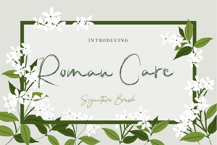
Roman care script font
The roman care script font is available in many languages. It is a brush font, and it is quite versatile, so it would be perfect for many purposes.
Neue Haas Grotesk
This magazine font looks very formal and strong. It is a sans-serif font that can be used for various headings, quotations and also as body text.
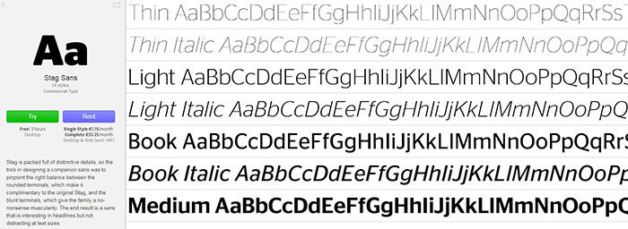
StagSans
The stagsans is complementary to the original stag font. You can use both of them and combine them into one project, for example for magazines that focus on fashion and style.
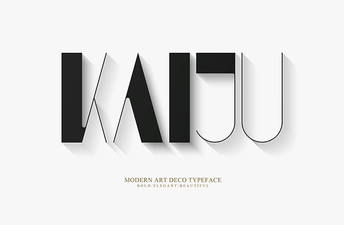
Kaiju Font
This font is available in Japanese and is one of the most popular magazine fonts for this language. If you need a font that covers the Japanese language, you can’t go wrong with this one.
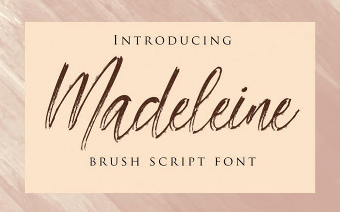
Madeleine brush font
A handwritten brush script font is a modern and stylish font that will fit all of the magazine projects that you want to have a modern and stylish look – magazines, name cards, quotes, web headers and more.
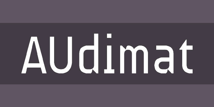
Audimat
The audimat font is great for musical magazines, and it can be used for many musical styles. From classical music, rock music, and techno music, this font will cover everything. You can style it all by yourself.
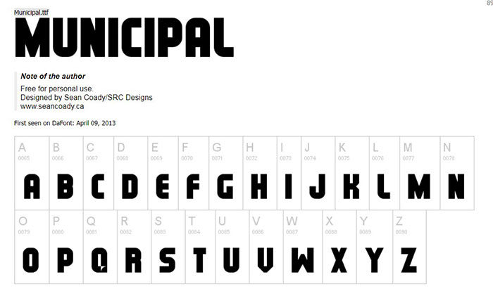
Municipal
This font is good for more serious topics, such as politics. Due to its retro design, this is a great magazine font or a font for more serious magazines and newspapers.
It is best used for headlines, but it has many other uses. Use it if you need a font for a political magazine or for newspapers.
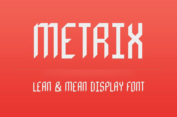
Metrix display font
This is a simple font that can be used for many purposes.
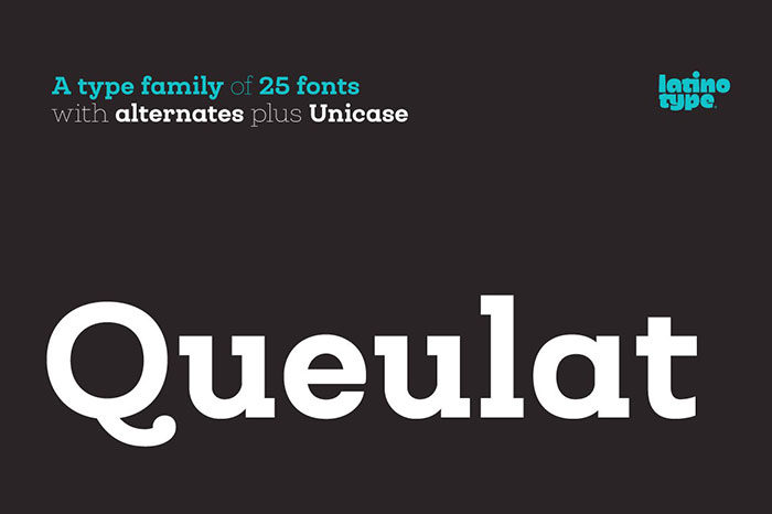
Queulat
The queulat font is a unique font with personality. If you need a strong font, you can use this one. It is a hybrid of modern and Grotesk typefaces, and it has two styles – the regular version and the alt version.
If you are looking for a font with character, look no further than queulat.
Ending thoughts on these magazine fonts
There are many fonts editorial designers can use for their magazines. These are some of the best magazine fonts. Each of them has unique qualities and you have to carefully choose which one best suits your project. Hopefully, you will have a better idea after reading this article.
If you enjoyed reading this article about magazine fonts, you should read these as well:
- Free Cute Fonts to Use in Your Thematic Designs
- Retro Fonts: 90 FREE Vintage Fonts To Download
- 117 Free Christmas fonts to use for holiday projects
The post Cool magazine fonts you should consider for editorial design appeared first on Design your way.
Source: https://ift.tt/2ZJyVJ1


No comments:
Post a Comment