As designers, we put much effort into digital trends and website design. However, labels and packaging can impact everything, whether you are purchasing something or the way you feel about a product when you open it. Designers who start these trends play with graphics, materials, and colors in exciting new ways. These aren’t just physical elements they impact the digital space as well. So, as a designer, if you want to stand out, you must analyze the tendencies that influence the market and evolve according to it. Only if you reflect on the evolution of the design, you can anticipate the trends and shape the future in new inspiring ways. So here are the top 10 packaging and label designing trends for you to get inspired.
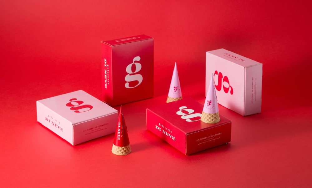
1. Minimalistic yet Colorful Design:
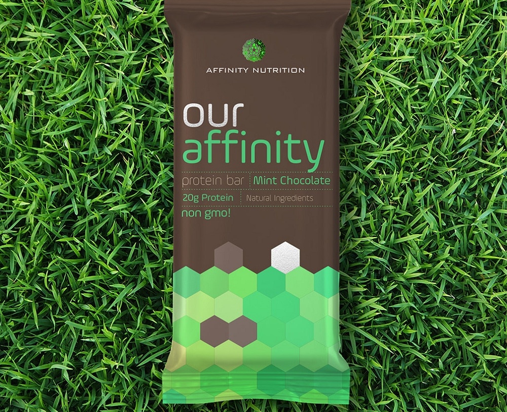
Most packaging companies have started using this trend. They use simple typography and image along with a bright color. They use the sleekness of simple design with intense color that can draw people’s attention to the shelf. With the minimalistic design, you can give a modern feel to the products in the package as well as the container. By using less, you focus more on the product while stripping away everything non-essential. These designs provide you only what you want and nothing you don’t. The act of cutting the essence of something is always challenging, but it is equally rewarding. It can showcase your design through simple shapes, patterns, and functionality, communicating an important message. This theory is not limited to packaging. This also applies to the product within the packaging. More companies are making a product that contains only a few ingredients, such as RXbar. It’s a great way of providing a seamless experience. So let the color and typography stand out in your packaging design as this way you highlight the product.
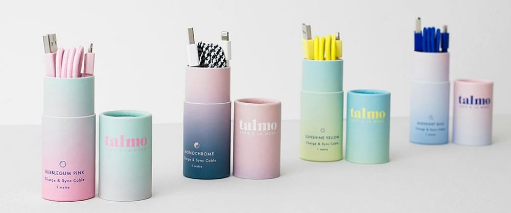
2. Gradient Design:
Gradients are one of the most practical and fun ways to use colors. You might have seen luminous, colorful, and neon gradients in packages. They keep fascinating both audiences and designers. They offer packaging designers the option to create something that feels new and fresh by blending colors, resulting in something revitalizing and unique. Gradients look great in digital formats and attract buyers’ attention to the product. They offer essential elements of design, by bringing dimension and depth to any composition. And with exciting and bright color combinations, they transform from being just a mere background detail to being the main component of the design. Gradients are equally fascinating as small design elements. That makes the gradient highly versatile for designing anything. So you can use a subtle monotone gradient to design a soft, understated texture or you can use a bold color pair to emphasis the interesting product that is inside the package depending on the product. It is no surprise that large companies like Apple and Microsoft have embraced this trend since 2016.
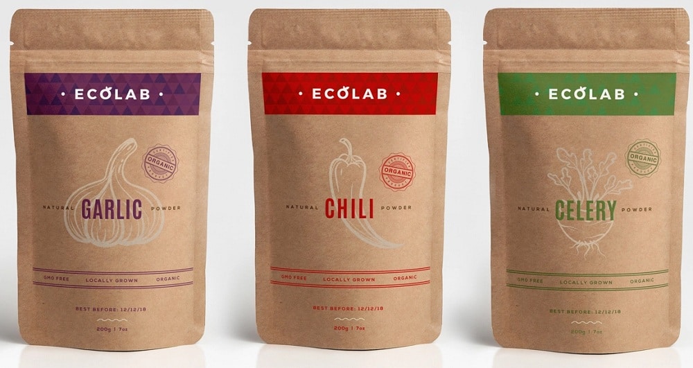
3. Sustainable Design:
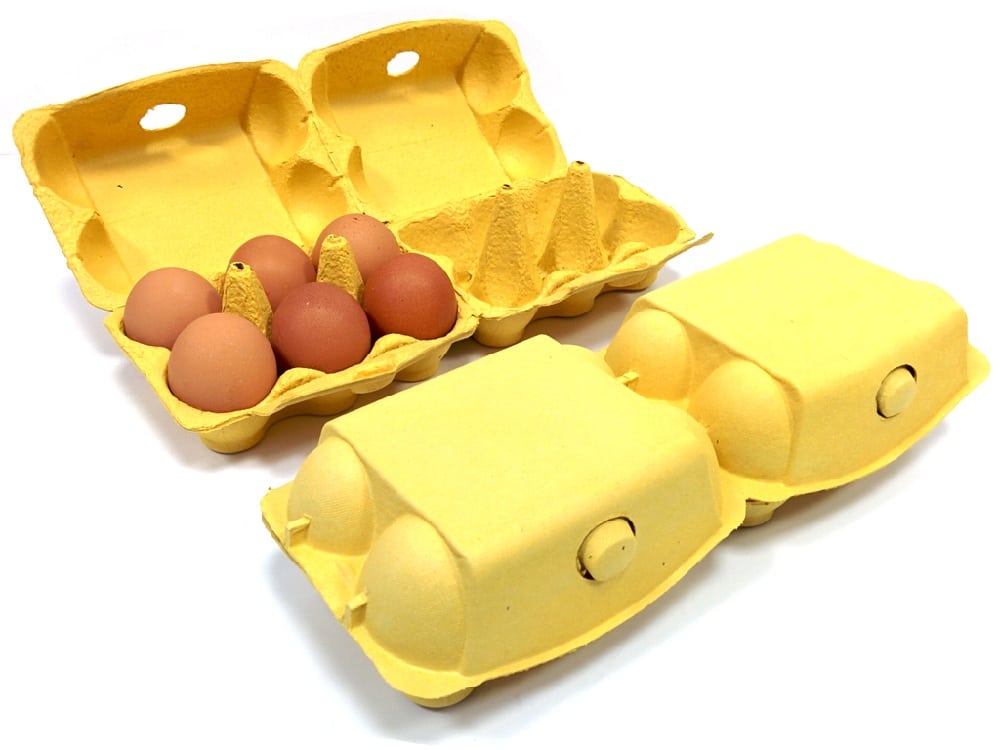
With the worldwide movement of cutting down plastics and increasing the use of sustainable alternatives, more companies are taking initiatives to design sustainable package and label design. You might have seen nature-looking, more “green” labels, and packages. These packages are usually made of paper rather than plastics. The packages are not dyed, so they look like brown paper, and the labels include words like “natural,” “plastic-free,” or “sustainable.” Also, green coloring for logo, ink, and other design elements emphasize the idea of sustainability. A good example of sustainable design is the collaboration between Ecologic Brands and L’Oreal with their product seed phytonutrients: a recyclable, paper-based, compostable pump bottle made for the shower. Another example is the microbial cellulose package designed by Emma Sicher for the project “From Peel to Peel.” The choice between sustainable and plastic products has started to become a real option for consumers. There are no real alternatives in the market for packaging designs that are being created that will help in making the future more sustainable and efficient.
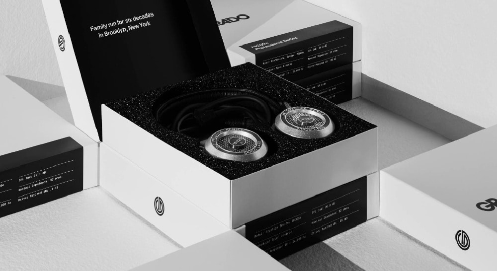
4. Black and White Design:
Restricting yourself to just two colors might be difficult. However, as far as white and black are concerned, it always makes the design more powerful and versatile in packaging and labels as well. The dynamic that these two colors offered in design is difficult for the consumers to ignore. This way is generally very effective to create separation between design elements and still establish the relationship between them. Black is said to be the color of elegance and white is the color of purity, and hence, people are attracted by such packaging. A good example of using emotive visuals is the project by mousegraphics for GAEA. It is simple, clean, and it balances the packaging and label designs. In contrast, the combination of white and black can create complexity while still maintaining the minimalistic traits. This is the oldest and easiest way to make your package look trendy. It may come as a challenge at first, but with the right application and intent, this combination can add more structure to your design.
5. Vintage Design:
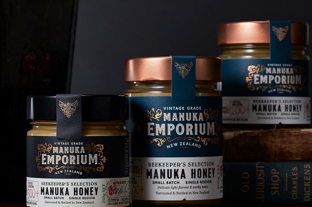
Old styles are coming back all over the world, and packaging and labeling manufacturers are aware of it too. The retro aesthetic of packaging and label design is more popular than ever. This trend is usually seen in food and beverage products. It is very easy to come across vintage packaging or labeling in stores near you. Vintage design sells first because of its authenticity. Besides this, vintage products are given more value because of the feel they spread; the consumer starts recollecting all the memories. Other than the use of vintage fonts, we can see more manuscript lettering, retro color patterns, and illustrations in the market used for conveying pedigree and age. Designers come back to old styles simply because they don’t understand what else to add to the “new” designs that their consumers will appreciate. Today’s market has a ton of new, improved packaging designs and so creating an advanced packaging doesn’t work the way it used to. However, sticking to the roots and designing a vintage package is classic and will never lose its appeal.
6. Flat Design:
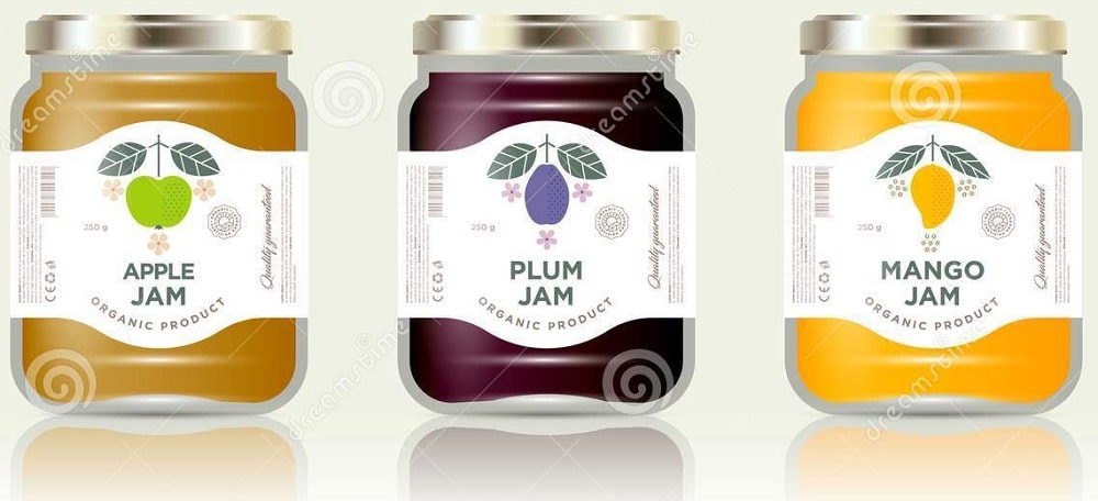
The origin of flat illustration goes back to Swiss Style that appeared in the 1920s and became a significant foundation for graphic designers in the mid-20th century. This approach started with print material and then moves on to other designs, including packaging and labeling. The focus of the flat design is a simple color, typography, and design, which make them ideal for any print material. Most of the time, we see flat illustrations that appear as simplified shapes while making the blocks of color standout and making the text more readable. These types of designs look clear and crisp by cutting away the three-dimensional effects. Furthermore, from simple to elaborate illustrations, flat design is a great way to add a colorful, fun label and include branding and typography without a design that feels complex. The best part about this ongoing trend is that you can evolve freely and fuse different elements. This trend brings a perfect harmony of aesthetics and functionality. Flat illustrations are mostly used in food and beverage packages and labels.
7. Nude Design:
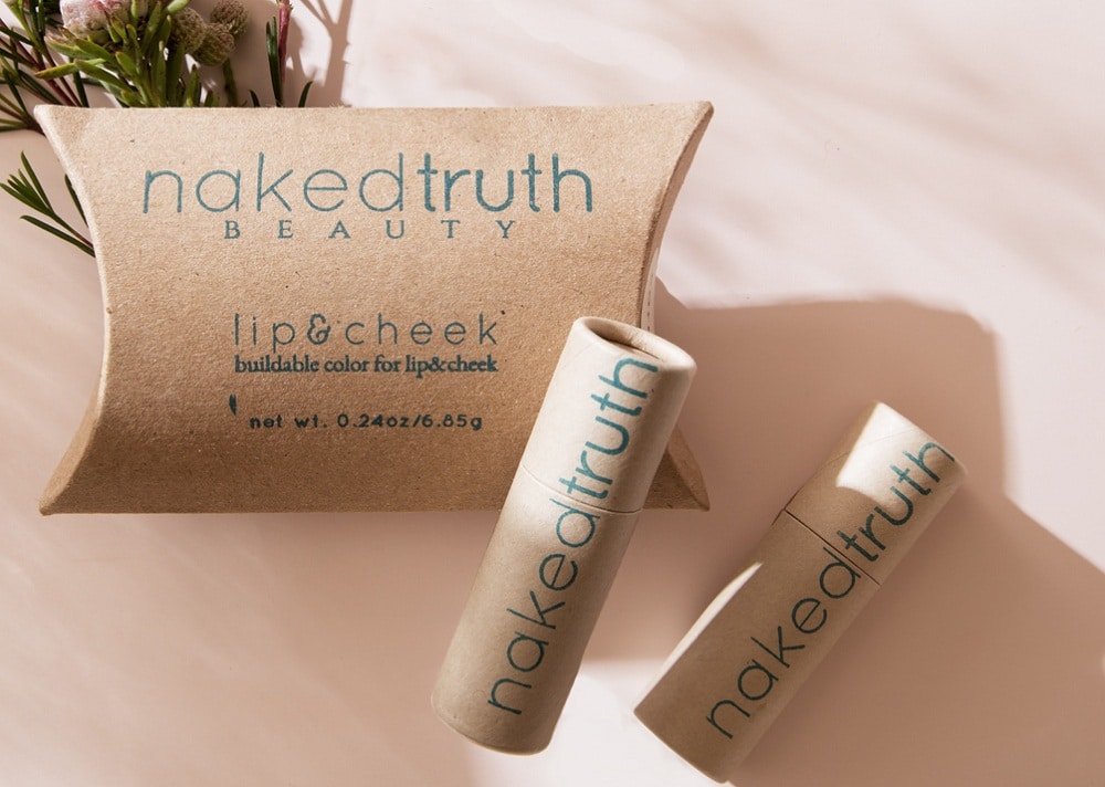
Nude colors have been around for quite some time now. Nude is not one color. It is a complex mixture of rosy, mint, ochre, peach undertones, with chocolate or cream hues. Shifting from bright colors to a palette of neutral and nude shades has become a trend in packaging designs and other areas of designs. In today’s market, packaging designers are embracing natural shades as the base of their design and playing around with combinations of sepia, pastel, and nude palettes. This trend has a minimalistic and easy-going approach with a hint of playful elements. Nude design is popular in skincare and makeup industries since the past few years. A nude palette in these industries primarily includes creamy whites, pinks, beige, and warm browns. These palettes are often combined with a pop of candy pastel colors to make them stand out. Along with this, they usually have clean white labels that let the unique color combinations and shapes stay in the spotlight.
8. 8-Bit design:
The pixelated game console look has been the most retro thing. And “retro” is back in style as it looks classic. It is a trend that stands strong and is far past its expiration date. 8-bit designing has originated from the art form of creating digital images using raster graphics software, where pictures are edited on a pixel level. It has a unique place in labeling and packaging companies because video games have always been popular, and they are simultaneously timeless and out of date. The drawbacks of 8-bit designing can double up as their strength if used effectively. The stripped-down illustrations full of hard edges, straight lines, and pure color fields are both accessible and commanding to customers. 8-bit design is a simple way to communicate an idea that otherwise would be complicated to display through other art forms. This trend can even add an ironic nod to the product. This type of illustrations catches attention in a store full of simple boring package designs. Although the design was created in the past era, the 8-bit design is embedded so deep in our memory that it will surely extend its lifespan in the future.
9. Unusual Design:
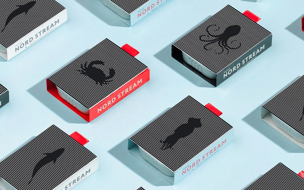
If we had to choose between two products at the same price, we would always select the product with more attractive packaging. Based on this experiment, designers have created more unique packaging designs that can communicate in a fun, unconventional way. For example, finding white activated charcoal in a box-shaped like a domino piece might be something you don’t usually expect. However, Lesh Limonov has found a great way to transform the domino principle into human health and convey that in a special premium package. Loco Studio creates another such unconventional work in packages for Nord Stream Seafood. Based on the interference pattern, the image on the top of the package starts moving when someone opens it, both involving and impressing the customer. Such unusual and original approaches drive the customer to the product. So if you are creative and want to showcase it, packaging and labeling is a great way to do that. The most memorable ones can be used for things other than packaging and labeling as well.
10. Flexible Design:
Flexible packaging is growing faster than others as it moves a bit further from the writing and images on the package. This type of packaging is growing faster because it comes with premium sustainability, branding, and functionality. Brand owners are always glad to see new, unique packages that have such qualities as increased shelf appeal. These types of packages can be opened and resealed quickly without much effort. Flexible designs are easy to carry and have the quality to extend the life of the product inside. Other than this, they are made with less material, so they are environment-friendly. These designs can easily optimize the e-commerce aspect and are efficient to ship. Here we are looking at a trend that reduces the cost for manufacturers and still appeals to the consumers as they serve multiple purposes. Additional qualities of this type of packaging are that their barrier protection is long-lasting, and they do not take up much space. Along with this, their carbon footprints are low. These designs are now made in new categories in which products come in stand-up pouches.
One exciting way to incorporate these designs is to find the intersection between them and add them to your design. You can easily mix these designs to create a package that sets the trend. You might specialize in print, and digital design or innovative designs, packaging, and labels are great to showcase your talent. The big lesson is to be observant in all types of design work, no matter if it relates to you or not. You never know what could serve as an inspiration for your next project.
The post Top 10 Trends for Packaging and Label Design appeared first on Web Design Blog | Magazine for Designers.
via https://ift.tt/30aIjkp

No comments:
Post a Comment