Graphics designing has become the core of every industry from the past decade. The entire digital marketing concept is based on graphic designing. For every website we create, for every blog we post and for every Instagram post, we require graphics that speak for us. Top companies are identifying the needs of graphics and have started adopting them using the latest trends.
Nowadays, the story is conveyed in a better way through graphics and visuals being the only words. The old digital marketing companies are converting their past blogs into infographic formats to re-use and update their information section.
The world is transferring from a digital to a designing world. Everything in the coming years will involve designing. The form, the shape, the structure, the words, the ideas, the thoughts, everything around us in the kind of content would involve designing. The next era is based on design and not just digital as design widely requires innovation, which has a high need in the world. Here, we are listing 20 graphic design websites that will inspire you to go to the next level and understand how important design is for our sustainable growth.
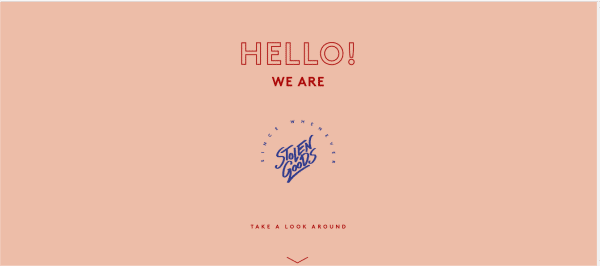
1. STOLEN GOODS:
Stolen goods are a straightforward, colorful, and elegant website, which is a kind of studio website. As we enter the website, it greets us with a hello and takes us through the website with a simple call to action button – ‘Take a look around.’ As we go further, we find a very subtle page bread crumbs defining the purpose and information of each page. It is a small one-page website. The footer contains all the social media pages and blog sections, to help the users connect to the website owner easily for work.
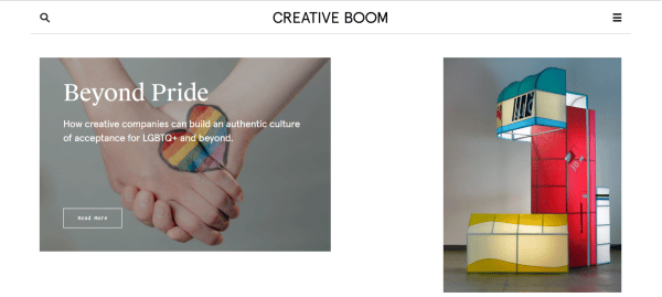
2. CREATIVE BOOM:
If you lack the color enthusiasm, the original boom will help you to get inspired in multiple ways. It has a very vibrant and clean user interface with a simple name of the website on the top. It does not involve any logo yet looks elegant. It has a search button on the top, which helps the users to find relevant information and a menu on the top right to help the users navigate efficiently. The blogs are segregated in the form of image boxes of various sizes, making it all look cheerful and vibrant. It is an art to build a website that is stuffed with multiple colors as well as makes it look clean and straightforward for visitors to use smoothly.
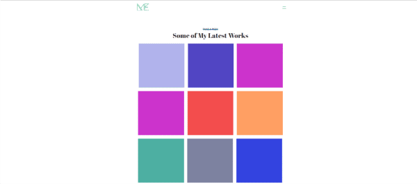
3. MAYA EALEY:
Maya Ealey is one of the most smartly created websites so far. It is a simple one-page website, which represents the information through the color bars on the home page. As you click through each color bar, it shows different information in the form of a portfolio. It has a small yet creative geometric-inspired logo at the top. It also has a menu bar on the top right, which helps the users to navigate through the information quickly. The designer has used the space very wisely and has made a difference in the viewpoint of the users. It is highly responsive.
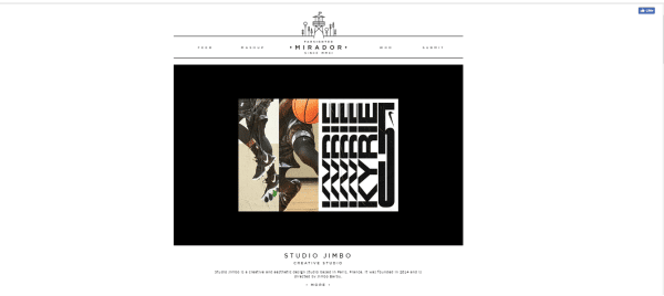
4. MIRADOR:
Mirador is an abstractly designed website. It is well segregated through different pastel colors blocks along with black as the significant middle block. It has all the features of a designer website as it includes the works in a very well defined manner. The logo is simple yet creative with the use of lines and other culinary objects. It has a link button on the top which allows the users to like its Facebook page directly. It is a tremendous one-page website that shows all the designs on a single page, eliminating the hassle of scrolling to different web pages.
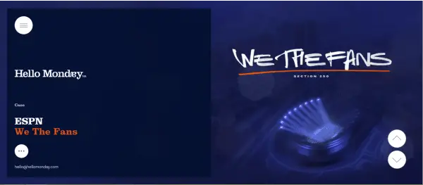
5. HELLO MONDAY:
Hello Monday is a true inspiration to every user even on Tuesday or Saturday: P. It is a great animated website with different animations on every scroll. It has a very smooth scroll which gives a satisfying user experience to the visitors. It has a scroll up and down menu on the right-hand side of the website, which allows the users to scroll quickly to different information. It also has a menu on the top left, which provides the users with the overall knowledge of the user.
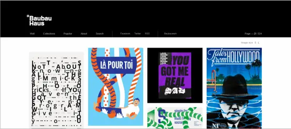
6. BAUBAU HAUS:
It is one of the most informational websites with multi-functionality. It is a type of portfolio website which inspires the users in multiple ways. It has a simple white logo that changes its background color as we scroll down to the image blocks. A unique feature of this website is the ‘S AND L’ icon on the top right corner. It shows that the image blocks can be viewed in both the sizes, giving an open choice to the users. It also has a clean bread crumbs section that has information about the entire website as well as social media icons in the same line.
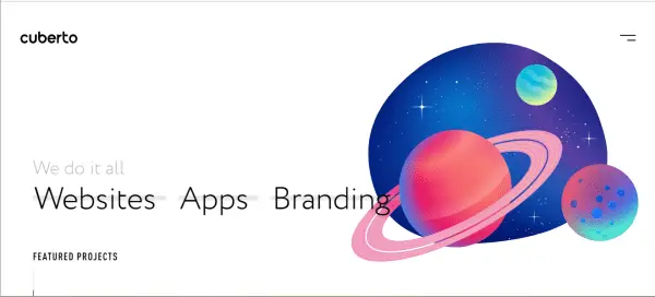
7. CUBERTO:
Cuberto has an Amoeba kind of animation on the home page, which glues the attention of the users in the first go. It has a colorful yet straightforward structure. The design consistency is throughout the website, which inspires the users in various ways. It has a menu bar on the top right corner, which helps the users to find the relevant information is quick time, thus saving their browsing time. It is highly responsive in spite of having much high-resolution animation on the page.
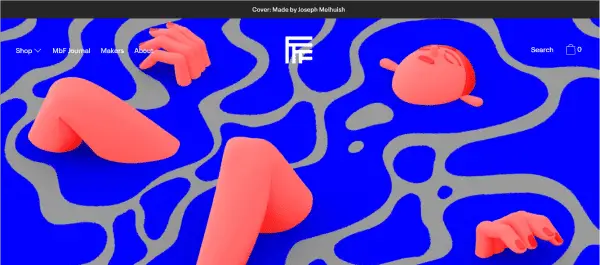
8. MADE BY FOLK:
Made by folk is a vibrant website with a hidden meaning in the home page art. The website is created in a very sarcastic way, making the users think and realize specific issues of society in a humorous way. It has a very creative all- white logo on the top which itself is enough for the inspiration. It has a search and cart button on the top right, which helps the users to search and purchase without any hassle. The typography compliments the color scheme of the website very well.
9. HICKS:
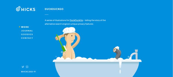
Hicks is a very quirky website like its domain name. It has a funny vector image on the home page, which makes it look like a happy and creative website. It is a great one-page website full of comic images. Each comic represents a story of its own. It has a well-segregated menu on the left, which provides information relating to work, journals, and goodie bag offers as well as contact details to help the users connect to them quickly. It also has social media icons right on the home page, which works as a clear call to action for the users.
10. STUDIO & MORE:
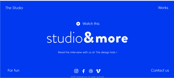
Studio & More is very crisp and to the point website. It is just one screen length website which has all the required information needed by the users. It has a simple animation in the middle of the website, defining the purpose of the website. It has four menus in the four corners of the website, which allows the users to connect to them quickly as well as know about their work in the best possible way. The designer has also smartly incorporated the social media icons in the footer of the website.
11. KANYEGG:
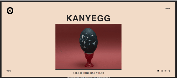
Kanyegg is a medium one-page website that has multiple features associated. It has an amusing animated logo on the top which represents the ideation behind the name. It also has an animated egg image in the middle of the home page, which gives a clear message of their purpose to the users. The entire website is based on photo blocks that provide information about a particular topic or design. It is inspired by Studio & more and has a similar structure like three menus on three sides of the home page. It has about us section on the top right corner, and a work portfolio menu on the bottom left corner with a social media menu on the bottom right corner.
12. ALICE LEE:
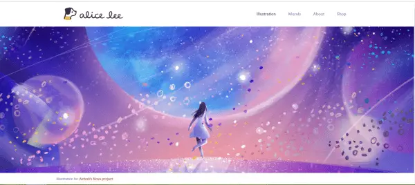
Alice lee is a graphic design inspiration in all ways. It starts with an animation on the entire home page with clean bread crumbs at the top. It has a small dog in its logo, which makes it look creative. It has all the work displayed on the website, allowing the users to access immediately. It has a well-defined footer with complete information on the website on one side. It has a subscription box at the end of the website to reach more users personally.
13. JUST CREATIVE:
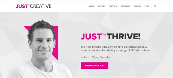
Just creative is a long one-page website. It is as innovative as its name. It is a portfolio plus a business website that has all the information about the owner’s work as well as the company’s work. It has a brief footer that displays the entire information of the website under one tree. It has a search menu along with the main drop-down titles to help the users find their relevant information. The blogs are displayed in the middle of the website with bog icons, serving as a form of call-to-action button along with guiding information.
14. DIELINE:
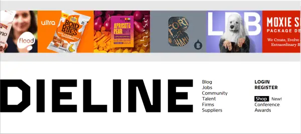
Dieline starts with a monochrome theme and ends with a highly radiant idea. The unique factor in the website is the typography. It has a new style of font which is consistent through the website, may it be blogs or any headings. The menu is displayed on the right-hand side in the middle of the home page, which makes the use clear for the visitor. It also has a login and register option in case the users would like to be a part of the member community.
15. AMY HOOD:
Amy hood has a straightforward and elementary design. It is a great one-page website. It has bread crumbs on the top, which enables the users to directly dive into the needed information without wasting much of their time. The testimonials section is a USP of this website. The testimonial section inspires the users to hire graphic services quickly, forming a trustworthy engagement.
16. ART OF THE MENU:
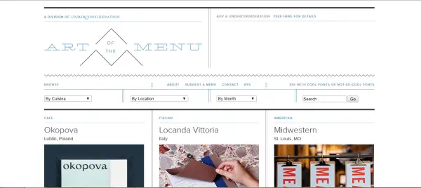
The art of the menu website is an art in itself. It is precisely designed in the form of menus, making the user wonder and stick to its front page for hours. It has excellent typography, which exactly compliments the overall website layout. It just has nine blocks of images which define its entire work and purpose. It has a total of 104 pages, and the user can jump to any pages with just a scroll. It has a clear disclaimer of about their services in the footer section.
17. ADHAM DANNAWAY:
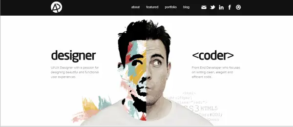
It starts with showcasing its most creative side. It is a portfolio website that portrays its mission and works through the owner’s image itself, leaving no ground for doubts. It is a small one-page website. This website shows uniquely the latest work done by the company. It is very crisp and clear. The same information is mentioned in the header as well as a footer for the users to follow.
18. YELLOW TRACE:
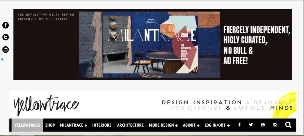
Yellow trace has a little tinge of yellow on the website. It has a clear tagline- ‘Design inspiration & resources for creative & curious minds.’ Defining its motto. The review work is displayed right on the top of the website, thus inspiring users in multiple ways. It has a consistent social media icons on the left-hand corner of the website, which serves as a clear call to action button for networking and interacting with the users through social platforms.
19. EYE MAGAZINE:
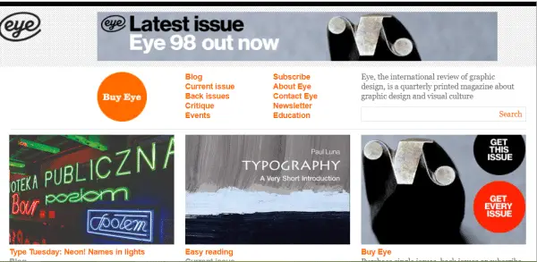
Eye magazine is a kind of website which mesmerizes the users. It is a graphic magazine website that allows different graphic designers to portray their works and skills in a single platform. It has a simple logo that defines its name and purpose clearly. It is a small one-page website with the information menu right on the top of the website. It also has a search button that helps the users find a particular magazine or work.
20. RENE AGUDELO:
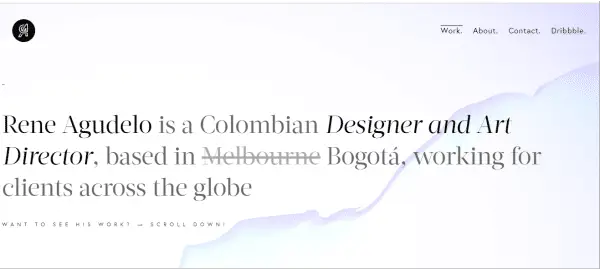
Rene Agudelo is a blue and grey colored theme studio website. It has a simple ‘A’ initial logo with attractive typography. It has a testimonial section right in the middle of the website, which attracts the users through the brands the owner has worked with. As we move further, it shows large blocks of images that display the work of the company very precisely. On top of the website, it also has a dribble account option that takes the users directly to the owner’s dribble account. Apart from these facilities, it is highly responsive.
Here we end with our handpicked 20 graphic design websites for inspiration. The most important aspect which brings these websites in the top 20 is the UX/UI features, flexibility, and unique display ideas. As a designer, your website is your main portfolio for the clients. Next, the time you design a website, make sure you have at least one creative factor from the above websites.
The post 20 Graphic Design Websites You Will Be Inspired From appeared first on Line25.
Source: https://ift.tt/2ZPosao

No comments:
Post a Comment