Date and time pickers are often considered to be a foolproof element for date and time selection – consistent, generic, and predictable. Most people use them as they are universally accepted guide for date and time input. However, there are situations where the date and time pickers are helpful, and then there are situations where they interfere with the site’s user experience. So you should carefully consider whether your site requires a date and time picker or not. You should include it only if it will give inputs to your users quickly and easily. You should also place it in front of your interface, as it will encourage the visitors to use it. However, it is quite challenging to find a date picker that fits your interface. But if a date and time selector is required, it is quite tedious to specify one date and most often it produces zero-result pages or irrelevant results. A few minor changes would make designing much more manageable. So, here are six essential tips for creating the right date and time picker for your website.
1. Add Numerical Values:
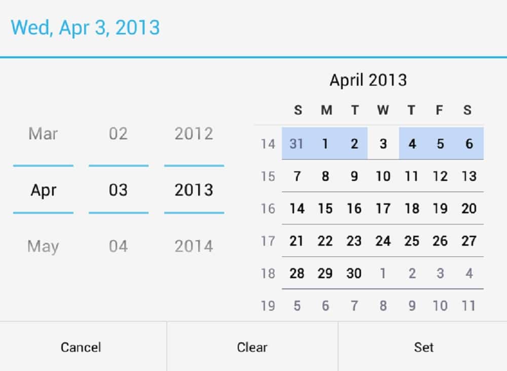
While designing a date and time picker, the first thing to consider is some sort of date and time input. You should use three separate numerical inputs for date and minimum of two numerical inputs for time input. These inputs should be separated by “-” or “/” and you could also use a dropdown for the day, month, and year and even for hour and minutes. However, tapping and scrolling aren’t the most seamless or fastest experience. You should make a date and time picking fast, probably within two taps (one to open the calendar or time setting and others to choose a day or time). To solve this problem, you can design a format that will automatically change the month and year while the user starts typing the numerical value for determining the day. Also, we have to make sure numerical input is reliable enough to manage all edge cases. You should also use some sort of placeholder or label to indicate the format of date and time picker. You should make sure that when the users activate the input field, the date format suggestion appears.
While designing a date picker, you should consider investing time for creating a proper numerical input. You could provide suggestions like “now,” “one year ago,” “yesterday,” “today,” “5 days to October,” etc. Depending on the application you are designing, you can decide to provide a flexible date or predefined options. Of course, you need to communicate the input to your users prominently. While numerical input is an invaluable input for determining the date, you should always have some default dates within six weeks. This will help those confused customers who are trying to book a quick weekend trip but do not have exact dates. In such cases, the calendar would be a great option to display all the available options. Furthermore, it’s good to consider the location of your customers while suggesting dates to avoid wrong bookings.
2. Set Default Values:
If you look into the date and time picker input, you will come across small but essential decisions around its interaction design. Some designers often come across the choice of placing default values in the input field or leaving it blank or showing an example of correct input. Further on deciding the default values and visibility of the input values is quite challenging. Though it is not tested or any preference spotted, but setting random values for the users isn’t the best option as it will force users to change the values from seemingly random to the ones they want to pick. However, if your users are likely to book last minute offers on your website (such as transportation or hotel), then a current day (“today”) or current time (“now”) would be a good option, especially in time-sensitive content.
Once the user has chosen dates or time slot but accidentally or deliberately refreshed the page, you can want to keep the selection or take it back to default values. If the visitor has unexpectedly refreshed the page, they won’t be happy to see their input being lost and having to type it again. However, if they deliberated refreshed the page, they would see predefined dates. In both cases, they will not be happy to find their input being lost. Hence it is better to save the input and provide a noticeable “New Search” or “Reset” link next to the date and time input. Instead of deleting your user’s input, they will have an option to delete previous input. This is also a mini-stepper that could be helpful, and hence dates might not change significantly. If you are sure that your users are likely to choose dates, then it is a good idea to set dates.
3. Create a calendar overlay:
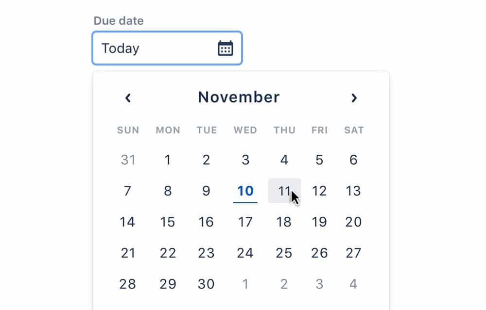
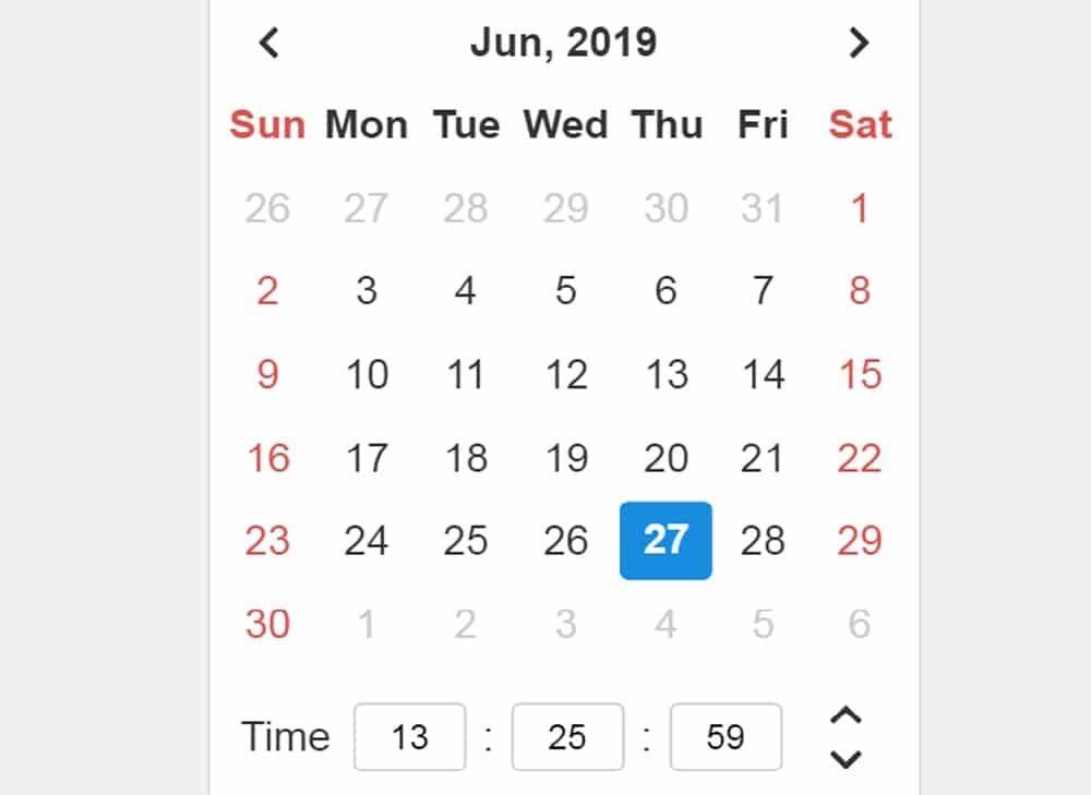
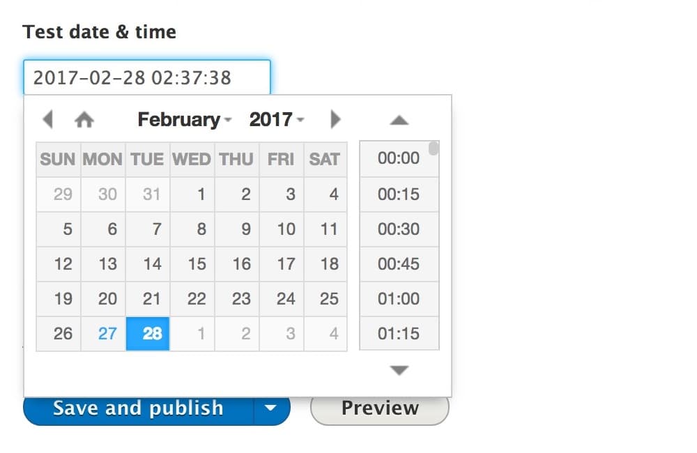
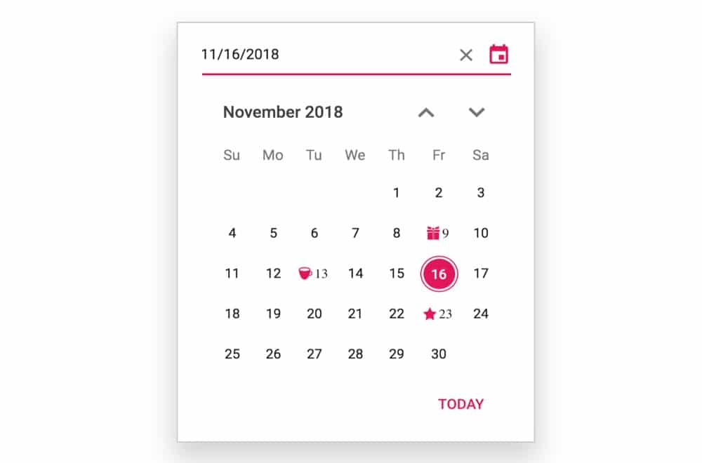
You don’t need to be creative for designing a clear calendar overlay. Usually, the calendar overlay appears below the date input field, as a small panel on a desktop or as a full-screen view on narrow screens. The days are organized in rows, grouped as week along with a dropdown menu to navigate months and years. A calendar overlay could contain various levels of navigation and detail such as when should the week row start or should it contain year input or not. All of this only depends on your audience and the application of your website. If you have a public transportation website, food service or a TV having a year input is pointless. Also, if you have a car rental website, there is no point in showing month input.
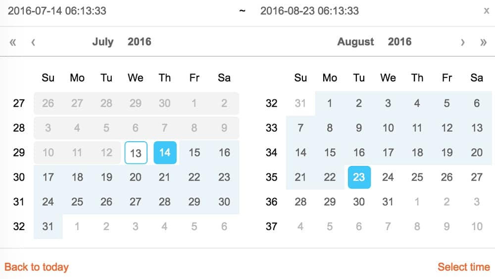
Another complexity happens while displaying a day of the week if people want to book an appointment. Sometimes you would also want to display pricing or availability (like booking a flight). Also, you might want to add date range and exact time slot. In such cases, you need to include time-slot selection with date selection or indicate a connection between start and end date. So, it is worth investing time in adding details to your calendar to make it helpful for your users to select date and time quickly. If availability matter it’s good to separate available and unavailable dates in a colour-coded way so that it is distinguishable easily. Additionally, if there are different prices for different dates, it is better to show them in the calendar. If your customers are more interested in weekends or public holiday, it is better to display those as well. Also, it is better to indicate and restrict the selection in the calendar itself so that customers get a hint right away.
4. Include Date jumps:
If your customers are likely to look for a quite short range of date option, you can add quick “next” and “previous” navigation next to the date input. For example, while booking a weekend trip, a customer would either want to leave on late Thursday or early Friday, whichever is cheaper. So, instead of making your customers retype or select a date in the calendar, a single tap would provide an expected result. Google Flights use this feature to make their date picker efficient. To be able to jump between months and years could be helpful. Along with this, a mini-stepper is an excellent enhancement for date and time picker. However, it is not a replacement for calendar overlay as too much tapping can become tedious. In usability sessions, tapping for the 10th time could test the patience of your customers. Eventually, your customers would switch to numerical input altogether.
So, you should first study the scope of date input range and purpose of the calendar. For example, if the booking date is in the future, it’s better to provide a numerical input in the date picker. On the other hand, if the date input range is short, you can consider adding a mini-stepper for quick jumps. Ideally, you should provide all three (a calendar overlay, a mini-stepper and a numerical input) so that customers have reliable options. If there are a few options for displaying time, then you probably don’t need a date picker. You should consider displaying predefined options such as buttons, links or a slider instead of using a calendar overlay. Also, your date picker will not appear unless in plain sight. So, date and time picker should be prompted by a tap or click on a date picker icon or an input field.
5. Provide Flexibility:
If your customers are confused and don’t have an exact date in mind, a date picker should be the method of last resort. More often, a couple of general and presets suggestions along with filters would work better than browsing years and months. In such a case, you could still offer your users a detailed calendar view, using color coding and displaying all options at once, for example, to showcase the best prices. Google Flight uses this approach while displaying selected flexible dates. However, the option is dropped to narrow screens. On the other hand, Dohop uses flexible dates along with flexible locations as their main feature. They prominently highlight both features once their users start typing date or destination. Instead of the price, they have a calendar view that highlights the availability of indirect and direct flights, as well as displaying the flight days with no connections.
To further make your date picker helpful for users, you can color-code the background while displaying the high and low prices using contrasting colors. In case of accessibility, it is useful to consider the color palette while choosing colors for the background. This design is quite helpful for users to use a date picker. Additionally, you should describe the meaning of color at the bottom so that there is no confusion. If you are designing a date picker for transportation, it will be helpful to provide an option between “one way” and “round trip” on the top of the calendar overlay. Also, giving flexible dates for specific months isn’t enough you could go a step further and include more general date ranges like spring, winter, summer and fall.
6. Include a slider:
Just like any other input, date and time data can be navigated using the knob of a slider. The slider can either be used for a single value input or specify a date range. It is often featured in the interface in which the customer can set some predefined range of dates. But a slider also brings in the problem of selecting a precise input. The denser or, the wider the range selectable through the slider, the harder it will be to use. In a usability test, a slider makes the customers move the knob very slowly and carefully. Hence it is not user-friendly while picking date and time ranges on narrow screens.
Sliders work the best when the range is not defined but flexible, or you don’t have many options to choose from. Unfortunately, a date picker does not function this way as customers have to adjust and refine quite frequently. So, numerical input would be much faster than sliding to select a number for date and time. Only in some cases, they appear to be helpful.
Hence the first step to designing a date and time picker will be to determine if you need one for the application of your website. Once that is decided, you can select the designs that help your users pick date and time faster. These tips could help you create a date and time picker that matches your interface and enhances your website’s usability. To further make your date and time picker useful, you could include more relevant details, such as pricing or availability. Also, the input field depends on what the customers prefer, so be sure to include the one that makes the selection quicker.
The post 6 Steps to Design the Right Date and Time Picker appeared first on Web Design Blog | Magazine for Designers.
via https://ift.tt/34FELKq

No comments:
Post a Comment