Restaurant Menu Design is essential for creating a great first impression on the customers. When it comes to a dining experience, many factors affect a potential customer’s decision of choosing a restaurant. It is a given that the food needs to be good. Also, the ambiance and service matter. If you have these two sorted, you know you’ll at least have customers who’d sit down. Now the next interaction they’re going to have is with the menu to order. This is a crucial stage that could make or break the deal.
A well-designed menu helps people feel a sense of comfort and trust in the standards of the restaurant. On the other hand, a shabby or unorganized menu might throw people off judging the quality of food by the quality of menu design.
A well-designed restaurant menu would not only ease people into eating at your restaurant, but many times, it can also justify the price of the items in your restaurant if the menu is well designed. It plays a psychological factor that makes the potential customer see the worth of the money they’re spending. Hence it is crucial to design an excellent restaurant menu.
Here are 10 essential steps you should follow to design your Restaurant Menu Design:
1. Learn about the different eye scanning patterns:
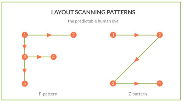
Most designers still believe that the natural trajectory of the eye goes from top right to bottom left of a page. Especially restaurant owners believe so. Hence they try placing their most valuable items on the top right spot hoping people see it first and order it. However, from recent studies, it is evident that people read a menu like they would read a book.
Hence their focus goes from top left to the rest of the page. It is said that an average customer spends only 109 seconds to scan through the entire menu. Hence a menu has minimal time to make a positive impact. For this designing a menu in a way which has clear and bold section headings, effortless dish finding titles and using more visual techniques or eye scanning techniques becomes essential.
A restaurant menu designer would know what portion of the menu is the hottest spot in terms of profit. A tip for vertical layout menus is that customers usually scan through such menus looking at the topmost and bottom-most menu items. Hence you should place your bestsellers on these spots if you’re designing a vertical menu.
2. Use Eye Magnets:
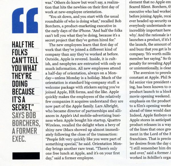
If you read newspapers, you might have noticed they have certain excerpts or sections of content as call-out quotes. The purposes of these are to provide either a gist of the article or highlight one interesting point. This would entice the reader to know more about the article. Similarly, restaurants also use a concept known as eye magnet that functions similarly.
Restaurants usually have a particular section of items that they think you’d want to order. They design it with some extra efforts as compared to the rest of the items on the menu. This helps it stand out and draw the customer’s attention to it first. Almost anything can work as an eye magnet for the menu. It can be a picture of the dish, an illustration, a graphic or even differently colored box. Anything that attracts the customer’s attention or catches their eye can be called an eye magnet.
3. Make use of colors:
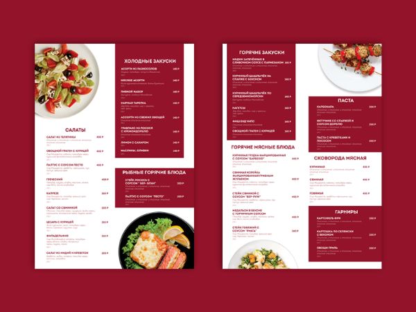
Colors have always had a noticeable impact on any design requirement. This is because color can often evoke an emotional response in people, subconsciously. Hence by using color theory, you can direct your customer’s mind to your convenience to a great extent. Though there are many colors options, for restaurant menus, red and blue generally are known to induce a feeling of appetite.
However, you don’t need to stick only to red and blue. Another approach can be to select colors based on your target audience and also to match with the theme of your restaurant. Since different colors have different psychological effects on potential customers, you can set a mood according to your cuisine with restaurant ambiance and menu design alike.
4. Use relevant images:
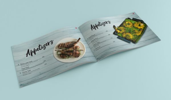
Images are the closest way to show your customers what they would be getting. It takes away the need to imagine or paint the picture for them. A good picture of your food items would entice the customers to try it. However, you cannot have images for every dish on your menu. It would get too extensive and lengthy. Hence use relevant images on the items you are confident about and want to sell more than others. This could be a great way of setting a first good impression. Now for the image to work, it needs to be great.
Don’t use stock images of the item you’re selling from the web. While a great picture of your actual product can draw more potential customers, a great picture from the web can push them away. This is because, you’d set a high expectation of your customers with the web image, and when they see the difference in appearance and presentation, they’d feel cheated. Hence, ensure to use your product’s photographs and get them clicked as close to perfection as you can. Put an overlay of the menu design color and graphics to blend it with the entire restaurant menu design.
5. Make use of effective typography:
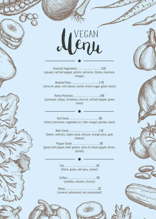
Typography plays an important role in Restaurant Menu Design. You need to use the best possible font for your menu. To decide on this crucial decision, you need to keep two parameters in mind; relevance and readability. You need to keep your typography in sync with your brand aesthetics. An ideal approach would be to maintain the same font you use for your logo into your menu to reemphasize your brand in the customer’s mind.
Generally, bold typography is well-conceived in restaurant menu design. Apart from telling the customers what the available items are, it also is an art element for your menu design. Other than this, you could also experiment with using optimized font pairs that would create a nice contrast and visual points on your menu. You could go big with a novelty typeface for menu headers and something more standard for the rest of the content of the menu.
6. Effective use of Special Elements:
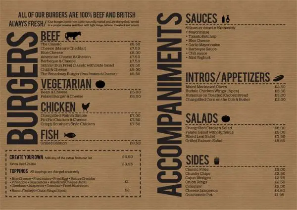
Generally, all menus have specific information about each product that is on it. The name of the product is given, and a short descriptor below about the preparation or ingredients behind it. You could take your restaurant menu design one step higher by providing additional information that adds value to your customer’s dining experience. There are different ways to approach this.
For instance, consider you are a restaurant that has to tie up with a gym, or your target audience is health-conscious people. You could include the calorie value of each item which would act as a helpful insight about the nutritional value of the meal for the potential customers. It is a small added element that doesn’t take much time on your behalf yet increases the value of your menu ten folds than the rest of the competitors.
Another way could be to demarcate your food into vegan, vegetarian and non-vegetarian food. There might be people who fall into either one of the spectra. They usually are reluctant to try an item from the other two. For them to have always to ask the waiter if a particular item is vegan, could get annoying. Hence help them out by creating a visual representation of vegan, vegetarian and non-vegetarian items on the menu. This would save time and effort, and they’d appreciate it. Similarly, you could also make icons for the level of spiciness for each item. Create an icon stack that has a natural feel and ensure it works in small sizes.
7. Cautiously Strategize Prices:
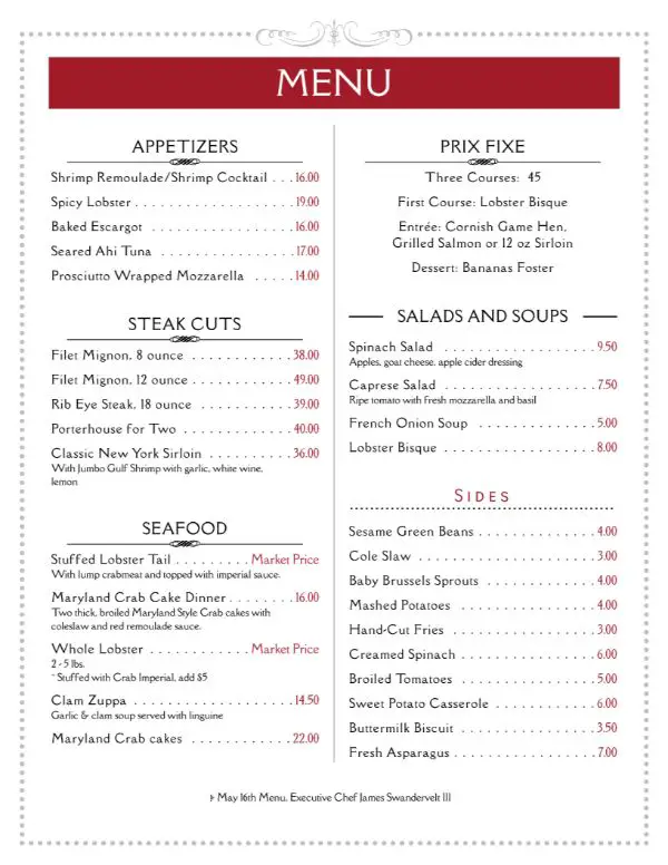
Many customers, when they first visit a restaurant, like to quickly scan the menu to get an overall price idea of the restaurant. If they feel it’s expensive, they might walk away or order the essential item on the menu. You might think it’s best to not mention the price on the menu to avoid this. However, that is not the way; you need to have prices included in the menu. The way you put them can be strategically planned for it to have less visual impact. Certain aspects you need to keep in mind for putting prices on the restaurant menu are:
Don’t use currency symbols on the menu. It is given that you’re mentioning price next to a product on the menu. Avoid aligning the prices vertically and horizontally. Make use of non-traditional pricing and use one decimal point instead of two. Suppose an item costs $12.40, mention it as $12.4. This creates a psychological effect as you’re not misleading them, yet creating a sense of lesser pricing by eliminating that extra decimal point. Also, use a slightly subtle tone of colors and typography for pricing. If your menu text is black for the items, use a grey shade for the prices. This would create less visual importance for the prices. Also, don’t align items of the menu from lowest to the most expensive item or vice-versa. Instead, mix the prices up.
8. Organize the menu with lines and boxes:
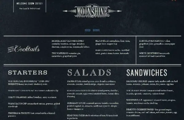
Your menu is going to have much information. To ensure that it doesn’t look overwhelming to the potential customers, you need to organize it. You can use lines and boxes to keep similar items together on a menu with many options or a variety of food.
It is essential to divide the menu in a logical manner that is easy to understand for the customers. Generally, the segmentation is done by the kind of food, like appetizers, desserts, entrees and drinks. Another approach could be to group the items by meat dishes and pure vegetable dishes also. Any kind of grouping is acceptable as long as it is connected by strong characteristics that are easily comprehendible. If your grouping is logical, and you use design elements of lines and boxes, it would be beneficial to your consumers.
9. Experiment with cross-selling items:
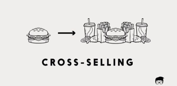
Cross-Selling is something you would have seen often in online retail websites. Whenever you click on a product to buy it, there is a frequent bough together line that mentions one or two more products that people generally buy with the product you’re looking at to provide a wholesome value. This is helpful for the person who’s buying the product as these products would add value to his original purchase. It is also beneficial for the seller as they are getting in the eye of the potential customer. This is called cross-selling.
Such habits can be used for restaurant menu design. You would have data about your items that are sold frequently together. For instance, customers might be buying a specific wine with individual dishes. Identify such pairs from the menu. Now group the complimentary items. Check if these items make economic sense to group together. Now highlight these complimentary dishes for cross-selling.
Suppose you have a main dish and a descriptor about the main dish below it. You could add a suitable wine below that items description by saying frequently complemented with, or any such appealing copy. This eases the decision-making process of your customers and helps you sell more items from your menu.
10. Plant decoy dishes:
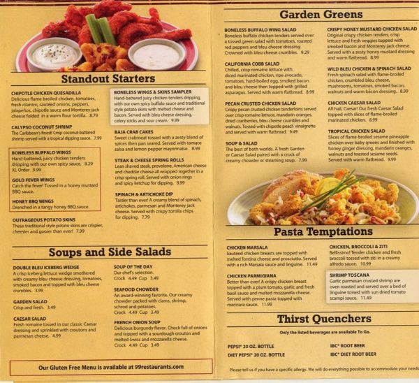
This is a rather exciting approach to restaurant menu design. You would want to plant a decoy dish as the first attraction on the menu. This means using dishes to lure people away from the intended course. Hence place an expensive dish on top the menu. This would create an impression that the other products on the menu have better value. This would lead to the customers feel they found a bargain, and hence they’d spend more on those dishes. Customers feel great about grabbing a bargain and end up spending more to maximize the benefits of that bargain. Hence it would be a win-win as they’d feel accomplished and you’d get the products you want to sell, sell better.
These were the 10 essential steps you can follow for Restaurant Menu Design that you should keep in mind while designing your next menu for a restaurant, cafe or any other food establishment. Keep these elements in mind and keep practising to attract your customers in a better way.
The post 10 Steps to a Perfect Restaurant Menu Design appeared first on Line25.
Source: https://ift.tt/2PYe8uR

No comments:
Post a Comment