As the global market expands, individual businesses do as well, and large numbers of startup businesses continue to appear over the horizon. That means more business opportunities for web designers like you. But, those opportunities bring with them a very real challenge – a generation of clients that are savvier and more demanding with respect to what they expect in the way of an online presence.
You’re naturally determined to get your piece of the pie and you’re quite capable of achieving that. Still, you may find yourself having to work a little harder at keeping abreast of the tools and techniques you’ll need to meet your objectives. Those are the tools, techniques, and tips, that enable you to design websites that are a cut above the competition’s. You are guaranteed to put big smiles on your clients’ faces.
With respect to tools, Be Theme is an excellent example. Be Theme, the largest and most versatile WordPress theme of them all, will do most of the heavy lifting for you and fire up your creative juices as well.
As for tips, we offer 5, together with cool examples. They are designed to help you create attractive, engaging, and visitor converting websites. It’s the kind that put those smiles on your clients’ faces.
5 Simple Tips to Building Astonishingly Creative Websites
Tip # 1: Overuse “white” space? Not a bad idea.
It’s actually rather difficult to use too much white space. A number of the examples accompanying these tips shows why. With respect to how much white space you can use, think “more is better” and you’ll usually do just fine.
Makespace’s clean design helps visitors focus on the main message and other important elements.
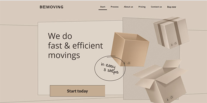
In the BeMoving 3 pre-built website home page even the boxes consist mainly of various shades of white space, contributing to an overall pleasing effect. The Drive New York also uses a generous amount of white space to great effect.
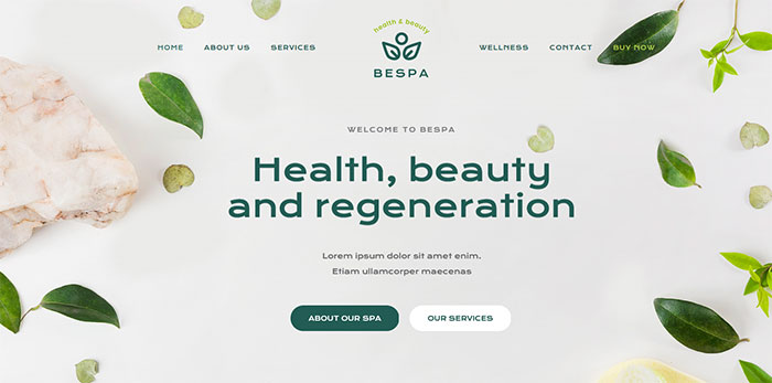
Often, it’s possible to make white space an effective part of the brand to help drive your message home. BeSpa 4 is a “healthy” example of the benefits of using plenty of white space.
Tip # 2: Show visitors how your creativity benefits them
Simply put, it’s important to remember that no matter how impressive your creative talents are, when it comes to website design those talents need to be focused on showing visitors what you can do for them. You might produce a truly memorable creative website, but the visitor is always going to as “what’s in it for me?” Let your creative talents supply the answer.
The BeLab 2 homepage video shrewdly illustrates how visitors can benefit from using one or more of your products.
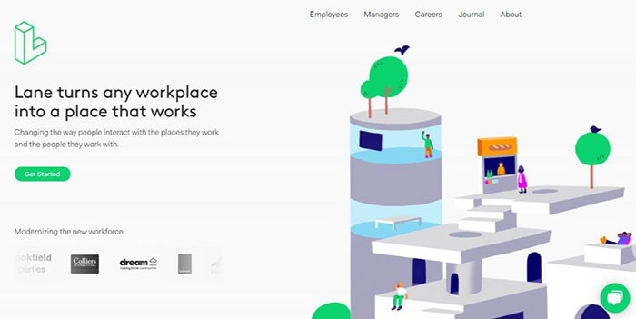
Lane’s approach to expressing structural design perspectives is almost guaranteed to get a visitor excited about renovation possibilities.
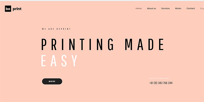
In this BePrint 2 example, it’s the typography and the way the text is presented rather than the text itself that’s most effective. It’s also an example of how minimalism and white space use tend to go hand in hand.
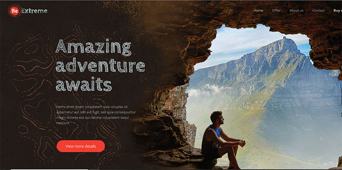
BeExtreme 2 not only provides an excellent foundation for a travel site. It can serve as a source of inspiration as well – to designers and visitors alike.
Tip # 3: Display crystal-clear photos and images
Crystal clear photos and images are key message carriers (1) the images themselves can contribute to or simply convey the overall message (2) they may be remembered, and (3), they reflect the professional care and craftsmanship that has gone into the design of the website (and even a clue as to how the client conducts business).
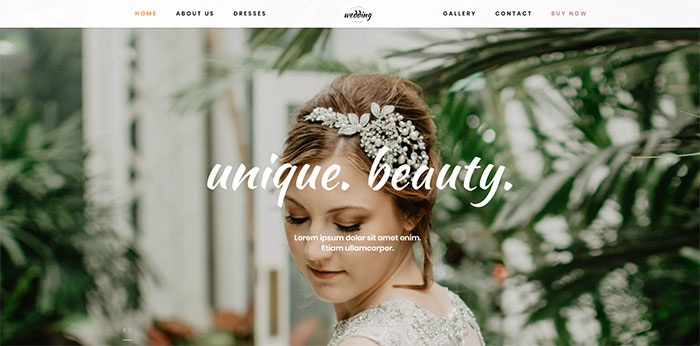
BeWedding Dresses illustrates how to present images with flair. Here, the crisp, sharp image against the slightly out-of-focus background clearly supports the sites’ message.
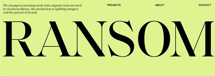
RansomLTD takes a minimalist, crisp, yet extremely powerful approach
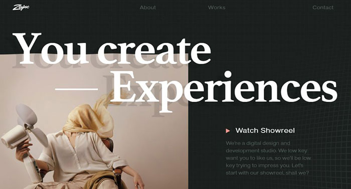
The Zajno creative website showcases the designers’ creativity, yet the focus remains on the visitor.
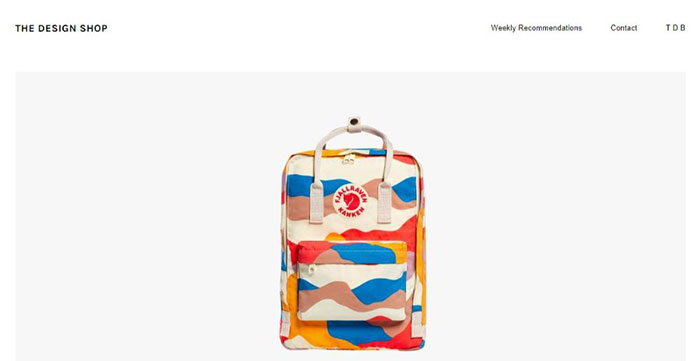
The Design Shop cleverly uses creativity to entice visitors using crisp, persuasive product images.
Step 4: Select a spellbinding color palette
While all 5 of these tips are more or less equally important, the choice of a color palette can make or break a website. Determining what color combinations will work best can be a challenge, but if you follow these two rules you should be OK.
- Choose colors or color schemes that will attract immediate attention
- The palette should visually support your site’s or app’s message and also should be on-brand.
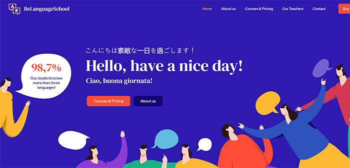
BeLanguage 3 employs bright and BOLD attention-getting color touches. Notice how the deep blue “white space” is the main attention-getter and how it draws the visitor to the headline.
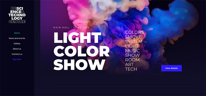
BeScienceCentre This Be Theme pre-built website is a great example of a color palette that grabs you and holds on.
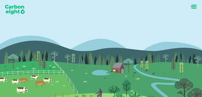
In the Carbon8 example, the color palette aligns with the site brand by an astute choice of shades of green. With the deep green element serving to directs a visitor’s attention to the center of the page.
BeSupplier subtly uses colors to support the crisp, clear images used to gain the attention of the clientele you hope to do business with.
Virtually anyone will find BeTransport 2’s color palette appealing.
Tip # 5: Make your CTAs easy to find and difficult if not impossible to ignore
Following the 4 previous tips is important, and not necessarily difficult. Do so, and you should end up with an attractive, engaging website. If, however, it isn’t performing as well as anticipated, it could be you’ve forgotten one important detail – a CTA button that’s easy to see and encourages a visitor to click on.
If your CTA button isn’t integrated into your website’s flow, or a visitor has to hunt for it, your creative efforts may come to naught.
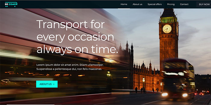
BeCoach’s CTA button is positioned above the fold and easy to spot. It functions like a gate that invites visitors to click on it to see what lies beyond (and tells them what to expect).
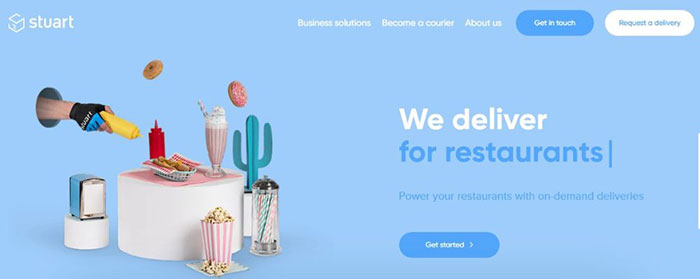
Stuart illustrates how you can effectively position 3 CTA buttons.
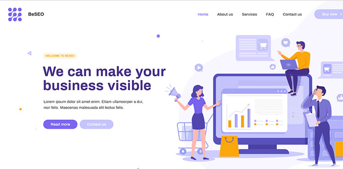
CTA buttons don’t always have to harshly stand out from the other elements on a page. They can match other elements and still attract attention. BeSEO 3 is an example of this approach.
Building Creative Websites – Summarizing the 5 Helpful Tips
You already have the imagination and creativity. The 5 tips presented provide a framework to work with that doesn’t leave a crucial factor out. Imagination, creativity, and tips can take you only so far, however. You also need the right tool or tools to work with.
You want a tool that does much of the heavy lifting, layout, tweaking, design element selection, etc., without placing limitations or constraints on what you’re trying to accomplish.
You’ll definitely find the cool gallery of nearly 500 creative websites on Be Theme a cool set of tools to work with. They’re not only customizable, but their designs support the 5 tips we’ve discussed here to the extent that you’re not likely to skip any of them.
They are also a godsend should your efforts result in an avalanche of new assignments.
The post Creative Websites and Tips to Design Similar Yet Unique Ones for Your Clients appeared first on Design your way.
Source: https://ift.tt/2P8WeFo






No comments:
Post a Comment