One of the major misconceptions that beginners have about fonts and typefaces is believing that the two are actually the same things. Those of you who are experts in this field have often seen this mistake happen and possibly corrected the beginner and told them that they are not the same things.
When we are comparing font vs typeface, we need to know that for some people the difference might be very minimal and unimportant, while to others it is very important and matters a lot. In this article, we will take a look at font vs typeface and what is the difference between the two.
What is the difference between font vs typeface and does it really matter?
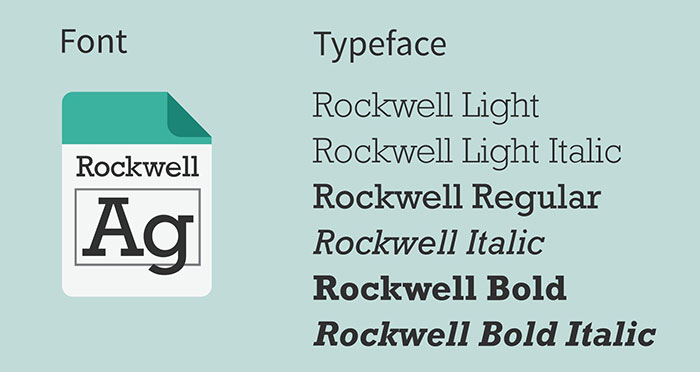
The difference between the two terms has become a little fogged in recent years as they have been interchanged quite a lot in different fields and to some people, it seems like there is no difference at all. It might seem like the difference of font vs typeface only really matters to font artists and editors.
To find out the real difference between a font and a typeface, we have to dig deep into the history of the two terms and how they developed; from analog media developing into digital media and so much more and the history of print writing and more.
Why is the difference important?

Often, it depends on the person you are talking to. If you are talking to a client of yours who you are doing the job for, then it might even seem that they do not know what a font is. If you are talking to a designer of a professional in this field, knowing the difference between font vs typeface is actually very important and can challenge your reputation and knowledge in this field.

If you are a professional, then you should really know the two terms and the difference between them. In the professional field, terms often find different meanings than they would have otherwise, and they often become very specific to the field.
For this reason, you need to learn the right etymology when it comes to your field of profession. It often depends on the specific context of where the term is used. To outsiders, some of these words seem meaningless, but professionals are actually important.
History
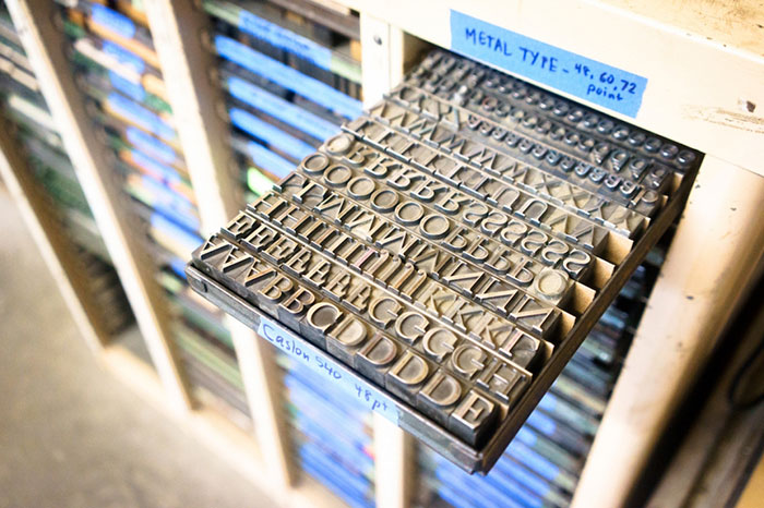
Let’s tap into the history of fonts a little deeper and try to find meaning there. Printing was invented centuries ago, and it was different from what it is today. To explain more about this, the letters had to be physically laid out every time you wanted to print them.
The characters were represented by metal blocks that had a relief of the character on its face (typeface), and then they were arranged in such a way that would represent the right letters and the correct sequences; then ink was applied, and letters were stamped onto paper.
Each character or the block was unique. These blocks were put together in groups, and each group had a different setting and parameters. These parameters were called fonts. Each font had different parameters and differed from other fonts.
Font vs Typeface
The usage of these two terms has changed over the course of decades and centuries since the print was invented. Nowadays, it might seem like there is no real difference between the two terms; while it is true in some settings, but in some specific contexts the difference between the two is really essential and you should keep that in mind.
The difference between font vs typeface is there, but it is rather complex and often misunderstood nowadays. Often they are used interchangeably, but that is incorrect. Often when people say fonts they are thinking of typefaces in reality.
This confusion has been made when digital fonts were introduced, and when these typefaces were named to fonts for naming conventions. This is where the confusion comes from, as people think that fonts are digital, while typefaces are physical. Typefaces are really the collective names for sets of related fonts, while fonts correlate to weights, styles, and widths.
The difference
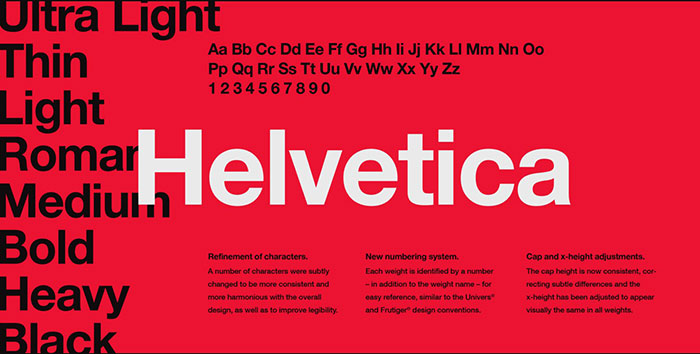
The main difference between a font vs typeface is the fact that font exists as a part of a typeface. Let’s take a look at an example; Helvetica is a typeface that consists of a common design code and a specific set of sans serif characters; this whole typeface collection is, however, made from a whole collection of different fonts with specific weight, style, and size and with other different specifics.
Fonts have many different features that are unique to a font. Here are some of these features.
Weights
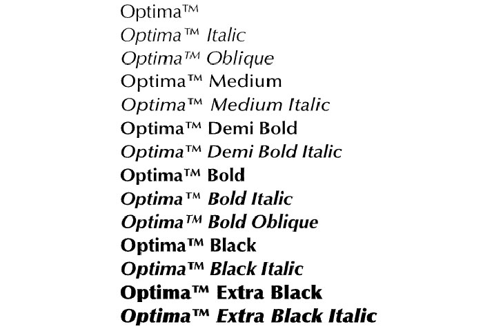
Weights for fonts can be thin, hairline, ultra-light, extra light, light, book, regular/roman, medium, semibold, bold, extra bold, ultra-bold, black and ultra black.
Widths
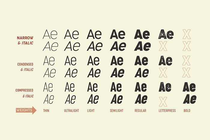
Compressed, condensed, semi-condensed, narrow, normal, extended, extra extended, expanded.
Styles
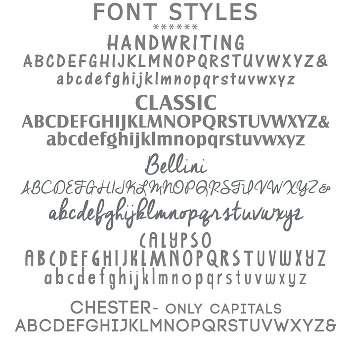
Roman, italic, cursive, oblique (slanted roman), small caps (OpenType feature), petite caps (quite rare), upright italic, swash.
Optical Sizes
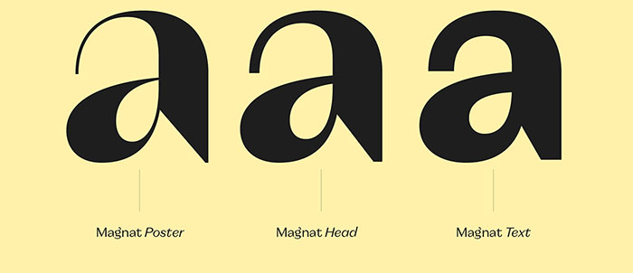
Caption, Text, Subhead, Display, Deck, Poster.
Grades
Grade 1, 2, 3, 4.
Effects
Inline, outline, shadow, fill, bevel.
The typeface
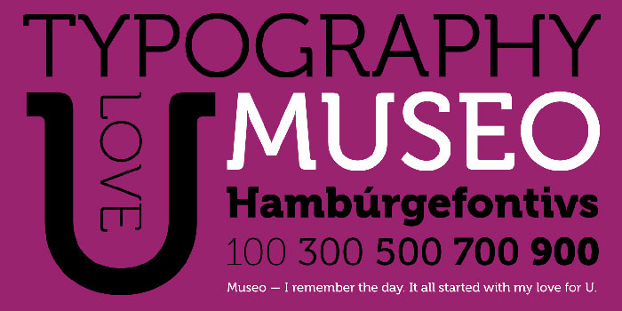
Often referred to as a font family (which you will also find in CSS styling) are often used in CSS terminology and other uses. However, this is not the same as type families, which you will also find in other settings. They are related to typefaces, and they cover serif, sans, slab serif and blackletter design. Let’s take a look at some types of family examples.
Brix sans, Brix slab, Brix slab condensed, Museo, Museo Sans, Museo Slab, Museo Cyrillic, Museo sans Cyrillic, Museo sans rounded, Museo sans condensed, Museo sans display, Scala sans, Scala, Skolar, Skolar sans.
Another thing to know is also that the typefaces that are used in scripts that are different than Latin (such as Greek, Cyrillic, Hebrew, etc.) are referred to as typefaces rather than fonts.
Some typefaces also contain some specific rules that you have to honor when you purchase them. This licensing that some fonts use can be embedded in the software they are used in, while others will have some specific rules that programs such as Adobe Acrobat do not agree to and will thus not embed the typeface.
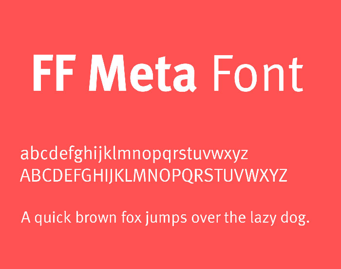
If we look at it from a typographer’s point of view, then a typeface is a collection of font designs, such as Georgia, Helvetica, FF Meta, and more. These are typefaces.
A font, on the other hand, is a version of the original typeface with specific settings (weights, style, variations and so on). There are usually many fonts within a type family.
Is the difference between a font vs typeface even significant?
In some cases, it is. For example, it is important if you are a typographer to distinguish between the two. But for anyone else, it is not really that significant.
The difference between the two terms has been erased with the rise of technology and the need to produce a nomenclature system that would simplify the whole process. The difference between the terms is really only important for experts in this field; but for all other people, it is actually just fine to use the two words interchangeably.
If you enjoyed reading this article about font vs typeface, you should read these as well:
- The Fortnite font or what font does Fortnite use? (Answered)
- The best fonts for print you can pick from this collection
- Ever thought about using a pixel font? Check out these cool ones
The post Font vs typeface, what’s the difference between the two appeared first on Design your way.
Source: https://ift.tt/35iiWAH

No comments:
Post a Comment