Posters are an excellent tool for advertising and marketing your product. From clothing brands to jewelry products and even local businesses have started using posters for marketing their products. Previously, poster design used to be perceived as limited to just movies. For movies, though there are many platforms available today for marketing and promoting their movie, movie posters stand out to be the best option.
This is because movie posters have the power of delivering essential messages in the most creative and fun manner possible. There’s much creative freedom for designers to experiment with so that the movie is promoted in the best way. Though there is no one particular method to poster design, there are specific guidelines or tricks that almost all movie posters tend to follow.
Some of the important guidelines for designing a movie poster are as follows:
1. Preparing for the process:

For getting started designing a movie poster, you need first to identify and be clear about what you’re creating. Here you need to communicate well with the movie’s team as to what the movie is all about. You probably should get a brief idea about the story, the crux, and the unique elements.
Talking to different teams like direction, action, v.f.x. would help you gain a holistic perspective on the movie and give you more tools to play around with. The foremost thing you should identify is the target audience for the movie. There are many instances of movies where the story might feel like it is targeted to children; however, it would be more specific towards adults and children would even not be allowed to watch that movie. For this, you need to understand the plot clearly and design the movie poster as per the target audience for effective communication.
2. Decide on the budget:

Movie posters can be expensive to design. You also need to ensure that the poster is spread across multiple locations for more visibility and awareness. Depending on the budget given to you for movie posters, you should consider a few elements and economic decisions.
Depending on the number of prints, you should be able to decide what material and what ink should be used for printing the poster. An excellent way to set a budget is to consider the overall budget and divide it by the required number of prints. This gives an estimate of the cost for each print. This helps save much time and back and forth with the client. It also ensures you don’t waste your resources.
3. Identifiable from a distance:
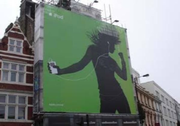
This is something designers often have a problem with. They usually don’t visualize the fact that their poster is going to go up a much larger canvas than their computer screens. Hence the size and proportions they see on their screen don’t help them visualize it on a larger canvas.
Now you can have fine text on the poster, for most content like legal information and casting if you wish to include those would come in the fine text. However, the main headline should always be written in a way that it is easily visible and legible from a considerable distance as well. Using the visual flow, you can set the hierarchy of the content available.
Movie posters are generally used for print and are on hoardings. As a result, the average time people get to see and absorb information from it hardly seconds. It becomes essential to engage them for that short span of time by giving away the central message of the poster most attractively and appealingly. You could either do this by placing large text or using graphics or any other element that is distinct to the product and yet relevant enough to create a direct relationship. For instance, the image above shows a poster by Apple where there is a large silhouette of a character holding an iPod.
4. Context-based designing:
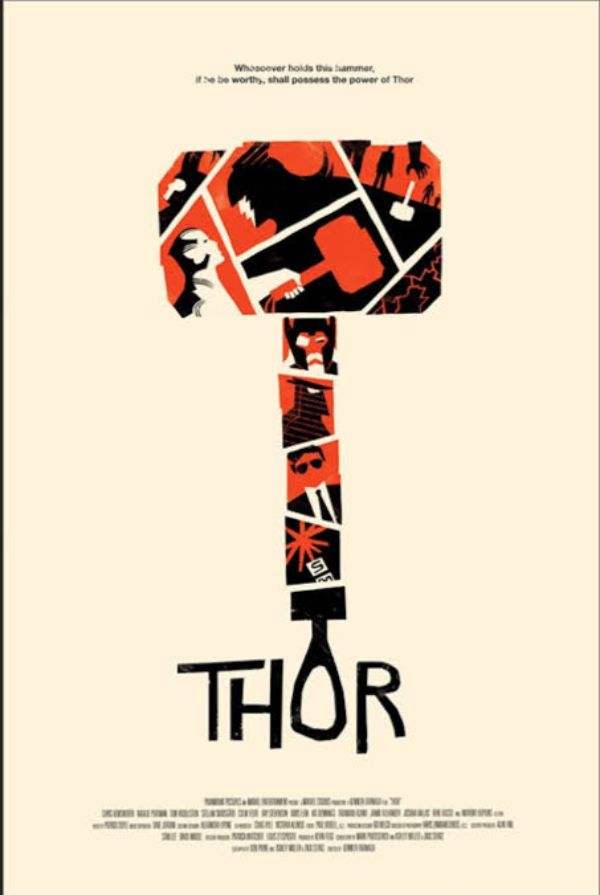
This is very crucial when designing a movie poster. You need to keep in mind where the movie poster is going to be displayed. There are various factors that role in for designing as per the context of place. If the movie poster is going to be against a white wall, designers know they need to use contrasting colours for the movie poster to stand out. The idea is to keep the poster distinct from the background.
5. Figure out your Target Audience:

Designing is a subjective practice. Each designer has their perceptions of excellent designs and bad designs. However, a designer must keep personal bias away when designing a movie poster, and keep it as close to the target audience’s characteristics and likings as possible.
An excellent example of this is how when you think of a Disney movie, you are reminded of Lions, from Lion King. The designers of that movie poster use two lions to recreate the nostalgia attached with this movie, instead of substantial text. This would cater to the nostalgia in anyone familiar with the movie and would encourage them to see it.
6. Smartly playing with typography and colors:
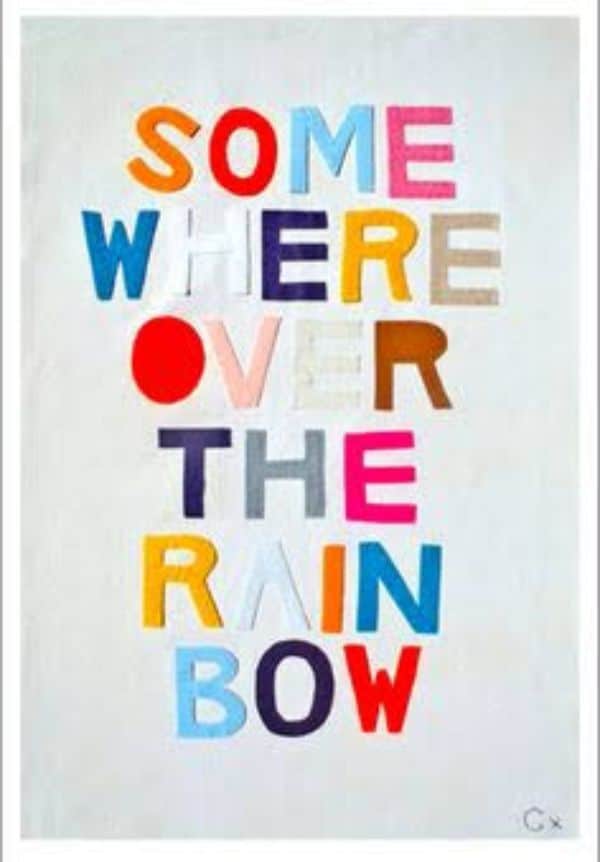
As a designer, you get the creative freedom to experiment with different design elements. However, it should be done strategically. Colors have an extreme visual power to speak volumes about design in a first glance. Hence color selection should be well thought of. Each color signifies or reflects certain emotion, like yellow, represents warmth, comfort, whereas green shows trust, credibility and more.
When we talk about typography, it also plays an essential role in forming a positive or negative opinion about the movie poster. Typography acts as a method of putting across the true story and relevance of the font used to the audience. A bad typography selection would not only look aesthetically bad, but it could also mislead people away from the movie’s actual story. Any typography material needs to direct the audience’s attention to the important parts of the poster and move their eyes in a visual and contextual hierarchy.
7. Brand Memory Retention:
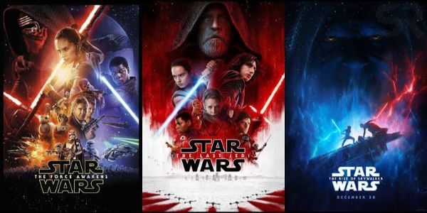
Any movie is a brand in itself, especially movies with sequels. There is always one important scene, prop, character or any other element in the movie that holds the potential to single-handedly summarize the entire movie. You can be creative with your design practices for movie posters; however, if you don’t include a memory retention element, people would quickly forget about your movie.
An excellent example of this is Star Wars. Notice how each of their posters has repeated use of lightsabers that are essential weapons that are used throughout the franchise. The design element is different for each poster; however since they have the same design element along with the branding typeface of star wars, it looks like in synergy and calls for immediate retention.
8. Use space wisely:

Generally, when designers design any poster, they scale and space them as per how it looks to them on their screen. Since movie posters are huge, they are often viewed from a distance. For this, it’s best to keep the space between different elements like icons, text and also illustrations or images a little exaggerated.
This might look wrong when you’re designing the poster on your screen, for which you should always step back to get a better idea of the overall design from a further perspective. If you optimize the elements for space, your movie poster would be easier to read, and also more visually appealing.
9. Short and Simple Design Style:
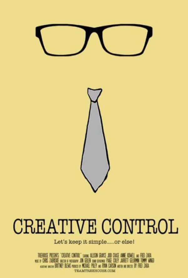
For any design requirement, short and straightforward design is generally appreciated. Any movie poster that is all over the place would throw people off. It would be too disruptive and difficult to follow to understand the message, mainly since people generally glance at a movie poster in a moving vehicle most of the times.
This would lead to inefficient delivery of the message and would fail the purpose of the activity. Generally, designers tend to use a lot of elaborate elements, which could lead to the audience getting overwhelmed by design, and lose focus on the key message. Generally, minimal, clean and limited design element using movie posters stands out and gets the message delivered better.
10. Importance of supportive text:

Many movie posters can be designed with a minimal approach and using iconic images or illustrations to depict what the movie is all about. However, not every movie has a unique plot. Some movies need something extra to put a sense of mystery or add support to the movie’s plotline for it to make more sense to the potential audience.
An excellent example of this can be the movie “Get Out”. The name itself does give a rough idea as to how what the movie is about; however, it isn’t substantial enough to draw people’s attention into finding out what’s going on. Hence the poster uses excellent collage of essential characters, and a supportive text above the name of the movie that reads ‘Just because you’re invited doesn’t mean you’re welcome. This adds more context to the possibility of the storyline.
11. Using the best Design Tool that is best for you:

Requirement of the movie poster design and your level of expertise should be the factors you should consider. Hand-pick the right software for your designing needs. Some online tools could help you create movie posters in no time; however, they often have limited flexibility. They are also repetitive as many designers could be using the same templates. As a result it would not give your poster any personality. If the movie you’re making the poster for is all right with all these setbacks, you could go ahead and use such tools as it would save you time, and them considerable money as well.
However, if you have a big project in hand, you should stick to professional software. Such software generally requires intense technical skills. However, it is worth investing in learning them. They provide unlimited creative freedom and options. As we all know, Photoshop works great for images and graphics or vectors; you can rely on Illustrations.
12. Creative freedom under set conventions:

Though there is no right and wrong to design, there is adequate and ineffective. While you should always push for new elements and new techniques of making a movie poster, there are certain set conventions as to how a movie poster should look like.
Deviating from this convention could result in misinterpretation of your movie poster design. It could either be considered as a novel or some other poster design. Hence it is essential to either stick to the set conventions or at least knows them. As a result, even if you deviate, it would be intentional, and you’d be aware of the possible repercussions.
13. Be genre-committed:
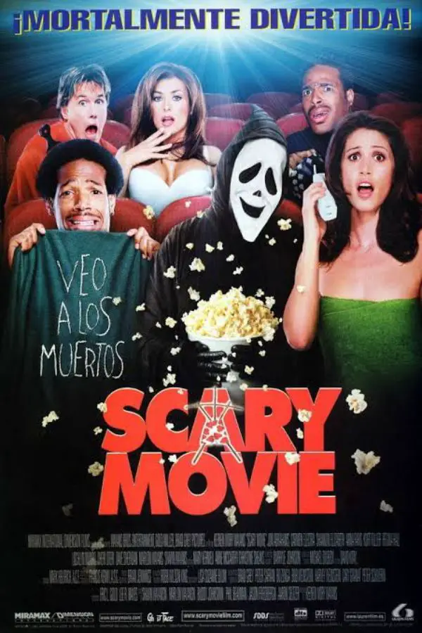
One of the most critical factors of the movie your movie poster needs to convey to the audience is; it’s genre. You need to establish the movie into the specific genre it belongs to. Not doing this could lead to two consequences. It could either lead to confusion amongst the audience as to what the genre is. Moreover, it could mislead them into believing it to be one, where it’s the other.
This can be detrimental to the movie’s health as a business. Many people might not see the movie as they’d perceive a comedy movie to be a horror film because of the poster. Or worse, they might see a movie poster that looks funny and watch the movie. Only later to realize it’s a horror film. This would lead to disappointment and distrust by the audience, and the movie would be poorly reviewed. Horror and comedy cater to two different moods which should be enough explanation of why this would be bad for the film.
These were the 13 important points to keep in mind for designing a movie poster. Next time you have a client who wants to design a movie poster, keep these points in mind as they can act as an ultimate guide to movie poster design.
The post An Ultimate Guide to Movie Poster Design appeared first on Line25.
Source: https://ift.tt/2YJtlCO

No comments:
Post a Comment