The art of attracting the eyes of readers to our content is complex and requires that we understand some design concepts. A monumental appearance can make our job easier. For this, there are letters like Trajan that easily stand out from the rest. If we are willing to use its monumentality, then we need fonts similar to Trajan to complement our site.
On the web pages, the visual section is essential if we want to succeed: this can make the difference between a user feeling intimidated or overwhelmed when visiting the site, or if on the contrary, it is pleasing to the eye. The mixture of images, colors, and letters has more impact than it seems.
The use of monumentality to impose respect is not new. Humanity has been demonstrating its ability to create magnificent works since prehistory. Trajan is a font that rescues the imposing of Roman typefaces and adapts them to the new millennium.
Designer Carol Twombly did this work for Adobe in 1989, and was inspired by the letters of Trajan’s column. These are said to have been painted on the stone, and subsequently carved.
As Trajan is a letter that emulates Roman design, it does not have lowercase letters, which can make it difficult to find fonts like Trajan to accompany it. That is why in the following list we present some alternatives that will meet the criteria of keeping the monumentality intact.
Fonts similar to Trajan
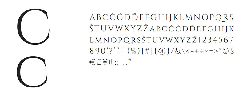
Cinzel – A contemporary alternative
Although the inspiration for Cinzel is very similar to that of Trajan (Roman calligraphy of the first century), it opts for a slightly more contemporary style, presenting softer and refined strokes, as well as compatibility with Latin characters.
However, there are letters where Cinzel’s similarity with Trajan are undeniable, as in “E” and “G”, so it works as an alternative.
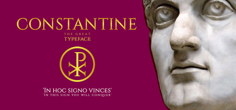
Constantine – In honor of the Great
Another typography inspired by the Romans, but this time its name is in honor of Constantine the Great, Emperor of Rome between the years 306 to 337. The letter takes almost all the features of Cinzel but adds compatibility with the Serbian and Cyrillic alphabet.
Its design is much more linear than that of Trajan, maintaining the same height between letters throughout the sentence.
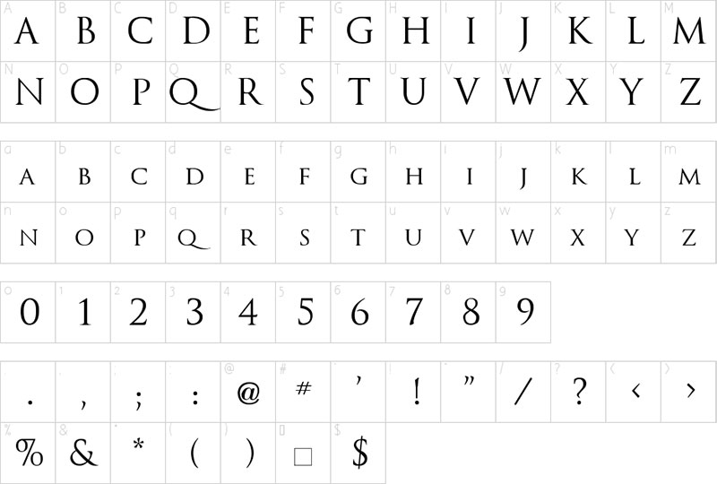
Trajanus – An option with lowercase letters
Unlike Trajan, Trajanus is a typeface that is inspired by the Roman emperor of the same name. This font similar to Trajan includes lowercase letters, something that is not typical of Roman calligraphy from the beginning of time. Actually, they were adapted from the Carolingian style (which are small uppercase letters).
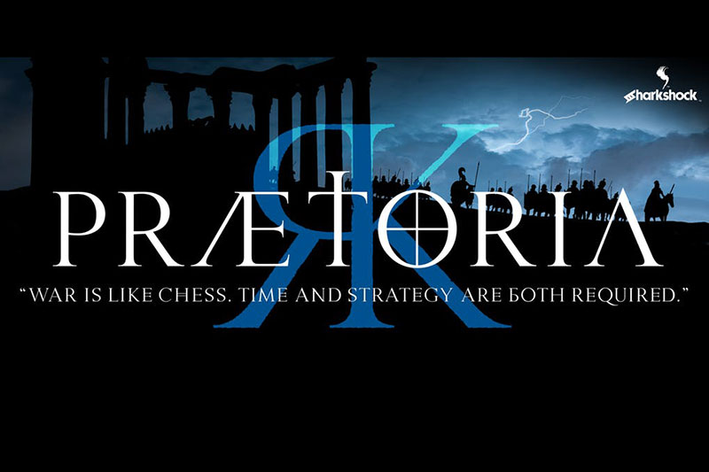
Praetoria – For the fantasy worlds
Praetoria is one of the fonts similar to Trajan that stands out most when it comes to fancy writings. Although the origin of most of its letters is that of the Roman capitals, the creators have taken some creative freedoms by adding lowercase letters and some Russian and Greek characters (such as “b” and “m”).
The font eliminates some lines of key letters such as A, but this does not make them more difficult to read.
CapitalisMinimalis Font – A lost font
This typeface almost forgotten by the world still resists the passage of time, being the most conservative when it comes to monumental Sans-Serif letters. Some ends have been lengthened to give a more subtle touch to the font.
Antiqua – 175 characters for any use
Not all monumental fonts inspired by ancient Rome have to have large letters; otherwise, we could not write paragraphs with them. Antiqua is a font similar to Trajan pro with lowercase that allows us to maintain a uniform style, but in a size according to what we need.
The inspiration for Antiqua is, ironically, more modern than other fonts. This takes its patterns from the letters of the fifteenth century since it has more fluid strokes than the previous options on the list.
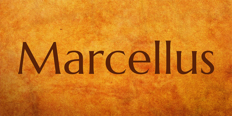
Marcellus Font – Simplifying details
Available in two variants (one regular and one with the suffix SC), Marcellus is a simple typeface, which keeps aesthetic details at a reduced level, being elegant and clear while saving resources, which makes them ideal for printing.
The regular version includes lowercase characters, which makes it better when it comes to paragraphs, while Marcellus SC only includes uppercase characters with a second smaller set of letters, so it is better to use it for titles.
This version includes the Latin-1, Latin-2, Windows Baltic and Turkish scripts, but can be freely extended.
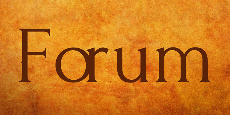
Forum Font – The multilingual alternative
Another of the fonts similar to Trajan that includes lowercase characters is Forum, which preserves Roman forms in a pure and more modern state. As it does not have stylistic details, the creator has been able to include a large number of Baltic, Cyrillic (including Asian), and Latin glyphs.
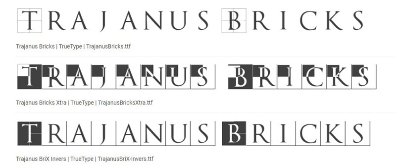
Trajanus Bricks Font – For huge designs
Trajanus Bricks brings us the same design of Trajanus but with a wider separation between characters, which makes the texts stand out easily. As it does not have lowercase characters, it is recommended to use it for headlines.
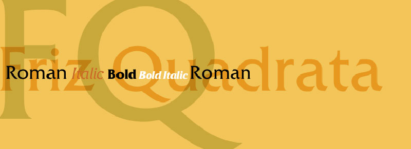
FrizQuadrata – Far from the Roman Empire
FrizQuadrata has nothing to do with the Roman Empire, but it is still a great choice thanks to its elegance. This typeface is somewhat thicker than other letters, which makes it a perfect candidate for presentations.
Jupiter – Quirky Letters
We cannot forget Jupiter in this list of fonts similar to Trajan. This typography shares many of the characteristics of the Roman letter of the first centuries, but it adds peculiar edges that make it much more dynamic.
Jupiter is not a direct reinterpretation of Roman calligraphy, but rather a mixture of the different versions that have existed of this alphabet, especially that of Friedrich Poppl.
Classic Roman – For the most conservative
Specially designed for headlines, if your website or the product you need to promote requires a classic typeface, this is the font you were looking for. Classic Roman shares many features with Trajan, but retaining its ancient origin even more.
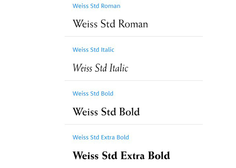
Weiss – Inverted Orientation
Thanks to the thicker strokes at the top, some letters like “S” or “B” seemed to be reversed, but it is Weiss’s peculiar style. This typeface can be found in four thicknesses.
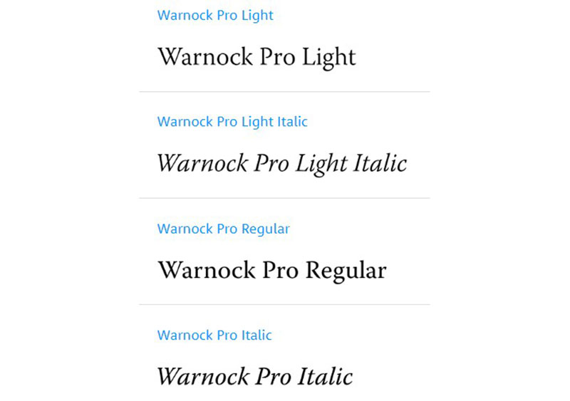
Warnock – OpenType option from Adobe
Designed by Robert Slimbach for Adobe Originals, Warnock is a typography with OpenType features and many Latin, Cyrillic and Greek glyphs. Its design is elegant, but what stands out most is its adaptability to any use.
Baskerville – The result of a life dedicated to calligraphy
This letter of such elegant strokes is a work of John Baskerville and George Jones, who were responsible for updating one of the best letters for books. Although its release was almost a century ago, its details are still an inspiration for those who wish to write unique texts.
If you enjoyed reading this article about fonts similar to Trajan, you should read these as well:
- Awesome spring wallpaper examples that will cheer you up
- The best fonts for print you can pick from this collection
- Check out these Hippie font examples
The post Fonts similar to Trajan that you can use in your designs appeared first on Design your way.
Source: https://ift.tt/2xY6dY0





No comments:
Post a Comment