Any business probably wants to see award-winning websites that feature their services or products. Creating a website is not that difficult anymore today; it’s a skill that can be learned.
A stunning website that has a nice design together with good pieces of content can make your company shine. It helps in sharing the story of the companies mission and also brings new visitors that can check what you do. A website is going to capture the attention of users that can be used for different purposes.
Compared to other domains, websites get awards, not just for their design part. Other milestones, reaching certain goals or delivering exceptional user experience, are equally important. Usability is indeed an important element in running a successful website. This is why site owners need to adapt often to new trends and more effective design principles.
Award-winning websites usually are visually-stunning, easy to navigate, and there are no bugs. The information that you see on them brings a lot of value and interest. In this article, you are going to find out some tips on how you could get your website to that level.
Looks are not all for award-winning websites
For sure, any of us wants their website to be a beautiful one. However, in order to be successful, the site needs a lot more help. Until design even starts, we need to understand how the site works and how users are navigating through it.
The features of it also need to be in line with the mission of the company. By checking all of these things, you will get a solid base to start with.
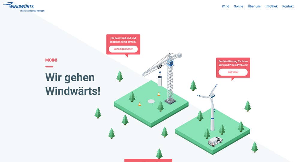
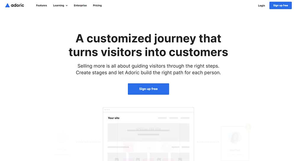
Look at these German websites, for example. Being, well… German, they’re more efficient than filled with fizzy graphics. And their experience is awesome.
Responsive Design
Award-winning websites need to have a responsive design. More and more people are checking websites not only from their computers. As the market is full of smartphones, tablets, and other devices, you need your website to work on any of them.
Creating a website that can work on multiple devices can be a big investment from the start. Still, in the long term, it is going to pay off for sure. First, it is going to optimize the way your visitors are interacting, and it is going to improve your search engine ranking.
The best advantage of it comes down to the numbers. It’s quite simple; your website is going to be available on more devices, so this means a bigger potential number of visitors.
Having a responsive design also helps with the users’ interactions with your website. Filling a responsive form? Amazing compared to a non-responsive one seen on a mobile device.
Looking at a map to see where a restaurant or company is located? Easy now. Websites now have responsive Google Maps embeds that make it easier for you to check out the map directly in the website.
Structure
A solid structure is going to help you bring a consistent, user-friendly experience from your website.
So the navigation needs to be smart and easy to use. From a user perspective, all you want to do on a website is to go quickly without any kind of problems to what you are looking for. Use this principle; award-winning websites do that.
Use white space
Your audience wants to see a user-friendly website, so be careful about how you use white space. You can start with a minimalist approach and showcase great graphics that people are going to enjoy. Having a busy and messy homepage can cause users to feel overwhelmed and confused.
So creating a website that has a lot of white space is going to encourage the audience to stay and explore it.
Speed is important
When the design part is done together with the functionality, you need to think of speed. Award-winning websites are very fast.
The best way to improve the speed of your website is by getting an expert on this task. What you can do by yourself is to reduce the redirects that are active, to simplify the codes and avoid any kind of bad requests.
If you’re using WordPress, things are easy. You can use several plugins like W3 Total Cache or something similar. An alternative to using plugins is by doing improvements yourself: use browser cache, Gzip, download some fonts and use them locally instead of embedding them, disable anything that WordPress offers and you are not using.
You’ll see the difference.
Think about your audience
A good experience for your audience is done when you consider them in the design process. Ask yourself who is going to check your website and why. This is going to help you better understand the design elements, colors, and visuals.
Content
In order for a website to be engaging, the content that it contains needs to be relevant for your audience. It has to be clear, and it can be of great help in building trust. There are a few categories of content that you can create, and that is useful, informative, and funny.
Make it interactive
People like to interact with websites. That can mean a simple chat with other members that are using it or just with its functions. Put this social aspect into your plan. It can help you create a community around your brand.
Avoid elaborate transitions
Transitions are very important as they can be exciting and bring a lot of energy. Still, you have to keep them short and relevant for the mission of your website. If you exaggerate, you might start seeing people live your website.
Engage
Your website even if you don’t know it is already competing with the whole internet. You need to keep your users engaged, starting the moment they come to your site. The rule of 3 seconds is important here. You need to make sure the first piece of content they see is clear, organized, and can start conversion.
If you have an online shop, you can use certain positive customer reviews that you had in the past. Another strategy could be to showcase certain deals or coupon codes for a particular promotion that you are running. By doing so, readers are going to be more open to purchasing your services or products.
Experience
Think about the experience that your site is offering. Award-winning websites always have a clear experience that makes their users be amazed. This means that all elements starting from the design part to functionality need to work together.
Here’s a quick example that you might have seen on boutique consulting firms’ websites or on any type of consultant’s website. They don’t use contact forms anymore. And don’t think that they just throw their email address in there.
They take it to the next level and implement a booking system so that you can book a certain time frame from their schedule.
Ideas
Play around with ideas, and don’t be afraid to do something new. For sure, you don’t know how it is going to be received, but taking chances can pay off.
Conclusion
In conclusion, award-winning websites are not that easy to create. It requires a lot of work and effort. Still, it’s not an impossible mission, and anybody that follows the tips we just mention and goes even beyond has a big chance of making their website visible. It’s just a matter of how important is this to obtain.
The post What You Need to Do to Create Award-Winning Websites appeared first on Web Design Blog | Magazine for Designers.
via https://ift.tt/39l6QYI




No comments:
Post a Comment