One of the things a good designer needs to know how to do is to create a website mockup. A website mockup is a visual and graphical representation of a website’s functions and its performance. A mockup of a website can consist of some or all of the properties that a website is going to have in the future. But, here’s the catch. There is a big difference between a website prototype and a website mockup. The website prototype clarifies the way how a website is going to function, whereas a website mockup talks about its design aspects. A website mockup is helpful to understand the future appearance of the website and its interactive elements.
A mockup is required to understand the issues that can crop up in the website design. There are times when the conceptualized website design is different from reality. And when these two things clash, you can understand the issues that show up in the mockup. Hence, a mockup can help you realize those issues before you actually launch the website. In this blog, we are going to look at the tips to create perfect website mockups.
1. Gathering information from the client:

You should always require all the requirements and information from the client. As far as the information is detailed, it is going to help you design and form the mockup accordingly. All the information regarding the elements of the website, color themes, navigation system, logo and images should be inquired. You should ask the client about how interactive the website should be or what kind of color themes would he prefer to have. Also, you should keep in mind the logo and the images that deserve the right place in the website mockup design. There are so many ways how you take up all the requirements from the client and combine it into a website mockup. Hence, a client requirement for a website mockup is of utmost significance.
2. Define the target audience:
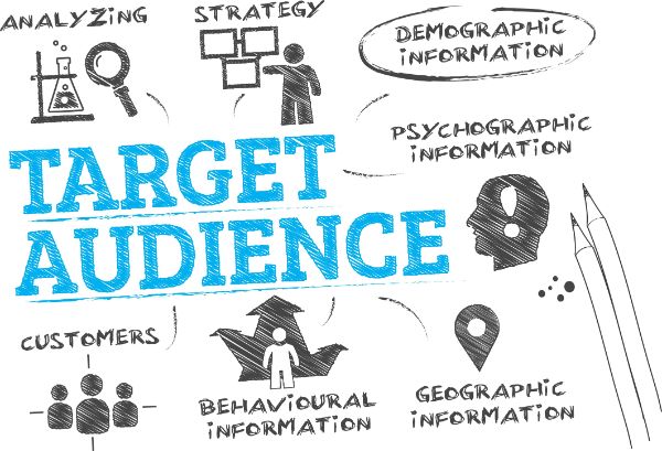
Once you have gathered all the required information about the website mockup design from the client, you have to define the target audience. The target audience is the set of people that are going to interact with your website mockup design. You have to decide how the users are going to interact, and what tools do they use for interaction. It is also helpful to know whether the user is tech-savvy or a person who barely uses the internet. If your user browses a website on a wide screen monitor, you have to have the design accordingly. And if your user uses laptop, mobile and tablets, you should design the mockup in a way that it is viewable across all the mentioned devices. Creating high-resolution visuals may be helpful because the user may browse the design on a wide screen. Hence, understanding your target audience can help you understand the design aspect and characteristics of the website.
3. Find a creative design:
In order to start creating the design, first of all you should study and research website mockups from other companies. You can also browse their website to get an idea of how the website design should be and what aspects of it should be covered to make it better. Being creative is also important when you start designing the website mockup design. When you look at other designs, you tend to create a similar design with different color themes. Instead, you should browse the websites for inspiration. And then, once you are clear, you should create a website mockup design that is unique and covers all the required aspects. There are so many ways to find a mockup design that is unique. For instance, you can explore various templates that let you decide upon the color themes. They also let you see how the elements placement is established.
As you achieve clarity on this, you can start the design of your mockup. You have to determine the layout of the mockup by accommodating all the information that you have gathered. In the beginning, you can use basic shapes and text to define the layout. Decide upon the logo design and its placement. The logo design can help you decide upon the color theme of the mockup. You should always have a theme that is relevant with the logo colors and its design.
4. Decide the fonts:

The fonts that you use should have the right size and the color according to the theme’s colors. This also includes the contrast of the font color with the background color of the mockup. For instance, you cannot use bright yellow background and use red or orange colored fonts. The size of the fonts should not be too small neither too large. Whatever font style you adopt should have the same color and be uniform everywhere. You cannot have Times New Roman for the main content on the first page and then take up Arial fonts for other pages. It is not feasible to have the text of the first link in the navigation to have Times New Roman and the rest of the links in other fonts. You should practice uniformity with colors as well as the font style and its formatting. The fonts in the website mockup should be reader friendly on all the devices. For instance, the fonts you use should be readable on the laptop, tablet, and mobile screens.
5. Select the right images:

An old adage says, “A picture is worth a thousand words.” It is important to decide which images are going to go on the home page and which image you put on other pages. Is it necessary to use an image that signifies a bird flying off the flower? Do you want to add an image that signifies the use of digital marketing? You can also use minute long videos to add to the website mockup design to talk about the brand. Does the website require flash plug in? These requirements should be discussed when you go to client for gathering information about the website mockup design. Selecting the right images is very crucial for the mockup design. The images talk about your company, your brand and your website. Hence, you should use the images that support the motive behind the website mockup design creation.
6. Refining the design:
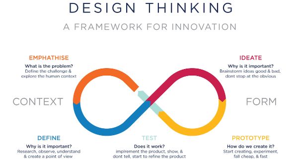
Once you have finalized the design and the theme of the website design mockup, you have to use trial and error methods to refine the designing details of the mockup. You can experiment with effects and animations on the interactive elements of the website mockup. Decide on how an image renders or how a website loading element appears after it is applied animation. You can also have pages open through animation and other graphic design functions. Wear your creative hat and put your imagination to a good use to come up with the best features of the website mockup design. The best advice here is to not work according to client’s imagination. Instead, take your imagination and put it to work. Put a background image if required and reduce its opacity. This can also be an image of the company’s logo to have a consistent impact on the viewer. Try experimenting with the placement of the images and animation with the navigation. How do you want the navigation to appear? You can make a drop down navigation on the mouse hover or make the user click to view the navigation menu.
7. Define the right tools to create your mockup:
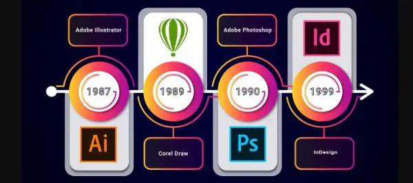
All the requirements are useless if you don’t have the right tools to create the website mockup design. Hence, you need to gain an access to the right tools to design the website mockup. You can use following tools to design a website mockup:
- Adobe Photoshop: One of the best design tools that you can use is Adobe Photoshop. Adobe Photoshop is a graphic editor software meant to be used in Windows and Mac OS. With Photoshop, you can create powerful graphics or edit and retouch the existing images to enhance them. With its updates and versions, it is deemed as one of the most powerful image and graphics editing applications. There are various versions of it like Photoshop CC, Photoshop elements, and Photoshop Lightroom.
- Moqups: Moqups is a visual software that helps you create and work with whiteboards, diagrammatic representations and design elements in one application. This is the best application if you want to design a website mockup. It can help you have an access to wireframes, diagrams, mind maps and prototypes.
- Adobe Illustrator: This is a vector graphic based application that you can use to draw and develop interactive elements of the website mockup design. Adobe Illustrator lets you create sketches, and artworks to create high-definition images and graphics. Among other tools, Illustrator can create website mockup design that is high definition and also allows you to visualize the website’s actual definition.
- InVision: InVision is a software that lets you handle the website mockup design while collaborating with the design team members. You can handle the communication between the design team members and have a design that all members agree upon.
8. Optimizing visual content:
If your website is going to have blogs on it, you should have proper room for the images and other graphics content for placement. Here, enters the optimization of visual content. With the mockups, you can determine the length of the blogs and work accordingly with the visual elements of the web pages. You need to have a specific area to define the placement of the images. The viewer of the website should be able to skim the information by a glance at the images.
It is very natural for the user to look at the content on the left first. Therefore, place the important content on the left side of the screen. So, place important links, images and content on the left side of the website for the user to notice them first.
9. Remove unused elements:

A good looking interface is always the first step to success of any interactive design. So, you need to pay attention to the design to remove all the unnecessary elements. A cluttered interface is always a big turn off and hence, you should opt for a clean look. Unnecessary elements impact the search functions, legibility and readability negatively. You should always present a strong design where the elements represent well-defined functions. Remember, that elements should not dilute out the design and the functionality of the website mockup. Hence, the ones you remove should be weaker in functions than the ones that you choose to keep.
10. Testing the mockup:

Once you have spent a good amount of time while designing the mockup, you have to test the mockup. There are various factors to look for when you start testing your website mockup designs. For instance, you should check the performance of the mockup on various devices with various connections and system configurations. If the mockup is going to be browsed on various devices, you should test it on different devices. The mockup should perform well on the readability test too. It should render all the graphics nicely and should work right across all the device configurations. You should also let other colleagues experiment with the mockup to understand their reviews.
Conclusion:
A website mockup is used to define the website goals and to visualize the website design that is going to appear in the future. It defines one of the most important things in the field of website design and its development. The above mentioned tips can help you develop a website mockup that can aid in development of an accurately functioning website. With advent of myriad of design tools, it is easier to develop the mockups. The users being tech savvy, you can rely on their experience to understand the required changes in the performance or the user interface. You should try working with different tools and techniques to come up with the best mockup design that can help you in development of the website with the correct direction and guidance.
The post 10 Tips to Create Perfect Website Mockups appeared first on Line25.
Source: https://ift.tt/32AK2nT

No comments:
Post a Comment