An efficient website has various design elements that play a vital role such as design, consistency, usability, and user experience. One most important part of any website is its footer, though it’s not really the most creative section or most interesting content, it certainly is a section where visitors frequently look for info about the site. Some time ago, we published an article on things you should not be doing in your website footer. Today, we are going to outline the design elements that you do need to have in the footer section of your website.
Consider any kind of website such as an e-commerce site, college website, event site, or a corporate one; the website footer plays a big role in web design. Most often website footers are neglected while designing the front-page but it is certain that the footer is one of the significant parts of your website.
The footer plays an important role in delivering amazing user experience and obtains the maximum impact. Designing a creative website footer comprises of choosing the content to be included in the website to satisfy user requirements and also fulfill business needs. Hence, while designing, the website footer should be given as much importance as the head.
An efficient website footer design helps users navigate their way through the site easily and track their requirements on the website. There are some main elements for having a neat footer design you need to know before starting to work on a website and they are as follow:
Contact information
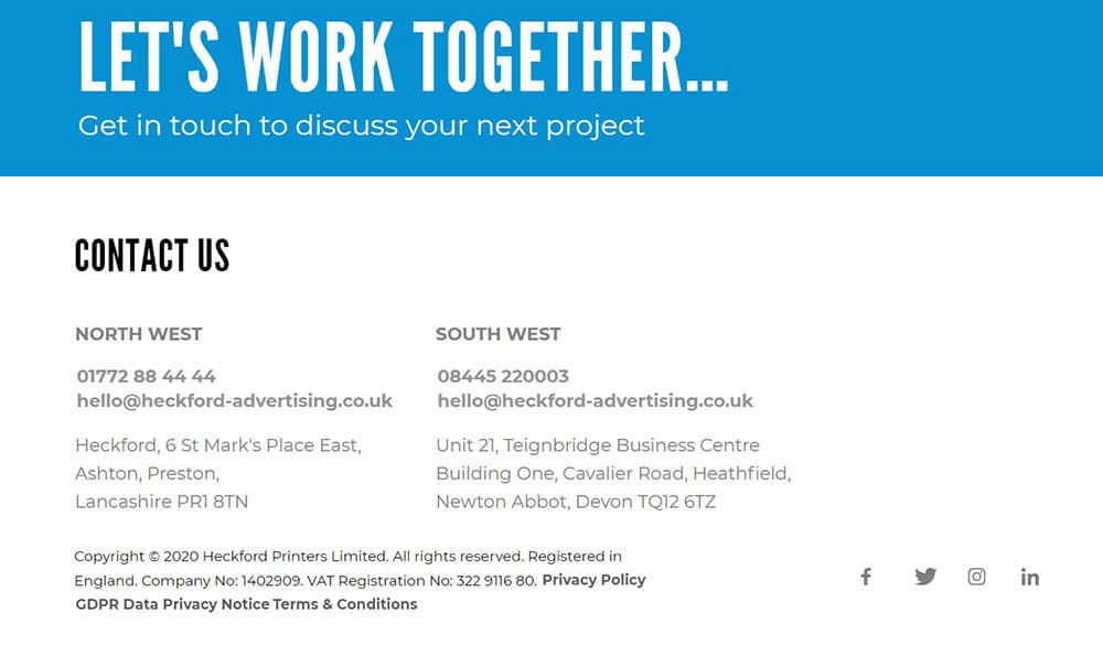
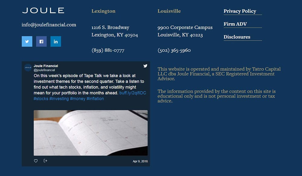
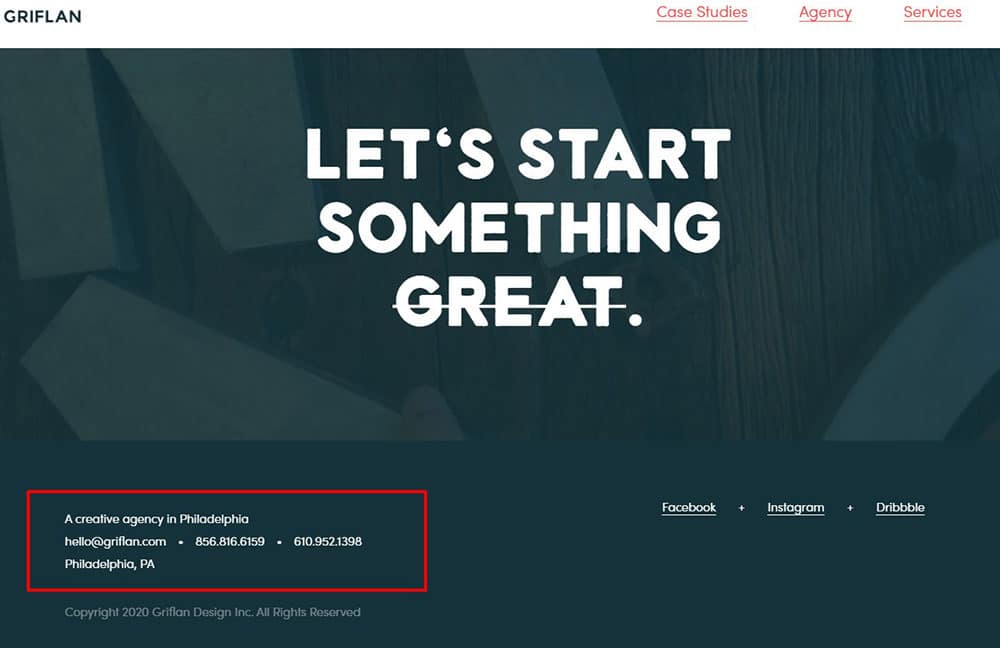
A normal visitor expects to find any kind of contact information to be present somewhere in the header, considering it is one of the most common web design standards. Likewise, people expect to have contact info on the website footer.
Mentioning the contact information allows the visitors to reach out when they have any questions, suggestions or a proposal. Also, you should not forget including relevant contact info in the website footer. This means a phone number or an email address. There are situations where including physical information would also do the needful.
Legal Details
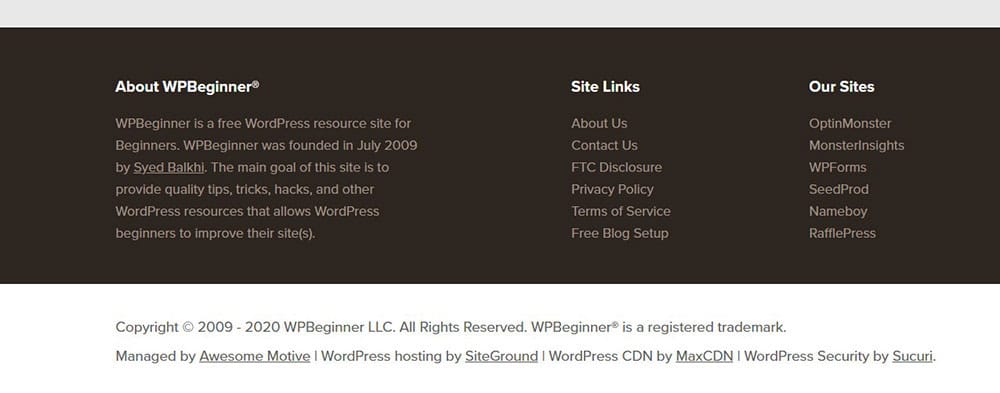
It is mandatory for a website footer to contain certain legal stuff such as Copyright, the Terms & Conditions, a Privacy Policy, and a lot more similar information depending on what business it is.
These links are essential for protecting the business but also to develop user interest and confidence regarding the website.
Copyright
One of the most essential information a website footer has to contain is the copyright information. If you’re bothered by how annoying it is to change the copyright text each year, you don’t need to be doing this manually. You can do this automatically with some code. Including copyright information is an easy way to safeguard your website from plagiarism issues.
Privacy Policy
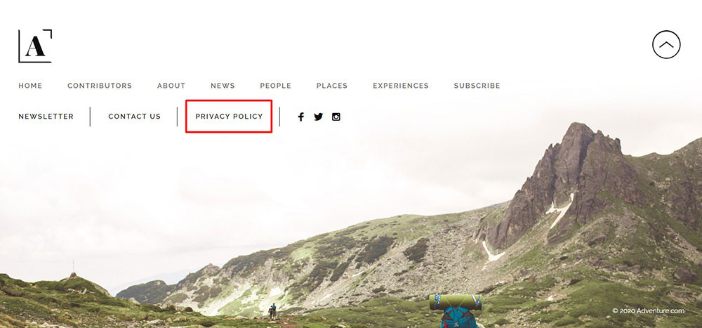
Another important information that should be included in the website footer is the privacy policy of your site. You need to attach a link by the title “Privacy Policy” which can connect the user to an article or page detailing about the kind of info your website is collecting regarding the visitors and how such information is saved and accessed.
Terms and conditions
Basically, the terms and conditions refer to the basic rules for using your website. In addition, you can rename terms of services as “Terms and conditions” or “Terms of Use”. Though including terms of services to the website is not mandatory, they should be included in the website footer.
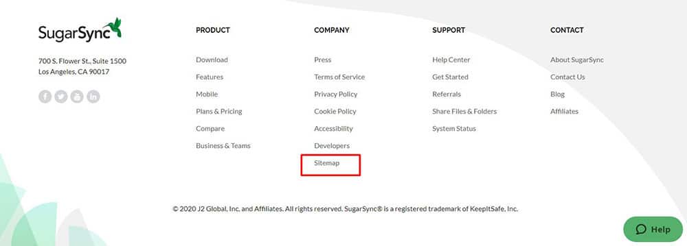
Sitemap
The sitemap can be defined as a collection of lists of links (pages) from your website. One of the main purposes of creating a site map is to provide assistance for search engines to crawl faster the URLs your site has.
The Newsletter
Maintaining relations with the customers through email so that, they are well informed of any exclusive offers of new information about your website is an old trick in the book which never fails to increase your sales. Most standard websites use this technique for marketing their business and the best section to add a subscribe button is the footer.
Call To Action Buttons
Other than including basic subscription forms or social icons, when you are trying to feature special offers, discounts or to spread out an invitation for the users to test a feature or a service that will guide them to the next step of the funnel, it would be advisable to include a CTA that isn’t taking much space and looks forced.
Social media accounts
The most appealing place for you to mention your social media accounts in the website’s footer. Basically, you have to prioritize your website more than the social media icons while making a presentation to a user. So that the user would take his time to first go through your website content and services thoroughly before jumping into the additional information you have linked to your site. Hence, mentioning your social media accounts anywhere else than the footer is not appropriate unless there’s a blog we’re talking about here
The Search box
Depending on the volume of content on your website, you need to include a search form in the footer as when a situation arises that a particular user is not able to find the information they are searching for on the page they can do a particular search for what they are looking for at the bottom of the page.
Also including the search box at the bottom of the page would strategize that though the user has reached the bottom of the layout, the website has got more to offer. This way they can browse your website more for obtaining the desired information.
Widgets
If you are looking for a way to insert different kinds of content in your website footer then widgets would be of great service. These small applications have a chance of increasing customer satisfaction with the site and also providing such services would leave a good impression on the standard of the website.
Phone numbers
Including the phone number with a local code would give a positive impact and gain a sense of trust as the customer can have information about the site developer. Also, the phone number must be able to transform to a clickable link when viewed on a smartphone so it can be dialed directly and not copy pasted. This would make the job less difficult for the customers who are in haste while browsing through the website.
Description
Adding additional information or links to your website for defining the purpose of the website or giving more examples regarding the services the website provides would be a good way to make the customer get a clear picture of your website.
Blog Posts
One of the best ways to attract users to read through the footer section of the website is by adding a posts slider or the most popular articles in a grid/list format. Also, updating your blog posts every two days to include any trending information or the latest fact would be a good way to grab the attention of the users.
Introducing Graphic Elements
Adding logos or graphical elements to your website might attract many categories of users who don’t pay keen attention to the written content.
Nike, for example, has removed their logo from the footer and they’re keeping it just in the sticky menu.
Also, make sure that including the graphic elements would not make your website look clumsy.
Attaching Important Links
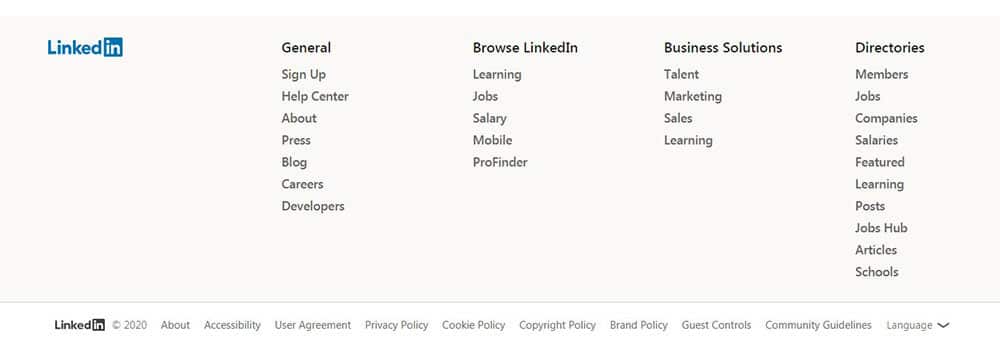
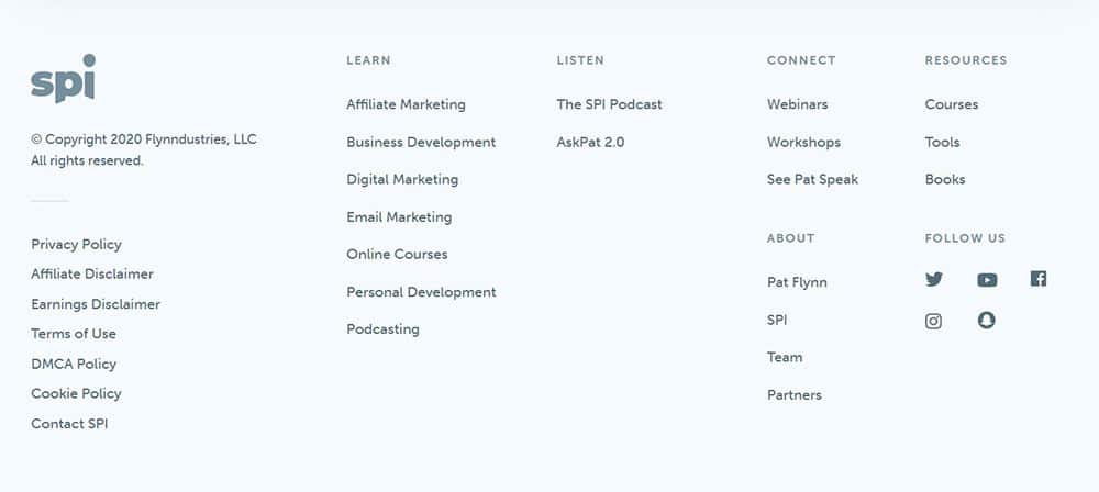
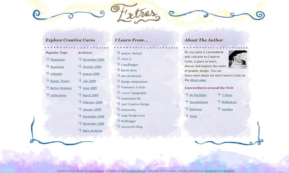
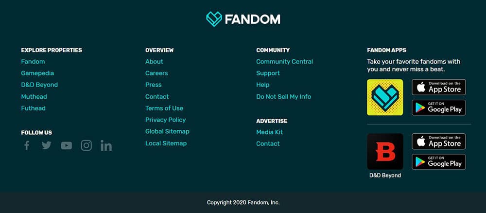
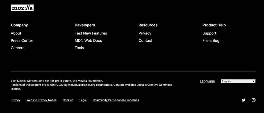
Mentioning your main site links to the website footer could help the users to jump from one page to another swiftly without undergoing a lot of hassle. Such a technique would be time-efficient for the use and build an impression about the website.
Including white space
Including spaces is very essential to make the information presentable so that no small content is overlooked by the user. When the links are too close to each other they make it hard for the visitor to click them. Hence, you can leave some space around a link to convey that it provides ‘click-ability’. Always ensure you have an abundant amount of space both horizontally and vertically between your information else the users would face a great amount of difficulty to navigate through the site.
via https://ift.tt/3jxsvmK




No comments:
Post a Comment