In every blog or a website, a header is the first thing that the website visitor notices. It makes the first impression. They say the first impression becomes the last. Hence, to make the first impression, your final impact, you need to have creative header designs that are visually attractive and have an artistic touch. And there are WordPress header designs available that make things easier. There are many header designs, and there are various categories on which your header should focus. The aim of the header design decides whether it wants to show creativity or talk business.
If the WordPress header is not visually impressive, the chances are that the website visitor may not even go ahead to read the website’s content. There are a lot of WordPress header designs that demand your attention. We are going to take a few of them in this blog, where you can take a day and stare at them as long as you want. These header designs are creative and inspirational that would compel a web designer to think outside the box to bring out the creativity.
1. Jason Bradbury:
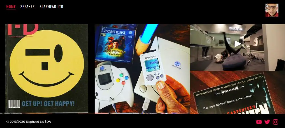
Jason has designed a very interactive header where he has put all the images on his website’s header, and each picture is clickable. When you click the photo, it displays information in the form of a caption about the history behind the film. One of the images and videos on the header also has his Instagram post. The photos show his love for traveling and the latest gadgets like cameras, video games, headphones, magazines, and cars. There are very few designers who think of putting an information overload in the header, which is the first thing for the user to see. Instead, this designer has put everything he loves in the header to let the user know about his passion for certain things.
2. Ozon3:
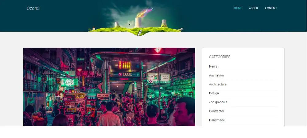
Ozon3 webpage shows a green landscape image that has cooling towers that emit rainbow-colored smoke out of it. This kind of header has been very innovative. The beautiful use of colors and the effect of greenery catch the eyes immediately. It encompasses nature and technology alike. The website designer has used artistic designs. With the increasing use of technology and infrastructure, everyone has started to care for nature and the environment. And this strikes the right notes with the website visitor because of its strong focus towards life.
3. Cult Foo:
The header of this website has used many vibrant colors with a combination of technology and nature. It depicts the birds putting pixels in place with their tiny beaks.The colors seem to emerge from the box that has the name “Cult Foo” written. There are flowers on both ends that epitomizes the nature and technology where pixels seem to appear.
4. J. R. Velasco:
This website’s header is an art masterpiece. It is so vague yet so artistic, and you can have so many people argue about what is the message behind this artwork. He has so creatively put the index section and then contact me section and the search section, they appear as the part of the artistic header.
5. Cleverbird Creative:
Cleverbird Creative’s website has a stunning header design. The website design is in a modular form that increases the responsiveness of it. With the division of the site in the blocks according to different subsections, they have paid excellent attention to the header as well. The header has full width and high-resolution images that never fail to catch your eye. The photos have simple text that is easy to understand.
6. Pierre’s:
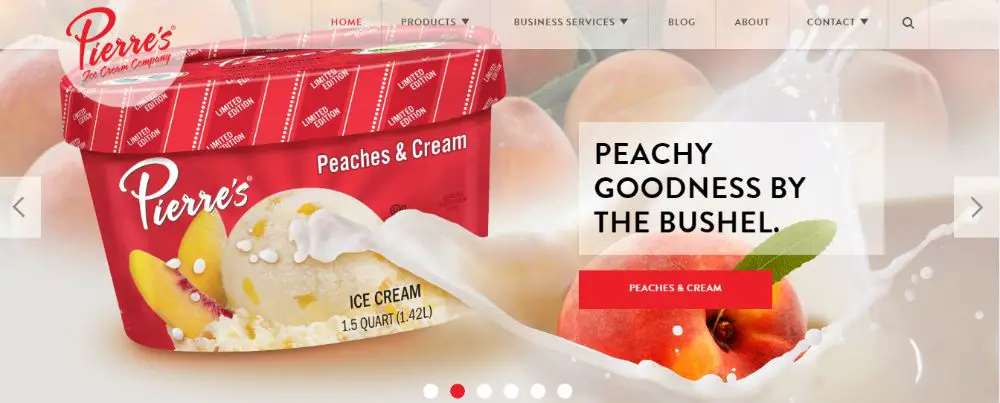
Pierre’s is an ice cream company that has designed some enticing website headers that show you life-sized images of their variants in ice creams and yogurts. The photos slide and have captured the best versions of their products. Along with the pictures that push, they also have placed their history, their line of products, and an image of a bowl of ice cream beneath it. The photos of the ice cream in the header entice a user to buy their ice creams.
7. August:
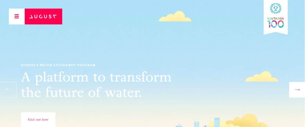
August is a website that smartly uses parallax scrolling, and the header provides a visual illusion to the web design. They have used the slider to have different high-resolution images that move. Parallax scrolling is a design where a website layout has a background moving slowly at the foreground, which creates a 3D effect as you press the scrolling buttons. It provides the website with a subtle element of animation, which gives an enhanced user experience. The design makes sure that they cover the entire screen when you open the website’s home page.
8. Le 28:
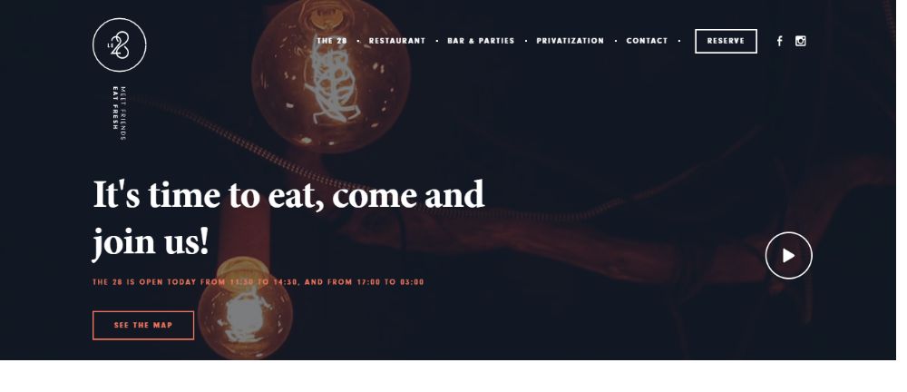
Le 28 is a website that uses video background for its header and sets the mood for dining at a restaurant because the site is for a restaurant. The videos in the header show the arrangement of their dining area, enough to create a hunger pang and lure the visitor. It is a unique header designing concept as no one would think of putting a video in the header background. The background video that carefully shows various processes of cooking a meal is a genius marketing move. It shoots two aims with a single arrow. While being an attractive header, it also is a pure advertisement for the brand.
9. The Rehab Studio:
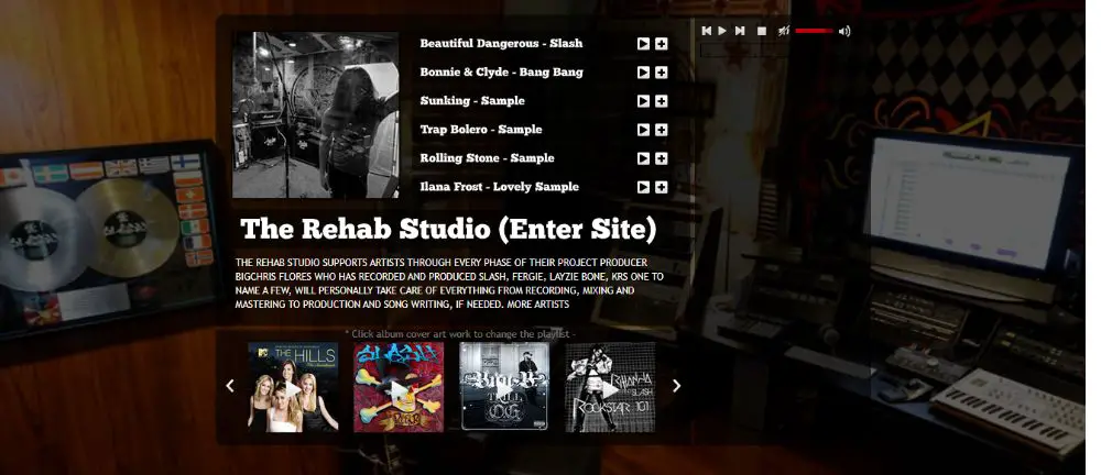
The Rehab Studio is a music studio producing music and sounds using various musical instruments. As you reach their home page, you find a playlist, the images in the slider of the different album covers, and a music player. They have smartly designed their header to showcase their best work, as every visitor on the website would want to play music free of cost. As you push the play button, it immediately plays some rock music and tracks from their portfolio. What a creative use of the header! It keeps a user engaged for a long time because of the playlist’s implementation and the famous songs they have displayed.
10. WPMUDEV:
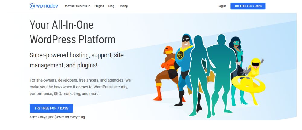
A superhero lover must have designed the header of this website because, as you open the home page, you see a group of superheroes. They have used the superheroes to convey the message that they are WordPress superheroes. And that they deliver the services quickly while keeping the quality in mind. Everyone loves superheroes, and no one would have thought of introducing them in a website header.
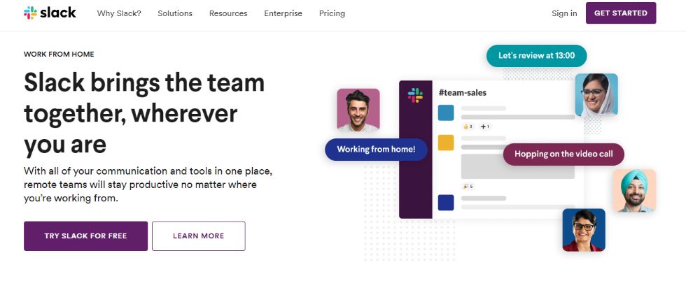
11. Slack:
Slack is a tool to carry out business communications that is used by teams in a company to communicate, share files, and have conversations. The header of the page displays the faces of different people over the communication threads. It entices a user to inquire more about it. At the same time, it is a creative yet straightforward header—a new and innovative header to signify the functions of the Slack application.
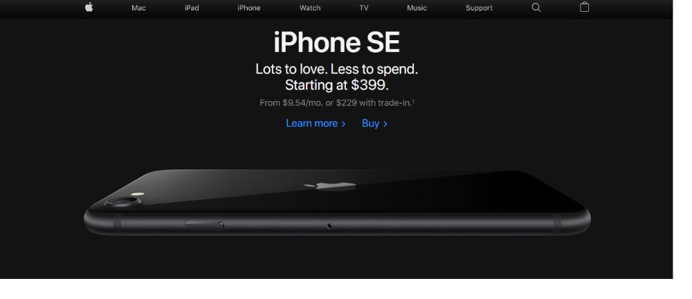
12. Apple:
While discussing website and header designs, it is impossible to forget the tech giant, Apple Inc. The header shows the latest Apple iPhone Model along with a very high-quality image of the newest iPhone model. The image is clickable, which takes you to the phone specifications page. Even if you click the picture by mistake, it will take you to the phone specifications page, which is smart. And putting your best product in the header section can be a well-orchestrated move. It keeps on changing its headers as it tends to display their latest product in the headers. This company tends to play with your thought processes and thinking patterns and has designed the website header accordingly. You are bound to inquire about the product that is in your face the first time you open its home page.
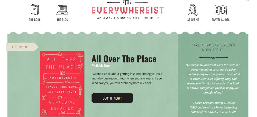
13. Everywhereist:
A smartly designed header on the Everywhereist website is eye-catching and has a perfectly placed call to action button. The header has a design with contrasting colors of grey and bright pink. The website sections like About me, The blog, The book have cartoon-like images for each section. The website designer should design the website in a visually appealing way, even if the user has nothing to buy from it.
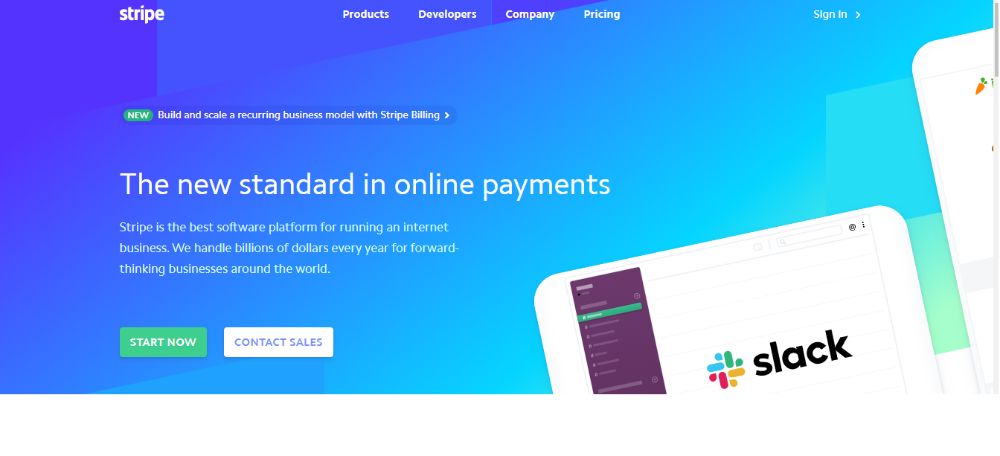
14. Stripe:
Stripe is an online payment portal that has a very brightly designed header. It combines one color in different shades and brightness levels that make it look attractive. They don’t have smart use of call to action button or any animation but only use bright shades of blue with a lot of texture.
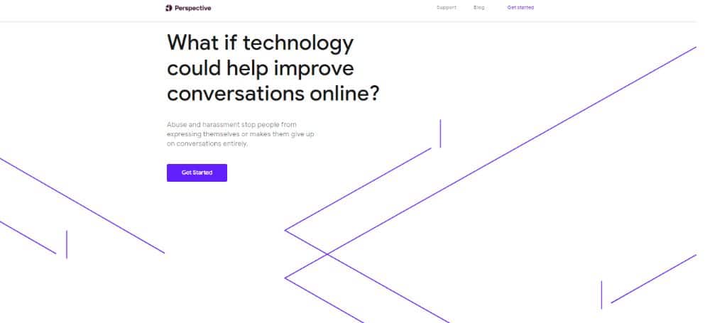
15. Perspective:
Nobody said that you could not use the geometric formations in your header. The possibilities of using various designs are virtually endless. Perspective does not have a compelling call to action, bright colors, or any other animations. It is such an example of using geometric designs in the header. It has merely geometric designs in its header section. These geometric lines give a very different kind of appearance to the page.
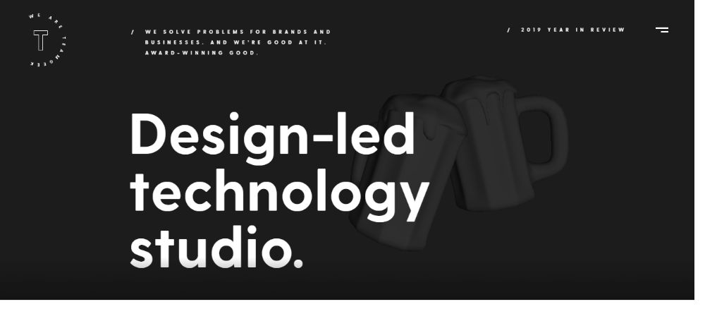
16. Team Geek:
The ideas and the designs of the header vary from designer to designer. The designer of Team Geek has a header that shows a visual as if it appears from a dysfunctional television. It shows a visual of a broken television broadcast network, and the distortion of the video continues as long as you keep the page open. As the image keeps on flickering like a distorted television network visuals, your eyes draw you towards the visual. And that visual makes you stare at it for longer than usual.
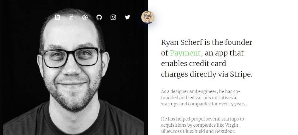
17. Ryan Scherf:
Ryan Scherf is the creator of this website, and the header of the home page talks about his portfolio. The home page has two sections, one being his close up image and the second being the information about the owner. The header has social media buttons that have links to his portfolio and social media accounts. A straightforward and minimalistic design is awe-inspiring.
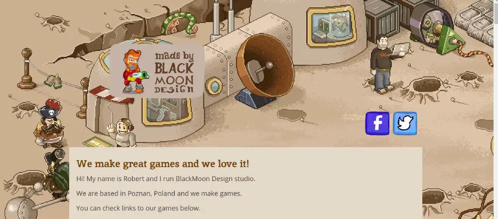
18. Blackmoon Design:
Blackmoon Design is a website for a design studio that is all about the game designers. The header of the home page of this website features a gadget-filled game screen that covers the entire width of the screen. This kind of header design is enough to tell you that the site is all about game designing and game designers. In this header, a player appears while toting a gun while chasing someone. Around him surrounds a garden-like structure and vast looking futuristic gadgets.
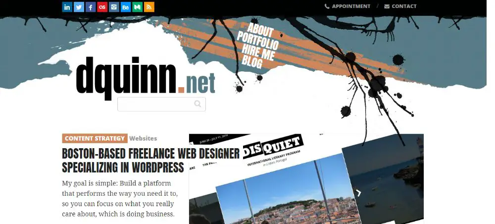
19. Dquinn:
This website has a very creative and artistic looking header. It has encompassed vector elements, and the website sections seem to blend in the header design nicely. The website specializes in the content strategy and has a very eye-catching header to its disposal. While arranging the website sections in the header, they all fall in a set of slanting stripes that catches your attention.
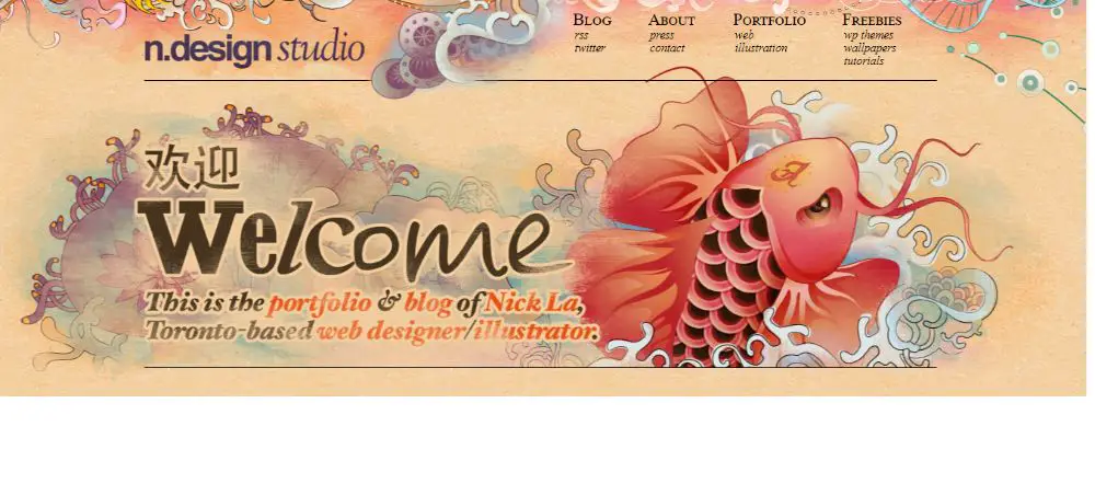
20. N.Design Studio:
N.design studio has designed its website header in a very artistic way with a wide range of combined colors. This website has a design as a portfolio of a Toronto based website designer called Nick La. He has designed a very ethereal looking website header that shows a sea dragon emerging out of a very colorful sea. With a perfect selection of colors, the website offers a new view yet simple design of the header.
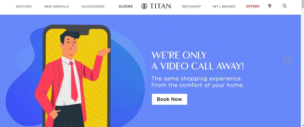
21. Titan:
Titan watches website never had a slider in their header design until very recently. A small strip is present for situating the sections of the sites like watches, new arrivals, etc. And beneath that is a slider that shows different images according to the current scenario. With the global pandemic going on, they have introduced the pictures in the slider accordingly with different messages. It has straightforward images along with a call to action button to shop from the comfort of your home.
Conclusion:
Header designs contribute primarily to the success of the website. The top part of the site is the first thing people notice, and it should strike a note with them. You have to be careful while choosing the header because a header decides whether the user will go-ahead to further explore the website. Sometimes, a simple and minimalistic-design header grabs a user’s attention, and at times, a very animated and artistic fails to strike a note with the user. Hence, you should keep in mind what elements are bound to work.
via https://ift.tt/2ZUOV8y



No comments:
Post a Comment