Selling your products and your services online is a massive venture into markets for a lot of companies. When you can sell your services or products 24 / 7, you can cash in a lot of profit and provide convenience to your customer to buy your products anytime. It also allows your customers to order your product online from whatever place they are in the world, as long as you can ship there. All of this can be established and accomplished by creating an e-commerce website. An e-commerce website reduces individual costs like having a brick-and-mortar store, customer representatives, call centers, and more, to a great extent. However, designing an e-commerce website is not only about creating the database for your products or the creation of a shopping cart.
Today, our blog is going to take you through the things you should not do when you are going to design an e-commerce website. Let us go through each of them in detail.
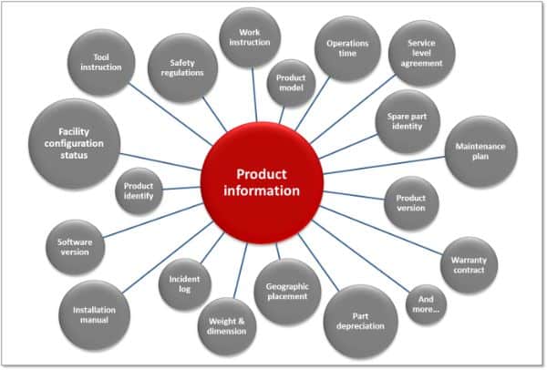
1. Absence of Product Information:

Whenever you visit a brick and mortar store, you can choose to pick up a product, look at it from every aspect, touch it, and see it with your eyes. You can also read all the labels on the product to gain more insight into the product. But when we think of online shopping, you cannot touch and feel the product. There are times when product information is insufficient. And, the customer goes to another website to look for product information for the same product. The customer would buy it on your site if the cost is less. Yet you cannot escape the customer’s difficult situation when he is unable to have any information about the product.
Hence, while designing an online shopping website or an e-commerce website, make sure you fill in all the product details as far as possible. The product cannot be touched and felt while shopping online. But if the information about the product is in detail, it becomes easier for the customer to gauge the product.
If your website deals with selling fabrics, you should mention the type of the material, colors, size, weight, and thickness of the fabric in the product detail section. And, while describing the product details, simple language must be followed to understand the product every term.
2. Contact information is hidden:

It is imperative to let a customer know that the company or the website they are dealing with is genuine and real. Eventually, they are going to trust you with their credit or debit card information when they buy something from your website. Hence, they need to know that they have some contact support if there is some issue after they buy the product or exchange or return the product. If a website does not provide your contact information or if it is hidden, the customer may not trust your site at all. These may make the customer remove any chances of having business relationships with your company.
Your contact details should be visible on every page of your website. It should be easy to find. The best places to add your contact information are on the page header or page footer. You can also provide a sidebar on your website just to store your contact details. If possible, provide multiple contact details like your official email address, contact number. You can also mention a contact form or a physical address of the store. These details make the customer have faith in you and your company. It is essential to know that if a product is expensive, it is likely for customers to want detailed contact information.
3. Tedious checkout system:

A tedious and lengthy checkout process is a mistake that can cause a lot of damage to your website’s online reputation. The method of checkout should be as easy and short as possible. A customer should be able to trust your website with their credit or debit card information to complete their order. If you have more steps between the product being added in the cart and paying for it, the customer may leave without completing the order.
Ideally, during a checkout process, the customer should be given order details before he goes further to edit his order if required. He should then be asked for the delivery address along with his contact details and then the payment details. Your website should display a confirmation page after the order is successful. Therefore, checkout should be only 3 or 4 step process.
4. Customer Account for order placement:

This issue relates to the previous point. If you ask a customer to create his account on the website, before he can place an order, it creates a new obstacle. You should prioritize one thing and ask yourself whether the account creation is famous or getting the order is? And if you decide on the former option, you should keep in mind that you may lose some customers.
There is an easy solution to this. You should make the customer save his details at the end of the order placement to avoid the signup process to place an order. Your website should provide your customer with an option to save their information to track their current order. And they can also order another product in their future easily if their data resides in the website’s database. The customers would agree to save their information on the site. They would not leave the order unfinished.
5. A deficient website search engine:

If a customer is browsing your e-commerce website, be sure that the customer knows what he wants. Some smart customers straight away go to the search box and search for the product they want to buy. These are the customers who don’t go through various product categories and product types for each group. For such customers, you need a well-functioning search box that lets the customers refine their search results instead of going through the entire website. You must have noticed that when you search for a product on a website, a lot of e-commerce website comes up with thousands of results. And this makes it difficult for a customer to find the product they are looking for.
A myriad of options for a single product type is a good practice to execute, but it causes many inconveniences if the product is invisible in the results somewhere. While giving the search results is okay, you should also provide the customer to filter the product by color, brand name, size, or other applicable parameters. You should also implement specific plugins that extend the functionality of the search engine. There should also be a facility to sort the products based on the parameters like price lowest to highest, most popular, and new arrivals.
6. Bad customer service options:

It looks similar to our previous point of hidden contact information. You should always make it easier for your customers to reach you to discuss a product or issue. The website should have a clear definition of how to contact you if a customer has a technical or a sales question or wants to return a product.
If you don’t have a customer’s contact number, you should have a ticket management module to handle customer inquiries. Your website should also have a FAQ page to address common questions that a customer can have. You can also have a form that a customer can fill up. In this case, filling up a form offers more assurance than just an email address to contact your company.
7. Poor product pictures:

We have already established that the online shopping experience is different from the brick and mortar shopping experience. The customer cannot experience the product during online shopping, as he can while shopping from a physical store. Therefore, you should add as many details about the product as possible while designing your e-commerce website. It includes images of the product as well.
Your website should have images of the product from all the angles for the customer’s understanding of the product. And tiny product images don’t serve justice to the customer. You should have product images that have high resolution or good-quality images that are practical for viewing. The images should have a zoom facility so that the customer can zoom in the image and look at the product carefully.
8. Only one image for the product:

Unless you have to deliver the product digitally, you need to click multiple pictures of the same product from different angles. The image of the product must be clicked from sides, front and back to highlight the best features. This technique of emphasizing the product may make a customer buy products from you.
It is a simple nut to crack. Each product should have a minimum of five or six images from different angles. The more product information you provide, the more likely it is that a customer may trust you. It makes a customer feel comfortable about placing an order with your company.
9. Insufficient shopping cart design:

The most significant part of any e-commerce website is the design of its shopping cart. It should allow a user to add multiple products from different categories modify the quantity or remove certain products before checkout. It is not as easy as it is said.
The right shopping cart design lets the user go back to the page he was on, after adding the product to the cart. To better the design, you should allow the user to add the product to the cart without leaving the page. Allow your customer to add a product or to remove the existing product from the cart. You should also display the additional charges like shipping charges and taxes before they checkout.
10. Absence of various payment modes:

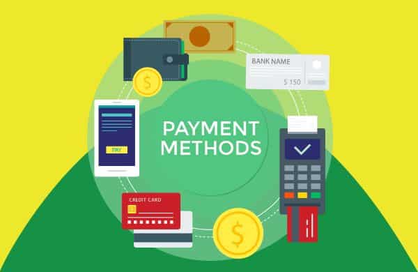
The websites all over the world allow various modes of payment. Some allow bank transfers and cash on delivery; some sites only allow payment through PayPal. What about a customer who does not have a PayPal account? You are going to lose a customer. Hence, you should provide all the means of the payment for a customer to receive his order.
You should include the payment service to let a customer pay in his ways without adding charges to one mode of payment than the other. Having multiple options to pay for the order allows a user to provide payment through his mode of payment. Different customers have different choices for payment mode selection. Various payment options avoid a customer from leaving the order halfway because his choice of payment mode was not available.
11. Exclusion of related products:

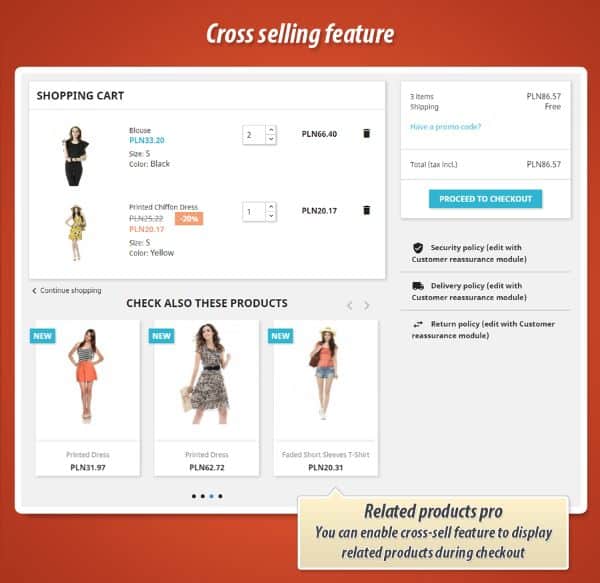
You must have noticed at a brick and mortar store that similar products are in a group in the same location. It is applicable to your e-commerce website, as well. For instance, if a customer is unable to find a piece of cloth in his size, he should be able to browse similar products of his size. You should implement an e-commerce platform that allows you to include related products on the product page. This platform can let you choose a group of similar products, as software programs don’t understand the associated products.
12. Improper website navigation:

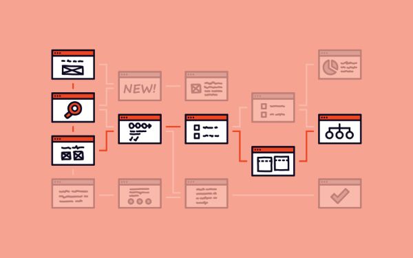
The worse part of a website can be navigation that confuses the website visitor. Another mistake that can damage your customer base is, segregating the products according to its category. Some products don’t have group, some websites even lack categories for their products and have the products scattered all around the site.
Your website navigation should be a well-thought and carefully crafted a system that can take your customer to his desired web page. The navigation system should be easy for the customers to sift through various products on your e-commerce website. Even if the customer doesn’t buy anything, it should be easy to browse and explore the products on your website.
Conclusion:
The motive behind developing an e-commerce website should be to make the customer’s shopping experience, similar to the brick and mortar store shopping experience. To make a good e-commerce website, you have to follow specific guidelines and protocols to establish your e-commerce website successfully in the market. The customer should have the flexibility of browsing and adding various products from various categories. He should be able to pay through multiple payment modes available on your website.
The post 12 Things NOT to Do While Designing an E-commerce Website appeared first on Line25.
Source: https://ift.tt/2VDxlEH

No comments:
Post a Comment