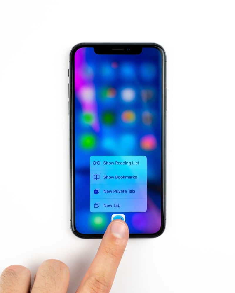
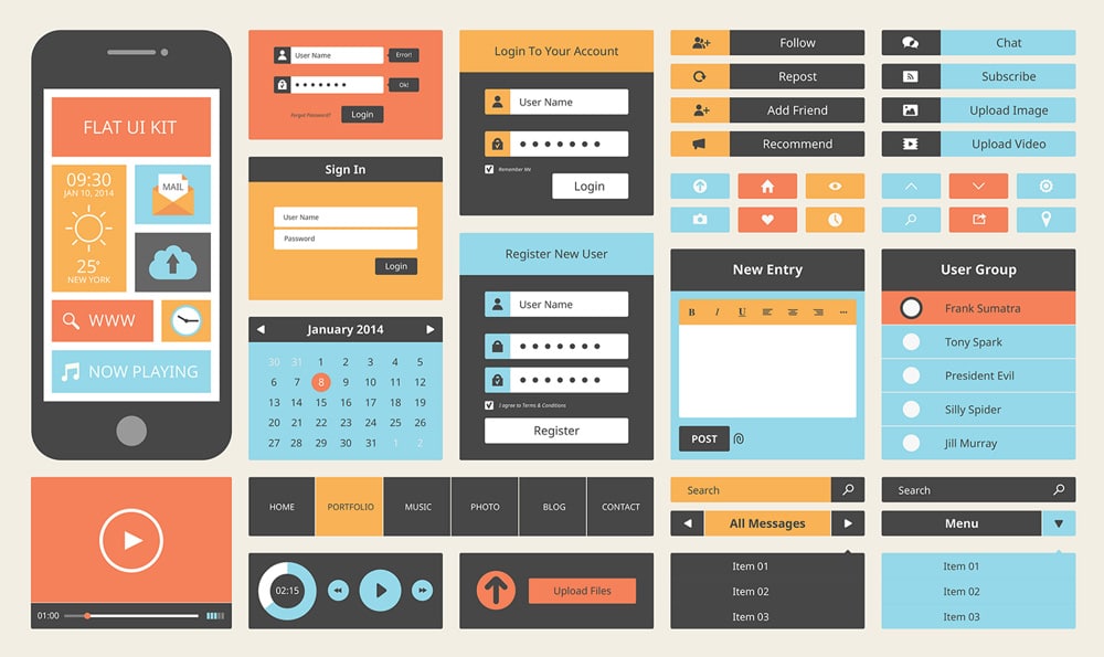
User Interface is the surface plane that connects a user to the device he or she is interacting with. UI design of an app or web application usually should help convey the essence of the brand, its story, functionality and overall value of the product. It is a critical step in creating a product. When done well can enhance the overall functionality of the app. Users should be able to efficiently use the product — this means that as UI designers, you should be able to design intuitive interfaces that not only delight audiences but are easy to use.
User Interface design is constantly changing, there are always new things to learn and consider when creating a design for interfaces. To increase your chance of success, we have put together some important principles that are applicable to any interactive systems.
1. Universal Usability
Your design should be responsive. This means that when you create a website or an app, it should be designed to be able to respond to various screen sizes and devices. The number of people using their mobile phones to surf the web has been growing rapidly and to keep up with this trend, user interface designers have to create interfaces that can adapt to different loading times and screen sizes. So when your designs are responsive to different devices that users may be using, you are naturally creating a great user experience for them.
2. Consistency
When you design around consistency, you are bound to make your interfaces intuitive. It directly relates to usability and learnability. When a user is familiar with a design pattern, he or she is able to use the interface without having to think. There are two types of consistency – visual consistency and functional consistency. By keeping the visual elements in your design consistent, you are able to create an interface where users don’t question its integrity. This is usually done by keeping the colors, typography, icons and other choices in your design consistent. Whereas functional consistency directly relates to how an object within the design would function throughout the interface. Users tend to get frustrated when things don’t work. By keeping the interface controls like buttons and menu items consistent, you increase your chances of having your interface run smoothly. So, make sure to create designs with users expectations in mind.
3. Clarity
Clarity is different from consistency. Clarity refers to letting your users know what to do at all times. When your designs are simple, you are making it easy for the users to understand different elements in your design. When you reduce the cognitive load for a user, people are not confused about the purpose of the page. One way to achieve clarity is to remove clutter. For example, instead of having a check out button at the end of a page, have your users navigate their way from the product page to the check out page. This will know exactly where they stand in the process and eliminate the ambiguity.
4. Feedback
The last thing you want in your app is ambiguity. When your users don’t understand what is going on, they are bound to not use the app. When you press a button, provide an indication that the button was pressed. No one likes to be uncertain about their actions, so feedback courtesy messages allow the users to know that their actions have been noticed and acknowledged. When a system is able to offer feedback that is relevant, informative, sensible and fitting in importance and urgency, it enhances the overall experience of the user interacting with the device.
5. Design standards and hierarchy
It is not necessary to redesign something if an old standard works. This applies for everything from icons to standard placements of elements on your web page. When you redesign a design standard, you are running the risk of having your users interact with a design they are not accustomed to. These standards have been put in place and have been designed around the users’ expectations so changing them will only lead to more confusion. There is nothing wrong with going against the grain and thinking out of the box to create innovative designs but it is quite meaningless and defeats its purpose when it is hard to use.
Different elements in your design must have a clear hierarchy. This improves the utility of the page. By keeping the most important elements at the top of the page, you are leading your users organically through the various elements and offers in the page. This also helps removes any unnecessary clutter and improves the overall functionality and usability of the web page or application.
6. Prevent Errors
Errors act as roadblocks to visitors taking the desired action. If the app or a site doesn’t function the way users expect it to, they usually leave. To reduce visitors abandoning web pages, it is important to minimize errors. So when designing a webpage make sure to design around the possibility of an error and design a system that checks for one before it is even made. For example, if a design system requires a user to set a password with a minimum of 8 characters and a set length. If the design system is able to notify the user as they type the password makes it easier for them to understand their error and this improves the overall experience of the user.
Conclusion:
In the ever-changing world of UI design, we will continue to find new ways to create and build interfaces that engage users and build meaningful experiences. The goal of a good UI designer is to create great experiences for the user. With continuous exploration, we are able to find new ways to delight a user. These 6 important principles are applicable to different interactive systems and can help make future interfaces engaging, user-friendly and intuitive.
The post 6 Must-Follow Rules for Creating a Beautiful UI appeared first on Web Design Blog | Magazine for Designers.
via http://bit.ly/2SrMdq2


No comments:
Post a Comment