Food websites often lack visual appeal even though their goal is to tempt their audience. However, the best food websites are incredibly attractive.
The secret to creating the most beautiful websites is about learning to see through the eyes of your clients. This will help you to capture the attention of your audience.
When you are working with food websites, you don’t only want to show a plate of food or a cup of coffee. Instead, include the ambiance, the conversation, the attractive foods, and the overall vibe.
It might sound challenging to do this in a single image or webpage. We’re here to give you great tips on creating great foodie websites.
Think from your clients’ perspective
When creating food websites, it helps to look at your clients. Who would you like to reach and why? A comfortable coffee shop which appeals to students and bloggers will have a different vibe to a family pizza and pasta shop.
What would you like your clients to know about your restaurant? Is it the great free wifi and coffee and cake specials? Or how about the bumper pizza specials and play space for the kids. When designing your food website, take the following into account:
- What can I eat here? This could include a full menu as well as great images.
- What will the food cost and are there any specials?
- How does the restaurant look? Include images from a gallery.
- Where is the restaurant located?
- Can I book a table or a delivery online?
- How do I find contact information for this restaurant?
- Can I use wifi during a work lunch?
- Is this restaurant child-friendly?
Asking questions will help you to understand (and speak to) the needs of your clients.
The best food websites embrace simplicity
Foodie websites are often very visual. This helps to share the color, atmosphere and aesthetic appeal of a space. Whenever text is used, it should be kept to a minimum.
You’ll need to give customers all the information they need while providing only a small amount of information. Keep content to a few small paragraphs on a food website.
Choose an attractive color scheme
Top food websites will use an attractive color scheme. Using bright colors as a background won’t bring visual appeal to a foodie site. Instead, keep your background pale and neutral.
If you do want to add bright or bold colors, such as the greens and reds of an Italian style restaurant, use them in moderation or you may overwhelm your customers.
Foodie websites must be simple and easy to read. Your clients are looking for key information that they can digest easily. Keep lettering simple and highly legible.
Go minimal
The landing page of a foodie website should be simple and clean. You want your page to be user-friendly while providing all the basic information. Stick to simple designs which will appear fresh and uncluttered.
Create a site which is easy to navigate
The very best food websites are easy to navigate. This means that all information on your site is easy to find. When food websites are well designed, clients are able to find the information they need. Navigating a foodie website should be intuitive.
Having industry style pages for orders, bookings, menus, introductions and contact information will help your customers understand how to interact with a site. This will make finding information quick and easy.
Display information clearly
Food websites are at their best when they show off all the information clients need. A website is there to tell clients all they need to know about a business. By making information easily accessible, clients won’t need to look elsewhere.
Menu
When you create a dedicated Menu page, clients will be able to assess what is to eat. Make all of your different menus (such as breakfast, lunch, dinner or late night menus) easily available.
Make it clear that different menu choices will be available depending on the time of day, and which choice is available when. Make it possible for your clients to move easily from one menu to another.
Order Online
Many clients prefer to order online. Customers browsing tasty treats may decide to order what you have on offer if you create an online ordering system. Foodie websites which allow online ordering will have a higher conversion rate.
If users want to order online, the best food websites turn this into a very simple and easy procedure. Your customers should know when their order has been placed, when it will be ready, and how it can be picked up or delivered.
Let clients know your location
If you have a single location, you can place your address online. Many restaurants even design their food websites with a map.
If you are part of a franchise, however, your clients may not know where to go or which is the nearest option to them.
Place each outlet onto your site, with a map as well as an address. Add contact details and trading hours to your site so that your clients will know how to locate you.
Add a feedback button
By adding a feedback button, customers will feel valued. When you show you care what your clients think or feel, you reach out. You’ll gain insight into how to improve your services.
You will also create a space for clients to share any grievances so that they can easily be resolved.
Add social media buttons
Would you like your clients to know more about your everyday actions? Would you like to encourage them to follow you or interact with you on a day to day basis? If so, you could always add social media buttons to your site.
Add a call to action button encouraging people to follow you on social media. ‘Follow us on Instagram’ or ‘Like us on Facebook’ will encourage your customers to share in the latest buzz. The best food websites often include images from social media sites such as Instagram.
Create an attractive About Us Page and an easily identifiable logo
If you want to create one of the most stunning food websites, focus on your About Us page. This will show the atmosphere or personality of your restaurant. You could introduce the people who are behind your restaurant, such as the head chef or owners. You can also share what you love about food, the culture of your restaurant and what makes you stand out from the competition.
Give your clients a peek behind the scenes
If your restaurant is known for a great chicken dish or vegetarian lasagna, give your clients a peek into how it was made. This will build trust in your process. It will also encourage viewers if they haven’ttried your dish yet. You’ll also let your clients know that they are eating fresh food which hasn’t been re-heated or purchased from an outside source.
Add excellent images
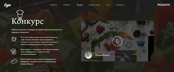
Food websites rely on images to add that special touch. You want your clients to be able to see the steam rise of a cappuccino, or taste the moistness in a slice of chocolate cake.
By using an excellent image on your landing page, you will entice your customers. Make sure you also add great images to your menu page. Your goal is to tempt your audience into making a reservation or online order.
Food photography will tempt your clients into trying your food if they are of a very high standard. The best food websites use high-quality images which makes your food look tempting. Bland, grainy looking photos will lack appeal. It is worth consulting a professional photographer for foodie websites.
When you add images, remember to look beyond the food. Add images which show the vibe of your restaurant. You want to encourage your customers to come along and enjoy time with friends, or enjoying a cup of coffee while writing up their latest blog posts.
Create a responsive site
Time out of work is often time spent on a mobile phone. Hungry travelers, tired parents and overworked students will often use their mobile phones while searching for a place to eat. Food websites should be optimized for mobile use.
You’ll need a site which displays your location and opening hours clearly even on a small screen. You’ll also need to have an easy to use site which will enable quick and easy online bookings or orders.
Keep it calm
Foodie websites should offer ambiance. The best food website designs are clean and uncluttered.
Web developers will advise you against adding music or animation to your sites. These will distract and overwhelm users.
When you create a new food website, you want to work towards a great user experience. The most beautiful websites are peaceful and uncluttered.
Mailing lists and contact forms
When creating food designs, it’s helpful to consider contact forms. Although many people choose to use contact forms as a protection against spam, a contact form is also a great way of acquiring customer email addresses. This can help you to maintain your relationships with your customers.
If your food website is interested in sending out an email marketing campaign, give your clients the option to subscribe to online newsletters. Your clients could be the first to learn about special offers, special events or tasty treats.
You could also send out recipes for your clients to enjoy at home or offer simple cooking tips. Make it easy for your clients to sign up with you by offering a link on every page.
Use Google Analytics on your food website designs
The best food websites use Google Analytics to assess how much time people spend on your site as well as what they are searching for.
You’ll find out how your viewers reached your site, links they clicked on or keywords they used. This will help you to see which advertisements were the most effective. You will also be able to compare your performances to your competitors and learn from top foodie websites.
Showcase of great looking food website design
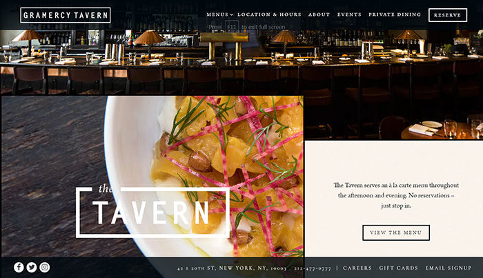
Gramercy Tavern
Danny Meyer’s Flatiron District tavern with a fixed-price-only dining room & a bustling bar area.
One of America’s most beloved restaurants, Gramercy Tavern has welcomed guests to enjoy its contemporary American cuisine, warm hospitality, and unparalleled service for over two decades.
Chef Michael Anthony’s ever-evolving seasonal menu showcases the restaurant’s relationships with local farms and purveyors.
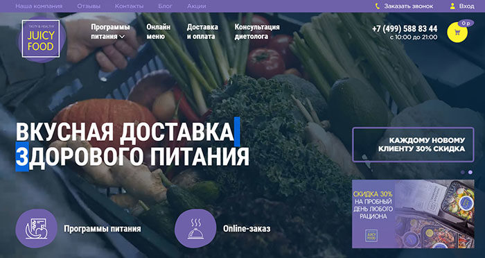
Juice Food
A project of a professional Moscow chef with his original look at the kitchen of healthy food. The result of our work is a fresh, juicy site with a bright memorable appearance.
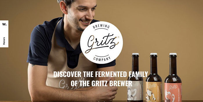
Gritz Brewing
The first gluten free craft brewery in Italy, Gritz choose All Creative Agency to create its Brand and Digital identity. A onepage website with terrific animation and nice illustration
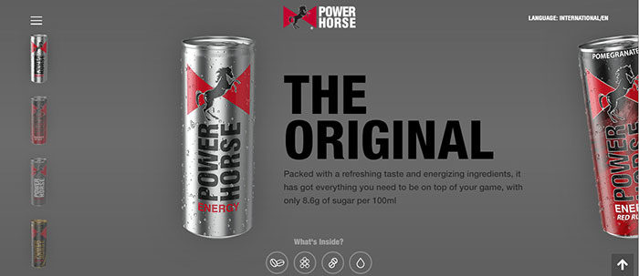
Power Horse
Power Horse brand was launched 22 years ago. Today, Power Horse is available in more than 40 countries worldwide amongst African and Middle Eastern consumers.
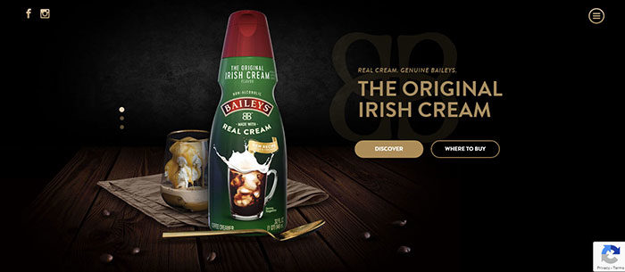
Bailey
Baileys Coffee Creamer site. Indulgence has never looked so good.
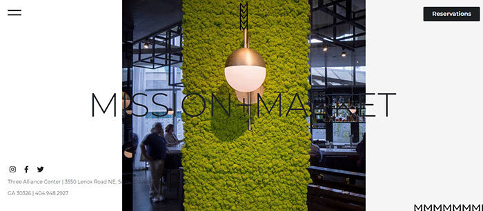
Mission + Market
Inventive West Coast inspired American fare, in a casual and airy atmosphere, with open kitchen seating and a large city patio.
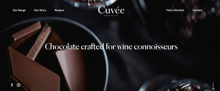
Cuveé Chocolate
A sleek and refined website for chocolate masters Cuveé Chocolate, based in Melbourne, Australia. Utilising Craft CMS and Shopify.
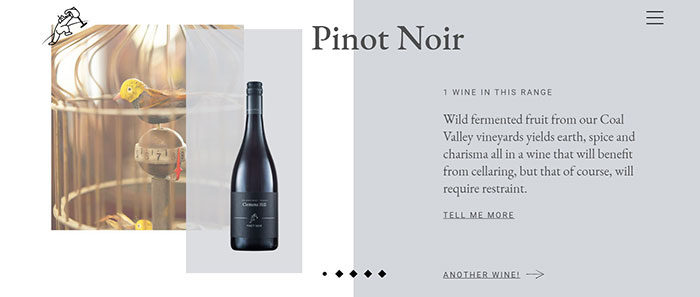
Clemens Hill
A little bit of wine magic from Tasmania’s Coal River Valley. Clemens Hill was founded over 20 years ago in a remarkable setting within the bucolic Coal River Valley. Which is where it remains today.
Del Cambio
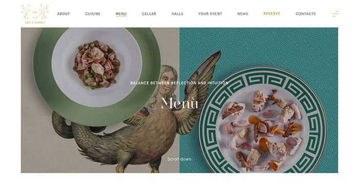 Dive into the world of Maison Del Cambio, symbol of Turin’s new cosmopolitan and vanguardist look.
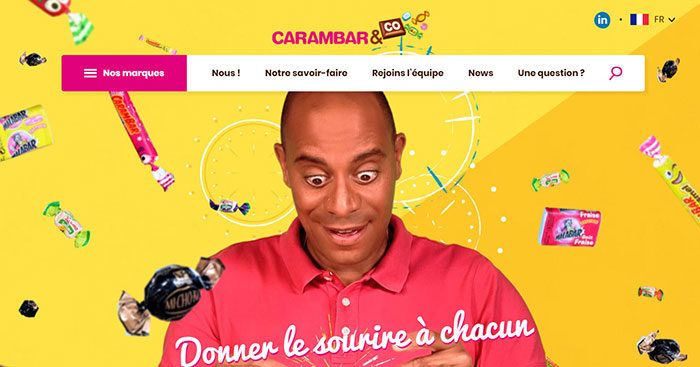
Carambar & Co
Carambar Company website promoting 13 mythical candy and chocolate brands.
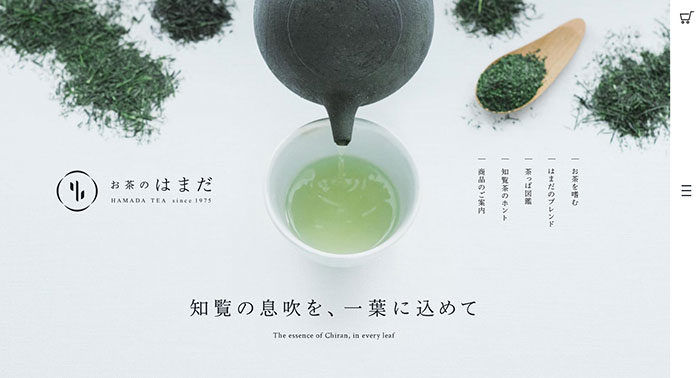
Hamada Tea
A brand site of a tea shop selling Chiran-tea that made in Kagoshima, Japan.
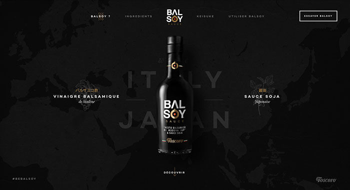
Balsoy Sauce
Balsoy is a new sauce. A perfect mix of soy sauce and balsamico vinegar. A taste of Italy and Japan, at the same time.
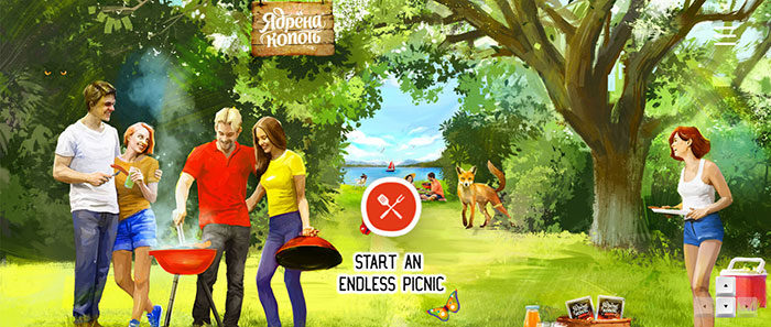
Yadrenakopot
Endless picnic with Yadrenakopot. The smell of fire, the taste of roast meat and socializing in a friendly atmosphere – for this we all love the picnic so much. With sausages and sausages “Yadren Soot” it is so easy to feel this warm atmosphere anywhere, anytime.
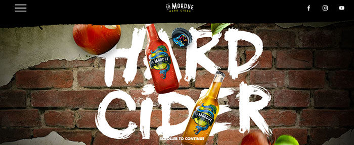
La Mordue
La Mordue is a 100% French Hard Cider. This alcoholic beverage is made with an original recipe, with apples rigorously chosen and with an unique production.
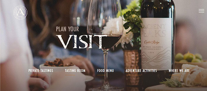
Ancient Peaks
Born from ancient sea bed, rocky alluvium, shale, volcanic, and granitic soil types, Ancient Peaks wine exemplifies the intimate relationship between vines and the earth.
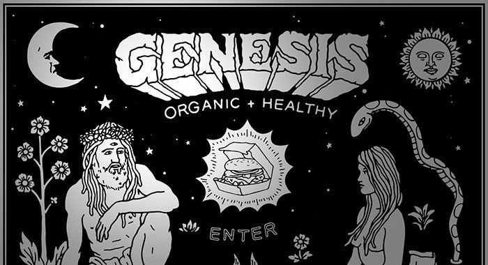
Genesis
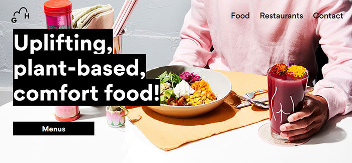
Genesis is a 100% plant based alchemy restaurant concept specialising in fast casual dining and organic comfort food.
SUMMER 2018 | BAKE CHEESE TART
BAKE CHEESE TART’s special summer package campaign site. Collaborated with New York artist Meguru Yamaguchi. Expressed his art using WEBGL.
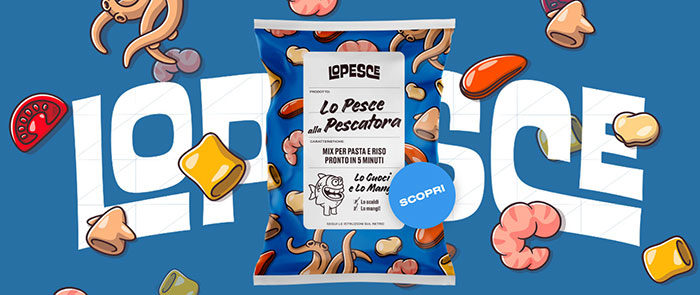
Lo Pesce
A fresh new Italian brand of frozen fish
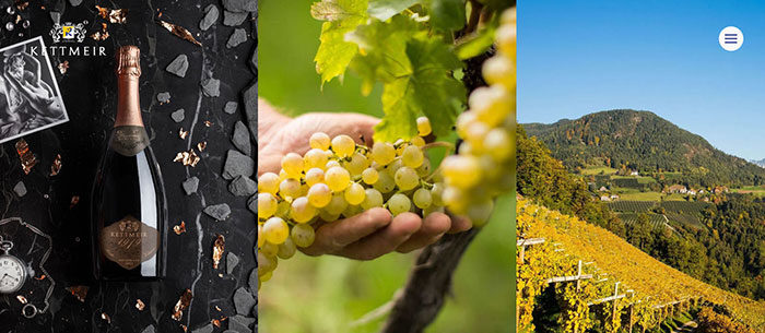
Kettmeir
Kettmeir is a sparkling wine brand from Sudtirol
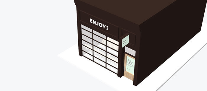
ENJOY
ENJOY: is a space dedicated to the joy of creative exploration. It’s purpose-built to host a broad range of experiences in food, art, and culture.
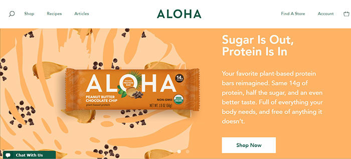
Aloha
Organic, plant-based protein products that support a healthy, happy lifestyle. Full of essential nutrients your body needs and free of anything it doesn’t.
Ending thoughts on these food websites
We hope we have inspired you to create food websites which will appeal to your clients. By following our tips, you will be able to launch beautiful food designs to tempt your viewers.
Enjoy using our tips to create an awesome foodie site. If you are a restaurant owner who is thinking about a new site design, share these tips with your designer to create one of the top food websites available online.
If you enjoyed reading this article about these food websites, you should read these as well:
- Cool Website Designs: 78 Great Website Design Examples
- Website design inspiration: business websites, one-page, parallax sites, and more
- Modern Website Layout Ideas (27 Examples)
- Horizontal scrolling website examples to use as inspiration
- Using a red color palette and the various shades of red
The post Food website design: Tips and best practices appeared first on Design your way.
Source: https://ift.tt/2SpprtV


No comments:
Post a Comment