People are hard-wired to recognize patterns. From the shapes in clouds to predictable stock market fluctuations, people see things that sometimes don’t exist. UX designers can use this to their advantage. By studying users behavioral patterns, designers are able to see how users navigate pages, use a menu option and how they use your site. If you use the internet on a regular basis, you are bound to notice a lot of UX patterns and problems associated with it. Some solutions to these patterns worked well and those are the ones we see repeatedly.
In this article, we will discuss the various design patterns that are prevalent today and how users use them. Using various examples, we will cover how these design patterns are used by some of the best websites and web applications to solve some existing user problems.
1. Flagging/Reporting
This UI pattern is commonly used when the user wants to play the part of content police. This helps the user gain more control over their site, especially when using online networks and sites that rely heavily on user-generated content. For example, popular sites like Facebook, Airbnb, and pinterest let users flag content when it violates site policies or is deemed inappropriate. They usually implement this by walking the user through a questionnaire. This can help add credibility to the content that is visible and lets the communities moderate itself.
2. Tagging
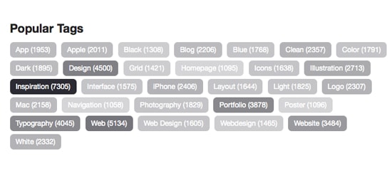
To help users organize their content better and to help them find similar content, popular sites like Behance and Flickr makes it easy for users to tag their content with specific keywords. For example, Twitter and Instagram categorizes your hashtags according to a topic or an idea and lets you share it on sites like Facebook or Google+
3. Conversational forms
User-centric conversational forms tend to work better than data collection centric ones. Users often find plugging in information as a tedious task. By designing forms that have a conversational tone, designers are able to get more from a user. Sometimes fill in the blanks forms turn out to be more engaging and interactive than drop down tabs and radio buttons. Although it may not work really well with lengthy and complex forms.
4. Input hints
It is helpful to provide users with hints to help them figure out what kind of data to enter in an input field. They are many ways to provide these hints – with the help of HTML5, the users can have inline text appear inside the input field. You can also have this text below or to the side of an input field. Implementing this design pattern will help you minimize clutter and make the users enter their information eliminating errors and possible confusion.
5. Drag and drop actions
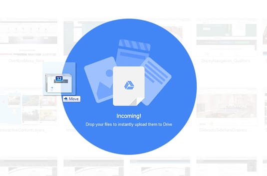
This UI design pattern lets the user interact with the interface in a more organic way. It is especially useful when rearranging elements within a website. If you are looking to upload an item or a file, users would have to click through various pages and switch from internet explorer to the browser window. Implementing drag and drop UI pattern can help eliminate this clumsiness and make the overall interaction a far more easy and seamless experience. Some of the popular companies that implement this design pattern are Asan, Google Drive, and Dropbox.
6. Social login
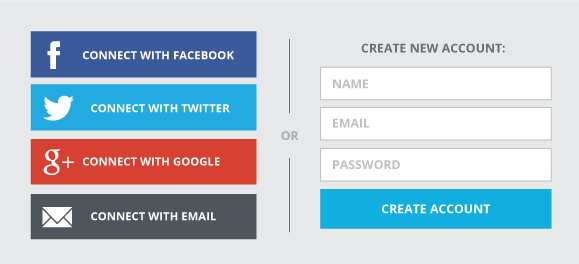
Most social networking sites are implementing easy login by letting users sign in with their existing accounts. This means that instead of having to plug in your name and other details, you are able to log in by simply connecting your existing account to the new one you are creating. This means that you have one less username and password to worry about and don’t have to worry about password security as much. Google, Facebook, and Twitter are the main OAuth providers and makes it easy for users to log in to most web applications using their existing accounts. This drastically improves the user experience and is being implemented in most web applications.
7. Natural language inputs
It is easier for users to enter data without having to worry about predefined text formats. This means that the system would have to translate these complex queries and sentences in the backend. This eliminates the need for the user to have to enter data into multiple fields and makes the overall experience of the interaction a lot easier for the user.
8. Inline validation
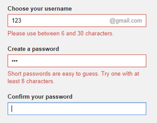
Implementing this design pattern can make data entry an interactive process. This UI pattern can be used to give immediate feedback to the user. It is especially useful when entering information, check formatting errors, mistyped phone numbers etc. Twitter and Gmail implement this design pattern and is able to provide immediate feedback to its users when signing up to use their services. It is especially useful when using account registration forms and other long or complex forms that require the user to enter data into multiple fields.
9. Completeness meters
Companies like Linkedin and Google+ use this design pattern to tell their users that they have completed their goal. This is often implemented by showing the users a quantifiable percentage of how far they have come and how far they have to go.
In the ever-changing world of UX, designers are constantly met with new challenges. By considering what the customer wants, understanding their preferences and studying their behavioral patterns, web designers are able to make informed choices to make a better UX for every user. There are many design patterns to learn from. We hope that these commonly used design patterns will help you get a better grasp on some of the recurring problems and solutions. Studying them in depth will help you see larger patterns or the commonalities between smaller interactions.
The post 9 Common UX Problems and Solutions appeared first on Web Design Blog | Magazine for Designers.
via https://ift.tt/2XmZoYe


No comments:
Post a Comment