As graphic designers, we work with color, typography, and other elements of design every day. There are many amazing resources and free assets available for designers today. Sometimes having too many options can feel overwhelming and can lead to a lack of clarity especially when designing for clients. With an entire color landscape available to help you hone your skill, it would make sense to establish some parameters when choosing different elements for your design. By narrowing down this landscape into specific spectrums, we will show you how to hone in on what the client is looking for.
By turning different elements of your design into a spectrum- classifying something in a way that it falls between two extreme points, we are able to identify different features associated with it and how it may influence the overall design. This way of working helps you get on the same page as your client from the very beginning and ensures that we don’t get too far down the wrong path.
When you define key elements like content density, color, typography, photography style, illustration, and other basic design elements at an early stage, you are able to collaborate better. When you present and collaborate on these ideas during the earliest part of the project you are able to determine which direction you want to take your designs.
- To get started, create a line with polar opposite ideas on each end of the spectrum. Now start populating ideas in between them. The chosen designs would transition to each side and ideally, it would range anywhere between 5-7 designs.
- Once you have this ready, start a discussion with your client and see which direction you should go in.
- Now, look into the preferred color choices of the client. Narrow it down until you get a well-defined spectrum.
Here are a few examples of different designs that were created on spectrum. This will give you a better understanding of how this tool is used and implemented.
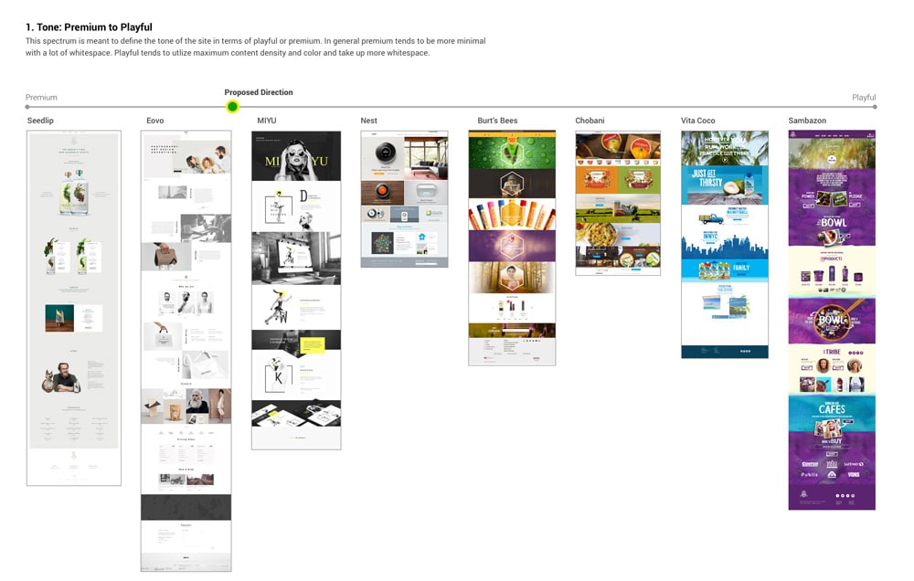
1. Premium to playful
Designers narrowed down the tone of the website to fall somewhere between premium to playful. By looking at this spectrum, you are able to see how premium colors and designs tend to be more minimal with lots of white space while playful imagery and designs gravitate towards the opposite end of the spectrum. Playful designs take up a lot of white space and visibly louder in design.
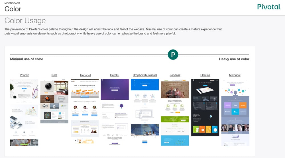
2. Color Usage
If you look at the color usage below, you’ll see how the layouts on the left side of the spectrum use color minimally while the ones to the right use bright splashes of color. Minimal use of color helps create visual emphasis on other elements of the design while saturated tones help emphasize the brand and makes it more playful.
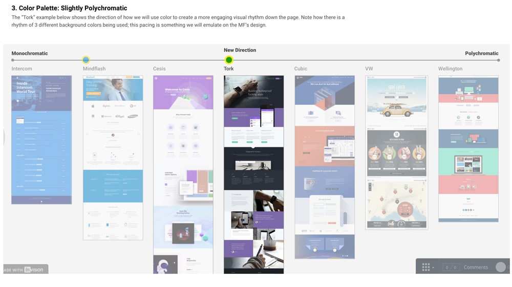
3. Polychromatic color palette
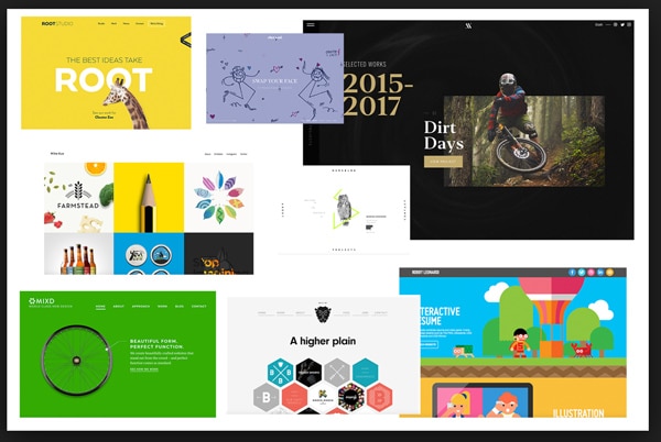
If you look at the example below, you will see how designers have used colors to create a visual rhythm down a page.
Design constraints help designers to establish consistency and a brand voice. Learning how to design within a box can help you actually become a better designer. Let us delve deeper into some of the important ones that can affect the overall design and functionality of an app.
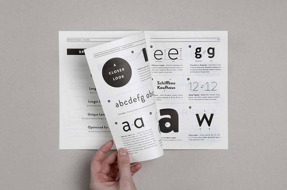
Typography Palette
When you are starting a project, typography may already be done for you. Working with predefined typefaces lets you test out your design ideas. By stacking type in interesting ways, you can see how a color or text will work with imagery. By sticking to established typography, you can still experiment with different nuances of the font. This will help keep the brand look and feel consistent.
Color Palette
There are times when you are stuck with a pretty awful color palette. The best way to work around this problem is to pair them with neutrals and white. If the colors are hard to manage, consider a minimalistic style where the color can serve as an accent and not the main visual element. Alternatively, you can play with varying tints and the saturation value of a color. Adding a color overlay will help make your designs pop as well. These limitations are incredibly helpful when it comes to color based branding.
Content
Too much content can be overwhelming but when crafted well can reach the user and motivate them to perform an action. Working with logos and imagery, on the other hand, can be quite challenging. These elements in your design can help set the overall tone of a project.
Canvas and screen sizes
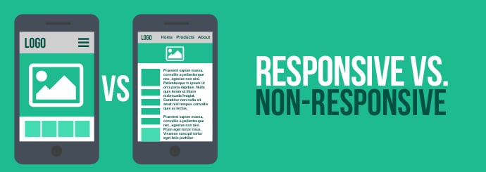
When working with a size constraint, designers have to think about different scales and how different elements in your design are going to fit within that template. This is easy to do when working with wide artboards or canvases. When you have to design for a smaller screen, it gets tricky. Either way, the most important rule to know is that the text should be readable and images should be in focus. Understanding how your design might be received in different environments will help you create and plan placements.
Conclusion:
Design rules and constraints can be a good thing. If you were given a blank canvas without any constraints, you will soon find yourself obsessing over a typeface and the many styles and ways it can be represented. Restrictions help you focus on other areas of the design and makes you think more creatively about a solution. Knowing and understanding these limitations will help you make quicker decisions about the parts that are not working. We hope that this article helps you understand how designers use constraints to design better design solutions for their clients.
The post Defining Design Constraints When Designing for a Client appeared first on Web Design Blog | Magazine for Designers.
via http://bit.ly/2TO3dDr


No comments:
Post a Comment