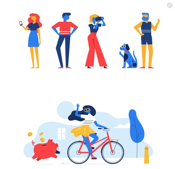
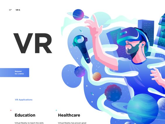
The word illustration itself stands for the idea of throwing light onto something. To take a complex idea and translate it to a visual representation is not an easy task. Illustrations can help the viewer understand and clarify an intangible idea or experience. Historically illustrations have been a big part of print stuff like newspapers, editorials, books, posters, flyers and educational materials. Lately, it has found itself a place in digital media. Due to its abilities to evoke an emotional and visual appeal, they have been a core visual element in UI Design. In this article, we will consider the benefits and pitfalls of using illustrations in UI design for web and mobile applications.
7 reasons to incorporate illustrations
1. Illustrations add a sense of novelty to your designs
A large part of our brain is devoted to visual processing — illustrations can help convey an idea or a concept with a single still image. Because of its ability to clarify concepts, companies have been using them in their blog articles, reviews, websites, and landing pages. By understanding their target audiences and aligning concepts with their business goals, illustrators are able to find metaphors and color schemes that appeal to a wider group of people.
2. Illustrations for creative storytelling
Illustrations can showcase characters, a story, set an atmosphere and convey a message through a series of interconnected image blocks thereby setting the overall tone, mood, and voice of the platform. To make a story memorable, there has to be a strong connection between its parts.
3. Illustrations as a visual trigger
Imagery can convey an idea much faster than text can. People are incredibly adept at recognizing and transforming visual marks into information even when the graphic has high levels of abstraction. Here are some useful factors to consider if you are thinking of using illustrations to your User Interface.
1. Visuals are transmitted to the brain at a much faster speed and even when text is the perceived source of transmitted information, they often end up being stored as images by the brain.
2. People tend to remember images a lot longer so the information conveyed through an illustration or an image gets processed at a faster rate thereby making the interactions easier and a lot quicker.
3. Illustrations tend to look and feel more universal than photo-realistic graphics or imagery. This makes the platform accessible to people in different countries. These factors play an important role in creating a visceral connection between the imagery in the app and the user.
4. Illustrations to help support the copy in web and mobile interfaces
People can perceive illustrations really fast but that doesn’t necessarily mean that they are able to read your message correctly. Imagery can be perceived in many ways but when it is accompanied by text, it is easier to create a positive user experience. Images can capture a users attention but in order to easily recognize an image, the visual metaphor you are using should be easily understandable and should resonate with the user. This is why designers often tend to use a mix of text and imagery to convey the desired message.
5. Illustrations to help support brand awareness and recognizability
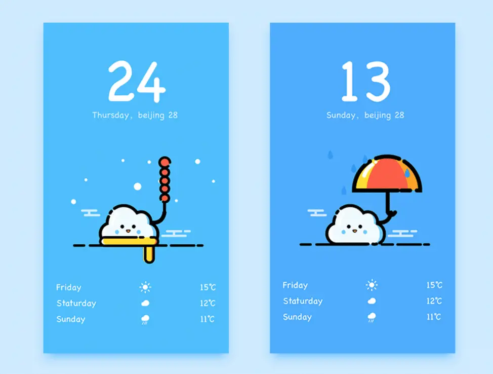
Illustrations can be designed around the expectations of the target audiences. Choosing the right colors, imagery and shapes can help inform different functionalities of an app of an interface. Since images have a tendency to stick longer in the brain of a user, it is useful to make them more informative when using in an app. This helps to make them highly effective and recognizable. To create an effective branding for a web or mobile app, it takes more than just an illustration. It requires you to create a story, set the mood, and create a voice for the platform. This is the reason why illustrations are widely used for onboarding screens and weather apps
6. Illustrations and interactions
Animations are a great way to improve the overall design of an app. Animating illustrations can enhance not just the usability but also the overall look and style of the UI. This movement adds more power to the idea, improves interactions and set the mood of the page. In user interfaces basic interactions should take seconds, adding a graphic or an illustration here should only be done when the message it conveys to the user is done with clarity. If the images are wrongly decoded, they may need help with an additional copy.
7. Illustrations and Visual metaphors for an engaging design
In art and design, visual metaphors are a great way to capture the users’ imagination. This way of abstracting a concept makes them think and consider offered ideas. To create an engaging user experience, it is important to include designs that invoke pleasure, joy, fun, and delight. Illustrations have the power to do this. By playing with shapes, lines, texture, and curves, designers are able to invoke different emotional responses from the user. By studying user behavior and their patterns designers and illustrators can use illustrations as a powerful tool to create a significant impact within the first few seconds of the interaction.
Conclusion
It is quite impossible to create illustrations that satisfy every user. Cognitive schemes differ from user to user but here are some aspects to consider when designing an illustration for UI. 1. Target audience and their environments 2. Global impact and recognizability. It is important to keep these factors in mind when designing an interface. It is not enough for you to make them see the elements and the layout but also create a graphic that is easily understandable and meaningful.
The post Functional Art : 7 Reasons to Apply Illustrations to Your UI Designs appeared first on Web Design Blog | Magazine for Designers.
via http://bit.ly/2MUvNQR


No comments:
Post a Comment