When you look at a geometric logo, what do you see? Shapes repeated in a regular manner? How do you feel about jagged edges and organic lines? When you use a geometric pattern to design logos, focus on the shapes you use in your geometric design.
Shapes play an important role in logo design. Different shape patterns each communicate a different message to an audience. Graphic patterns not only offer symmetry and balance. They can also be used to share a message.
Shape patterns may be formed by circles, squares, triangles or crosses and geometric logo designs have become popular. This is because they offer a precise and very balanced beauty which evokes (and expresses) emotion. A geometric logo is made up of squares or rectangles and can feel very stable and precise while circles can create a feeling of freedom or eternity.
Geometric logo designs extend beyond simple shapes to tell the story of a brand. They have historical value. For centuries designers have used geometric logo designs to tell stories. Ideas about art, religion, science, and culture have all been represented using geometric designs.
As geometric patterns are subtle, historical and shape culture, how might you draw on them to express your brand values in your own logo? Have a look at the examples we have found to assist you with some new and creative ideas.
What makes geometric images so popular?
Geometric designs are everywhere. From an exposed brick wall to kitchen tiling or the repeated rectangles which shape living room windows, we see geometric patterns all around us.
Geometry is used to build our lives. Geometric patterns also shape our universe. We are so familiar with shape patterns that they have become very popular in logo design.
The difficulties of using geometry in design
We are so familiar with geometric shapes that it might sometimes be difficult to use these shapes as simple line designs or graphic patterns.
Drawing up logo designs with graphic shapes can sometimes feel challenging because the original shapes might box us in at first. There are some issues to work with before you are able to create the cool line designs you will use for your logo.
When you create a logo you will need to use shape patterns in a creative way otherwise your logo will appear to be rigid or stark. Work with your shapes until they become pattern designs in their own right and the original shapes will be less obvious. That way you’ll end up with beautiful patterns which create interesting shapes.
Here are some different designs to inspire you
In the examples below, you will be able to see some graphic patterns which use shapes to create cool brand logos.
Microsoft
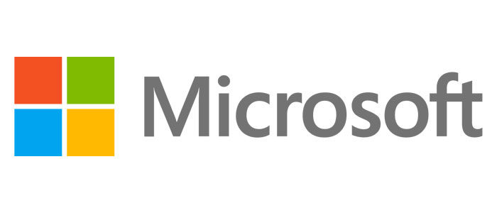
Microsoft is a leading global brand which uses a geometric logo very effectively to create a unique and easily identifiable logo. With a product called Windows, it is no surprise that the company has chosen to use four squares to identify its brand.
These squares join together to form a larger square which symbolizes the Microsoft Company. Each box is a different color, symbolizing the diversity of the company’s products as well as the workforce diversity within the company. Diversity is a source of great pride for Microsoft.
The company relies on simple geometric designs to send a message to viewers about both Windows as well as company values. Viewers are easily able to identify and resonate with the company brand which uses bright and very cool geometric shapes to attract attention to the brand.
National Geographic
Whenever you see the National Geographic logo you’ll be able to see how simple geometric design has been used to create a brand logo. The yellow rectangle which identifies the brand has been placed on the left-hand side of the text.
Although the simple yellow logo may appear dominant at first, it is the text beside it which gives it meaning. National Geographic shows us the world through a camera lens, creating photos or imagery of nature. The yellow color in the design symbolizes the sun’s energy. The geometric graphic design image helps us to identify both the magazine and what it offers.
Vodafone
Vodafone is all about connecting people. The Vodafone logo uses geometric design to show how communication creates fulfillment and increases our social circles so that we feel a sense of contentment or satisfaction.
This geometric logo combines shape (a circle) and the vibrant color red to symbolize connections, passion, love, and life. This is a very simple and easily identifiable logo which expresses the warmth and value communication brings to our lives.
Adidas
Adidas uses a geometric logo to share its brand motto with its clients. Adidas transcends simple sportswear to represent a lifestyle. The Adidas logo is shaped like a triangle which shows us that we can climb mountains and conquer our limits to achieve peak health and fitness.
The simple geometric design, created using thick geometric line art is simple to reproduce and easy to identify. Isn’t it fascinating how a simple geometric logo can tell a story?
MasterCard
MasterCard uses interconnected circles to achieve a unique brand identity. The logo is a great definition of creativity. The circles within the logo design are connected by a series of straight lines which allow the colors within the circles to interconnect.
Using geometric pictures, MasterCard shows how MasterCard connects people to the world. The logo is striking not simply because of its cool geometric shapes, but also because of the dual colors. These colors symbolize different nationalities or currencies which are treated equally when it comes to service and support.
Types of Geometric Shapes
Simple geometric shapes
 As we can see from the above examples, a geometric logo does not need to be complex in order to share the story behind a brand.
A simple and yet easily identifiable logo which tells the story behind the brand will always exclude excess detail. Patterns and designs are therefore incredibly effective.
Geometric logos can use implied textures. Think of how the items around you are never flat but contain a range of different textures. The feathers on a bird or the shape of your teeth will always have edges, indents, raised surfaces and even holes. This implied texture can be used within simple logos.
Have a look at the bite as well as the gradients which form a part of Apple’s new logo.
Modern and millennial
 When a brand uses minimalist shape patterns without any intricate details, it is normally aiming at a younger market. Geometric patterns and minimalist designs are often a reminder of a digital era, with abstract and precise lines. Technology presents a different image to the organic, natural world. Those who identify with technology enjoy precise lines and pattern designs.
Geometric pattern designs feel modern because they use abstract shapes and mathematical structures. If you are inspired by technology and development, and wish to create a sleek impression then minimal design is the perfect source of inspiration.
Vintage or retro geometric pattern designs
Geometric shapes can be minimalist or modern but they can also create an image of a time gone by. This creates a sense of nostalgia as well as a futuristic feel. Some geometric designs take us back to the 1980s and the 1980s visions of the future, with sleek, fast cars and hoverboards. Think of Tron.
A company who wants to create a geometric logo which inspires nostalgia would do well to use a geometric logo in this style. Vintage clothing stores or those who sell vintage style electronics would do well to incorporate images of times gone by.
The whole is more than the sum of its parts: using shapes as constructs
Every brand is made up of separate parts which, when combined, create a unique whole. Brand logos which indicate how different parts combine to create a new whole are great for companies which use construction.
Shape patterns can be unique and do not have to be limited to a building block style of design. As long as shapes fit together well they can be used in combination to create an interesting image.
Balanced or symmetrical geometric shapes
When geometric shapes are balanced, they create beautiful patterns. Companies which focus on movement, health or holistic living can use symmetrical shapes and flowing patterns to represent the rhythm and harmony of a healthy lifestyle.
When logos use balanced or easy geometric patterns they create a feeling of ease and trust within their viewers. We feel comforted when a logo pattern is predictable. These patterns feel familiar and safe and give us a sense of control.
Companies who focus on a holistic lifestyle often use a beautiful pattern which is full of symmetry but wellness extends into communities too. A social justice or advocacy group, relationship counselor or legal rights representative would also benefit from a balanced geometry logo design.
3D geometrical patterns
 Geometrical patterns or logos are made up of different layers or planes. By shading these planes, it is possible to create a multidimensional image. Colorful geometric patterns will look three dimensional but it is also possible to use light and shadow to give a 3-dimensional quality to a monochromatic logo pattern.
Many companies work with 3D designs. These include 3D artists or printing companies. A 3D logo design will create a visual representation of services offered. However, there are many companies who work on multiple levels or dimensions in their businesses or services.
A company which offers both a research and a practical component, for example, can use 3D geometric designs to share how different levels of service come to life to create a new level of service.
Geometric logo designs are dynamic
You can use cool shapes for logos to send multiple messages or display many different goals. Once you know the value of your brand, you will be able to use amazing patterns to share your brand’s value.
If you want your company to come across as reliable, trustworthy and precise a pattern logo is for you.
Some interesting ideas for creative geometrical graphics
When you use art design patterns, always remember that you are using them to enhance your logo. They will always fit in with other elements which form an important part of your design.
Blend Patterns With Photography
Photographic images can be striking, but combining them with an amazing pattern can create a new layer of interest.
Using a great graphic design pattern in combination with a photographic image will create a new layer of eye-catching interest. You can even use graphic shapes to change the frame of your photo for a unique and interesting touch.
Create A Geometric Gradient After years of flat design, gradients are becoming a new trend. Why not incorporate gradients into your geometric logo in order to create cool new designs? Combining these two design trends will give you a geometric gradient.
What could be a more cool way to create beautiful patterns? You can use a gradient to create different designs, scaling it up to create bold, vivid shapes, or scaling it down for a subtle and nuanced design.
Here are some other ideas to consider when creating graphic patterns:
Clashing colors or monochromatic designs
 Although limiting color choice and pattern styles is always helpful when creating a simple design, you can clash colors and patterns to create a unique design. You can also subtract color altogether, creating unique patterns in monochromatic color.
Combining pattern and type
 If combining pattern and lettering is your thing, you will be able to create a creative graphic pattern with a predefined boundary.
Go manual
 Shapes do not have to be repetitive or perfectly styled. Create shapes manually to ad a handmade quality to your pattern.
Interlock your shapes
Interlocking shapes which combine to create an hierarchy or lead your eye down a page make cool geometric designs.
Use graphic shape designs as photo frames
If you have a great photograph, you can add interest by framing it in a cool geometrical form.
Play with pixels
If you have an amazing geo pattern and you want to add texture, how about playing with pixels? Pixels will create a new and vibrant feel to your geometric logo and add eye-catching appeal.
Ending thoughts on these geometric logo designs
Digital design has become increasingly simple and sleek. Therefore it is helpful not to use too many shapes in your geometric patterns. Repeating shapes is possible but create enough balance not to confuse your viewers. Otherwise, you will create a frustrating result and reduce your UX.
If you are working on a digital webpage rather than creating a brand logo, use geometric patterns to direct the eye. This will give your viewer a sense of ease. Your viewer won’t be aware of being directed to an important element of your page, but will know what to do. Your page will feel clear and precise rather than cluttered and confusing.
Geometric patterns have emotional meaning and resonance with viewers. Used carefully they can improve your user experience as well as evoke trust and harmony.
If you enjoyed reading this article about these geometric logo, you should read these as well:
- Logo trends 2019: what you should look out for
- Logo colors and why they’re important
- Some logo design ideas that you should use for branding projects
- Logo Design Cost: A look at the logo design prices
- What is a logo and why you need one
The post Geometric logo design: examples you should check out appeared first on Design your way.
Source: https://ift.tt/2tE6l9u



No comments:
Post a Comment