There are very few useful Medical websites that give the necessary information and have other essential design elements. Most of the people search online first before going to any hospital. So your site must be mobile-friendly, navigation should be clear, services and emergency numbers should be there.
Many elements should be there to make your medical website effective and responsive. So here are some examples of medical website that has gorgeous website design and this will help you to improve your medical website:
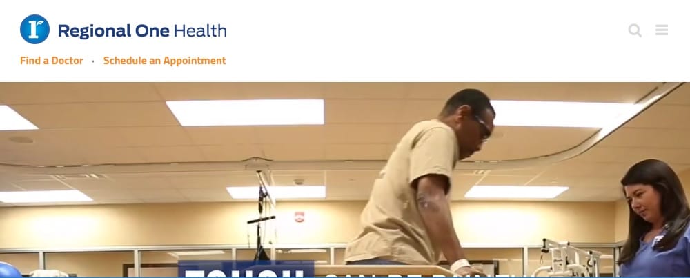
1. Regional One Health:
Regional one health website has featured everything on their site. The color theme of the website is blue and white. Many medical websites have this color theme. What makes them different is they have featured video in the header section. They have shown how they work and about the services. The site navigation is clear. All the call-to-actions like find a doctor, schedule an appointment are featured at the top of the home page only so that visitors can easily find the necessary information. Moreover, they have put information about their doctors, staff to build trust, and to connect with people. They also have a section of what services they provide. The contact us page is excellent as they offer you a different number for different services. Apart from this, there is also a news section on their homepage where all the recent news about the hospital has been shown. Overall the site feel is good as they have demonstrated all the necessary information regarding the hospital, doctors, staff and also they have a donate now call to action in the footer.
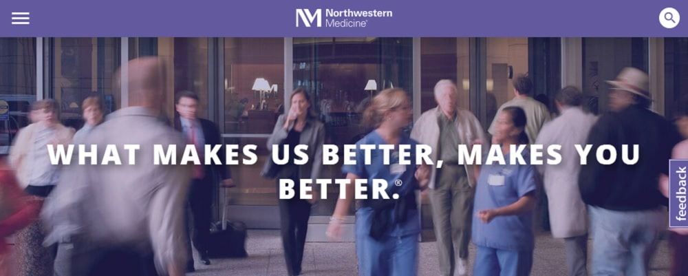
2. NorthWestern Medicine:
Northwestern website design is fantastic. When it comes to giving information, they are very focused and straightforward. Alike, regional one health, they also have call-to-action of find location, request an appointment, and find doctors in the header. This is an essential part of all the medical website as a visitor must be in a hurry so they should see what they are looking for. They have made good use of images. They have also featured the number of doctors and hospitals they have. Their site is linked with other social media handles like Twitter, Instagram. In the footer, they also have a video library and a blog page link. The video library and blog page are very engaging.
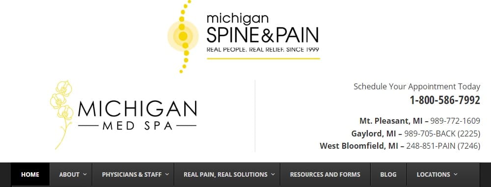
3. Michigan:
Unlike any other medical website, Michigan’s website does not have a typical blue & white and a little bit of green color as its color theme. They have a yellow and black color theme that looks attractive, and that’s what makes them stand out from the crowd. They have a quick contact form in the header so that the visitor can quickly get in touch with them. The site lets you know that they specialize in spine pain. They also have featured the treatments they do, information about the doctors in their other primary web pages. At the top of the website, they have provided contact numbers of their different offices. This also makes it easy for the visitors to contact the offices which are nearby them.
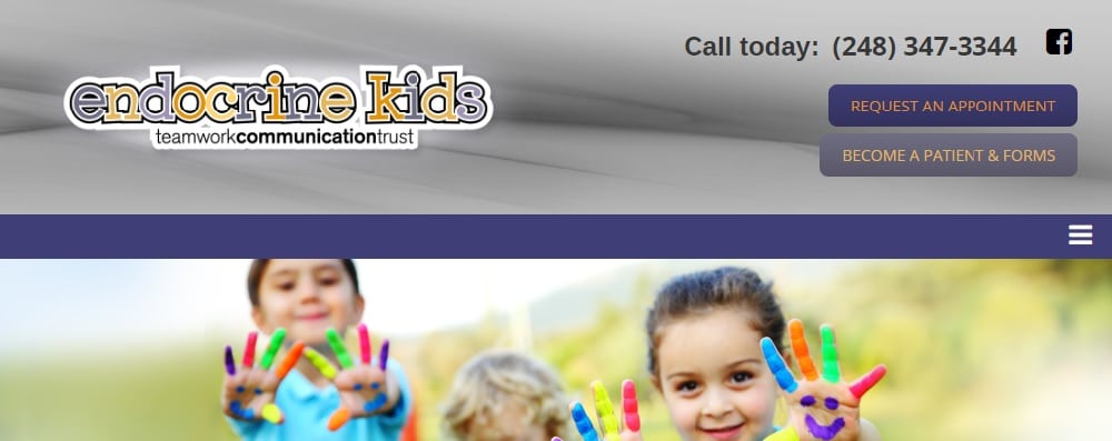
4. Endocrinekids:
Endocrine kids website has a very joyful vibe. The site theme immediately tells you they specialize in children’s healthcare. The fonts style in the logo and on the homepage also has a youthful look. The call-to-actions are appealing. Their primary pages include specialties and services, FAQ. They have given brief information about Dr. Bishop and their staff. They also have a news section in the footer.
5. Avery Arora:
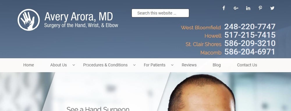
Dr. Arora’s website has a sophisticated theme. They have featured big, bold images through a slide show. The site easily lets you know that they specialize in hand surgery. The site also consists of the appointment request section and consultation request section so that people can easily connect with them. Their primary pages provide detailed information regarding the type of problems and their treatment. They also have a review page that’s a great way to build the trust of the visitor. They have featured details regarding the location and contact numbers of all the clinic of Dr. Arora.
6. Danish:
Dr. Danish’s website has a soothing aesthetic. The color theme is subtle and classy. The good thing is as soon as you open the site you get to see the doctor. They have featured different multi-media elements like slideshow, videos. They have made good use of images. The video gives the necessary information. Their site consists of a lot of before and after pictures. Their website also has a page for testimonials.
7. Children’s Hospital, Colorado:
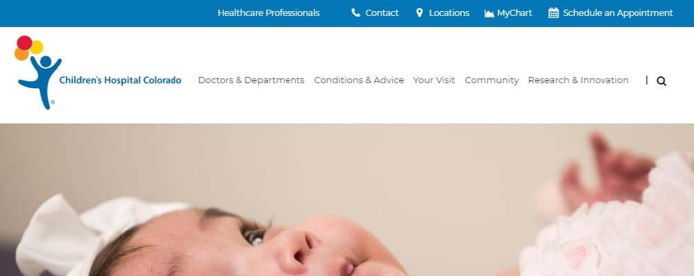
The site looks classy and elegant. It’s mainly for children. The site has many design elements. They have put a lot of information about the hospital, their services about the doctors and their staff. They have featured videos and images to show how they are different from others. They also have a section about trending topics on their homepage. A thing to observe is the right placement of call to action section just below the header.
8. Brighton Pedia Centre:
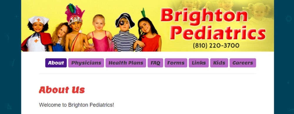
The Brighton pedia center’s website is very colorful. The site theme is exceptionally designed around children as they are health specialists of children, infants, and adolescents. They have used very bright and attractive images. They have mentioned details about their services, office hours, after hours. Their primary pages include more information about the physicians, health plans, FAQs.
9. Image By Design Plastic Surgery:
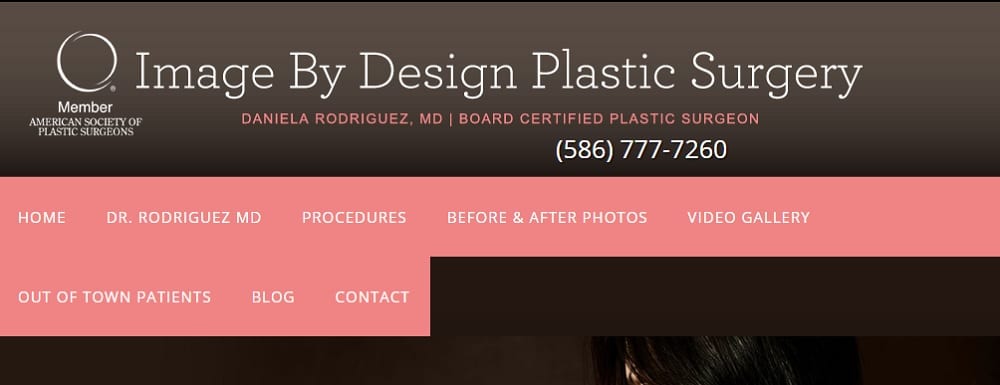
Image by design’s website is unique because of the color scheme. This website theme does not look like a typical medical website. The website feel is intense and bold. They have given information about the doctors and the staff. The before & after page consists of a lot of images. The site also has a video gallery pages. They have also mentioned their awards and achievements until now. And one can quickly get to know what their mission is. They also have a blog section on their site. They have also placed the map location of their office in the footer.
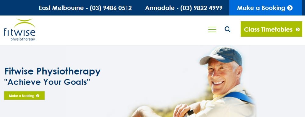
10. Fitwise Physiotherapy:
Fitwise website has an elegant and refined look. Their site has featured big images. In the header, through the slideshow, they have shown the photos, and alluring call-to-action is there. They have attached other pages of men’s health, women’s health, and exercise. The color theme is also enjoyable. In the footer section, they have a call-to-action of sign-up to connect with their visitors. In the footer, they have mentioned the location of their different offices. They also have their blog page, reference resources page, and many other pages.
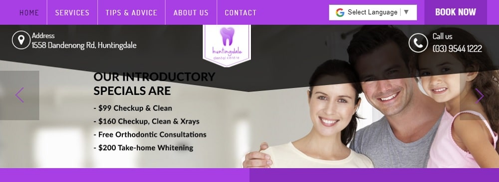
11. Huntingdale Dental Clinic:
Huntingdale’s dental clinic’s website has a very colorful website design. The graphics are enhancing the look of the site. On their website, they have used many multi-media elements such as slideshow, images, fonts, design. The pictures let you know that they have a dental clinic. On their homepage, they have given information about their opening hours, their location, and also have a quick contact form. So that people can easily connect with them. They have made good use of images. The color theme is also very gorgeous. Their about page is attractive and gives more information about their dentists and also has appealing call-to-action on the top right side of the site.
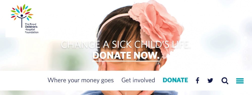
12. The Royal Children Hospital:
The Royal Children hospital’s website is impressive. The way they have given the information about the hospital, about the patient is very creative. The site looks excellent, and the graphics are commendable. The images are beautiful and attractive. The site is very engaging. They have given all the information by using multi-media elements like a slideshow. The photos are enhancing website look. They also featured their supporters in the form of slideshows. In the footer, they have linked their other social media accounts to get in touch with their visitors and also have a sign-up call-to-action. They also have mentioned contact details and the location of their offices. Overall, the site does not look like a typical medical website; unlike other sites, it is different and unique.
13. WeightMedics:
Weightmedics website has a clean look. The site also has a pop-up box for special offers to attract visitors. They have given information about their team and doctors. In the header, they have featured the results and reviews. The review section is also shown through images. The use of images is done correctly. They also attached their other social media accounts on their site so they can connect with their visitors on other social media platforms. The call-to-action is placed on the top right side of the site and sign up is there in the footer. The images enhance the site look. The video is also put to show how they help their patients to get back in shape.
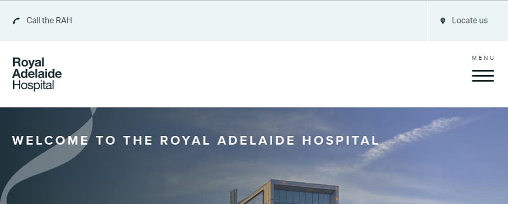
14. Royal Adelaide Hospital:
Royal Adelaide hospital website design is unique. The way they have given information is very different. The call-to-actions are used correctly. The color theme is unique and attractive. The news section on the homepage is an added feature. The images used in the site are big and bold. They also provide a virtual tour of their hospital. They have mentioned the contact details and their locations.
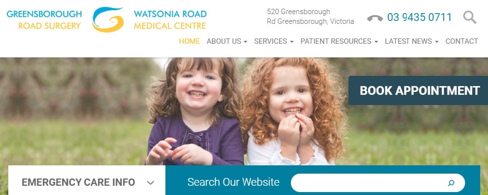
15. GreensBorough Road Surgery:
GreensBorough’s website has so many things on their site still it doesn’t look cluttered. The theme is simple yet classy. The fonts and color themes are complementing each other. They have featured images through multi-media slideshow. All the details, like opening hours, about the doctors and news, are featured on the homepage. The Book Appointment call-to-action is placed all over the site so that people can take action immediately. They have given information about the medical services, about hospital history on their home page. The footer consists of a sign-up option.
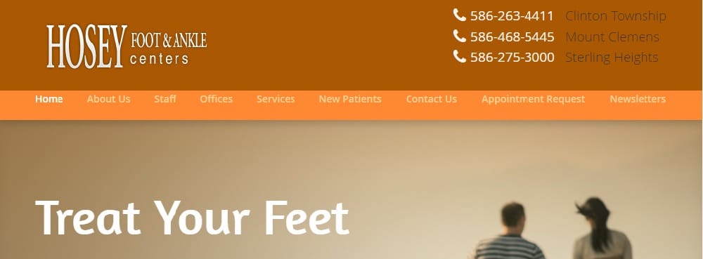
16. HOSEY Foot & Ankle:
HOSEY’s website has a different color theme of orange and white that generally medical websites don’t have. The theme is simple yet classy. The graphics are enhancing the look of the site. They have featured different design elements like multi-media slideshow and videos to give more information. They have mentioned links of other pages of the site that consist of details of the services they provide. The contact details are mentioned on the top right side of the website. The call-to-actions are also inviting.
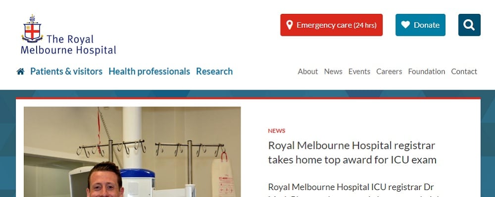
17. The Royal Melbourne:
The Royal Melbourne Hospital site looks like a typical medical website that has a blue and white color theme. But what makes them different is that they have an update section on their homepage and details about their services and doctors. A section about their news and upcoming events. They have welcoming call-to-actions like Donate and Emergency Number on the top right side of the page. So that people can immediately take action. In the footer, they have attached their other social media accounts and location of their different offices.
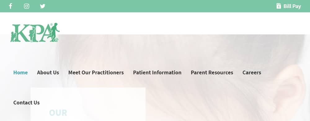
18. Knoxpediatrics:
Knoxpediatrics have designed nicely as the site theme and images are of children. The color theme is green and white and is complementing the fonts. The about us page has detail information about their hospital, about their mission and facebook feed link is also attached to about us page. Overall the site does not have a typical medial website design.
19. Mercy Health:
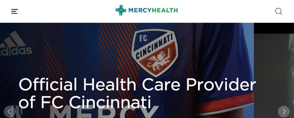
Mercy health website design is very interesting. The site has a stunning theme, and they have used very bright colors to attract visitors. At the top of the site, they have featured a video to show how they work. They have also placed many call-to-actions. On their homepage, they have a section for news and events. They have given information about their mission. Stories section is also there. Overall, the site is unique, and eye-catchy one can easily take inspiration from their site design.
20. Entallergy:
The site theme is simple and refined. The call-to-actions are placed on the top of the site so that the visitor can quickly take action. They have smartly displayed an image describing health issues and set a call-to-action button right there to attract people. You can find all the activities once you scroll on the homepage. They have even explained one of their procedure with images, which is very interesting.
While designing a medical website keep in mind to place your call-to-action button where visitors can easily access it. Also, understand that visitors might be in a hurry, so don’t add unnecessary elements to confuse them.
Which of these medical website design examples did you like the most, and why?
The post 20 Gorgeous Medical Website Design Examples appeared first on Web Design Blog | Magazine for Designers.
via https://ift.tt/2NhR5uj



No comments:
Post a Comment