Launching a restaurant website is easy. However, it is tough to build an effective and responsive website. For an effective and responsive restaurant site, your site must have a great theme. In today’s era, where everyone searches on the internet about everything, your site’s design must be as good as your restaurant interior because it will convert a site visitor into a customer.
A good restaurant website is mobile-friendly, consists of high-quality photos that have a well-organized menu and online booking call-to-actions. Many websites do not have all these elements on their site.
However, we make it easy for you by providing you a collection of gorgeous restaurant website design examples. So have a look and get inspired by these fantastic restaurant website designs and make your site look visually appealing.
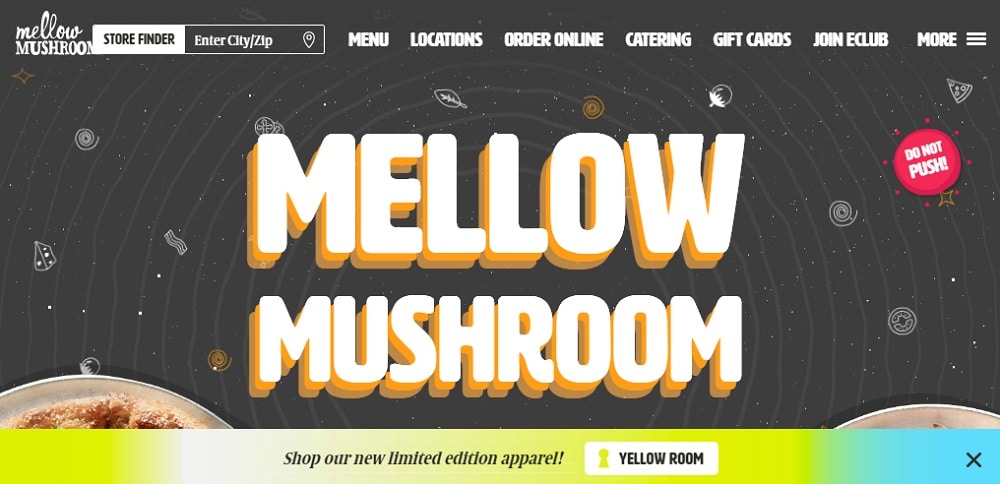
1. Mellow Mushroom:
Mellow mushroom such a fantastic website. Their website design is fun and exciting. The site look is eye-catchy. The fonts and color themes are complementing each other. Moreover, the information regarding the menu, the restaurant is on point. All the call-to-actions are placed correctly, and so one can’t ignore their offers. The graphics give the website a unique look. The site has an informative home page so that the visitor can quickly get the information regarding the website. From graphics to the theme of the site, everything is just perfect. They know the importance of building an email list that’s why at the end of the home page they have featured sign-up call-to-action. The site also consists of other primary pages like the menu, locations, gift cards, and many more.
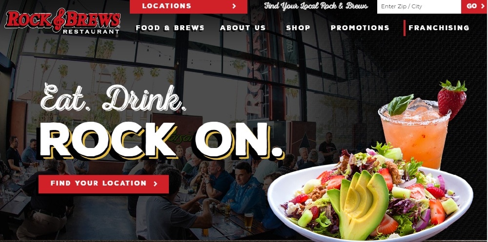
2. Rock & Brews:
Rock & Brews restaurant’s solid theme goes with its name. Their color theme is intense. Their site graphics are commendable. They have featured multi-media elements like videos, images. They have featured high-quality photos. On the upper section of the page, they have the placed call-to-action. The other call-to-actions are alluring too. The content is maintaining the site flow. They have also linked their other social media handles so that people can connect with them on other social media platforms. They have provided enough information regarding their menus and about the restaurant. The site has a great user experience.
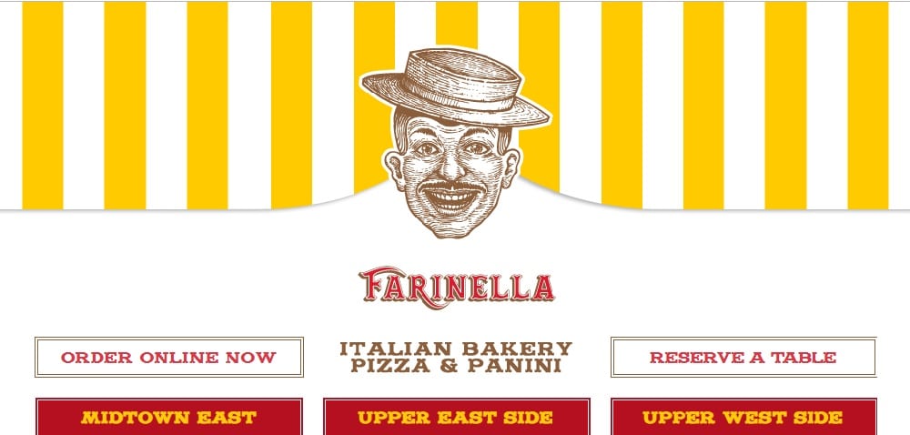
3. Farinella:
Farinella’s bakery website is sophisticated and colorful. As the site design is very has a very suitable color combination of yellow and red. The fonts are bold, and they complement the site theme. They have used the slideshow to showcase their food and their restaurant. They have an informative long home page. The images featured are big and bold. They also have the blog section on their site, which is a great way to create engagement. On the top of the website, they have inviting call-to-action like “order online now” and “Reserve a Table” which can help them to convert their visitors into customers. They have also mentioned their 3 locations on the top of the site so that people can easily find their restaurant. At the end of the home page, they have “subscribe” call to action so that people can join and stay in touch with them.
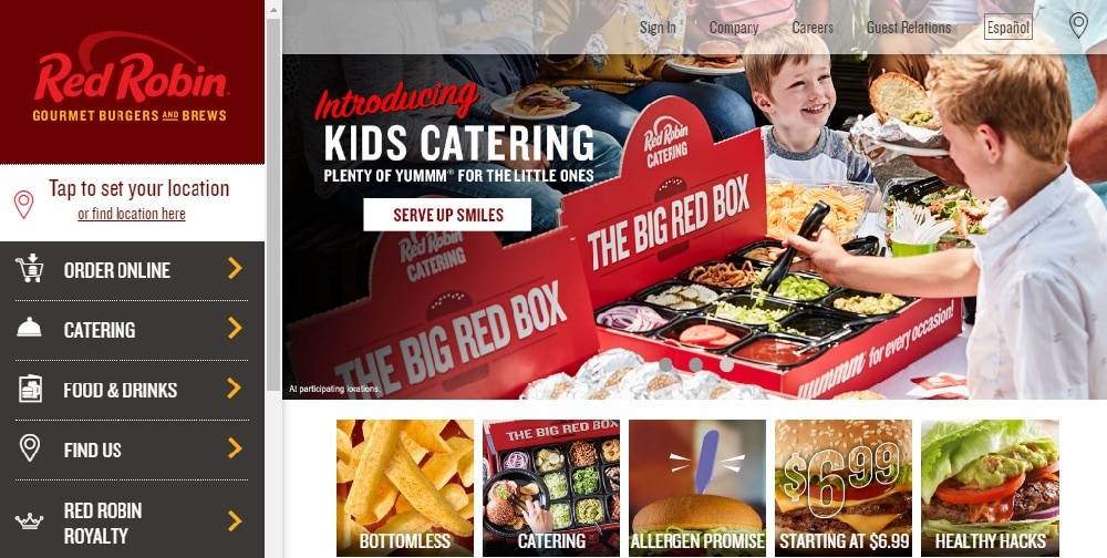
4. Red Robin:
Red robin website does many things in the right manner. They have featured many things on their website. Their side menu gives website different looks. Moreover, they have featured multi-media slideshow, big & bold images, and videos. The site color theme is visually appealing. The site theme and color combination goes with the restaurant’s name. The site has other primary pages like finding us, gift cards, sign up page, and more. The call-to-actions are appealing.
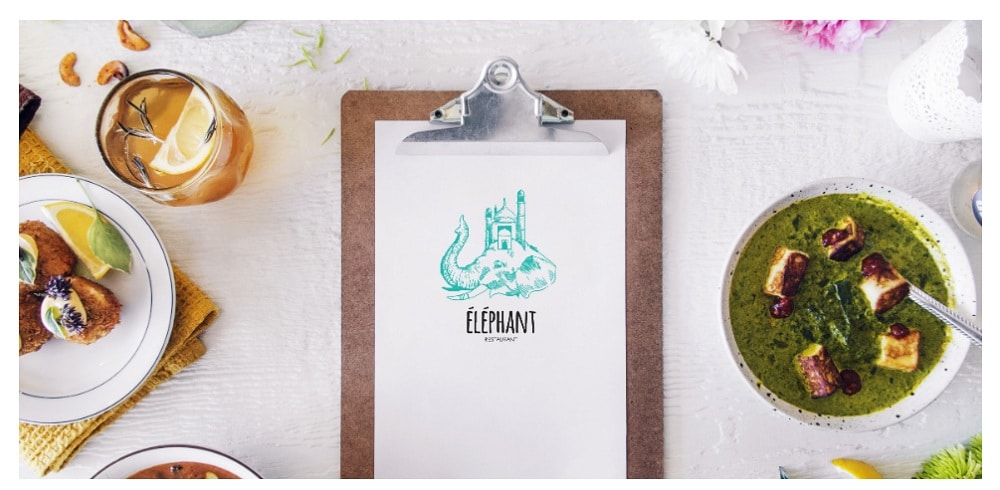
5. Elephant:
Elephant website has a very subtle look. The website theme is straightforward and elegant. The graphic enhances the look of the site. They have featured attractive images of the food through multi-media slideshow. It gives delightful vibes. The color combination is also complementing the fonts and theme of the site. All the necessary information is featured on the home page so that the visitor can easily get the essential details on the menu and the restaurant. They have also mentioned the hours of operation and location at the end of the home page so that people can easily find them and contact them.
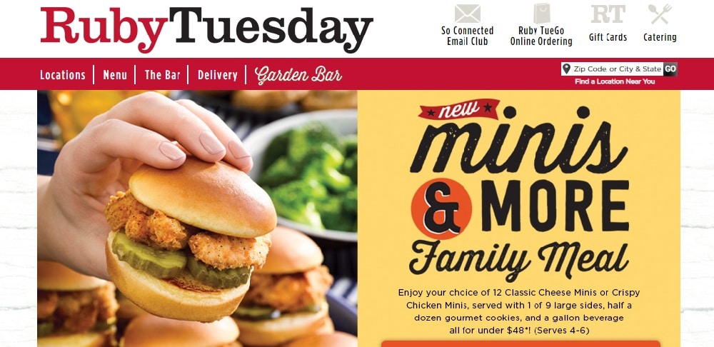
6. Ruby Tuesday:
Ruby Tuesday has featured many things on their website. The images are so big and bold, and they have done customized coding on their site. The best example of featuring so many elements that it does not look cluttered. They have featured multi-media slideshows and have informed about their offers and delivery services and many more. The call-to-actions are also inviting. They also ask you to sign up. There are other web pages like the menu, the bar, delivery, which will give you more information about their food and services. Overall the site theme is sophisticated.
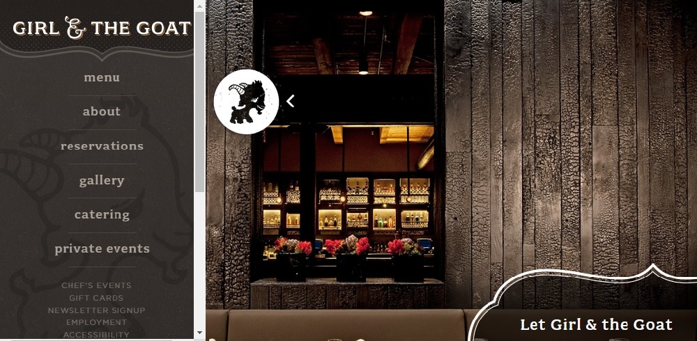
7. Girl and the Goat:
Girl and the Goat website is just wow. The site theme is of their restaurant interior, which will make you want to go there. The site has a side menu in which there are other primary web pages like a menu, about, catering, reservations. So if your restaurant also does the events and catering service, then you can get inspired from this site design. They have also mentioned the hours of opening and the location so that potential customers can easily find you.
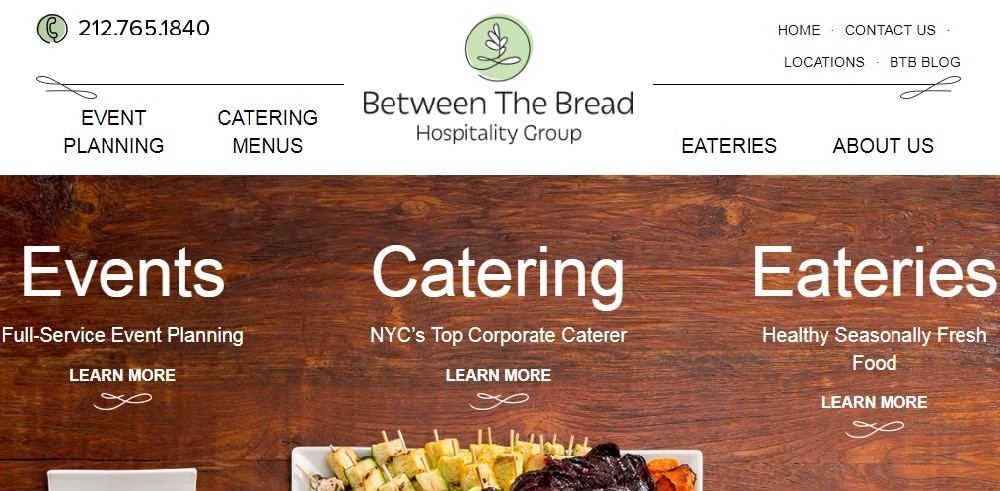
8. Between The Bread:
Between the Bread, website design is unique and elegant. The images featured on the site are beautiful and attractive. The fonts and color themes are complementing each other. The content is maintaining the flow of the site. Their site also consists of a blog section to create engagement. They have also shared their story on the home page itself so that the visitor can get information about the restaurant and menu. The site has a great user experience. They have also shown the address of their restaurants which are located in different areas so that people can easily find their restaurant. They also have a sign-up option on their site to build the community.
9. Pho:
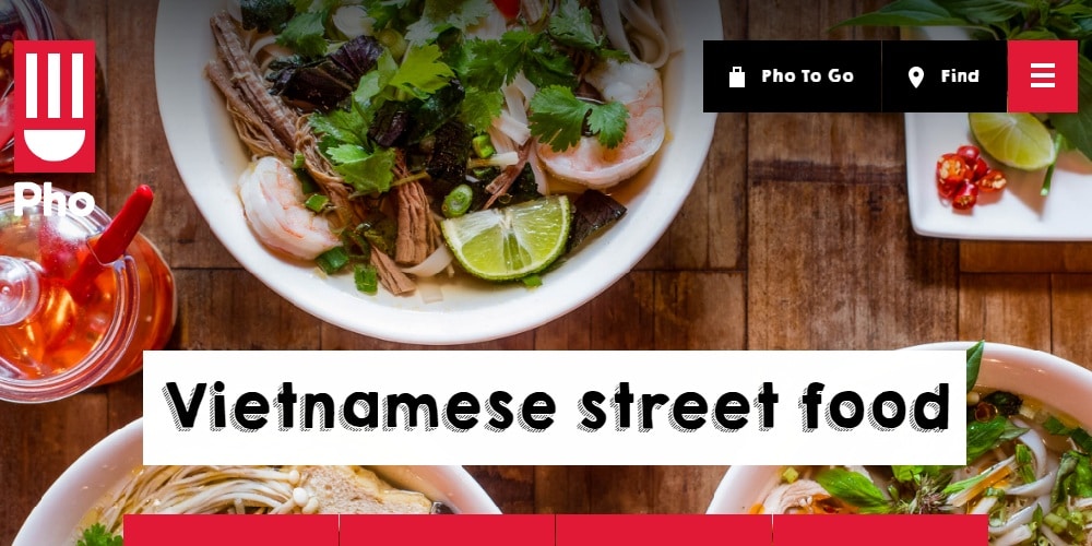
Pho cafe’s website has an attractive full-width background image on their site. The website look is excellent. They have given all the necessary information on their homepage itself. The call-to-actions are placed correctly. They have used big and bold fonts which are complementing the site’s theme. The color theme of the site is very appealing. They have given information about their unique dishes. They have also linked their other social media accounts. They have featured an email form at the end of the home page for news and offers. Through this, they can keep their customers updated and can connect with them.
10. Olive Garden:
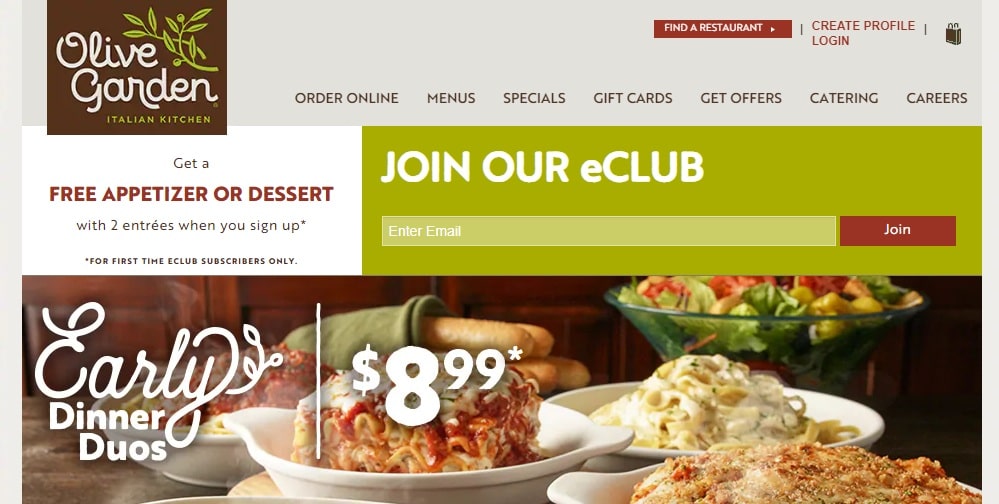
Olive garden’s website has a very classy theme. The website feel is delightful. The navigation is also evident. They have featured multi-media videos and attractive images. The images are lovely and eye-catchy. You can almost taste the food through these high-quality images. They even have their app, which is a great way to give information about their restaurant’s location and services. To attract visitors, they have put the offers on the top of the page, and the offers are being shown through slideshows. The call-to-actions are also engaging. Overall, the site is beneficial as it has all the essential elements in it to attract visitors.
11. Mingus:
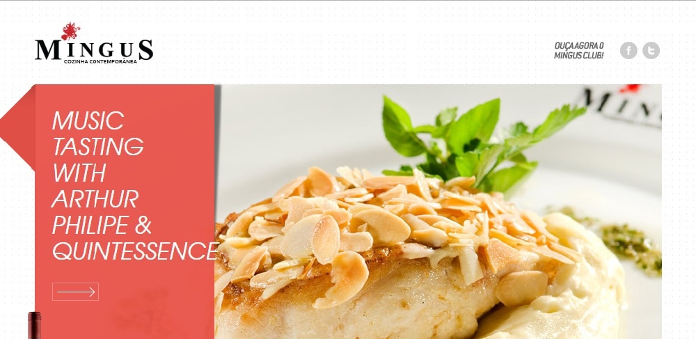
Mingus website design is simple yet bold. The site graphics are amazing. The way they have given information regarding the menu, and the restaurant is different from any other restaurant website. They have featured multi-media slideshow, videos and bold images of the food and drinks they serve. They know the importance of high-quality food images. They have featured an email form at the end of the home page.
12. Charlie Browns:
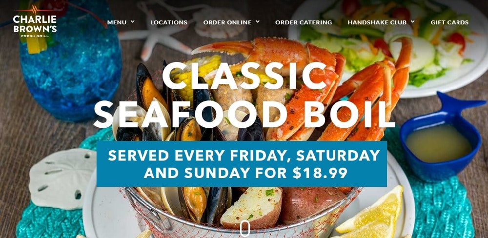
Charlie brown’s restaurant website has a beautiful full-screen background desktop image. The graphics are stunning. They have a vibrant design that complements the values of the business. The use of images is done correctly. On the home page itself, they have given information about the restaurant. The menu list fonts and designs are elegant and classy. In the footer, they have put their location so that people can easily find them.
13. Col’ Cacchio:
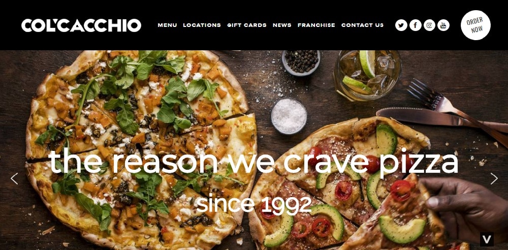
The bold and beautiful, Col’cacchio’s website will make any visitor want a slice of pizza as the images used on the site are amazing. They can make you feel hungry because of their beautiful images of pizzas. They have shown these images through slide show in the header section. The graphics are good. The call-to-actions are inviting that they have placed in the header section so that visitors can be easily converted into customers. The offers are also shown at the top to attract visitors. The fonts are big and bold.
14. Gramercy Tavern:
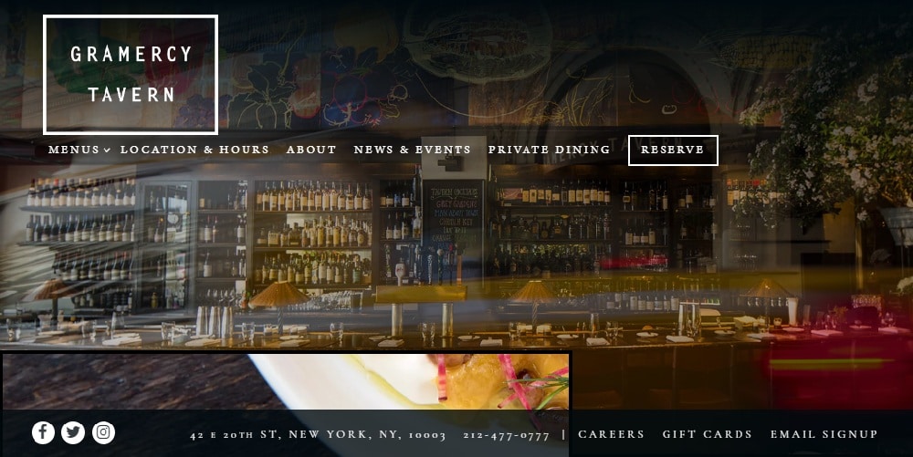
Gramercy tavern’s website has classic design elements. The images are large and tempting. The call-to-actions are placed on the top of the website. They have featured images through the slideshow. The user-experience is good. The navigation bar is well-built to display every essential element. The site is mobile-responsive, which is great for widening the reach of the website.
15. Burgerij:
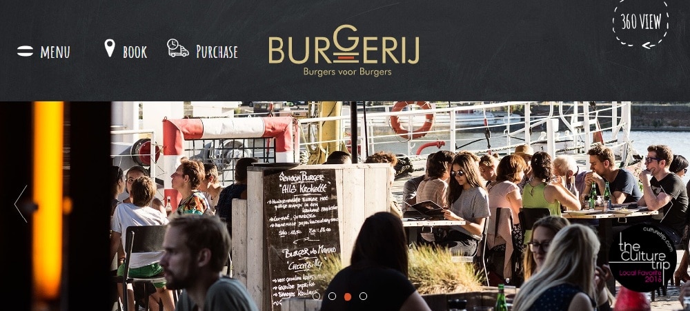
Buregerij website has many things on its site from images to slideshow and blogs. The site has terrific design elements. They have given much information about their restaurant and the food they serve. The use of images is done correctly. The site has a lot of happy photos, which makes the site look engaging. The graphics on the are created well.
16. Napoli Centrale:
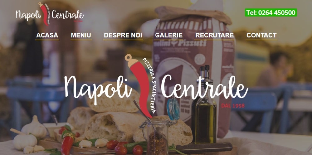
Napoli central has a well-organized website. The header is featured with a full-screen background desktop image. The site graphics are excellent. The images on the site are attractive and of high quality. They have used images to attract people to look at the menu and order. All the other relevant pages are there on the site. Overall, the site look is fantastic.
17. The Kitchen:
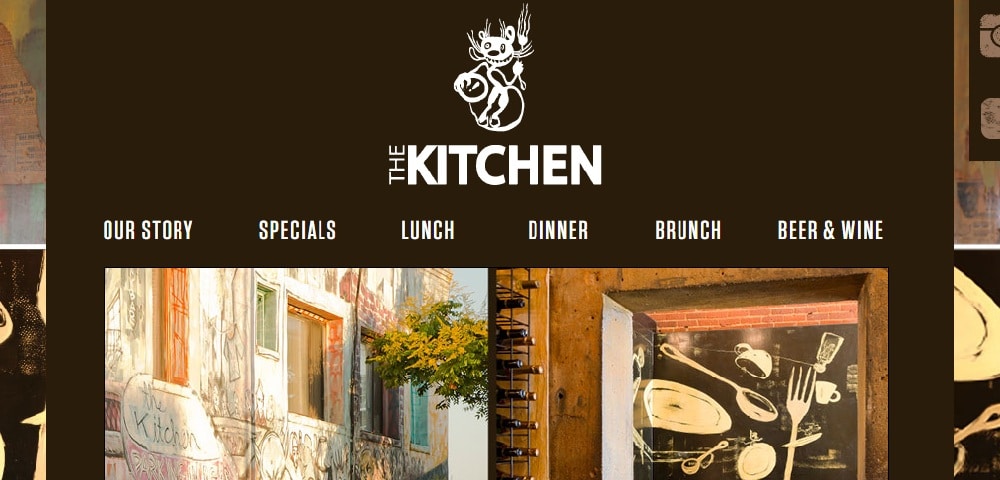
Gorgeous, bold, and simple, the kitchen’s website has a lot of gorgeous images. The site gives rustic vibes. They have a good sense of photography and surely knows the importance of good quality of images. The site is all about the images. The color theme is solid. Together the images and themes are complementing each other. Along with the food images, you also get to see the glimpse of the interior of the restaurant as well.
18. Le-Bernardin:
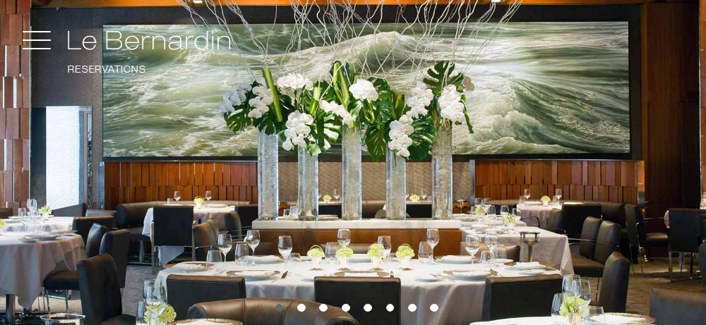
Le-Bernardin’s website looks very attractive. The images they have shown of their interior and food are gorgeous. It’s like when your hotel or restaurant has a fantastic interior then all you have to do is show off the images of your interior on your site to attract visitors. They have featured their pictures through a slideshow. They have also given information about the restaurant and also highlighted their team, staff, and chefs, which helps them stand apart from any other restaurant site.
19. Blue Moon:
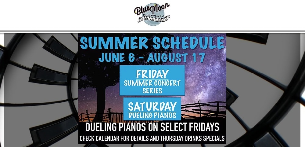
Blue moon’s site theme is impressive, and it goes with the name of the site. The color theme is also set according to the site name. They have featured information regarding the upcoming events happening at their restaurant. The call-to-actions are fascinating. They have given the necessary information about each event and concerts. Moreover, the offers are also placed in the header section to attract visitors. The good thing is that they have mentioned hours of operation and the location of their restaurant in the footer. All these elements make the site useful.
20. Victor:
The site has big and bold images that are shown through multi-media slideshow. You can see a glimpse of the interior and food they serve. Its simple one-page responsive site consists of other primary web pages for more information about the menu and restaurant. The overall site theme is subtle.
21. Lee:
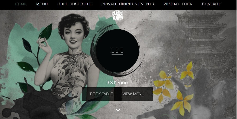
Lee’s website has a very classic layout. The site has a retro feel and is a simple one-page restaurant website design. The call-to-actions are interesting. For more information, the site has other primary pages like private dining & events, menu, contact, and more. They have given a unique feature of the virtual tour on their website that allows visitors to get a better picture of the restaurant.
22. Print:
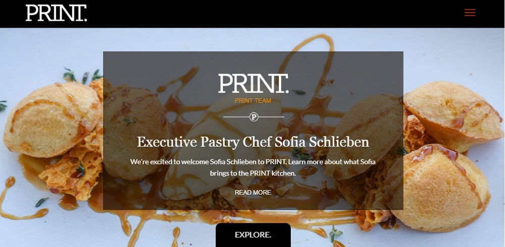
Print’s site has a unique design. The graphics are commendable. The images are bold and beautiful. You can also have a view of their restaurant interior. The scroll function is different as compared to other restaurant sites. The call-to-actions are inviting. The site theme is very dark and intense. They have given the necessary details at the end of the homepage.
By looking at these examples, you can design your unique restaurant website that is mobile friendly, well-structured, and visually appealing. Most of these sites have placed call-to-action button strategically to attract customers.
Which of these restaurant website design examples is your favorite, and why?
The post 20+ Gorgeous Restaurant Website Design Examples appeared first on Web Design Blog | Magazine for Designers.
via https://ift.tt/2N72kpj

No comments:
Post a Comment