There was a time when more people used to go to church when they heard or thought about God. However, in the present time where everyone is so busy with their lives, many people just opt just to read their prayers in the comfort of their home, at work, or wherever they feel is right. In the current time with the Internet ruling the market with its main benefits being comfort and convenience, it has become essential for churches to build an online present to let people know about their location, mission and even to enable people to donate to the church directly through the website.
If you are in charge of a Church and are looking at building an online presence, or you are a designer and have a client who needs the same, then you need to make sure you cover all the right points on the website. Your very first mission behind having an online presence should be to assemble all the interested people in a single space as well as notify them regarding all the future related events. The second mission should be to spread awareness for the new members who are willing to join, as well as for the tourists and visitors. Here are 20 of the most beautiful church website designs which should fit the above criteria, and we hope they will inspire you to create a beautiful church website design that serves its mission well:
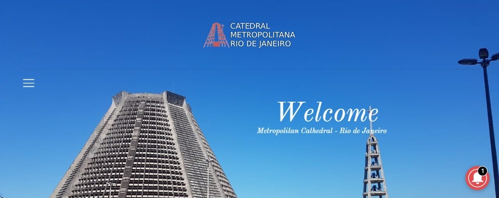
1. Cathedral Metropolitan:
Cathedral Metropolitan, a church based in Rio de Janeiro, has a very significant online presence. The website design is a mixture of modern elementary. It looks subtle due to its color scheme and handpicked widgets. The critical information is segregated in a conventional manner, which makes it easy for visitors to discover their interests. It has a great UX/UI, which makes it a user-friendly website. It is accessible in multiple languages. The site navigation bar has elements like a 360-degree view, calendar, social media details, and more.
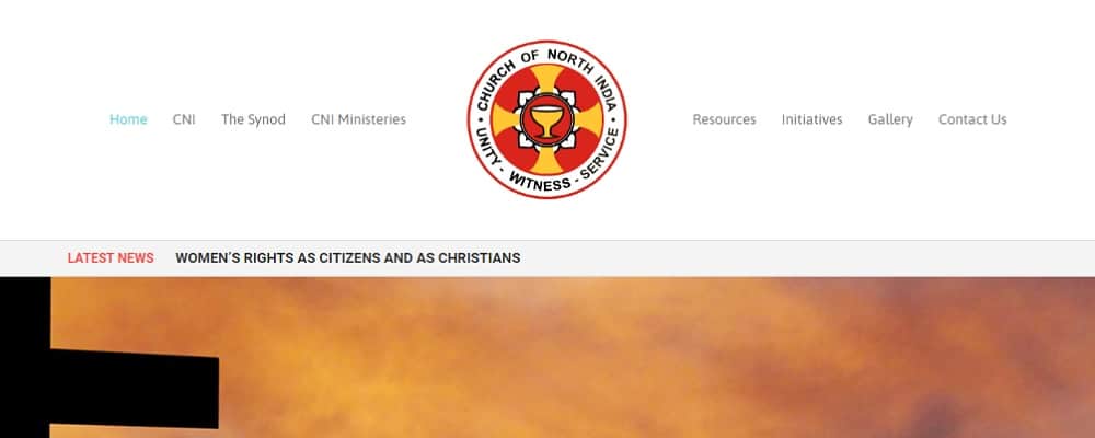
2. Church of North India:
Church of North India is among one of the famous churches in Gujarat, India. It has a very straightforward design theme. The user-interface has been selected very intelligently to dismiss the primary difficulties like navigation and menu bars. The logo is visible at the top as the visitor enters the website. The typography used in the site complements the overall design. One of the best features of this website is the ‘Latest News’ bar flashing right on the top, which helps the visitors to keep a check on the current happenings.
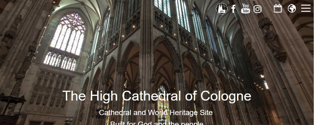
3. Cologne Cathedral:
The template selected for Cologne Cathedral’s website is simple but elegant, as it just has an image in the background to compliment and social media bars in the footer. The colors are soft and soothing to the eyes, which make it a little eye-friendly too, to the visitors. The entire information related to the church can be accessed from the top-right menu bar in the header as well as several sections in the footer. It shows a 360-degree view of the entire church just with a click. It also has a search button on the top right, which allows the visitors to navigate to any section of their choice effortlessly. It can be accessed in multiple languages; making it easy for the tourists.
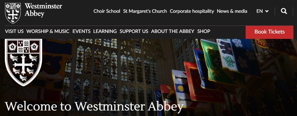
4. Westminster Abbey:
The entire website has a combination of different shades of blue and maroon, which makes it attractive. It has a search bar on the top, which helps the visitors to collect their required information. There is an option to purchase tickets on the top right (below the search and language bar), making it easy and time-saving for the tourists. The main feature of this website is the ‘Today’s Service’ feature. It showcases the entire schedule of the day on the top. The members and visitors do not have to dive in deep, to search for the daily information, thus saving time again.
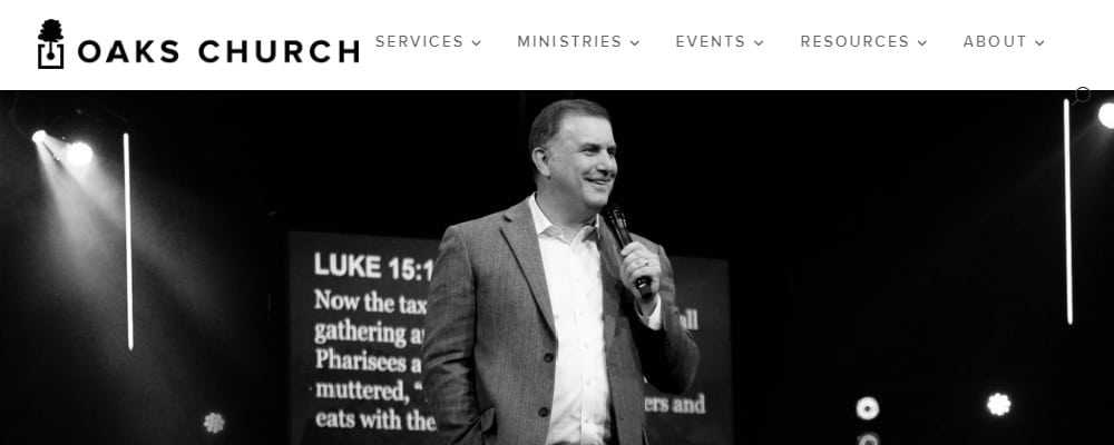
5. Oaks Church:
Oaks church has a simple one – page website with a monochrome theme. The entire color scheme is used on the base of Grayscale, and it’s largely black and white. It has large image blocks on the homepage, which shows the title of all the offered services. The inspiring monochromic image of an elderly motivational speaker serves as an inspiration to the visitors. The header and footer columns are segregated in a very systematic manner, which makes it easy for the user to navigate and hop on to the required information.
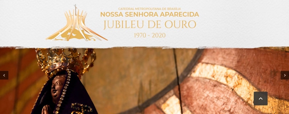
6. Cathedral of Brazilia:
The color theme of the website is pastel pink, that makes it look soothing and peaceful. It has a clean and elegant look, which makes it look a little more sophisticated compared to other website designs. The header image of the website displays the message of peace. The right selection of typography is an ‘Add-on’ here. Another important feature being that the site can be accessed in multiple languages. The navigation bar is unusually placed on the left of the homepage giving the website a unique look.
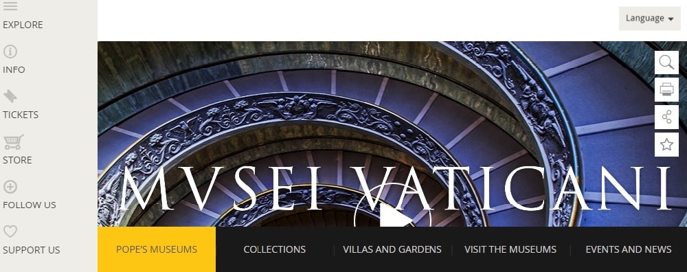
7. The Sistine Chapel:
The Sistine Chapel has a short one-page website which has a limited number of options for the visitors. The designer has tactfully tried to make use of every corner. It starts with a brief video and photo gallery in the middle of the page, letting the visitors access their required information without wasting much time. It has an excellent feature ‘Print’ right below the search button on the left-hand side of the website, which allows the users to print the mentioned details in a single page. This is the first website where there is a ‘share’ option. The users can also use the ‘Star’ icon to bookmark their ‘Favourites’ on the site.
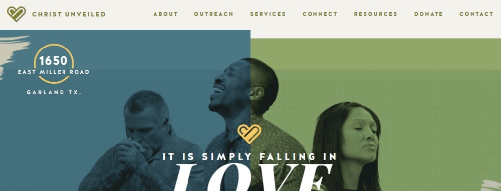
8. Christ Unveiled Church:
Christ Unveiled church website has a picture of the devotees depicting their trust and belief in god. The color scheme and typography compliments each other well. It has three direct call-to-action buttons, which shows their purpose, mission, and process very clearly. It also has a separate section for a schedule that shows clear communication about the timings and program, from their end. It has well-designed call-to-action buttons placed strategically to get visitor’s attention.
9. Borgund Stave Church:
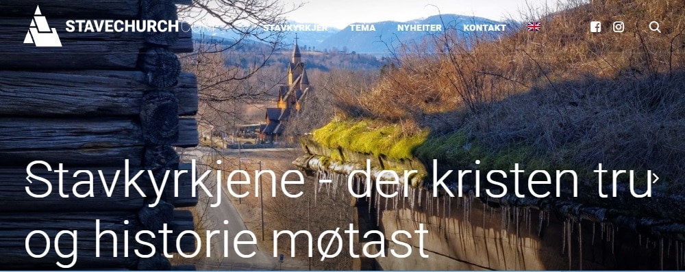
Borgund Stave Church’s website has very responsive and user-friendly UX and UI. It is a small one-page website which is full of high-quality images. The social media menus are also shown as separate blocks instead of icons, which makes it more appealing for the users to click and find out more about on-going activities. The navigation bar allows you to contact them, know their focus, and stay updated with the latest news. They have an informative homepage describing how they started the church and known insights about it.
10. Anthem Church:
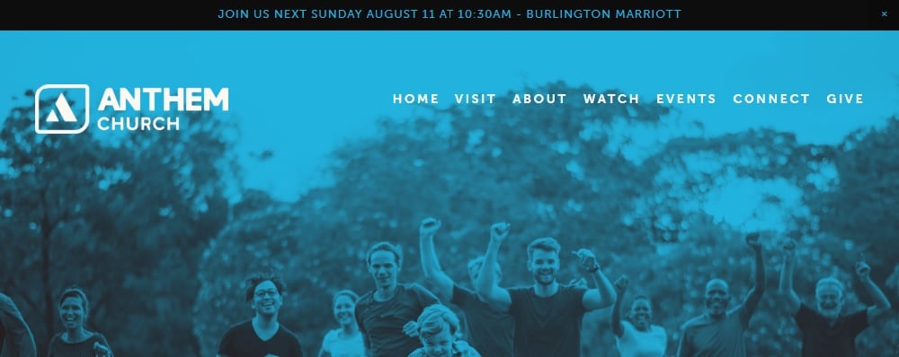
The tagline of the website is very engaging. The background provides support to the movement that they are promoting. The very first bar ‘Plan your visit’ takes the user to the necessary information. However, most relevant information like location and timings are given on the top of the webpage. It has an add-on feature that shows a live map along with parking details. It is designed considering the first time visitors. They have also displayed original photography on their website to make the site look familiar to the visitors.
11. Next Level Church:
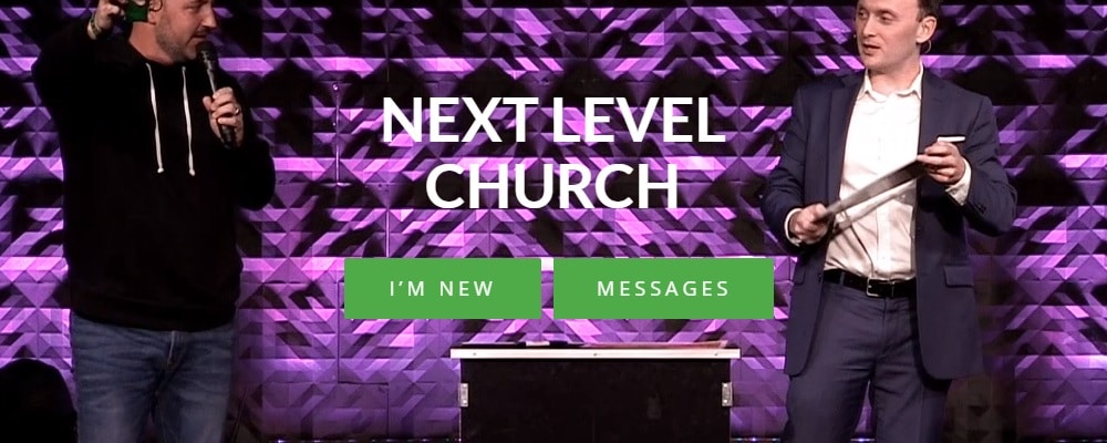
The website looks like it is exclusively designed for newcomers. It has a prominent call-to-action ‘I’m new’ stating the next step for the new users. It has a background video showing the activities and experiences of the church. This is one such church, which is established at multiple locations. Therefore, it is necessary to provide the exact information regarding the locations and event timings to the users. It has a contact form as well as a search icon for helping the visitors about the places. There are options for contacting them on various social media.
12. Calvary Church:
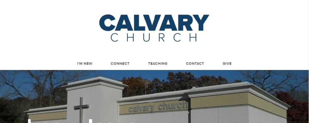
Calvary Church is a straightforward and user-friendly website. It is quite to the point in its communication. The purpose and mission are defined very clearly through the tagline. The sections are smartly segregated with the headline ‘Something for everyone.’ The location and timings are mentioned correctly in the footer of the page, which makes it very easy for the user to navigate. The navigate bar has sections such as teaching, connect, and more.
13. Church of the Holy Sepulchre:
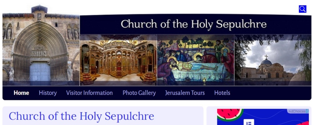
The website starts with a photo gallery followed by a navigation bar. It has a ‘Search’ button right on the top of the website, which helps the user to dive into any needed information. The entire home page is covered by the information and history of the church, which answers the curiosity of the new users. It has a good loading speed compared to other websites. However, the site doesn’t have call-to-action on the homepage.
14. White’s Chapel:
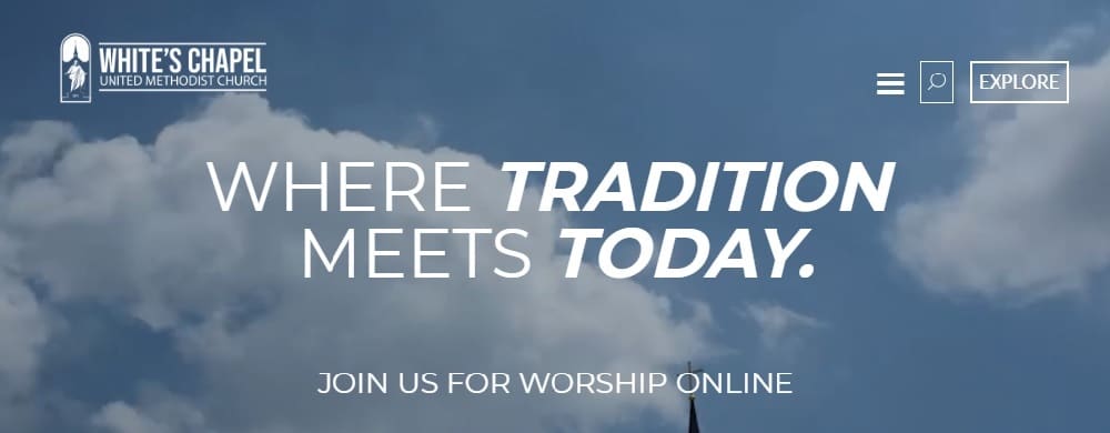
The website is all white and simple. It has a running timeline showing the information about the next prayer. It is the first website that has an online prayer facility. Along, with the search bar and menu bar on the top right, it also has a very well defined footer that shows contact details and church working hours very precisely.
15. Kampin Kappeli:
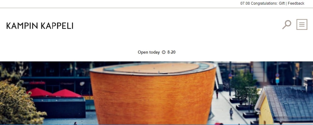
Kampin Kappeli website has a similar structure like the previous one but with a better layout and color scheme. It is a short page website with a clear purpose. They have included video as for the homepage that makes the site visually appealing. The add-on is the name of the place and the time bar on the top of the page. It has a multi-lingual facility for the tourists.
16. Mont St. Michel Abbey:
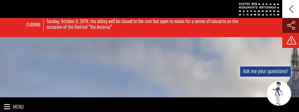
Mont St. Michel Abbey has a website that has a freeze menu in the footer. The social media sections are placed right in the middle of the website, along with the separate icons in the footer. The pro point on the website is the ‘Weather forecast’ tab as well as the ‘Live chat’ option at the end of the website. The site also contains photo galleries of previous events.
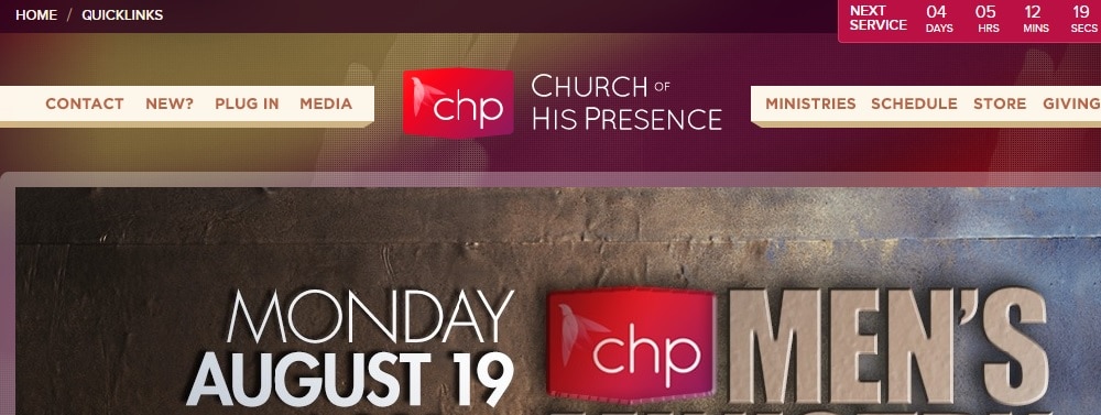
17. Church of His Presence:
Church of His Presence had a different shade of maroon that makes it look attractive. It doesn’t have a separate navigation menu. The entire content is displayed on the home page; making it easy for every user. It has a donation form as well as a subscription form on the same page, highlighting their purpose. The events and timings are presented separately at the end of the website, again making it easy for the user to jot down the essential details.
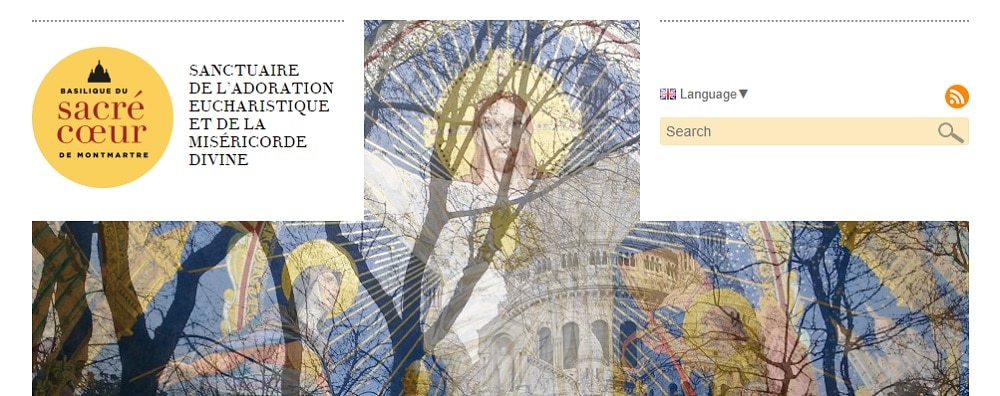
18. The Basilica of the Sacred Heart of Paris:
The website is quite responsive and interactive. The important information is placed at the end of the website in the footer, making space for informative blogs and videos explaining the history. It has a very quirky feature ‘Audio guide’ for the visitors. It is the right way of presentation to the tourists and newcomers. It also has a language menu on the top right of the website, thus helping non-localities to access quickly.
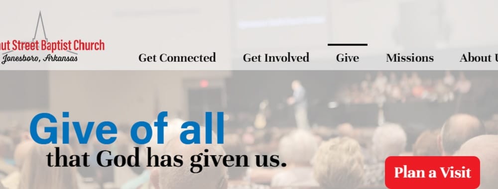
19. Walnut Street Baptist Church:
The website looks beautiful due to the use of vibrant colors. The typography compliments the color scheme very well. It also has a testimonial section in the video form, right in the middle. They have given a list of upcoming events at the end of the welcome page. It has an attractive call-to-action button ‘Plan a visit’ below that allows the users to book and plan their visits.
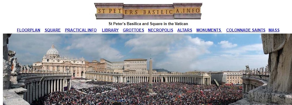
20. Peter’s Basilica 20:
The website layout is average compared to other websites, but what makes it stand among the top 20 list, is its content. The website is entirely concentrated on information and knowledge and not just layout and typography. The intention is to educate the visitors about the church and its related topics. The contact details are given in an effortless way at the end of the website.
The above 20 examples of church website designs show that defining criteria such as design, content, and information are very important for creating an attractive church website. So if you miss even one of these criteria, the user experience of your website will be affected negatively.
Which church website design is your favorite, and why?
The post 20 Wonderful Church Website Designs appeared first on Web Design Blog | Magazine for Designers.
via https://ift.tt/2Yycqq5

No comments:
Post a Comment