Jewelry has its own place in our hearts. It is every woman’s best friend and more. Since ages ago, wearing jewelry is not just a tradition, it is a form of lifestyle. As a jewelry curator, we would love to display our products, which can help us in generating direct sales in return for our hard work and investment. A jewelry website should be artistic, with a simple navigation and display to help the customers purchase without much discomfort.
Underneath are 20 elegant and some of the best jewelry website design examples which you can use for inspiration when designing a jewelry website:
1. Pipabella:
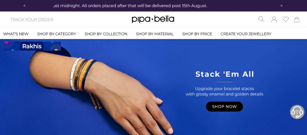
Pipabella is a single page website that attracts the user due to its colorful background designs. It is divided into photo blocks that display the combo jewelry packages. The website is segregated in many categories. The designer has intelligently tried to stuff the entire information into different pages. The six bread crumbs at the top of the page allow the users to navigate as per their needs and interests. It has a search button at the top right of the website, which helps users to search the required item without wasting much time. It also has a shopping cart beside the search button, which allows users to secure checkout at the end of the shopping. The interesting point is the top header where the latest news flash wide to alert the users for upcoming news and offers related to the website. Overall, it is user-friendly and straightforward to navigate.
2. Pandora:
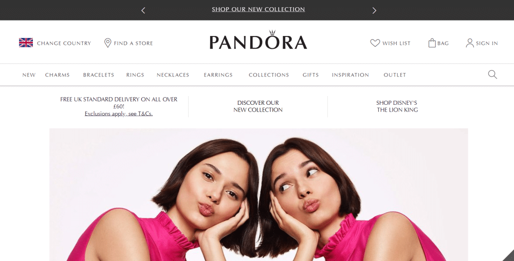
The website has all the features which a jewelry website should have for a good sales experience. It is simple, crisp, and elegant. As we enter the website, we see a happy picture of two girls with bright pink top and jewelry displayed on their hands as well as shoulders. The unique feature of the website is the ‘Find the store’ icon, which helps the customers to locate the offline shop quickly. The website has all the categories displayed at the top in the header as well as footer. The new collection of jewelry is displayed through photo boxes with a ‘Shop now’ button right in the middle of the website, which takes the users straight to the checkout menu.
3. Voylla:
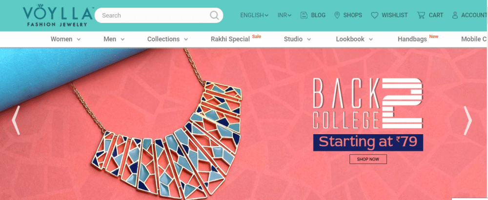
The website is all blue and red, which makes it look colorful and bright along with the subtleness of ocean blue effect. Jewelry images are displayed on the home page with a call to action button with every image. It has a unique feature which shows ‘Deal of the day’ to attract more customers. It has a video at the end which allows the users to check out information and designs of the websites. It has multiple image boxes that display the available jewelry stock on the site. It also has a language option at the top right to help the alien visitors.
4. Bicknells Jewellers:
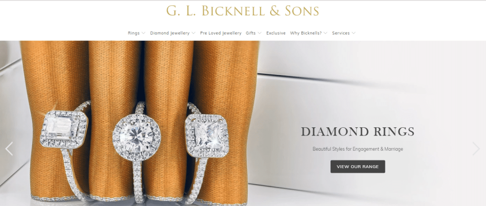
The website looks quite appealing with the use of grey and white theme all over. It has colors that complement the overall design structure. It is a tremendous one-page website, which is the simplest to navigate and explore for the customers. At the end of the footer, it also shows timings for the offline shop along with contact details on the right. The unique feature of the website is the blog section. It shows the blog section clearly, which gives brief about the jewelry industry and its products. It has all the accessories which can brighten up your wedding ceremonies.
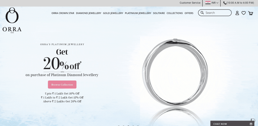
5. ORRA Fine Jewellery:
The website captivates visitors through its pink and lilac shades. The typography of the website is selected as per the color combination, to give a good UX/UI experience to the visitors. It has multiple categories like Gold, Diamond, and Platinum, which is clearly shown in the page title of the website. It is segregated a little differently compared to other websites like for daily wears; evening party wears, engagement and marriage functions, etc. It helps the users to directly land up at the required page and get to the shopping area without wasting much time.
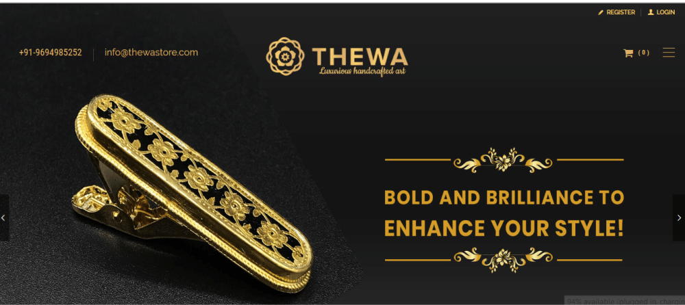
6. The Wa Store:
The website is all shimmery from the color selection stage to the product design stage. The products are elegantly displayed, which attracts the customers in the first go. The menu is right below the login and register button, which helps the customer find their desired items quickly and without much discomfort. The contact number and email ID is displayed right at the top, which allows the customers to contact the store soon. The black and golden color theme is adding to the charm.
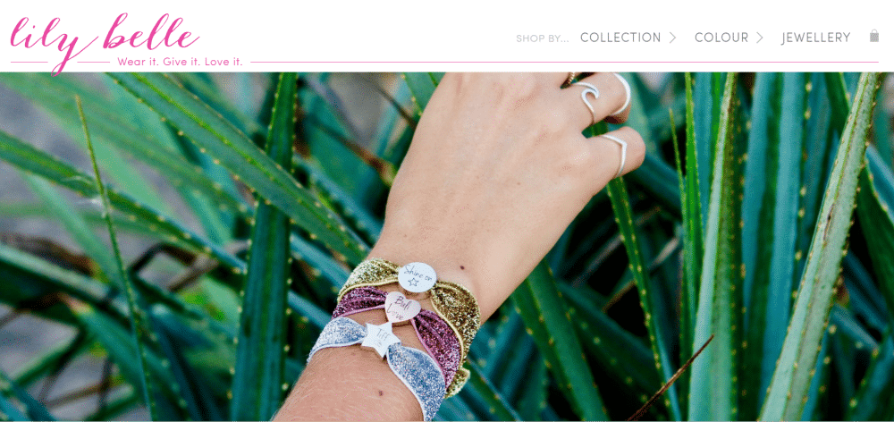
7. Lily Belle:
It is effortless and crisp. The white and pink website theme makes it look more endearing for the girls who love everything pink. The tagline of the website speaks for it in the best way. It is entirely picture based. The product pictures are displayed on the entire homepage, which gives the customers a clear idea regarding the available products. A brief introduction of the website is presented right in the middle of the website, which helps the customers to know the brand in a better way. It also has a subscribe button at the end.
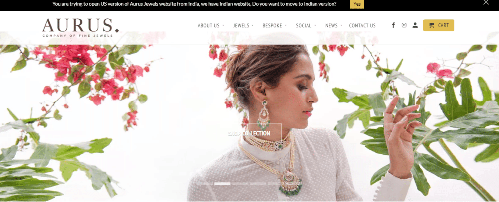
8. Aurus Jewels:
The website is designed with simple pastel colors. It displays elegant Indian jewelry through different story themes. It makes the site unique compared to other websites. It has a ‘Customize with us’ feature, which notifies the customers about their friendly services. It also has a call to action button ‘Shop collection’ right on top picture booth navigation bar. It allows the customers to scroll through the options quickly and direct to the check put options.
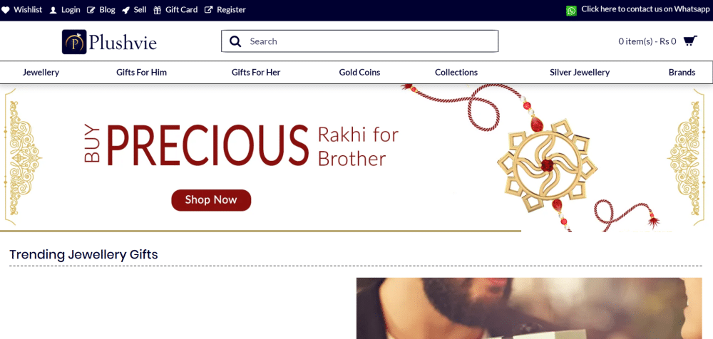
9. Plushvie
Plushvie is a multipurpose website with jewelry being one of their top graded products. The website design cannot be considered too simple due to the color scheme as well as the information chart. The right amount of information is provided on the homepage with the use of picture boxes on every corner. It saves the surfing time of the customers through the search and finely segregated categories option. The latest blogs are displayed at the end of the footer.
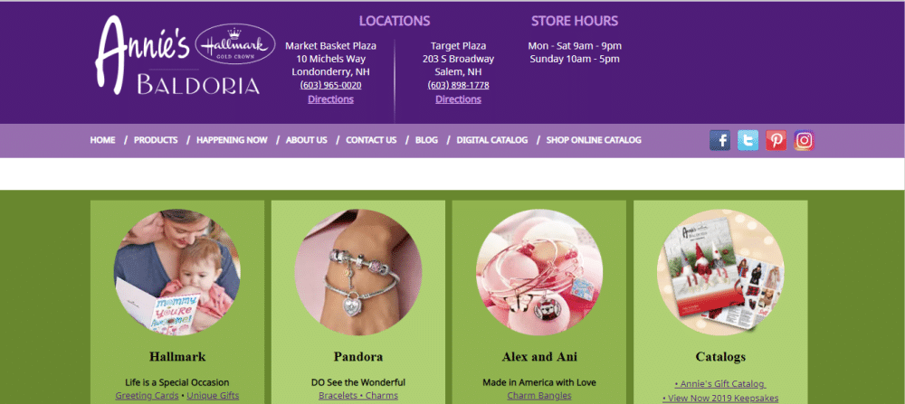
10. Annie’s Baldoria:
This website has multiple products along with jewelry products. The jewelry is displayed right in the middle of the website as soon as the customer enters, showcasing the current availability of a particular product. Store timings are displayed right at the top of the website along with the store locations to help the customers with the necessary required information in real-time, thus serving their purpose of visit.
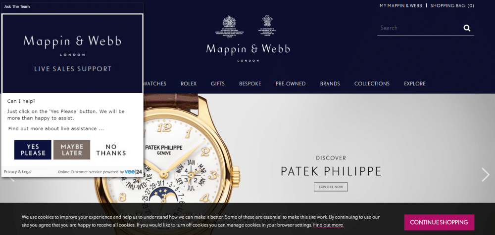
11. Mappin & Webb:
This website is our personal favorite due to its color combination. It has an unusual shimmery pastel violet background which adds the charm to the displayed product. It has a search button right on the top. It also has a call to action ‘Visit all jewelry’ which helps the customers to navigate through the entire jewelry section easily. The header is simple and elegant, while the footer is quite informational.
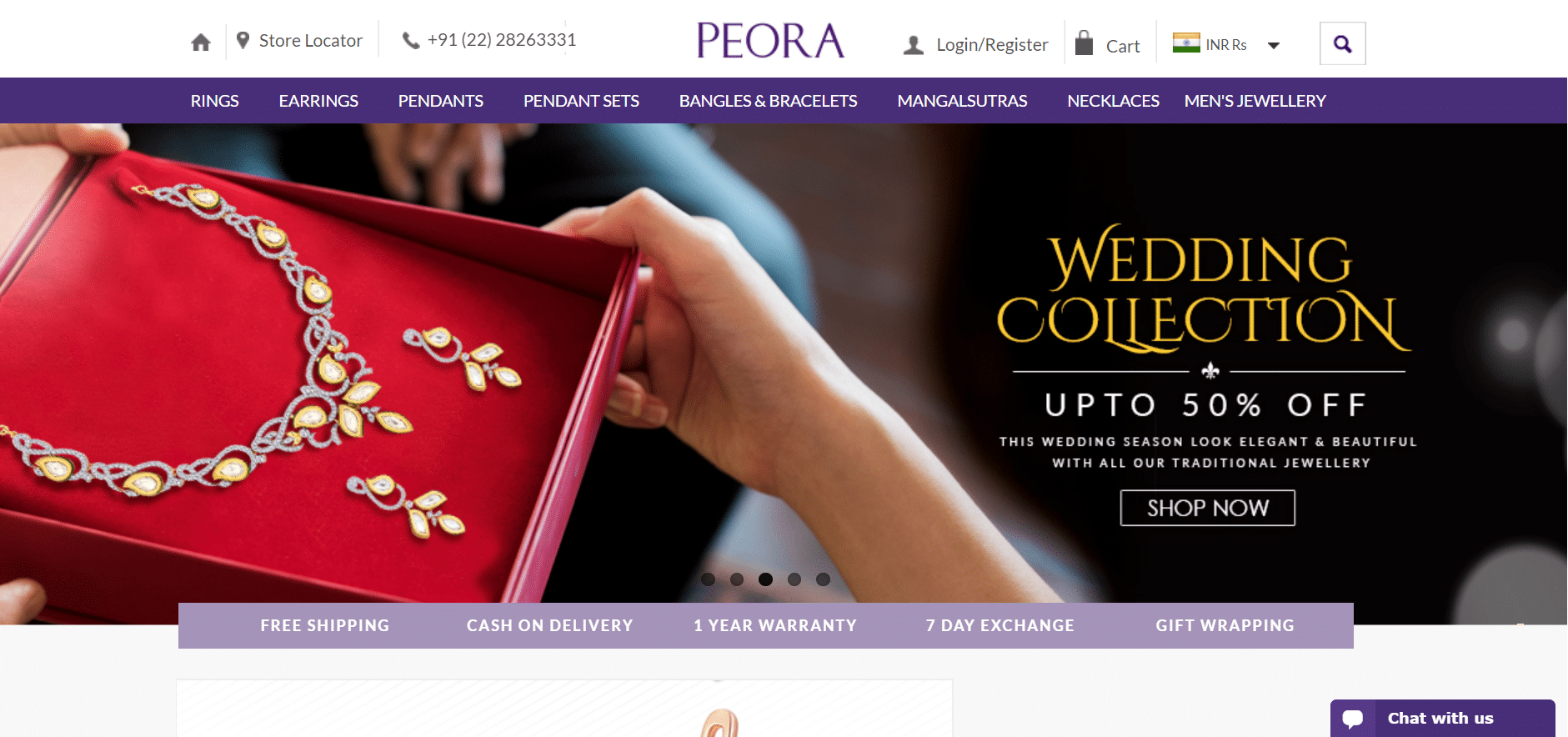
12. Peora:
The website welcomes us with a wide subscribe button for dropping our emails. As we dive in, we can see a festival offers to flash bright, taking us directly to shop without any delays. The categories are displayed through the picture canvas of the collection. It has a unique feature displayed in a tiny slim box that showcases the ‘Testimonial’ section. The website is responsive and easy to load.
13. Alex and Ani:
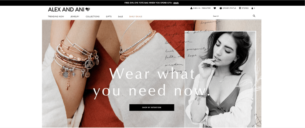
Our eyes directly take us to the daily deals section due to its color display icon in an entirely black and white theme. It has some fantastic jewelry in silver, golden and copper shades. The website is also designed, keeping in mind their jewelry collection. It glues our attention to the jewelry and not the models through their display pictures. The website has a good attention span. It also has typography that matches the overall display theme.
14. Soklich Jewelers:
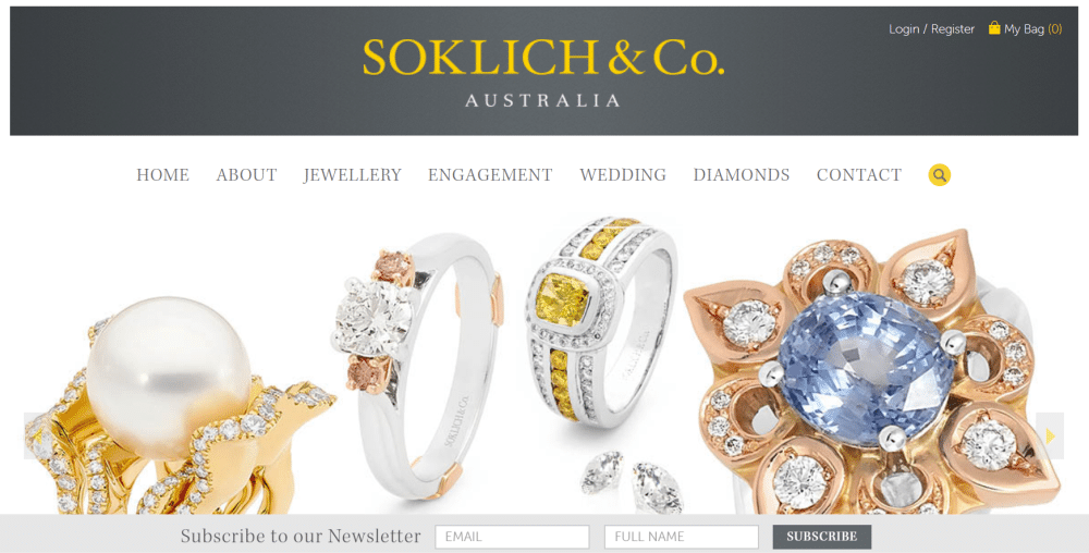
It is a short one-page website that attracts the customers in the very first go. The product display is done very selectively, which triggers the buyer’s mind and declines towards the sale. The ‘Feature jewelry’ section displays different categories of products. It helps the customers to identify a particular jewel through a brief bio at the end. It has a small footer section that displays the address and contact details of the shop.
15. Panaah Jewellery:
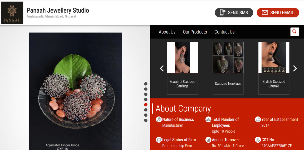
It is a small one-page website that displays the jewelry on the left-hand side corner and brand information on the right. It is short yet informational. The unique feature here is the ‘Get instant quote’ option at the end, which helps the users to know the price of a particular product quickly. It is an excellent way to generate sales. The website is average in terms of display. However, it has all the features needed for jewelry shopping, being most important the loading speed and product display. It helps a lot in decreasing the bounce rate of the website due to the high-quality user experience.
16. Tiffany & Co:
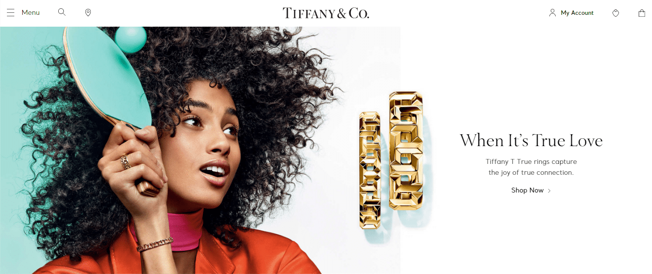
It is one of the most elegant website designs specially designed for jewelry purposes. The first image and quote itself display the use of the brand. The brand caters beautiful diamond rings which are shown correctly through the monochrome background picture of a girl and her fiancée. The typography is selected in such a way that it unveils the overall theme of the website in a charming way.
17. Kitsch:
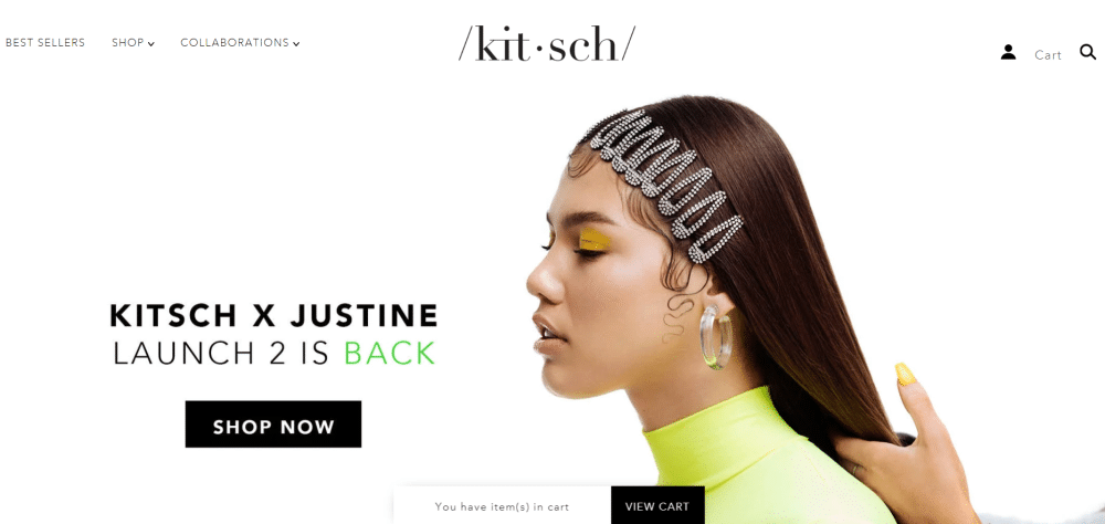
It is, again, multiple product websites. It is colorful, subtle, and sophisticated at the same time. It shows the elegance of the product in the right way. The theme complements the products in a very refined way. The page breadcrumbs are divided into three categories and are displayed right on the top of the website, making it easy for the customers to scroll through the entire website. The modernity of the site has not affected the user-friendliness and responsiveness of the website.
18. Shane Co.:
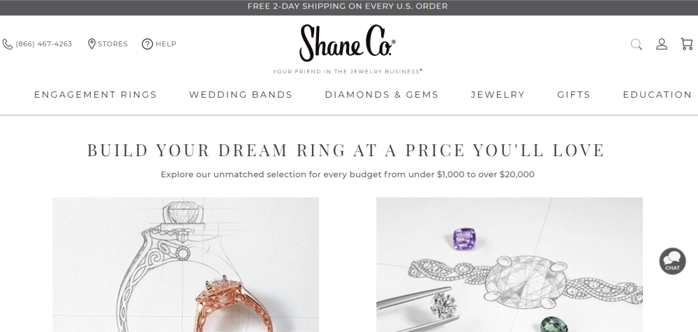
It is a simple diamond jewelry website. The designer has matched the specialty of diamonds on the site. The products are customizable, and it is displayed quite artistically through the ‘Pick a setting’ and ‘Choose a stone’ option. The use of pastel colors adds charm to the display. It is very responsive while surfing through the products. The placement of menus is complimenting the overall website design structure.
19. Kimber Fire:
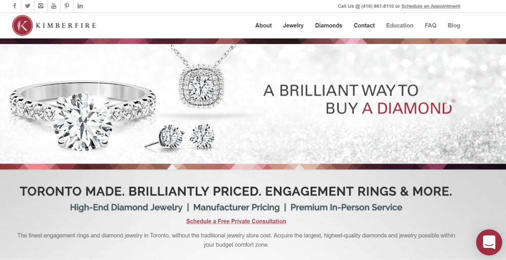
It is also a diamond jewelry website that is designed in a shade of wine. It is a tremendous one-page website that has all the information about the company as well as the product quality right in the middle of the home page. The customers get all the information at the beginning of the website and do not have to hassle through different pages. It also has a map feature that helps the customers to locate their shop quickly. They sell dreams in real sense.
20. Stella & Dot:
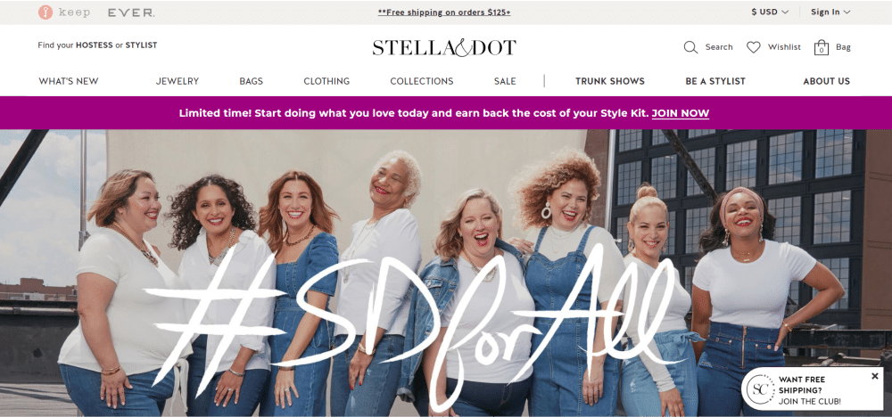
It looks like a happy website. The background picture showcases females of different shapes and sizes who love the same kind of jewelry. It depicts a message – we have something for everyone. It is informative as well as has the option of becoming your stylist with their range of products. It has a unique feature ‘Want free shipping? Join the club’ which allows the customers to join in a community of similar choices. The loading time is also less compared to other websites, making it more responsive and user-friendly.
And these are all of our best jewelry website design examples. We hope we have helped you with enough jewelry website themes to design a great jewelry website. The main thing to keep in mind while building a jewelry website is the product display and description. The customers must get the right description of the desired product to eliminate post-sales confusion or buyer’s remorse.
The post 20 of the Best Jewelry Website Design Examples appeared first on Web Design Blog | Magazine for Designers.
via https://ift.tt/33FY5GU

No comments:
Post a Comment