Everyone in the world loves traveling. They are ready to spend as much as required for a luxurious stay. They pay not just for a visit but because of the experience. It is essential to narrate the hotel’s theme and experience through its online identity. The website is the online premise for the hotel. Therefore, it is vital to show a real-life scenario of the hotels and their services through the website.
Here are the top 20 upscale hotel website design examples which would help you design your next hotel website project:
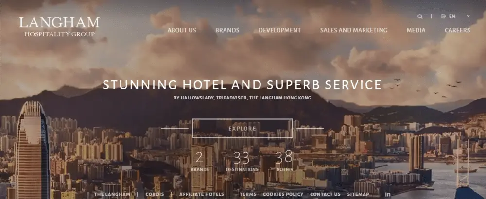
1. Langham Hospitality Group:
The website is clean and attractive. It has an animated background showcasing the outlook of the cities where they exist. In the middle of the website, the visitors can see numbers related to the hotel like their brands and establishment in multiple cities. The page bread crumbs at the top are well segregated and define all the information clearly. In the about us section, the information is precise and real, which makes the visitors fall in love through their stories. The white color selected for typography makes it look elegant and impressive. Even though it is not visible clearly, the website is designed in such a fantastic way that the visitors would like to make efforts and read between the lines.
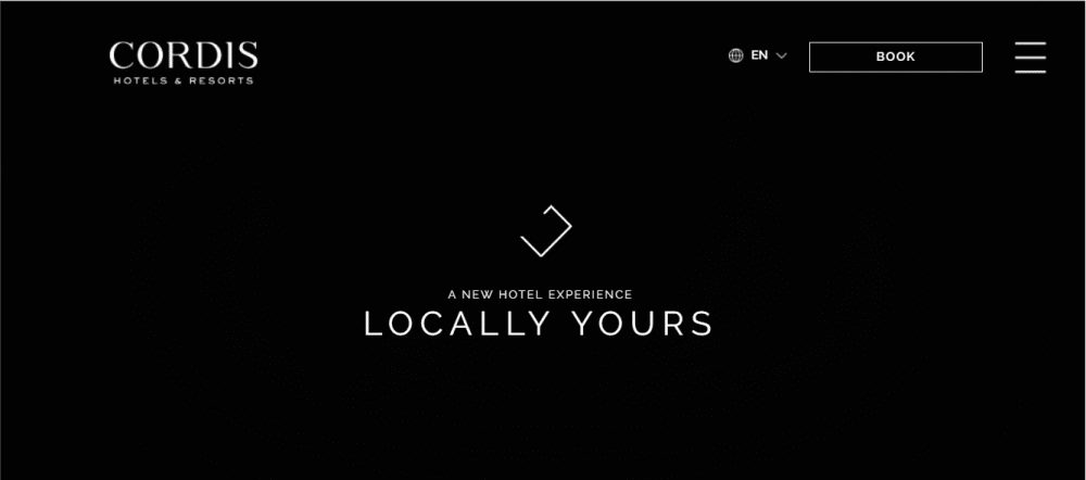
2. Cordis Hotel, Auckland:
The website starts with a quirky yet straightforward animation with a logo beneath describing their purpose- ‘Locally Yours.’ It has a language option at the top right corner, which helps the visitors of every country access it quickly. The call to action button ‘Book’ is right beside the language button, which takes the visitors directly to the booking and checks out the area. The information is evident even before scrolling to the actual information page. The background video showcases the customer experience while enjoying the services, leaving the visitors to imagine themselves at the same place.
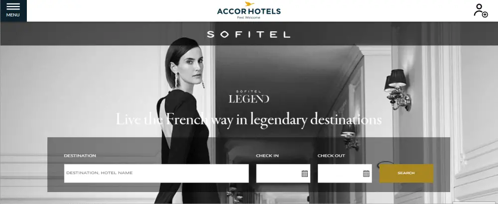
3. Sofitel, Paris:
The website has a modish background that displays the classiness of the hotel’s group. As soon as we entire the website, there is a booking back which takes the visitors’ information regarding the destination and duration of stay. It has a menu on the top left corner, which has all the information regarding the hotel. The services are listed clearly within each category that helps the visitors to know about the services beforehand. The unique feature about the website is the feedback button on the left end corner, which allows the visitors to express their views and experiences of the stay.
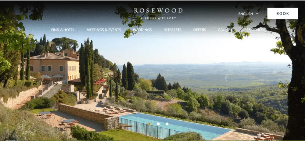
4. Rosewood Hotel Group:
The website is all fair and bright. The background picture displays the view from one of the hotel premises, which makes the visitors wanting to go more. The UX/UI of the website is taken into account very seriously while building it. It has a clear segregation of information on the website. The top bread crumbs are displayed in a straightforward way, which makes the website look refined and sophisticated. It also has a section where the customers can directly book the venues for marriage and event purposes.
5. Four Seasons Hotels and Resorts:
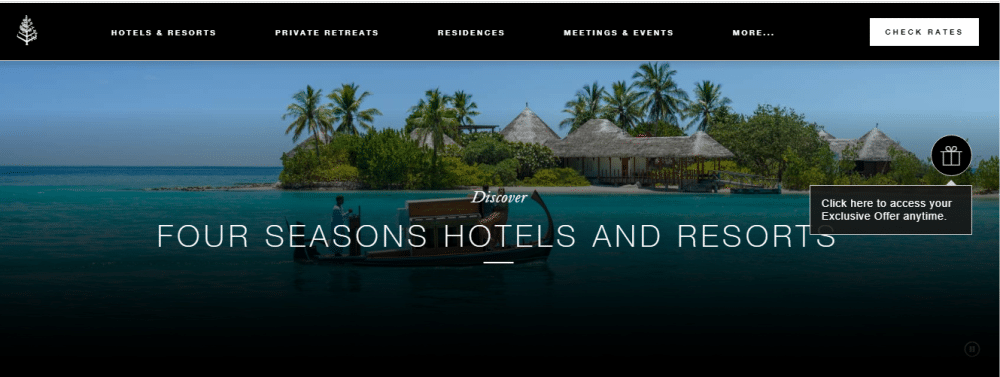
The website is all decorous with a touch of modernity. The home page background displays a serene scene of a sea beach. At the top right corner, there is a button ‘Check rates’ which takes the visitors to explore different deals and certain combos. Later, it makes them directly to the check-out page for confirmation. It has a photo gallery on the home page, which displays the information and luxury of every hotel place, leaving the choice on the leader to select the location of his or her choice.
6. The Ritz-Carlton Hotel Company:
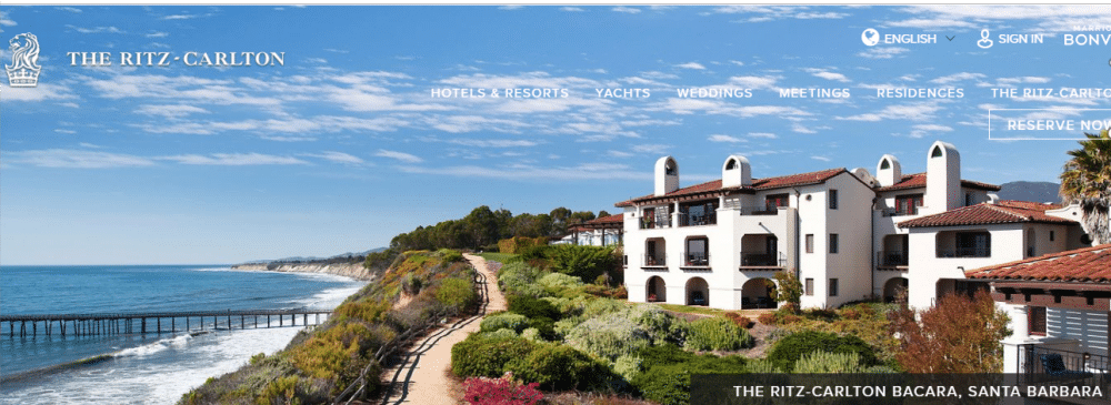
The website design is simple and average compared to other websites, but what makes it to the list of top 20 is the information section of the website. It provides information about the hotels, deals, and places to explore, to the visitors. It makes them aware of the hotels and their surroundings, which helps them in planning the tour. Even though the website is flooded with content, there is no problem in loading speed as well as responsiveness.
7. Waldorf Astoria Hotels & Resorts:
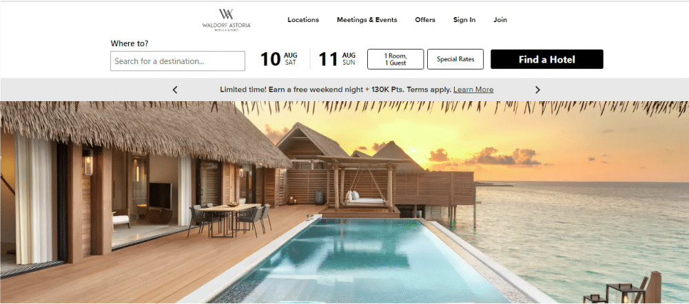
It has a similar website like the parent company Hilton. It has a crisp display. It has the option to check out the available dates right on the top of the website, which helps the users to check out fast and thus save time. It also displays various offers right on the top of the photo gallery, which allows the users to explore more benefits. It also has a photo gallery at the end of the website, which expresses the experiences of the customers in the past. It gives a surety to the new customers by displaying old stories and experiences.
8. Kimpton Hotel & Restaurant Group Inc, California:
The website is like a library to places. It has information about all the nearby places where you can travel and explore. It has information about the UK, Europe, and many other places. It has a Check-in option for exploring the available dates and rates of the hotel, right in the middle of the homepage. It also has contact information in the form of telephone number and helps desk, right at the top of the website which makes it easy for the users to contact the hotel in case of queries and emergencies.
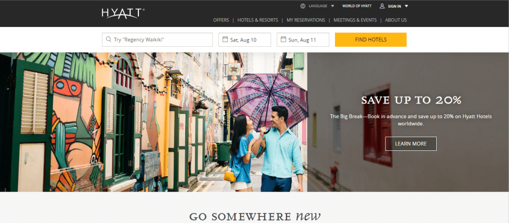
9. Hyatt Hotels Corporation:
This is our personal favorite as it has a very colorful display at the entrance. It rejuvenates the energy of the visitors and pushes him to book the hotel instantly. The check-in and check-out button are right on the top of the website, which helps the visitors to jump to its purpose without wasting much of his time. It also has a separate space for offers and discounts which attracts more users to the deal. As we move down, there is an option for subscription as well as joining the Hyatt community.
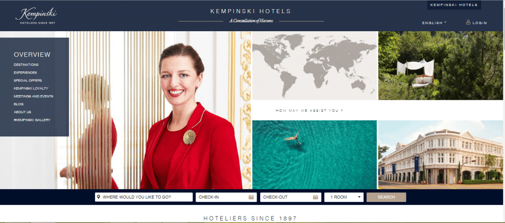
10. Kempinski Hotels S.A.:
The website starts with a happy picture of a lady, which showcases happy vibes to the visitors. It has a menu on the left side, which displays the information about the destinations to explore as well as about the hotels and his history. It also has a login button at the top right-hand side which allows the visitors to maintain an account during pre and post service usage. It has a very brief footer at the end of the website, which showcases contact information along with multiple social media options, thus helping the visitors to connect to them faster and efficiently.
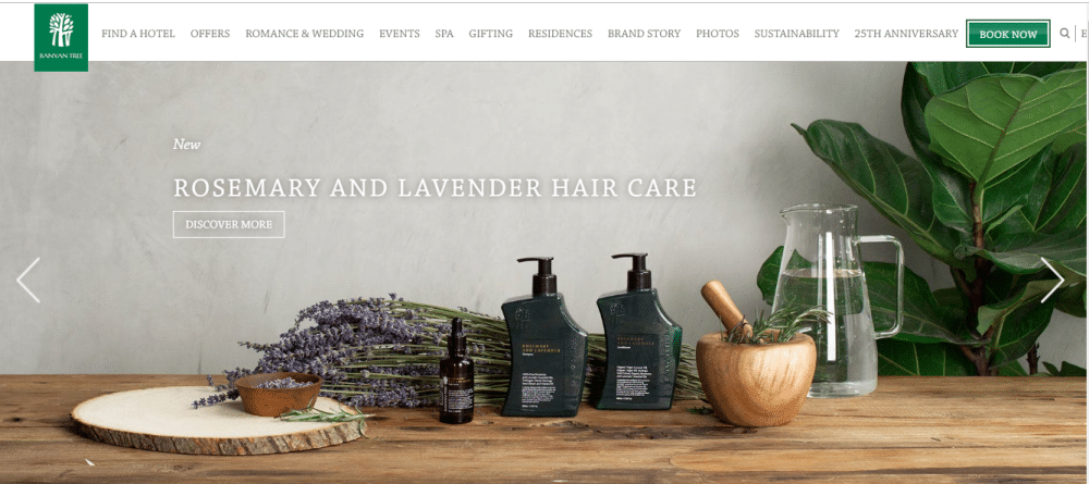
11. Banyan Tree Holdings Limited:
The website has a photo gallery as we enter the website which displays the pictures of the city as well as the spa products and other related services. It also shows their anniversary offer at present, which helps the visitors to enjoy their low-cost bookings. The display of offers at the right place is significant at it is one of the main criteria to attract customers and end up with the conversion. The designer has very well understood this concept and has displayed the right things in the right place.
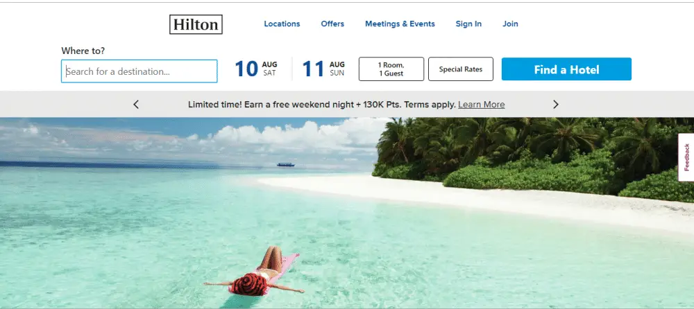
12. Hilton Hotels & Resorts:
This website has a colorful and straightforward user interface. It has offers like ‘Join for free’ to attract more customers. It also displays the locations of hotels around the globe. In the footer, the Room key option takes the user directly to explore the available dates and rooms. After that, the user lands up at the check-out page for final bookings. The social media icons are large and displayed at the end of the footer. The website is responsive similar to other top hotel websites.
13. Mandarin Oriental Hotel Group:
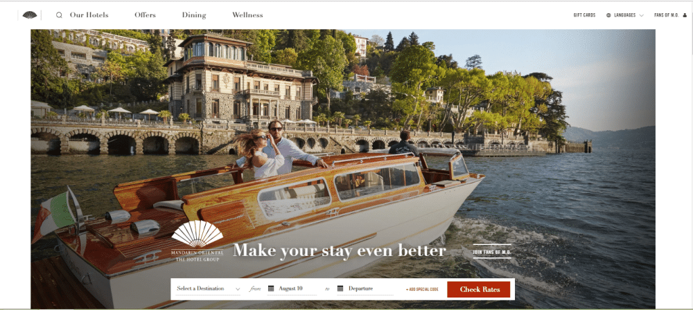
The website has a posh display with good use of typography. It has a call to action button right in the middle of the website, which allows the users to check the rates as well as explore options. The overall website design is crisp and clear compared to other websites. It has also segregated the hotels into different types based on our purpose and stay duration which helps the visitors to choose among the best suitable option for his or her requirements
14. Marriott International:
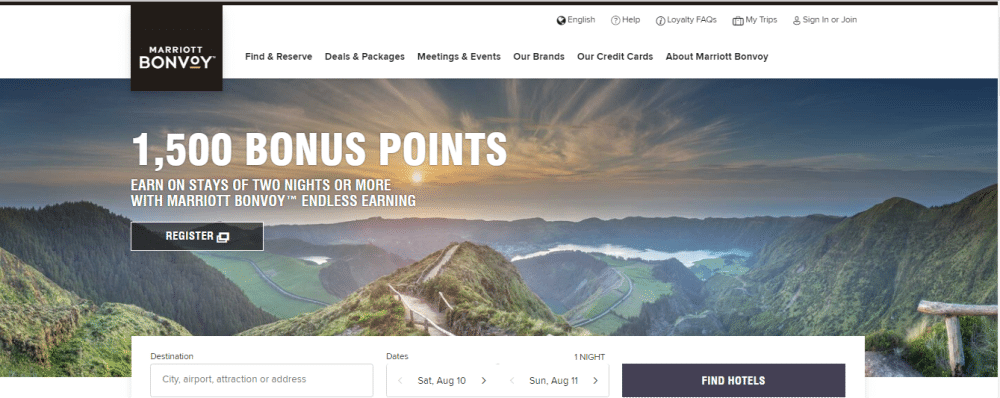
It is a website of one of the biggest and most extensive hotel chains in the world. It has multiple branches, so it demands to have a high worth website. The website is highly responsive with a perfect typography structure. It also has a decent UX/UI selection, which makes it look elegant along with stacks on information stuffed on the website. It has a clear call to action in the middle of the website as well as has icons on the top, which helps the user in every way. The facilities served at hotels like free Wi-Fi, Mobile check-in options, etc. are clearly defined on the home page.
15. Regent Hotels & Resorts:
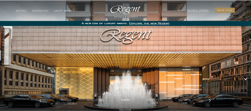
The website has a very subtle and opulent display. The photo gallery shows the interiors of the hotels and resorts. It has a separate section for different types of offers which helps the customer to select one program and make the bookings. It has an icon for languages which allows foreign customers to access quickly. It has a clear call to action button on the top right corner, which helps the customers to take the required actions and save time.
16. Lotte Hotels and Resorts:
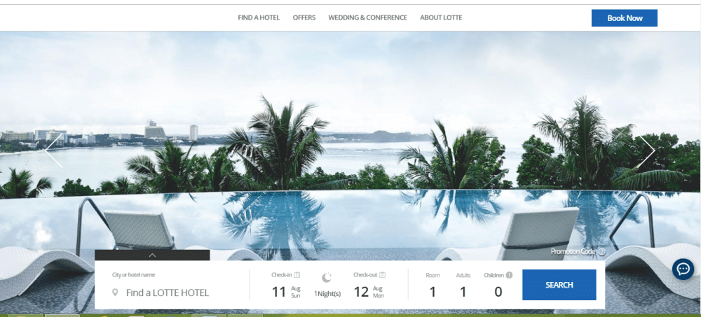
The website of Lotte hotels and resorts is built on the shades of blue, which makes it look soft and subtle. The services offered by the hotel are mentioned on the home page, which helps the customers to select a deal for themselves. It also has information regarding the book club, which allows the customer to join the community without any hassle. It has a straightforward UI that adds value to the user experience as well. The footer has all the information regarding the website, sorted at one place, to help the user access the information quickly.
17. Shangri-La Hotels and Resorts:
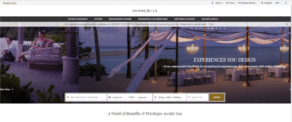
Shangri La is considered among the well-known and famous hotels in the world. The website displays the beautiful venues available with Shangri La for the occasion of marriage and events celebration. The photo gallery is placed so artistically which itself is enough to make the users go gaga over it. It is a small one-page website, but it covers all the needed information. The unique feature of the website is the currency icon on the top right corner of the website, which helps the users to convert the money into their currencies easily.
18. Belmond Ltd:
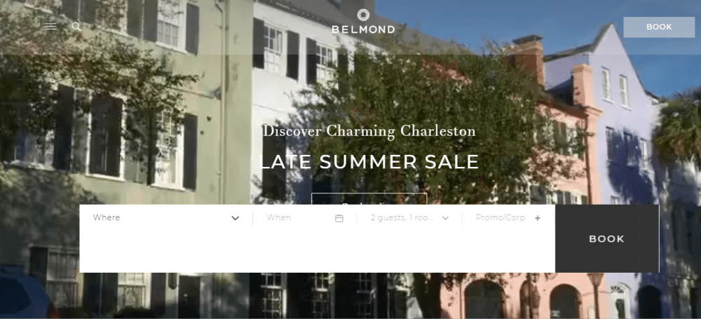
The website starts with a beautiful video showcasing the premises of the hotel. It has a search button right in the middle of the website, which helps the users to check the available dates of stay. It also has a photo gallery showcasing the nearby spots. It has a subscribe form right at the end of the website which helps the user to be a part of the community by receiving the news and events in the hotels. It also has a gift card option at the end of the footer for the customers. Its typography complements the overall website structure.
19. The Oberoi Group:
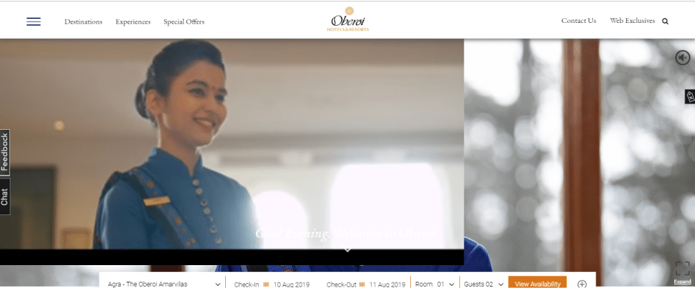
The Oberoi group of hotels are spread across multiple locations in India as well as overseas. It has some of the most luxurious services for the customers to provide at their approval. It is a niche among other groups of hotels. The background video displays the culture and tradition through the hospitality of the staff at Indian premises. It also has a chatbot and feedback option at the left end corner of the homepage, which allows the customers to contact in case of queries and share their views on the provided services.
20. Hoshino Resort Co. Ltd.:
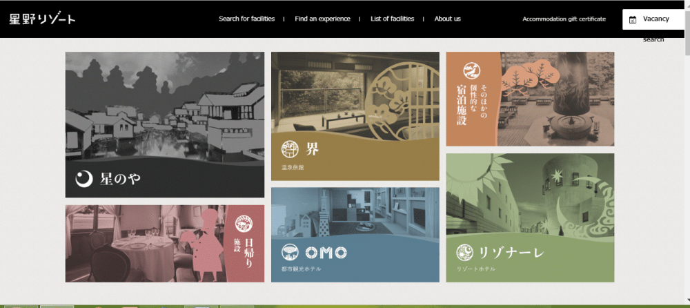
It is a Japanese website that can be accessed in any language across the globe. It is a short one-page website that displays its services way too clearly in the form of image boxes. The page bread crumbs on the top are stuffed with the required information related to the website and bookings. It is responsive and elegant.
And here we end with our hand-picked hotel website design samples. The only thing you need to take care while building the website is user experience, the right information at the right place and call to action button. If you take care of these three factors, you are good to go.
The post 20 Upscale Hotel Website Design Examples appeared first on Web Design Blog | Magazine for Designers.
via https://ift.tt/341X6Rp

No comments:
Post a Comment