People usually come to a footer of a website to find important information like a disclaimer, contact details, relevant resources, copyright notices, etc. A website footer also provides the users with a sense of consistency because the user can find some information at the bottom of every webpage on your website. As such, designers should focus on designing a footer that allows visitors to interact with the site efficiently. Also, remember to include a call to action, contact forms, address, location/maps, images, social media handles, newsletter sign-up form, and popular articles or posts. However, including all this is not enough, as you will have to design a useful footer so that visitors can find everything in one place. Here are 8 tips and tricks to create a great footer design:
1. Keep it simple:
Working with a lot of information is difficult and so keeping the design as simple as possible can solve many problems. You should opt for clean elements, organize with purpose and space out elements efficiently. You must avoid making the footer look cluttered and logically think about the aim of each element and whether they add value to the footer or not. Footer size is related to the number of pages on the website and the amount of information. You should keep in mind the theme of your website and use the same color scheme for icons and texts in the footer.
2. Personalize it:
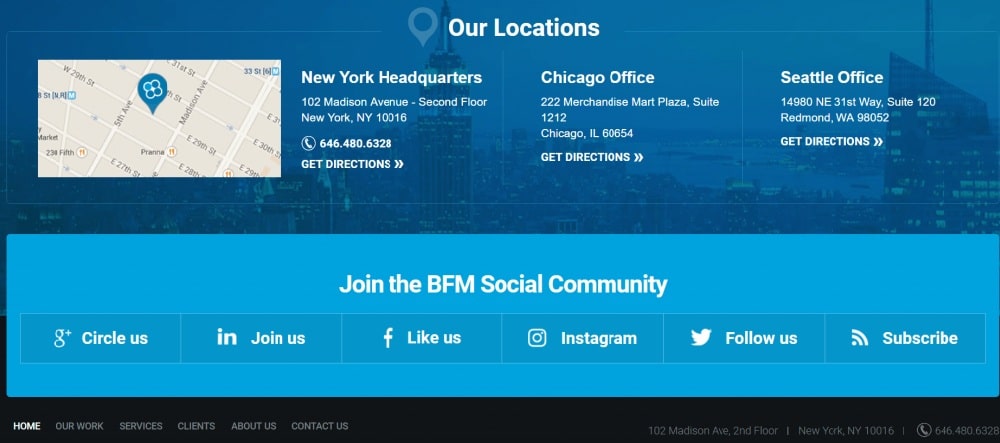
The two most important things usually found in the footer are “Contact Us” and “About Us.” Many users come to a website to find information about your brand and how to reach your team. Contact details are more significant because most people lose business cards and come to your site to retrieve that information. Contact information must include your company’s address, phone numbers, location, social media handles, and any other relevant links. In the case of “About Us,” you can include your company’s goal, current projects, your strategies, etc. The goal here is to make it easy for visitors to find information.
3. Group similar links or information:
The first thing for organizing your footer is grouping links and information. You can create several columns of relevant information like services, contact, links, and social media. You should also add a heading for each section so that people know where to find particular details such as “company,” “learn more,” and “connect with us.” Moreover, you should highlight the heading of each section so that it catches a visitor’s attention. You can even use creative icons for some elements while mentioning your phone number, email address, social media handles, etc.
4. Add action button:
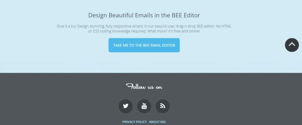
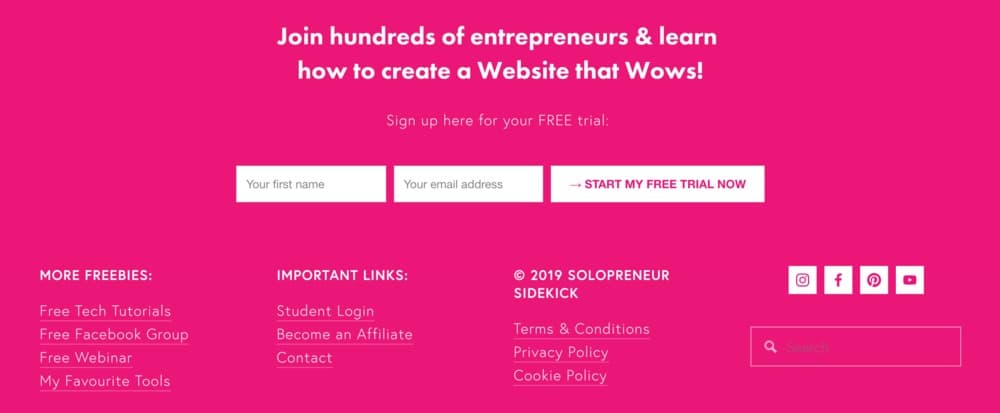
Once your users have explored the homepage and navigated to the footer, you should give them something to do. This will make your website more engaging. You can add action buttons that allow users to subscribe to your newsletter or tell them to connect with you on various platforms. You can also use this space to convert clicks. However, make sure the action button is appropriately highlighted so that visitors don’t have to search for it. You can even use attractive fonts and colors to emphasize the action button. This step is significant as it will bring you sales.
5. Use attractive graphics:
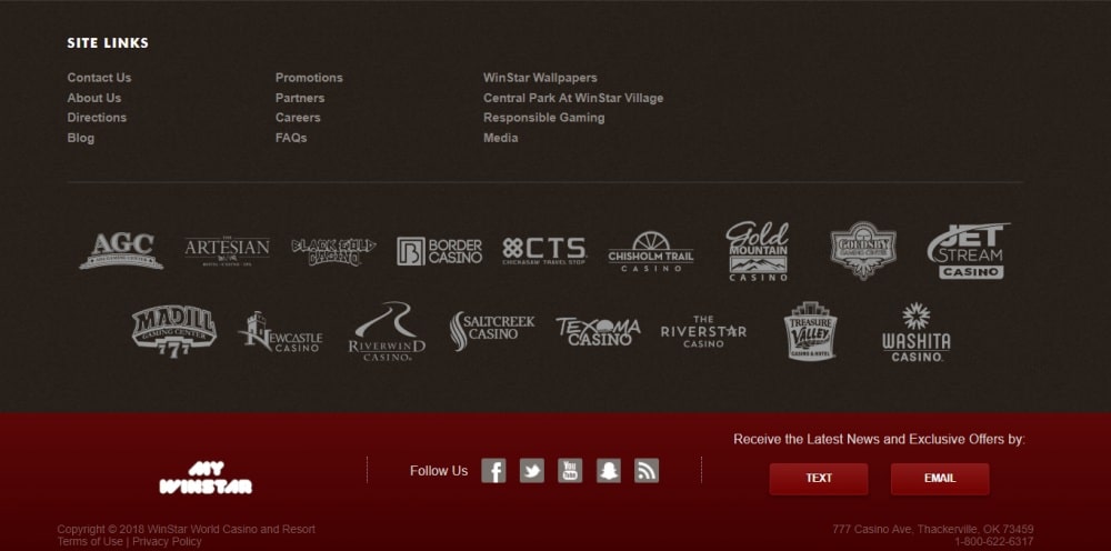
Most people don’t understand the importance of graphics in the footer. They create a basic design for footer that doesn’t engage users. So you should add graphic elements or logos to add visual interest in your website’s footer. However, make sure you don’t load the small space with too many details. You can do this by including relevant icons for different actions. This will add graphics while not taking much space. However, while adding icons, keep the size large enough so that visitors can understand and click on it quickly. If you want to put more graphics with information, you can use sliders.
6. Add copyright mark:
This simple line of text can be beneficial. While most sites write “copyright” in the end, you can design it to match your theme. You can either write the word or use the symbol (circle with “c”). Usually, sites include the name of the copyright owner and year of publication. Some sites have multiple copyright notices that account for design and content as a third party partly creates them. You should place the copyright notice at the end of the footer on the bottom right as people expect it in that place. Also, remember not to highlight this notice so that it doesn’t come in the way of more important elements.
7. Consider readability and contrast:
Footer does not have much space. So, you should think about the color, contrast, and weight of the text and background elements. Everything should be readable. You can use simple typefaces with medium heights and appropriate negative space. You should choose contrasting colors so that the text is highlighted and hence, easy to read. Also, avoid using ornate typefaces and varying colors. You should keep the design classic and use basic color combinations for text and background. If you don’t understand color combinations go for a plain white background and use primary colors for text elements.
8. Use hierarchy:
The best way to organize your footer is to make use of hierarchy in placing elements. So the most important elements should be placed on the top of the footer while the least important details at the end. This will allow visitors to know what needs attention and what can be skipped. Usually, the call-to-action button is an essential element, and hence, it should be the most prominent. On the other hand, copyright is the least important, and so it is often the smallest in scale. You should even use hierarchy in each section to encourage a particular action such as phone number over email address (encouraging people to call rather than mail).
Footer is the last thing visitors see before leaving the site. So design a footer that is informative and a footer that keeps the visitors coming back. Use these footer design tips and tricks to build an attractive and cohesive website that has a significant impact on user engagement.
The post Website Footer Design: 8 Tips and Tricks appeared first on Web Design Blog | Magazine for Designers.
via https://ift.tt/2KKysNA





No comments:
Post a Comment