Business Cards remain timeless in their utility and relevance in any professional field, irrespective of technological advances and modernization of business spaces. Previously, business cards used to be the first point of communication between a brand and a potential customer. They were was used as an introduction tool and were looked at as a more informative document rather than a potential creative design element. Those business card designs were fundamental. The information put on them was also the bare essentials like name of the company, address, email address and possibly a fax number. However, with changing times, today’s business cards are often used to add additional valuable content in many creative ways. A business card isn’t looked at as just an informative piece; it is used as a tool of advertising and brand promotion as well. There are many developments in business card design trends.
An effective business card design has contact details of a company, and in addition, conveys the brand message of the company as well. For any business card to have such an impact on the receiver, it has to be unique and easy to remember. Many designers have experimented with different styles, and many printing companies have created different effects (such as embossed business cards), breaking out of the box at times to create business card designs that stand out. However, a delicate balance between innovation and utility is a must to maintain. Keeping this in mind, here are a few important business card design trends in 2020 that are most likely going to change the game:
1. Minimalism in Business Card Design:
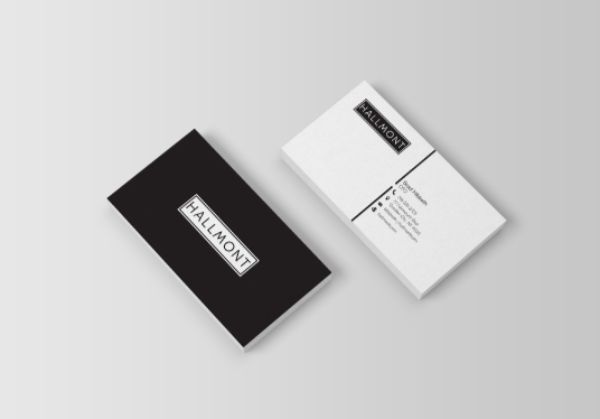
The successive years a design trend stays relevant, shows its effectiveness and strength. This stands especially true for minimalism in business card design. The trend for minimalism initiated during the 20th century, and it is still strong. Minimalism is the art of delivering more using lesser elements. Generally, it is perceived to be easier, as it looks effortless once finished. However, to showcase an entire brand and summarize their brand message using minimal elements, is often more challenging. Hence minimalism in business card design refers to not just making the design look easy, but making the design look impactful without depending on any superficial elements.
Using minimalism in business card design makes the business card look modern, clean, and clutter-free, and the focus shifts to the content on the card, rather than the design. It is possible to create a great complex design business card that looks visually pleasing. However, the main takeaway from the card needs to be the content of the card that people might miss out on, with too many distracting elements.
2. Business Cards with Interactive Designs:
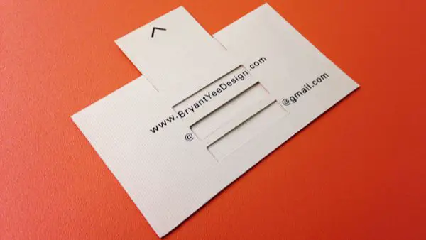
Business card Design Trends in 2020 is all about getting experimental. One such experimental design element that is likely to gain popularity is using interactive designs on business cards. Many graphic designers are attempting to get this right with business cards. Generally, they try using dual or triple layered cards to give a sense of more dimensions to the card. Carved or stamped business cards would look more detailed and interactive. There are easier ways to do this too. The only thing to be kept in consideration is that the elements of the design elements used in the interactive design should complement elements of all other marketing materials and business stationery materials.
By using such interactive designs, the receivers would get a perception about the attention paid to details by your company, and the dedication behind making a great first impression. Translating the efforts and results of the business card design into many serious projects, they would be able to judge your commitment and dedication to your work better.
3. Business Cards as Smart Card:
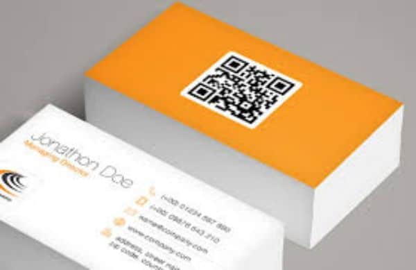
Entering 2020, would not be complete without bridging the gap between the real and digital world. QR codes have become more are more compatible and have eased the process of linking or redirecting customers to relevant sites and places important to the company. 2020 would witness the implementation of QR codes on business card designs. Due to the flexibility of size of them, this would not only save space on the business card but also act as a clutter-free solution of providing additional information without stuffing the space.
By adding a QR code to your business card receivers would be able to go through your website quickly and check out the content and services you have to offer. It is a minimal yet impressive thing to have on your business card that would ease and reduce the time for them to go back and check your website. If they had to search for it manually, most people would not, hence this increases website traffic and chances of them availing your services as well.
4. Business Cards with Big and Bold Fonts:
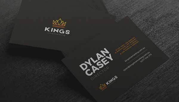
Nothing shows confidence and assertiveness, as much as big and bold fonts and typeface do. This is a prominent Business Card Design Trend in 2020 that encourages designers to use the majority of the card space with bigger typefaces. Using bigger typefaces redirects the receivers’ attention to the business name and tagline if they have one. This is an excellent way of ensuring the receiver remembers the name of the company as it is so direct and assertive. Generally, such business card designs that use bold typefaces make use of a single solid fill background color that gives the design a unique appeal. However, the color of the typeface and background should complement or contrast each other in a way that it looks visually aesthetic. It is also essential that the color schematic is uniform through all other business stationery products as well.
If you are confident about your company’s name and the tagline to be enough CTA for people to find out more about it, you should try this business card design trend for your card. It shows confidence, assertiveness and a sense of leadership to the receivers. It is the same philosophy of minimalism, where the brand that uses this trend showcases confidence that their name is enough to market their services.
5. Clever use of Symbols in Business Cards:

Another innovative and valid Business Card Design Trend in 2020 is going to be using clever symbols in business card design. Symbols as an individual element hold significant value in communicating brand/product value and purpose. Symbols are also a great way of putting across what target audience the brand is catering to and what industry it belongs to. Hence, using clever symbols in business cards gives it more personality as well the receiver appreciates the genius behind it.
This doesn’t mean that you use any symbol just to have a taste of it in your business card design. The symbol has to be relevant to the niche and the target audience and should emphasize on both these aspects. A poorly designed symbol might create more confusion in place of adding value. Hence choosing the right symbol at the right place is vital.
6. The simplicity of Design:
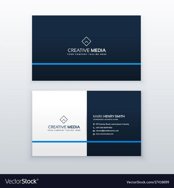
Simplicity isn’t to say that the business card should not be stylish. It just focuses on the importance of serving the primary purpose of business card across clearly. Designers need to keep in mind that a business card needs to put across the brand’s name, address, telephone, and email and fax number across in a way that it is legible and easily visible. This information needs to be presented in a simple way. The viewer’s eye should be first driven to these vital information bits and not be distracted by other design elements. Hence, keeping the business card relevant and informative while keeping it stylish- is a business card design trend in 2020.
7. Branding Elements in Business Cards:
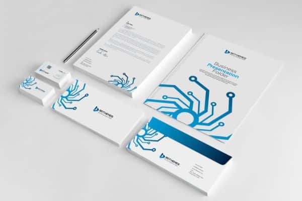
Moving towards 2020, designers realize the need of creating an ecosystem of uniform design elements across all their business stationery material. There are different ways to put your branding elements across to the viewers. The reason for using similar branding elements is to reemphasize the brand message to the potential clients to get them more acquainted with the company. Various ways of putting across your brand message are through using different distinctive design elements such as colors, symbols, images or only the slogan you use across all products.
Business card design trends in 2020 are all about reinforcing the brand image and brand story. How you do it most subtly is what makes the design stands out. The idea is to make the potential client relate the design element you are choosing to be consistent across all your business stationery line.
8. Business Cards with Experimental Shapes:
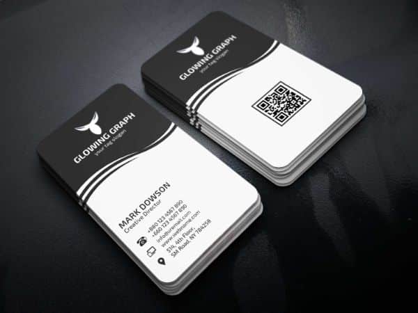
When it comes to being experimental, 2020 is full of surprises as designers are now breaking the trend of sticking or restricting design possibilities to a rectangular shaped card. The standard shape for business cards generally is 3.5 by 2 inches in the US. The average business cards also have sharp corners. Many designers are experimenting with different shape cards or merely changing the traditional layout a little to give it a minimal yet different look. What approach you want to take should depend on the brand and the relevance of the shape you decide.
Many designers are using square or rectangular business cards with rounded or soft edges; some are using the shape of their logo, while some businesses try to shape their business card in a way that it represents the products they deal in. Hence with experimental shapes, one thing is sure, that is no limitation to creativity with business card design trends in 2020.
9. Business Cards with Colored Edges:
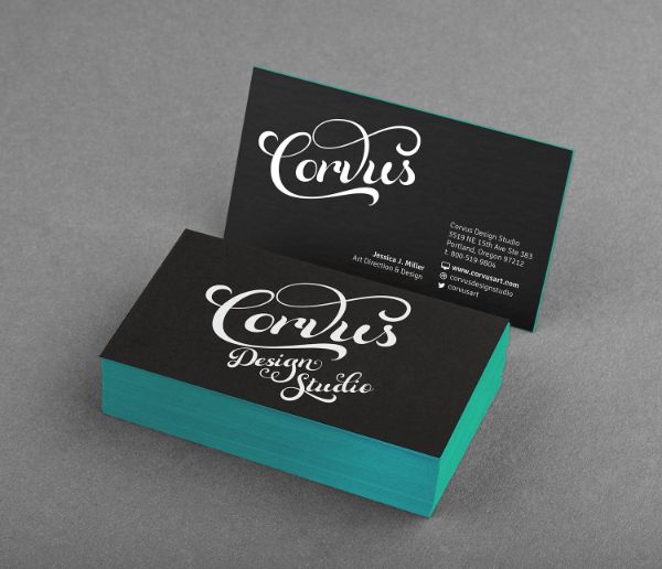
Colored edges are one such business card design trend in 2020 that might not sound like much; however, can have a significant impact on how business cards have looked before this trend. This design element would add a sense of depth and three dimensions in business card design trend. When the business cards would be stacked together, the colorful edges would catch the eye of any viewer. For this design to have more impact, the business cards would also be thicker in width to give better results of the colorful edges.
10. Business Cards – Hand-illustrated:
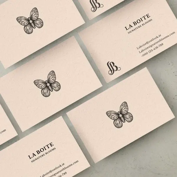
Business Card Design Trends in 2020 would also focus on using unique illustrations. This would be to personalize the feel of a transactional object. Since business cards are meant to be a summary and introduction of your business to your potential clients or customers, a hand-drawn illustration on top of it would show efforts and sincere approach towards delivering excellent work. The illustrations could cover the surface of the card or used at the centre depending on the overall design. More than anything, illustrations help ease the conversation and approachability as it demonstrates care.
Hand-drawn illustrations are often paired with pastel tones, serif fonts and motifs that represent nature. Such business cards feel delicate and are ideal for small businesses. Especially for ones that would have many ones on one interaction with customers.
11. Neon business cards:
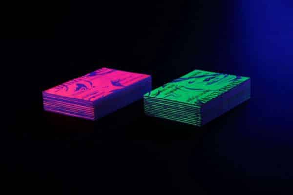
Neon business cards are something traditional designers would have never thought would be a thing in the past. However, business card design trends in 2020 accept and embrace neon business cards. Such business cards are ideal for people who prioritize boldness over subtle nature. This, in a way, would reflect on the company’s approach to work and their niche as well. For neon business cards, the main design elements to focus on are colors. Such business cards are ideal for companies that deal with technology and modern industries.
12. Monochrome business cards:
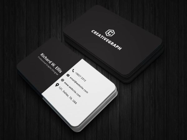
The classic combination of B&W is a timeless design trend, especially for business cards. The modern business card design trend in 2020 adds a little twist to this design approach. It updates the classic black and white style with modern approaches. Use of minimal design elements, effective typography and gradient fall would make the classic black and white design more alluring and appealing.
These were the 12 Business Card Design Trends in 2020. They would make any business card stand out from the rest. Business cards are going to remain relevant even in the era of digital marketing. Hence, it is essential to stay updated about the trends to ensure your design doesn’t go obsolete.
The post 12 Business Card Design Trends in 2020 appeared first on Line25.
Source: https://ift.tt/2RhsR3q

No comments:
Post a Comment