Founded in 1994, Amazon is now known as a worldwide e-commerce company that provides one of the most comprehensive e-commerce services in the world. There is little wonder why this company is so well-known; it provides arguably the best service in this field as well as great prices for a wide range of quality products. In the time that the company has existed, it has built a very memorable image, which includes the famous Amazon font.
The Amazon font is one of the best fonts by companies when it comes to readability; at least the company claims so. The fonts that are used on Amazon are designed in such a way that they provide clear readability on all screens – from large screens to tiny, mobile screens. Not only that, but they bring a recognizable quality that only an Amazon font does.
The Amazon Font for Web and Kindle
Not too long ago, Amazon has released Bookerly as its default font for Kindle Paperwhite. This change happened in 2015, and the font that was implemented had a large amount of success. It is reportedly much easier on the eye and also allows users to read the text much easier and quicker.
This font represents a slight change from the previous Amazon font, which was the Ember font. Amazon now uses Bookerly as its default font for texts on the website, as well. It is not a massive change, but it is rather subtle; but it does offer a refreshing font, which is a bit more readable than the previous font. The difference is that Ember was a font that was derived from the Arial font family, while Bookerly is a serif, which means that it is a bit more ornate and a bit more decorated.
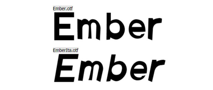
Ember Amazon Font
So what is the Ember Amazon Font like? Well, it is primarily more on the informal side, but it still offers enough elegance and subtlety to make it a bit more formal. It does not have the overwhelming number of additions and ligatures that some informal fonts have, but it is a bit subtler compared to those.
It does have its own style. As we said, the Ember font is a derivative from the Arial font. It does have ligatures, and some stylistic alternatives; you can freely change the ligatures and the stylistic properties of this font freely with OpenType.
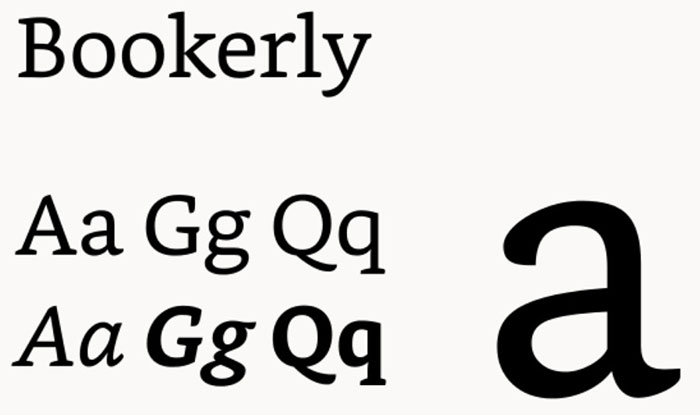
Bookerly Amazon Font
Amazon has made some subtle, but recognizable changes recently to its typeface and the way it is presented. It introduced Bookerly as the primary Amazon font, while also changing the hyphenation system altogether and did some alterations to the spacing rules.
These implementations allow Amazon to present their website in a more readable fashion and also to fill the spots of blank on the website. Bookerly has worked wonders as an Amazon font, as it improves readability greatly while also being capable of being displayed in low-quality environments and smaller screens.
Bookerly was designed by Dalton Maag. The font allows users to read text much easier and with less eye strain, as it is easier on the eye while also improving the readability massively. It is a serif font that includes some ligatures and kerning pairs.
The font is now the default Amazon font for apps, websites and Kindle platforms. The font is composed organically, and it improves the user experience and visibility in lower-quality environments greatly. Overall, it represents an improvement over the last Amazon font.
Amazon Logo Font
Officina Sans Bold / Officina Sans Book
These two fonts were used for the old Amazon logo. They were in use from 1998 to 2000. The fonts were actually released in 1990 already, but it wasn’t until 1998 that they gained much popularity. The logo was composed of two parts: the Amazon part, which was made with Officina Sans Bold, and the .com part, which was written with the Officina Sans Book.
The Amazon font family for the logos is a very versatile font family, as it offers support for 21 languages worldwide and with that, many different characters and ligatures specific for certain languages.
The font is actually quite a versatile font and can be used for many purposes. It can be used to create an awesome design in many ways. You can also create brand logos, layouts, covers, brand design, various invitations, cards, headlines or even for games and themes for a website. As you can see, it has many nice uses.
The Current Amazon Logo Font
The current Amazon logo has probably its own Amazon font, which was specifically designed for the logo. The font is pretty standard, but it works really well with the current logo. The font also covers the “a-z” part.
The font is currently not available for download, but you can have a pretty close alternative with the Franklin Gothic Medium font. This font is used for the Amazon part, while for the .com part, the Helvetica Neue Light is used. It has a black rounding stroke around the edges to soften the logo a little.
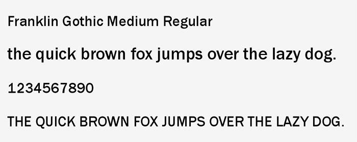
Franklin Gothic Medium Font – The Amazon Part
The Franklin Gothic is one of the most popular fonts in the world. It is a sans serif typeface that can be seen very often in its ATF version, but it has 5 different weights. Most often, it is only seen in one weight, and it has no light or intermediate weights available as of yet.
The font itself was designed first in 1902 by Morris Fuller Benton and has developed a lot since then. It has become one of the most popular sans serif fonts for web design, logo creation, and other similar uses. In 1991, condensed and compressed versions of the font were created on behalf of ITC in Boston. This added flexibility and more usability for the font.
Alternatives for the Franklin Gothic Font
Whenever the font may not be available for you, there are still plenty of alternatives to use that are quite similar.
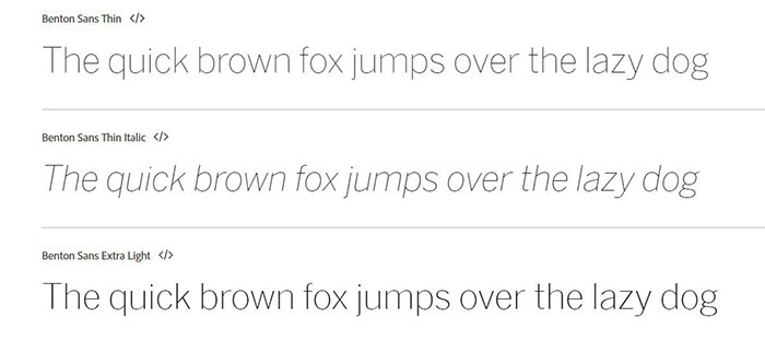
Benton Sans
The Benton sans font is a very flexible and versatile font that has 8 different weights – thin, extralight, light, book, regular, medium, bold and black. These weights also have italic and caps styles included.
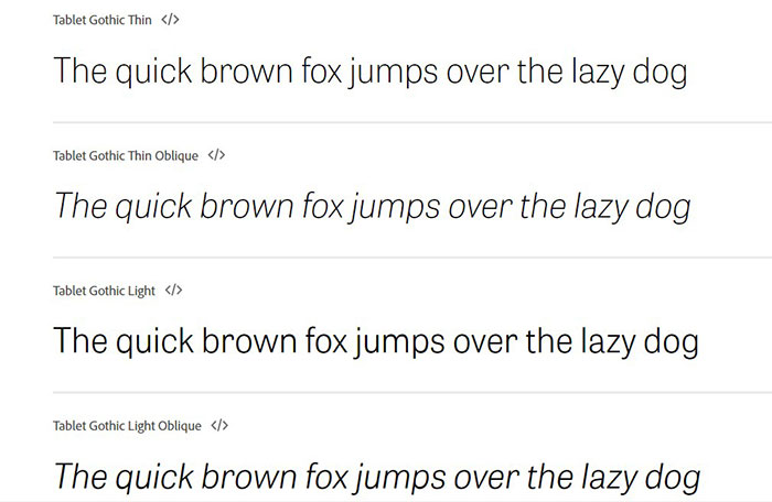
Tablet Gothic
The font was first introduced in 2012 on the TypeTogether platform, and it was designed by Jose Scaglione and VeronikaBurian. It is quite a grotesque and gothic font, and it certainly offers a huge selection of styles and weights that you can use.
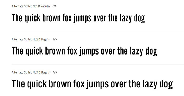
Alternate Gothic
Just like the Franklin Gothic font, the Alternate Gothic font was designed by Morris Fuller Benton in 1903, and it is a condensed version of the original. This font can be seen in the Youtube logo.
National
National is a versatile font that is offered in nine weights with roman and italic versions. It is based on 19th-century grotesque styles and it has kept up to date very well.
Maple
The Maple font is another alternative for the Amazon font, and it was designed in 2005. It is another grotesque-styled font that is a refinement of the Process Grotesque font, which was made obsolete in 2003.
HelveticaNeue Font – The .com Part
For the .com part, Amazon uses the Helvetica Neue font. This Amazon font contains plenty of features from the original Helvetica font, but it has some specifics; namely, it is more minimalistic and a bit more elegant than the original. If you pay close attention, it is actually less round than the original and offers a slightly different look.
Alternatives for the Helvetica Neue Font
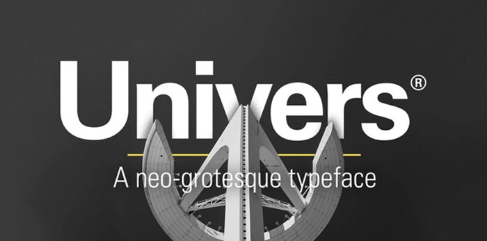
Univers
It is very similar to Helvetica, and a bit more flexible.
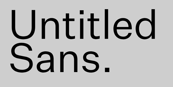
Untitled Sans
Another good alternative for the Helvetica Neue Font.
Suisse Int’l
It follows the footsteps of the Helvetica font, but it has some slight changes; most notably, with counters and terminals.
If you enjoyed reading this article about the Amazon font, you should read these as well:
- Quirky free Disney fonts you can use in your thematic designs
- These condensed fonts were made to impress (Check them out)
- Cool video game fonts to use for designing game related projects
The post The Amazon font. What font does Amazon use (Answered) appeared first on Design your way.
Source: https://ift.tt/39zgCYm






No comments:
Post a Comment