As a Graphic Designer, your Design portfolio is your identity- at least during the initial process of recruitment. Recruiters and Hiring Managers only spend a few minutes on your portfolio. It is extremely crucial that you present your work in a simplistic manner, which portrays you as a talented designer.
Therefore, the purpose of creating your design portfolio must be singular – that of showcasing your best work and skills, through the collection of curated samples of your past work. This can be easy to understand and even follow. However, many designers fall into the several traps and gimmicks of the portfolio, which can divert you. Here’s what you need to avoid, in order to make an impactful portfolio.
1. Using Generic Introduction:
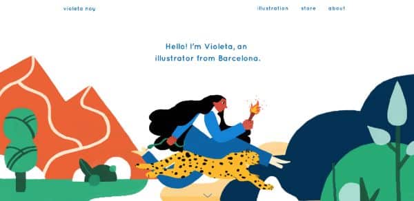
Steer clear of the buzzwords and the typical jargon. Ask yourself whether you would hire someone using this statement or not, before adding it to your portfolio. It is crucial to remember that your portfolio would be one of the tens, or maybe hundreds, for the person wanting to hire a designer. Your introduction should be meaningful and make you stand out. The introductions do take up a lot of space- so ensure that you use this space wisely, to communicate your skills- what have you done, what you can do, and what you can offer as a designer.
2. No ‘About’ Page:
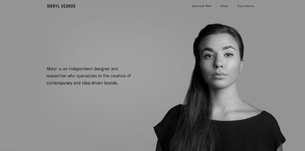
Even if it is one of the most important details, it is easy to miss out on this one. While your designs can be excellent, and your previous work can impress the reviewer, you need to get yourself out there. Your portfolio should be discoverable to the public and must connect to your profile. Your portfolio needs to have your basic information, such as your skill set, education, social media platform links, and contact information. Refer to the work of the renowned international award-winning designers. Not only would you have the design inspiration, but you will also find the effective ways of displaying the contact information- which would be showcased multiple times in their portfolio.
3. Complicated & Cluttered Layout:
While it is certainly difficult to compile all your work and details into the concise format, it is a must. In this process, designers often end up having an extremely ‘crowded’ portfolio. Avoid having an overly designed layout. Your portfolio has a singular purpose- to highlight your best work, in the best way possible! Consider this while planning the layout and designing the portfolio. Focus on the user experience, just like you would in any other design. Make it easy for viewing and understanding. Let your work do the talking for you.
4. Lack of Balance:
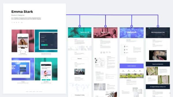
Designers generally are caught between this dilemma- either too much work is displayed, or too little of it is displayed. Too much work displayed can be overwhelming as well as confusing for the reviewer, while, too little of the work can defeat the entire purpose of the portfolio. The key is to find the right balance, a sweet spot, which will reflect your identity, and add up to the narrative you are trying to create. Avoid the temptation of including every single and small projects you have done. Instead of doing this, strategize. Choose the niche you want to go into and choose the projects accordingly. Present the work which resonates with the work you want to be hired for.
5. Setting No Context:
Ensure that your portfolio isn’t full with blocks of text. However, it should not also be without the text either. Just like striking a balance in displaying the projects, you need to strike it right here too! Setting the perfect context in your portfolio is necessary, especially for potential clients or employers. With this context, they will be able to understand your portfolio in a better manner. Write a brief about the project. Include your design approach, thought process, and your working style. Don’t forget to include the basic details, such as the company name, the goal of the design, the goal of the design, and most importantly, your specific role and responsibility in the particular project.
6. Using Portfolio Templates:

An ideal portfolio, above and everything else, will create a lasting impression on the minds of those who see it. At times, this is mostly due to the fact that it is particularly unique, and the work is presented very effectively and is visually appealing. Make your portfolio unique and memorable. For this, avoid stock photography as well as the clichéd templates. Using these two creates a very negative impression on the potential client and/or employer. In any case, you have to use the template, then go for something which is minimal, and has a greater scope of modifications.
7. Too Many Redesigns:
Unsolicited redesigns may be a great tool for displaying your design skills, especially when you have just started out. It is also a great way to create hype and gain attention in the design community. However, as a designer, the core purpose is to create solutions to the problems, or at the very least, attempt to do so. Attempting a quick visual redesign of a successful brand or a Fortune500 company may not be a great way to showcase your skills. Doing so, you are doing it for a company that is already successful, and has amazing products or assets to showcase. It is best to keep them as an exercise, rather than including them in the portfolio.
8. Flat & Dry Portfolio:
It is vital to consider that your portfolio is very important and a prime part of your professional identity. Amongst the hundreds of the portfolios, yours needs to stand out. Add your personality to your portfolio. Ensure that you add a personal touch, and design it in YOUR own way, using your signature style. Avoid having a monotonous feel to your portfolio- avoid exporting images directly from the Illustrator or Sketch. However, like in other aspects, here too, balance is the key. Keep it professional and quirky. Strike the right balance and have your own personal branding in place.
9. Lack of a Narrative:
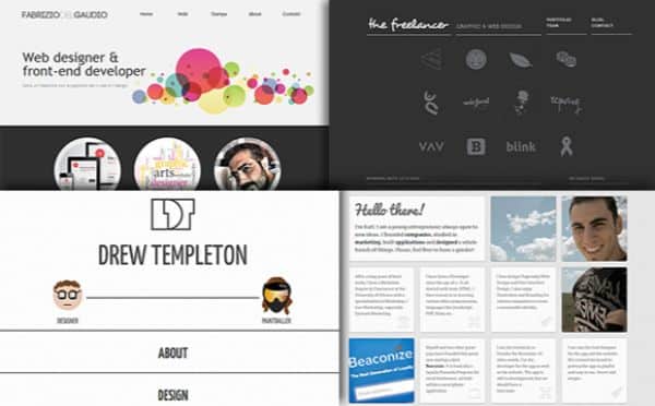
A portfolio is not just about showcasing your work- it is also about portraying yourself as a skilled and qualified Graphic Designer, who is perfect for the job, in the eyes of the employer/client. It is advisable to build a narrative as you go along and create an identity of your own. Include the portions of your resume in the portfolio. Mention the projects you have had, the struggles you faced while accomplishing them, and the solutions you provided or came up with. Don’t forget to mention and give credits, wherever you have worked as a part of a team, no matter how big or small. In such cases, you can also mention how you contributed towards the design. This will help you gain trust, with your portfolio, and create an impact. Remember- do not sell yourself short.
10. Displaying Visually Appealing Images:
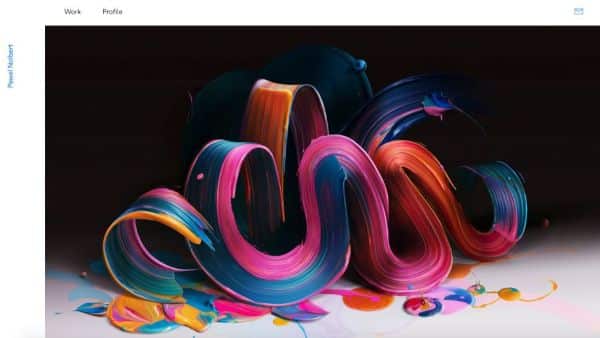
Yes, the portfolio is certainly about establishing yourself as a skilled Graphic Designer. High resolution, polished, and edited images do surely have a place in the portfolio. However, one must be cautious of relying on them too much. What is important is how you got to the final design. Evaluate what you can include. You can also include the project briefs, mockups, as well as the results from the user-testing. Strategize the projects which you wish to include, and include the details as well, along with the images, explaining the project.
11. Making Portfolio an ‘Art’:
Yes, portfolios are meant to portray you as an artist, but be careful of making your portfolio into an art piece! Portfolios are more often than not, mistaken to be a creative outlet, with the freedom to design it however you want. It is worth noting that the core purpose of the portfolio is not this. It is to communicate and express your skills and qualifications. Making it too artistic and creative would only result in the usability being affected. In the end, it is the usability and compatibility that also matters. A lot of portfolios are rejected often due to the reason that it is difficult to navigate to the actual work, within the limited time frame. Keep it minimal, simple, and check for compatibility on all devices, especially phones.
12. Lack of Social Media Presence:
While this may strike as an obvious to-do, plenty of times, this factor is overlooked easily. The power of a strong social media presence can make a huge difference in your career. Your website is surely important, but so is having a social media presence. You can keep your portfolio content on these platforms as well, and keep it updated too! Set up profiles on LinkedIn, Behance, Google+ and Pinterest profiles. People can discover your work and then can view your website as well. Other platforms such as Facebook, Instagram, and Twitter can also help you get visibility among different audiences as well.
13. Using Similar Approach for Every Project:
Each and every project is different- be it the sector, niche, scale of the business, and type of the work done. Think about how you will present your work, and each and every project in a compelling manner. Not every project will fit perfectly into the same template- due to the differences. Think about what all steps you want to include the design process and what to exclude. Consider representing each project in the best manner. At times, just the brief explanation would serve you better than the image of a whiteboard with ideation on it. You can also showcase compilation of your sketches, and explain the direction which you opted for with it. Focus on presenting your work in the most convincing way.
14. Quantity over Quality:
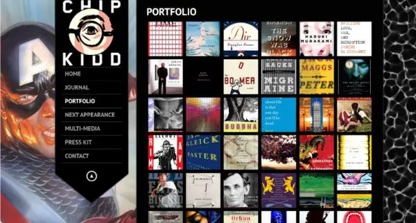
This is an area where a lot of designers often make a mistake. Always remember, QUALITY over QUANTITY! Choose the projects carefully after having a strategy in place. It is recommended to show a variety, but you don’t need to show everything. Focus on creating a diverse portfolio, covering the range of the work you have done, without being repetitive. Be selective with the pieces you wish to include. If you have managed the end-to-end project, right from conceptualization to the development, then you can include it in the form of case study as well. Don’t just go on filling up the portfolio. Just go with the work you are most proud of.
15. No Labels:
Each and every element and work in your portfolio should be perfectly and clearly labelled. The recruiter or the client would not be familiar with the processes and the nuances of your work. Hence, you need to show them exactly what you did, and how what you did is a crucial part of the design. For example, you may display the designs of marketing collaterals in your portfolio, but you need to specify whether the collaterals were your design, or the logo and collaterals were both yours. This will help the reviewer navigate through your portfolio easily, that too, with a clear understanding.
Your portfolio is the testament to your skills and qualifications. It is your portfolio which would be viewed first, by your potential clients or employers. It is important to remember that no portfolio would ever be complete. It is constant work, which you would have to keep doing. Keep updating your portfolio as you go along, and build it up. Your portfolio will, too, evolve along with you. It would surely seem like a lot of work, but it is just the beginning. If you want to be different and stand out from others in this competitive field, you got to take the time and sweat the details. Your portfolio will not only help you in getting your foot through the door but will also prep you for the presentation of your work in person. Make a strong mark in the design world with the perfect, effective, and a flawless portfolio.
The post 15 Things NOT to Do While Creating Your Design Portfolio appeared first on Line25.
Source: https://ift.tt/2ty3brL

No comments:
Post a Comment