There are many tutorials based on graphic design, and how to play with the elements to create the perfect design. Similarly, creating a website also requires an understanding of certain universal elements a website has. Designing a website requires a sense of visualization and hierarchy to best put these elements in a way that suits the purpose and looks appealing to the end-users. Often, this process can feel quite overwhelming. However, if you make use of the block by block website layout technique, it can be pretty simple.
The block by block website layout divides some aspects of a website into different sections. Then, the coders and developers would create different modules and compile them in various sequences for creating appealing and attractive templates/pages.
By trial and error or by proper planning, using block by block website layout can help you design unique pages that remain true to the niche you are targeting. To keep the brand, uniformity designers often make use of common design elements such as color, typography or other designing elements.
The layout of a website is responsible for giving it the needed structure. Different layouts work for different niches, based on the content and kind of business. The building blocks of the website layout are:
1. Feature Image:
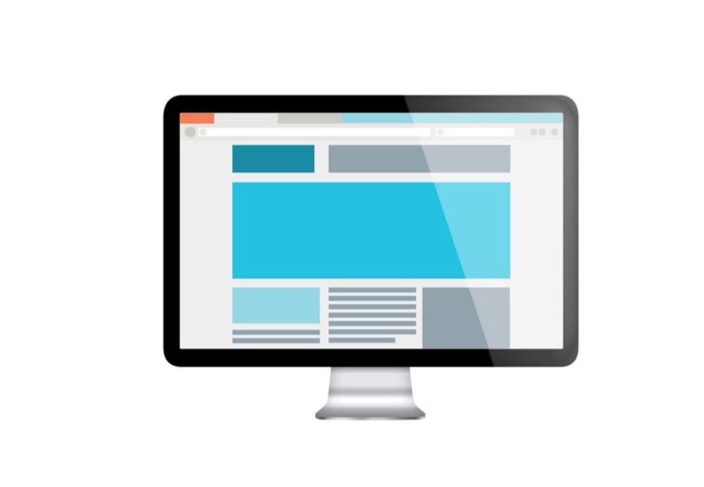
For any business or project that doesn’t require many images, using a feature image layout is a great option. As soon as a user visits the website, the feature image would be the first thing they would see. Feature images are big, bold and unapologetic. It immediately draws visitor’s attention to what it is trying to portray. Using an impressive image here would give the website layout an aesthetic and confident look. After this, the entire image can have understandable text-based content. Such layout is ideal for businesses that have more content to push and lesser visuals.
2. Grid:
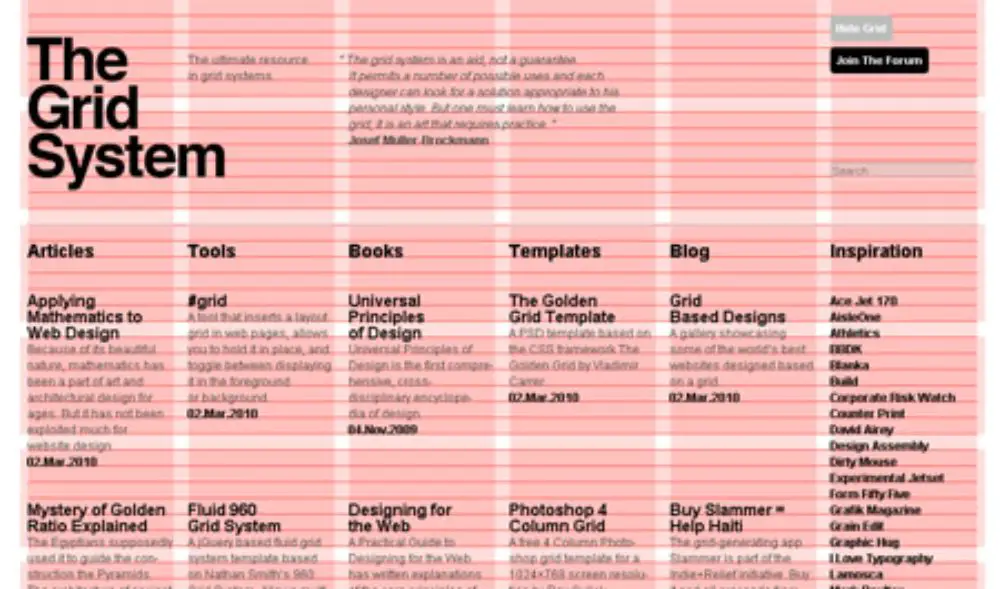
Grid is similar to the feature image in some ways. This layout also includes one big graphic area. Below this is a section where there are various separated blocks of different shapes and sizes. Here the user can insert any content they’d like. The content for these blocks can be product images, textual content, blog posts or any other thing. If a brand has much content and a variety of content, this layout helps them showcase it in the best light possible.
3. Power Grid:
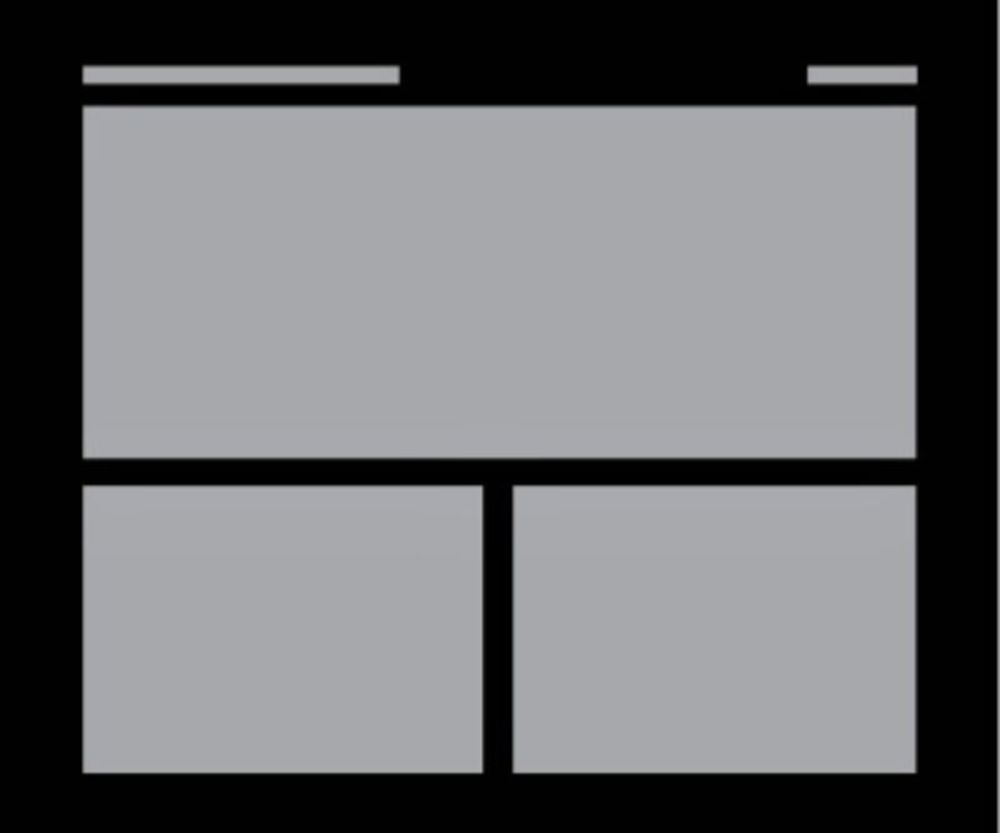
Power Grid is an enhanced version of the traditional Grid layout. This layout uses many different shapes like rectangles, squares, and also makes use of the difference in area between the various elements in the grid. It is an ideal layout if you are looking for a website for a brand that has a lot of video, text, images and other varieties of content.
4. Fixed Sidebar:
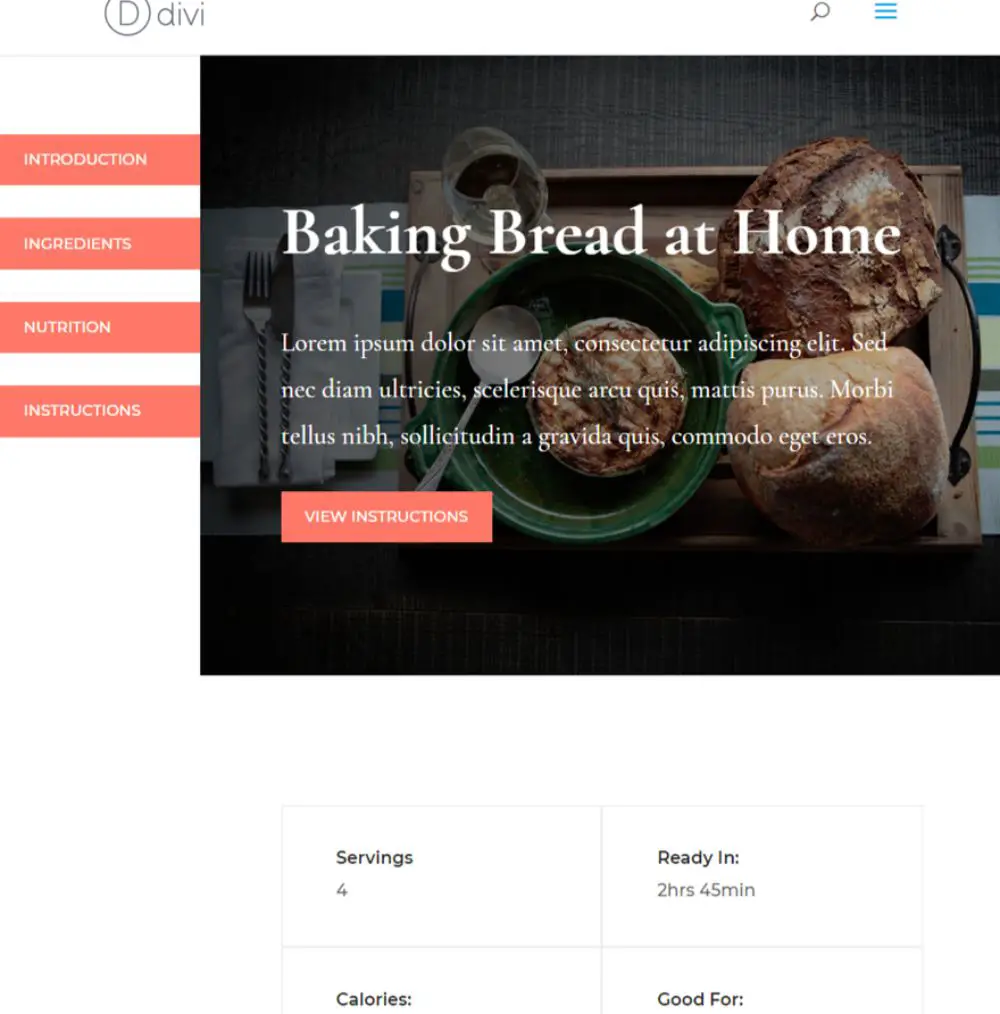
For all the previously discussed layouts, the navigation menu is generally situated on the top of the page. Fixed Sidebar layout sets the navigation to one to the sides of the layout as per the user’s preference. It can also accommodate additional content. This kind of layout is ideal for websites, where you want visitors to have an accessible navigation bar at all times. It would remain on the side of the layout and would be accessible all times for the visitor. This makes it easy for users to move between the various pages of the site without getting lost or spending time to switch to other pages.
5. Responsive Design:
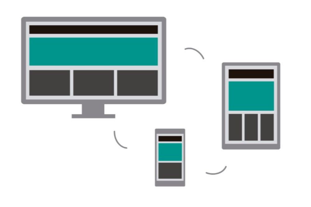
This is an essential aspect of website design that you should aim towards, irrespective of what layout you go after. With the change in time, many users have shifted from visiting websites on desktops to using them on their smartphones and tablets. Having a responsive design is a way of assuring that your website has good user experience across multiple devices and browsers. Make sure to thoroughly check the website out for different devices and browsers before you make it live.
Till now, we have understood how to develop the basic framework of any website. Now this block by block layout needs to be filled with different kinds of content. Some of these essential content types are:
6. Navigation Bar:
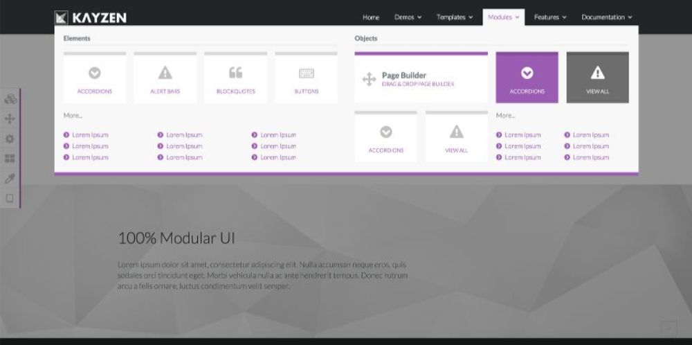
Navigation Bar is the essential map-like feature for a website. It helps the visitors understand where they can go and how the content of the website is organized. A well-structured navigation bar should come to any visitor’s rescue that gets lost browsing the website. A navigation bar is not an optional element to have; any websites need to have a navigation bar. The placement of the navigation bar can be on the top of the sides, depending on the use and content layout plan. A general guideline that helps decide between the top layouts versus the side layout is- use the side layout when you have many subpages, as it is more accommodating.
7. Images:
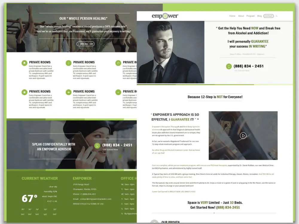
Images have strong visual power and can be a great design element if used correctly. The images can be used for various purposes. They can add support for an idea of your copy to put it through faster, and more efficiently. Photographs have the potential to create an emotional connection with the visitors, which helps increase engagement. If you include an Our Team page, the visitors get to be familiar with the team that adds a sense of credibility and trust. Also using illustrations can show your branding skills, as well as graphics, can help bring focus to the important chunks of your content. Images can be used at many places like featured images for blog posts, as a gallery slider, header images, product pages and author or bio images.
The balance for the images needs to be carefully thought of, overdoing it would cause a cluster effect and too less would make your overall website layout feel less appealing. The focus should always be kept on the content, and the images should add support to the content, not take the visitors attention away from it.
8. Typography:
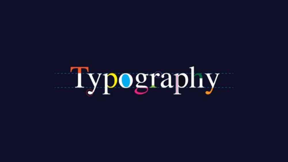
Just like images are essential for a website to look visually appealing, the text is essential to add value to the overall content you have. However, you can’t be ignorant about how you present your textual content. Making use of useful typography hierarchy can help guide the visitor’s attention to priority content easier. For typography block, the few considerations to be kept in mind are – don’t use too many fonts. Generally, more than two fonts don’t provide value, instead look strenuous to look at.
Another thing to consider is you should keep the typography bold and legible. The text needs to be big enough for the visitors not to have to strain their eyes to read your content. Your font selection should also depend on the niche you are targeting. For instance, Times new roman font is ideal for news related websites. However, it won’t be best for a comic website. Other than these considerations, you need to ensure to organize your text. General formatting that helps plan content better are Headers, subheaders and body.
9. Color:
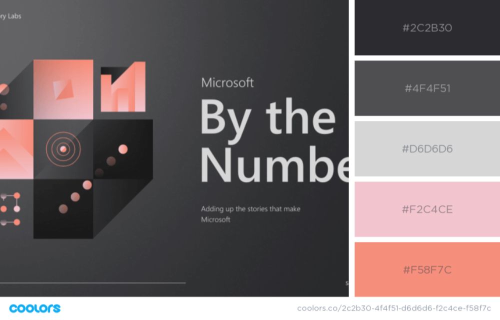
Color is one of the essential designing elements, whether it is graphical or website design. They usually have an emotional and psychological connection attached to them. For instance, blue is often related to calmness. Hence if you are designing a yoga website, blue could be an excellent color to incorporate in the design. It is very important to plan a color palette for your brand and use the same color palette or a similar one to guide your website layout design.
Just like typography, you shouldn’t go overboard with colors on a website as well. A general guideline is to keep it to 3 or less. More than that would look like your brand has no focus or identity. Many times, if the brand is such, lack of colors could be more effective. Additionally, you can also try using whitespace for separating different sections of the website and bringing focus on the CTAs and important content portions.
10. Footer:
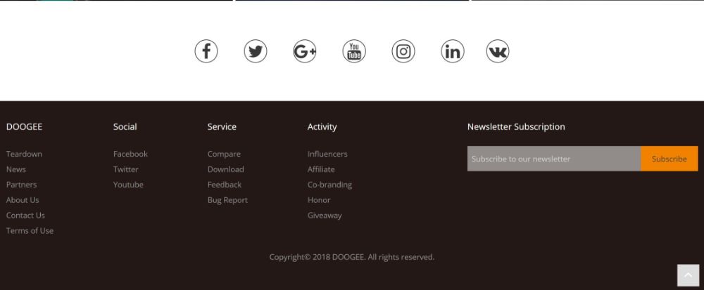
Footers are natural to be taken for granted by many. It doesn’t seem like a critical section, but it truly is. It is a place where you can include all the important information about your company. Link the relevant pages like About Us and Contact Us. Other than that you should include all important legal details of the brand, terms and services as well as privacy policy. Moreover, the footer should include the brand’s phone number, and a Google map plug-in to reach out to the business. It is also ideal for you to include social media buttons here.
11. Call to Action:
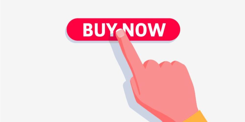
An important element of a website is a call to action. CTAs are opportunities for you to drive the engagement and conversions by giving the visitors cues and encouragement to do what you want them to do. There is a variety of CTAs that can be included in a website. There can be a lead generation CTA where you can ask the user for an email address; then there are forms, read more, sales closing and many more. The CTAs should be used strategically for grabbing the attention of the visitor. They should be very clear and easy to understand.
12. Pop-ups:
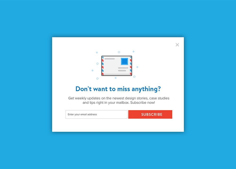
Popups aren’t something that adds to the user experience. However, they are still an important effective way of capturing possible leads and increasing database of email-ids of visitors. Having a good database is an effective manner of marketing. There are various kinds of popups that you can make use of, as per your liking and what you feel would be most effective. Time-pop ups are popups that would keep appearing at specific time intervals, click pop-ups get activated when the user clicks a specific area on the site on the other hand scroll pop-ups would trigger when the user scrolls till a point on the website. There are also entry popups that would load up as soon as the visitor reaches the site and exit popups that show up when a visitor tries leaving your website. All type of popups is different and serves different purposes and goals.
It is very important not to overdo popups or else the visitors would be thrown off and not continue using your site. It has to be blended in the website layout as subtly as possible. As far as the size goes the pop up can take up the entire screen, it can be an overlay in the centre of the screen and also a slide-in box that slides onto the page.
This is the essential block by block website layout making technique that will help a designer focus on the individual elements, creating a synergy between them to create a well-structured website layout. You need to take care of all design aspects and use the elements correctly in the correct hierarchy to match your brand requirements. As a bonus, it will help showcase the brand in the best light possible.
The post How to Create a Website Layout Block by Block appeared first on Web Design Blog | Magazine for Designers.
via https://ift.tt/2RWZpjG

No comments:
Post a Comment