Logos are one of the easiest ways to connect with a brand, they help us form a first impression. From a designer’s perspective, they are the way a brand says hello to the people watching it. They’ve got energy, vibe and they play an important role in the branding world. Seeing the logo evolution is quite interested and understanding how some of the most known ones first looked can be something that you should check out.
In the end, a company logo is a tool that helps it connect with its public so people can recognize it easier and faster. Without this part of branding, people will not be able to different companies so they will not know how exactly to expect a certain standard or quality from the company they interact with.
Some of the old logos that are iconic today have gone through a lot of changes so you might not even recognize them if you compared the old version with the present one. The history of logos has a lot of stories to tell so let’s start exploring more about this.
How Can Company Logos Change or evolve?
Many marketers focus on branding when they want to get more awareness in the market. Even today defining branding is quite difficult because there is a lot of definition that can be given to it. Still, companies that choose the branding aspects should consider any key moment that can help them grow. It is important that logo changes are connected with a purpose and that everything is built around the values and mission of the brand.
Logo evolution shows us that you can adjust it in diverse and sometimes even unusual ways. Below you can find some elements that can be used when this type of change appears.
Check the logo evolution of some popular brands
Microsoft
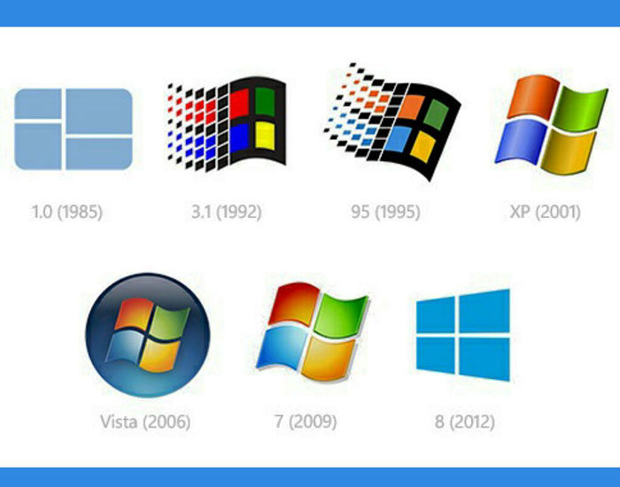
Since it was launched back in 1975 Microsoft had a simple logo that got changed a few times in time. Most of the designed were focused on text-only and their final version went towards some color as well especially when they wanted to feature their most famous product, Windows.
In 1992 a new Windows logo was shown to the world, it was a window with four panes and a black frame. This remained the same till the launch of Windows XP in 2001. So, as you can see the logo evolution takes some time in order for it to manifest, changes don’t appear overnight.
Coca-Cola
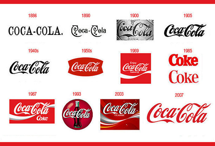
One of the most known old company logos for sure is the one that belongs to Coca-Cola. It became an official trademark in 1886 and its first logo didn’t have any script design, it just was the brand name in black using a sans serif font. A year later this changed, and the color got changed to brawn.
As time passed the font just adjusted but it kept its original shapes and the small dash that made it iconic. For sure Coca Cola is a great example of logo evolution and how important it is that sometimes you keep the original elements of your brand.
Amazon
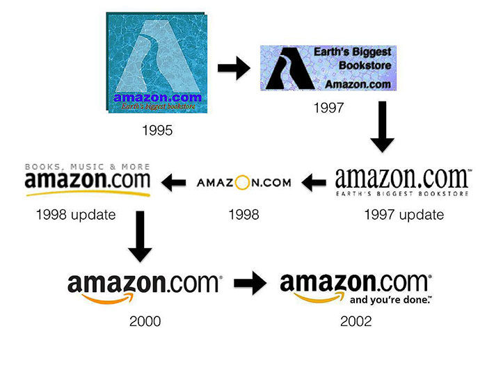
This online retail giant is probably one of the most known websites on the internet and it looked its name from the largest river in the world. The logo is brilliant and if you look well at it you will see that the arrow used shows the idea of A to Z, they basically have everything in their storehouse.
The end goal of this retailer is for sure to always have a happy customer and this is why the arrow ends with a big smile suggesting that the current logo is doing the right mission.
Apple
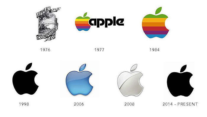
Apple always went for a simpler approach in its products. Since the launch its logo evolution had some changes along the way but now is looking better than ever. Their current logo is simple and easy to remember, it basically checks all the principles a logo should be.
The old logo that they had was first launched in 1976 and it was very different from the logo we got to know today. It featured Isaac Newton that was sitting beneath a tree and had an apple almost ready to drop. Sure, it was creative, but Apple changed it fast with a more simplified version and made their logo be similar to an apple.
Between 1977 – 1977 Apple used. the color version of an apple having a rainbow effect. The logo changes that took place after just continued to get to a more and more simple version.
Walmart
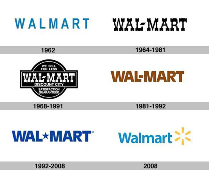
Walmart is one of the biggest retailers in the world according to Forbes. In the past, they had some critical moments, but they managed to focus on their mission, and they overcame them. It has some of the most original logos that you could have seen back in 1950. The first one featured the name Walton’s.
After 12 years it changed and more exactly in 1964 the logo got a western font that was accompanied by the slogan We sell for less. Through the logo evolution of Walmart, we can see that they always focused on keeping some similarities with the original design.
The final form was done in 2008 when it was turned into the well-known version that we know today. The brand’s name became Walmart and you might also find it featuring the slogan Save money/Live better.
Volkswagen
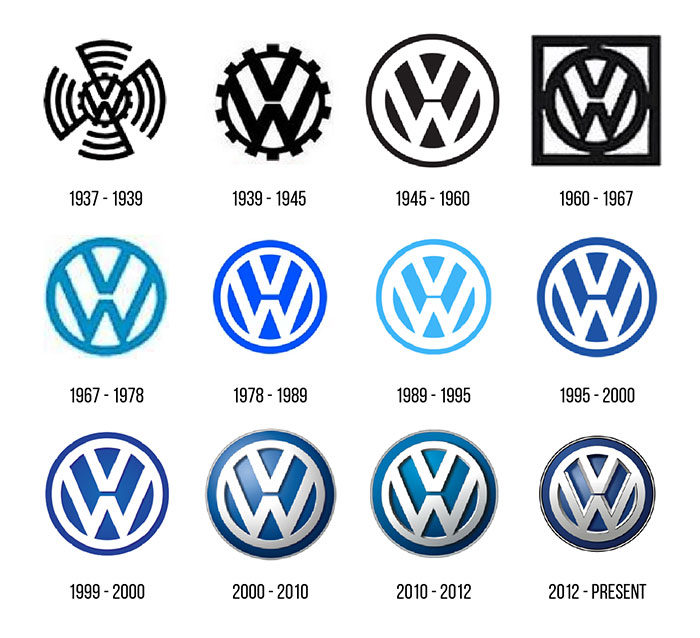
The evolution of logos also brought this brand up to our list. In 1939 when the original VW logo was made it had bumped teeth around a circle to make it look similar with a gear. However, before the WWII ended this changed and in 2000 the VW logo had blue and silver as its main colors.
Nike
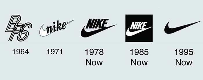
Besides having a great logo, Nike came up with a great slogan as well. If we check its logo evolution, we can see that the first name they used in their logo was The Nike Swoosh. Over time it remained relatively consistent but as the company brand grew its symbol became famous and they could drop the name entirely from the logo.
Pepsi
![]()
In the first original logo, they had Pepsi had a red script on white. Pepsi introduced a red, white and blue round bottle cap to its design in 1950. Since 2011 Pepsi kept it simple and the striped circle stands alone as its logo.
Adidas
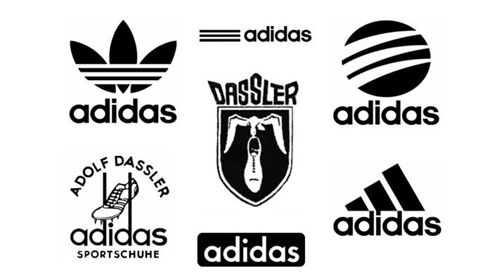
Another mention that we have is one of the old logos that made it big. Adidas persevered the same font and three stripes while changing their icon over the years.
Shell
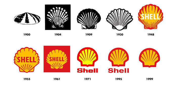
The colors and shape of the Shell logo are very distinct that they even don’t write their name on the logo anymore.
BMW
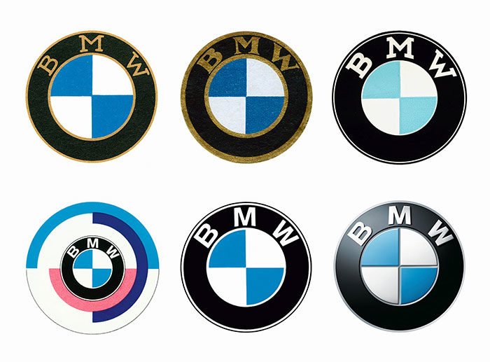
People know BMW as having a powerful car as products, but few people know what the logo really means. It actually symbolizes the movement of an aircraft propeller that cuts through the skies using its blades. Since its launch, the logo evolution of BMW did not suffer major changes. Fonts and colors were changed a bit.
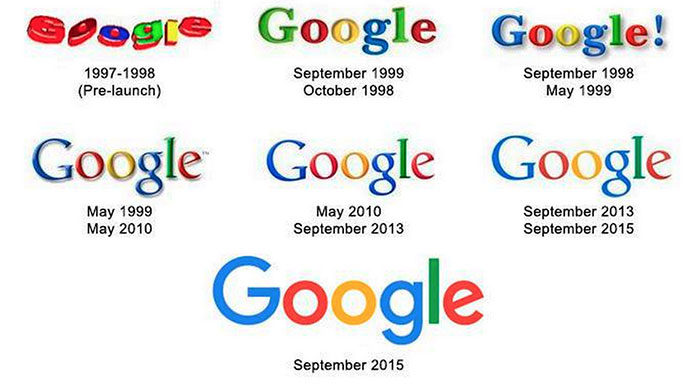
Google is a giant and it is a great example of how a simple logo can express so much. The logo features the three primary colors, the message behind being that Google doesn’t always care about rules.
If you enjoyed reading this article about logo evolution, you should read these as well:
- Learn About The Apple Logo: The Tech Giant’s Branding
- The Coca-Cola logo: Over a hundred years of logo evolution
- The Adidas logo: What makes it so special
- The Nike logo (symbol) and the history behind its simple design
- The Amazon logo: Its meaning and the history behind it
The post The spectacular logo evolution of famous brands appeared first on Design your way.


Source: https://ift.tt/2RtLYc9


No comments:
Post a Comment