The app design trends always keep on changing. The more attractive and vibrant colors the app design has, the trendier it gets. Recently, app designers are taking inspiration from old school designs and colors to connect with the users by bringing nostalgia. Users get attracted to new and trendier app designs, but they relate to those designs whose color palette and fonts remind them of the good old times. The app designs always convey how the thoughts have evolved and the way we want our communication designed.
The speedy growth in technology is bound to affect design trends every year. It is a must for a designer to stay updated about the upcoming trend. Designer and IT professionals should always be aware of the new updates and the current trend to continually study, improve and enhance their skills to get better recognition and idea about the market.
1. Animation and Micro-interactions:
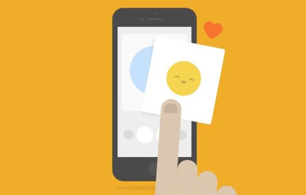
Animation is something you would see in every part of the application. It may be a tiny animated element, but it is sure to find a place in the app. The transition of the colored button when the users hover over it is one of the examples. Animation helps to keep the users hooked and enhance the way people view digital products.
Micro-interactions play a vital role in applications which may go unnoticed sometimes. But when the micro-interactions have missed from the interface, it is then you realize that something important is amiss. To explain the micro-interactions in a better way, let’s take the example of Like function on Facebook. It is seen as part of the interface and is important yet go unnoticed, only while it is missing you would realize it.
2. Gradients:
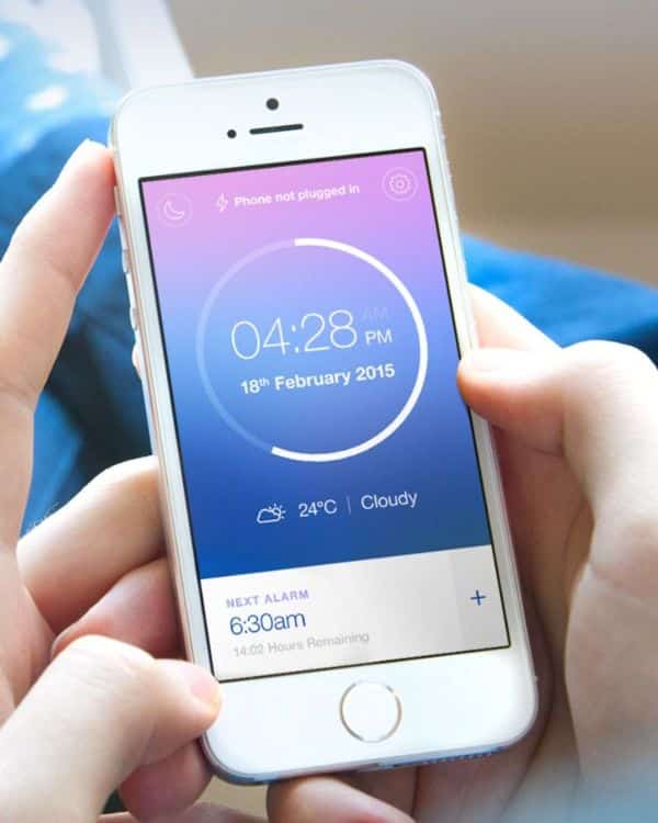
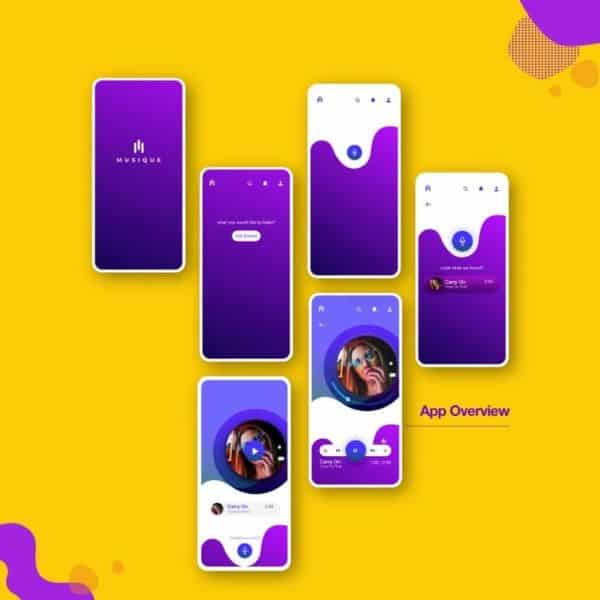
The minimalistic approach has taken over the app design trend. The designer follows the rule of reducing unnecessary content and object from the design to make the critical content and design look more prominent than in other design. The minimalistic approach creates designs which have more of space which led the designs to look the same. The similar-looking design led to the use of gradients. The flat color or space was taken up by the gradients. Gradients add a certain depth and make the application look more visually appealing.
Moreover, the use of gradients would increase as the designers could add the branding color and can connect to the users like never. In 2020, the gradients are the trend to follow as the gradients keeping the minimalistic approach still manage to maintain the style and simplicity in terms of application. Gradients not only add depth but also makes the design attractive, which makes the user interface bring out a different feeling for the users.
3. Dark Themes:
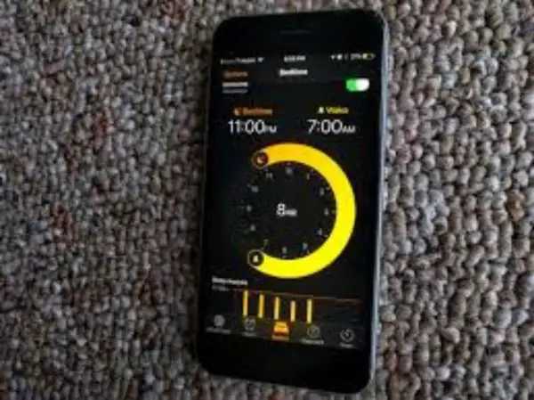
One of the most Application design trend that is currently taking over is the dark themes. The dark themes are where there is low light in the user interface. Usually, dark themes use two color design and have significant advantages for the users. The dark theme saves battery power and the use of bright pixels.
It also reduces eye strain and adjusts the screen brightness as per the external lighting conditions. Dark theme is bound to make any theme much more prominent than the others. The app design trends are visually appealing and dark theme adds to the appeal.
The dark theme tends to save energy and extend the life of the screen. It is usually suited for OLED screens. The best part of the dark theme is that it is bound to make your application better than before.
4. Futuristic color overload:
An amateur designer tries to bring all the color in the application design. There are colors which are natural and specific are created by designers. The natural colors were in use for a long time. Now designers use contrast colors like purple, pink and blue to make the application more visually appealing rather than using earthy tones like browns and greens.
The colors purple and pink are dominating the application trends now. The bright colors give a glow and a pop against dark backgrounds. Not only the bright colors make the application trendy but also look cool as the users want. Moreover, today’s application is created in a way to present a bold and vibrant color to show the real potential of their brands.
5. AR:
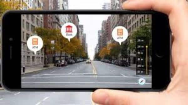
If you want to give your application a mixed reality approach to create the layouts more functional, then you must imbibe AR into your applications. Apple’s AEKit and Google’s ARCore supports augmented reality. When the device usually a mobile phone is turned on and placed in a specific position, it executes navigation is what AR does.
The way the technology is speeding up and the trends are moving ahead suggests that augmented reality would become a vital part of the mobile devices and a vital part in everyday human reality. The augmented reality has been since long in online banking, e-health, e-commerce and offline purchases as well as construction and engineering.
The users can save time with augmented reality as the task gets simplified. AR used in applications, makes the functions activate the unique or real 2D graphic tags. Moreover, the design trend is already famous and would get more in future.
6. Transparent Elements:
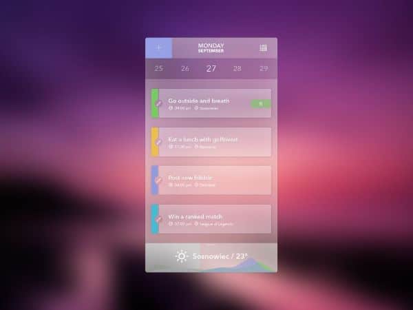
The trend of gradients is getting stronger and integrating to every app design. The attractive colors used in gradients are great for the design to keep the users hooked. The new trend that is overtaking is color pops and overlays going semi-transparent and transparent. Using the transparent elements, the designers create a sensation through this design which makes the user feel that they ca touch through the layer. The design gives you the feeling of lightweights.
Through this design, the designer tends to give out excessive information. Information on the page doesn’t seem heavy or overwhelming as individual design elements are transparent, which also doesn’t look cluttered. The design is bound to be accessible as the mobile device tends to have less screen space and yet has to contain all the information a design which transparent elements make it visually enhanced. Content and image segregation is done by a layer which is not upfront but subtly gives the application a better view.
7. Rounded, organic shapes:
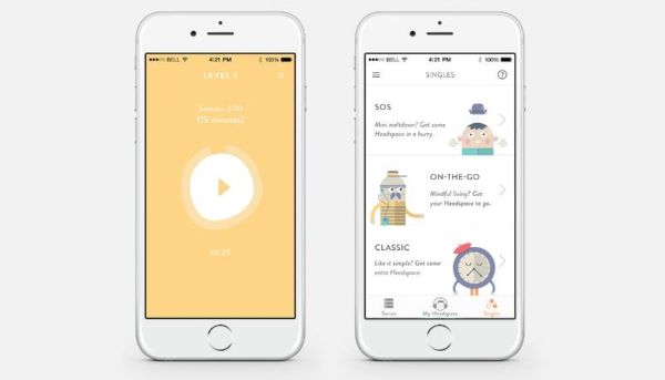
Round Shapes and organic shapes give a soft side to make a specific theme which is upfront rigid and cold. It is one of the upcoming trends in app designs. These soft shapes engage users and bring out a more natural way for interactions. When the users come with an technical based application , it creates tension to understand the topic and instructions.
Using soft shapes to illustrate and instruct makes any topic easy and friendly. The organic shapes used in the application makes the user comfortable with the information presented as it is easier to understand. It takes away the stress and fear that comes with topics like finance or economics.
8. Retro Vibes:
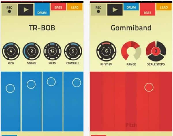
The simple graphics pixelated and block text which used to rule the computer screens in the late 80s and 90s have come back with a bang. The retro vibes are taking over the design trend and is getting the necessary hype. Retro vibes are those designs used back in the times of video games. Some designer tends to go for the whole design to have a retro vibe.
In contrast, some create the retro elements at some spot of the application to draw the user’s attention and guiding it through along with the modern fonts taking over the other spots. With the retro vibes keeping up the pace, it not just text that designers are inculcating in the designs. But sometimes keep the text to the modern fonts the colors used in the design is a retro-inspired or the type of illustrations or schemes used. It is about the limit to which the designer wants to go with the retro vibe in the application.
9. Personalization and customization:
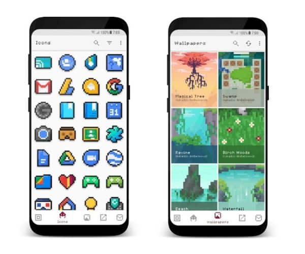
The trend that would be evergreen and continue to be trending is personalization and customization of the app design. Customization is what everyone needs and what we expect when it comes to anything. Users are thrilled when Facebook shows the things that you would have just talked.
There is an expectation of users to personalize the experience, and that is what the designer works. The application must treat the users as individuals, that is what the user expects, and the designer does the work for us. Individual choices given to the users, allows the application to judge the needs of the users and generate an output which is not generic but specific to an individual.
10. Illustrations front and centre:
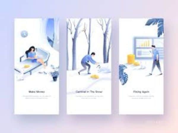
Graphics are usual when it comes about application designing. Illustrations are put in use to represent the brand or product. Rather than an image or photograph cut pasted in the design, an illustration would give a better organic feel to the users. The illustrations are more comfortable to connect with, as they just represent the theme or brand and not any person.
The images used in design tends to get biased on the name of race or country. Illustrations help to overcome the negative aspects of the images used in the design. Capturing the attention of the users can be through illustrations in the design.
Whenever an application is in creation, the need and preference of the users must be known. It is essential to know what kind of feeling or emotion of the users need a connection through the design. The generations need more customizations and a realistic approach when it comes to the applications. So, the designers must keep a check on the upcoming trends that would suit the users.
It is more than necessary for the designers to know to communicate to the users through the nonverbal and non-visual interface, which helps to connect with people with disability. With high-speed internet, the number of users has increased over a global network. And that has increased the interactive elements in the design of applications.
All the app design trends are exciting and make the users feel good about it. The dark theme enables the users to have a good read during late nights and makes it simpler not manually to change the setting to reduce or increase the brightness. The trends keep on changing, but the designer tends to bring out the best, creating a mix of retro and modern designs.
Like the old designs come to trend bringing back the nostalgia, it is designers that implement it for us. The trends keep changing, but the trends that stay or become popular are the ones which designers work on and push boundaries and integrate old ideas and create stunning designs which are praiseworthy. Stay updated always!
The post 10 App Design Trends to Follow This Year appeared first on Line25.
Source: https://ift.tt/2xPisGt

No comments:
Post a Comment