Website prototypes refer to an interactive representation of the web design. A website prototype doesn’t have all the features of the final build; however, it helps the designers to get an excellent idea about the functionality, flow and user journey of a website. Website prototypes are a high-fidelity visual version of a site that links screens and conceptualizes how the website would function before it gets built. It is essential to create website prototypes so that the user can interact with the website as closely as to how the website would have behaved if it was already built. While prototype might not include any transitions or styles, the basic functionality and interaction can be tested with ease and efficiency.
Prototyping is very beneficial for the design process as it allows the designers to save a lot of time and resources on the overall project. Finding out about the areas of improvement helps make rectifying the errors easier as compared to identifying them once they are in the development phase. It also helps the designers visualize the site better as compared to working with flat visuals.
Clients especially need them for various reasons. It helps them visualize the look and feel for their future website at the very beginning stage. Website prototypes also give them the flexibility of changing the vision and finalizing on it for a lesser cost. They can set the timeframe and expenses more accurately. It makes sense for a client to be unclear about the vision on the website they want to be built during the initial stages. Most of the times, their teams can’t come to an agreement, as they have different opinions. A website prototype allows considering most of these ideas in an unbiased manner, to give more clarity and save time and resources. Prototyping also helps save immense money on the website development end.
These are the best practices for creating website prototypes –
1. Know your audience:

Website prototype designing and development process would involve many people throughout the chain. Hence you need to present your content according to the teams you are discussing the process with. This means the information you share with the marketing team would not be the same as the content you show to backend developers. Hence, it is important to have relevant features in the prototype to cater to your audience. Showing a copywriter the animations might impress them, but it wouldn’t certainly add any valuable inputs. Understand the role each department has and discuss with them the part they’re responsible for. It is important to have clear communication and work as a collaborative team to make sure all aspects are thoroughly covered.
These are still people who have been discussing the prototype since you began working on this project. It is easier for them to understand the concept. However, other external audience members are the actual users of the website. To explain to them the functioning and the purpose of the website prototype, you need to know a few things. Firstly, be aware of who your end users are. Secondly, understand what their expectations regarding this site are. Finally, run a usability testing on a prototype built after factoring all these points. To get effective feedback to improve the prototype, you might need to ask a lot of questions to the client regarding their expectation. Avoid using technical jargons as most of them might not be very versed with them.
When you are testing a prototype, it is of utmost importance that you put the prototype in front of an unaffiliated user. This would help you get honest and accurate review on the prototype’s functionality, usability and information architecture. Having the ability to identify several small problems at this stage would make working on them easier, as compared to identifying these problems once the website code and design reach too far.
2. Start with paper and pencil:

Even when you are designing something digital, you can always start analog. Before you turn to pixels, you can always pick up a pencil and a paper to roughly sketch out your prototype. By making quick sketches that have low commitment needs opens up a designer to try creative solutions in lesser time. It also helps the designer get a basic idea of the structure before moving to pixels. If you are tight on a deadline and need to create instant presentations, PowerPoint and Keynote are more than sufficient software to communicate a simplified version of your site’s appearance.
3. Make use of CSS and HTML:

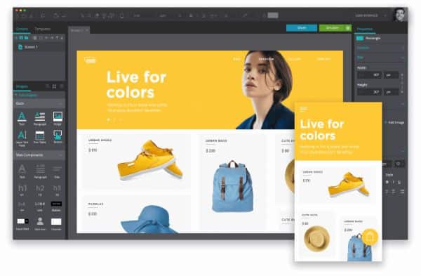
A coded prototype is one of the best ways to demonstrate how a website would function and look. Hence sticking to CSS and HTML would help us achieve exactly that. A prototype that is made on code saves time and hassle. Since there are different devices and screen sizes out there, using HTML and CSS would help get a quick understanding of how the website would look on them. This eases the process as now you just need to send one link to everyone involved instead of multiple PSD files.
When you are checking how the website would look on different devices, you might come up with some changes that need to be done. With CSS and HTML coded website prototype, you can make the changes in the working model. Doing so would ease the development process and let you launch the website faster as compared to some traditional methods of prototyping. It is also far more impressive to show all the work you’ve put on the website rather than theoretically explaining it. Coded website prototypes also help identify bugs that pop up during the development process.
4. Design using real content:

A prototype is way more than a wireframe or a mock-up. It doesn’t even need to the complete version. It is not a compulsion to use real content in the design process, and you can use dummy text for the prototype stages. However, it is always better to make use of actual headings and content that is going to be on the final website, even if the content or copy is not refined or in its initial draft. Having real content to fill up the space of dummy content would help an outsider to understand what the page is about and how the information is structured.
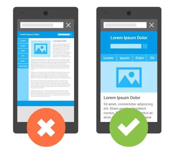
5. Don’t forget about mobile:

For any successful design, you need to know the idea that needs to be communicated as well as the action you want the people to take next. Finding the focal point for each page is particularly important for mobile devices. The limited screen size can be challenging and demand creativity.
You can start by removing distracting and repetitive elements. The layout needs to be clean and concise. Don’t include any bulk content or graphics. The simpler the layout, the cleaner it would be. Also it would be easier to communicate what it is supposed to. People who are going to use the website on their mobile screens would only have their finger to interact with it. Their navigation needs to be made simple. The effort should always be on trying to give the users the access to do what you want them to, in the least amount of steps. Prototypes also need to show how animations, micro-interactions and other dynamic elements would help improve the user experience.
6. Website prototyping with professional apps:

If this seems a little overwhelming, you can always rely on professional apps for assistance. Many useful apps are specialized for website prototyping. There are Sketch, Microsoft Visio, Axure Pro, Adobe InDesign, Adobe Photoshop and many more applications. Any prototype made with these tools would have a professional look and aesthetic. Some apps also allow you to add clickable elements to the prototype. However, this approach could have certain disadvantages. Most of these apps are expensive and require a certain level of expertise to utilize them. Moreover, only the designers would be able to revise a project. Hence there would be multiple versions which might get lost in emails.
7. Prioritize prototyping over planning:

Website prototyping is an effective way to validate and work on existing assumptions and requirements. When you spend more time and resource for planning, it creates a list of heavy documentation. Going through this documentation could lead to misinterpretations and assumptions. It would be much easier to focus more on prototyping as it would bring every same page much faster. When you effectively work on a prototype, it has the capability of instilling a quick understanding of various stakeholders. Then you can take their valuable feedback and make improvements in the early stages of the process.
8. Share the prototypes early and consistently:

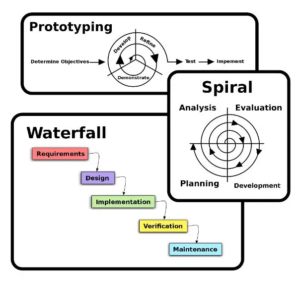
Website prototyping is a cyclical procedure. You should start with the basic wireframes and functionality. Next, remove the areas that need clarification and details based on the stakeholders’ feedback. Even if your project is nowhere close to perfection in the early stages, the more you share it, and the earlier you share it, you would get more valuable feedback. This would also save time and avoid confusion as you wouldn’t be working on any wrong assumptions since you are continually communicating and showing the work to the stakeholders.
9. Don’t include everything in the prototype:

You should not waste time prototyping every element of your website. Prototyping everything is a waste of time, efforts and money. Instead, identify the important elements that need to be prototyped and tested. Prototype the involved elements, require buy-ins or the ones that require user-testing. It is important to remember that a website prototype is not meant to be the final product but a place for collaborative understanding and getting quality feedback to improve the outcome. It also helps every stakeholder be on the same page throughout the process.
10. Set realistic goals:

It is essential to sit with your clients and first discuss the scope of work and their expectations out of the prototype exercise. The duration and all other deliverables should be discussed beforehand with rough cost estimation to avoid any confusion after starting the process. Prototyping exercise must go smoothly. Any interruptions after the process starts can affect the quality and efficiency of the website prototyping process. As a website developer, it is also essential to make your clients understand the value of undergoing this process, as not all clients might be ready in agreement for it. It is the developer’s job to make them realize the benefits of website prototypes in the long run.
These were the 10 best practices for creating website prototypes that you can use. They would help you create an impressive and feasible structure that would ease the process of continuous testing and inputs. Be as transparent and open for discussion with the clients as possible. This would only help you to identify issues at the early stages so you can rectify them quickly.
Moreover, using website prototypes would also allow you to identify some advantages or features that you wouldn’t have earlier thought about. Hence you could implement them in the website design as well. Carrying out this process would help you understand what you’re building and how relevant it is to what you want the ultimate product to be like. Keep practising and follow these 10 practices to bring efficiency to your website prototype design process. It is much better to rely on coding rather than paid software to create the prototype as it is easy to edit and work upon. It democratizes the process and allows all stakeholders to edit or review the prototype.
The post 10 Best Practices for Creating Website Prototypes appeared first on Line25.
Source: https://ift.tt/34JFt9V

No comments:
Post a Comment