We are surrounded by a world where we are constantly bombarded by advertisements on a daily basis. We can see ads everywhere – on TV, on the radio, on billboards, leaflets, signs, newspaper – basically, everywhere you look. An interesting fact that an average human being sees more than 360 ads every day, but only about three percent of those ads actually stay in our memory. That is why only the best print ads make it into our minds.
One might think that digital ads and online advertising is the staple of the advertising of companies nowadays due to the rise of the internet, but it is actually the traditional style of advertising that is more important.
It is no surprise to see that so many people work in advertising and marketing today. The numbers of marketing professionals are only rising, and the need to come up with new and fresh ideas is larger than ever before in a market so saturated with old ideas.
The best print ads must today be compliant with the large variety of ways that advertisement works – it must be a multi-layered process, one where the ad is promoted on various platforms, and especially on social media, which have a massive influence on people today. Sometimes a simple formula that mixes a good picture with the right words works better than a more complicated approach with lots of editing.
In this article, we will take a look at some of the best print ads out there – ones that have caught the eyes of many people with inventive, fresh, comic, controversial ideas.
The best print ads
Keloptic: Van Gogh
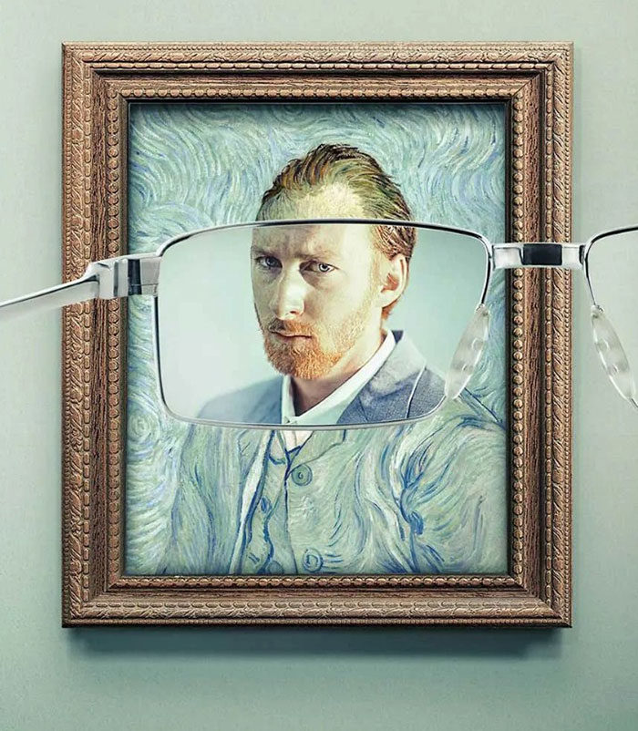
You may not have heard of Keloptic before, but this is an online optician that sells eyeglasses and sunglasses as well. But after seeing their print ad, this company might stay on your mind for a long time. It smartly uses the van Gogh’s self-portrait to promote their eyeglasses, as if the picture is so blurry before and after using the glasses.
The ad is quite smart, we have to say, because it uses a well-known painting that makes it even more popular, and it makes a twist that is slightly humorous, but also very smart and inventive. And the ad also promotes the eyeglasses very clearly – you can quickly know that this ad promotes eyeglasses. This makes it one of the best print ads out there.
Children can be scary
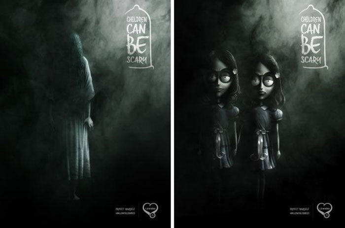
This print ad covers quite a controversial topic nowadays, especially in Africa. This print ad was issued by DDB Mozambique, and it promotes the idea of safe sex by promoting Lirandzo condoms. This print ad features some of the scariest child characters ever seen on television, such as the twins from the movie The Shining and Samara from The Ring. This all ties together in a smart ad promoting safe sex and the use of protection.
Use the fold
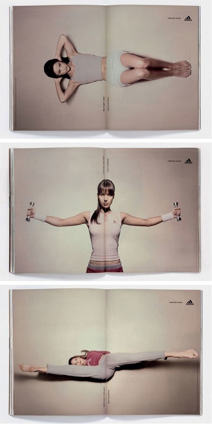
This is an Adidas print ad that features a double-page ad and it smartly uses the fold of the book or the magazine to portray athletes doing various exercises, stretches or dumbbell movements. This is one of the best print ads in sport.
Glacial
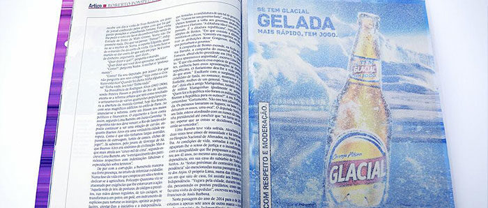
Who doesn’t want a cold beer on a hot summer’s day? This print ad was designed to portray exactly that, the coolness and freshness that beer brings after a long day at work. This ad was made with salt particles to portray the glacial effect.
Hulk Have Boo-Boo
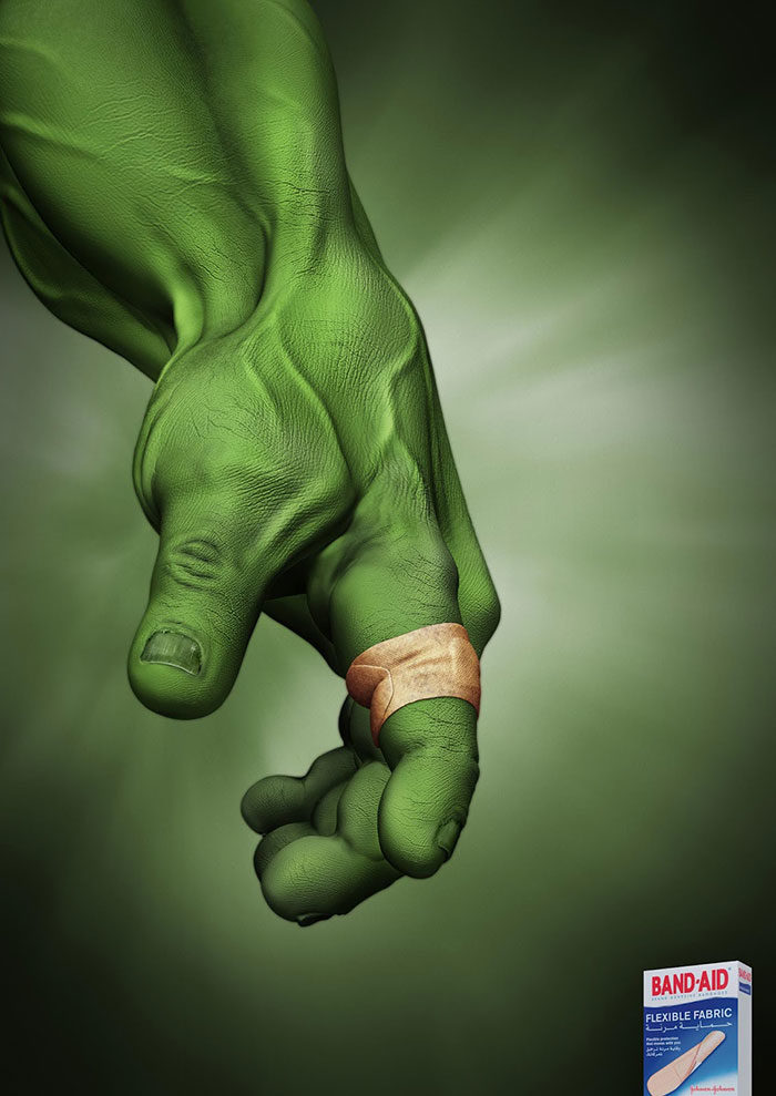
This is a very smart and quite comical ad for Band-Aid – it is so flexible that it fits around a Hulk’s finger, and that is certainly no easy feat. It is quite funny because Hulk is known to be this giant strong being that destroys everything in front of him, but he still wears a Band-Aid. This is a great example of a print ad using popular characters to promote itself.
SANCCOB: Save the Penguins
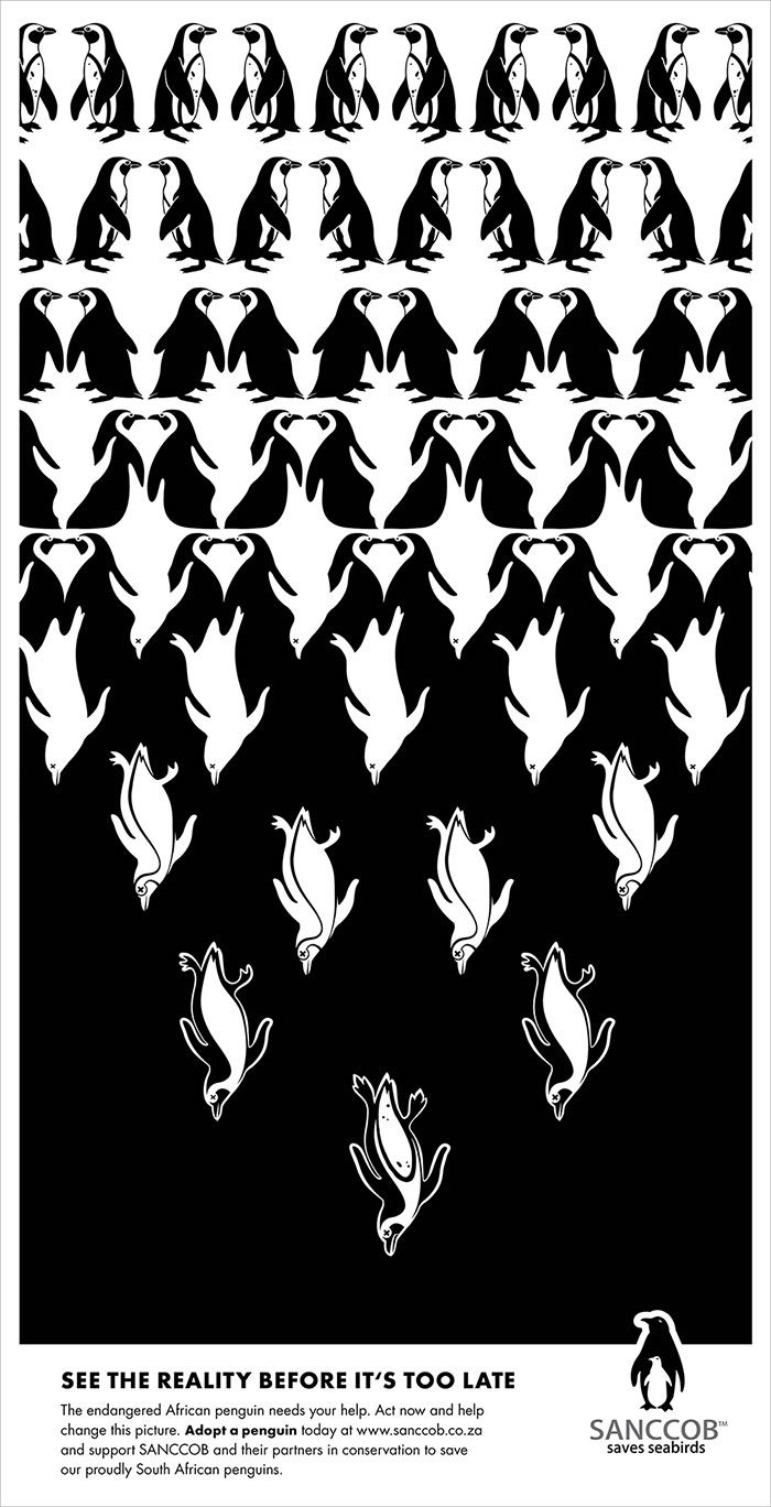
This series of print ads is one of the best print ads promoting the safety of animal species. This ad was issued by SANCCOB, an organization that helps seabirds to avoid extinction. This specific campaign was made to save the African penguin, and the print ad is quite smart.
This print ad features some optical illusions which actually promote a very good idea for saving the creatures. The structure of the ad shows that the numbers of the penguins are falling with a pyramid shape used for the illusion.
IKEA iDealisk
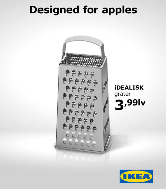
This ad is an example of a company getting an idea from another company’s product to make a comical effect. The IKEA iDealisk is a cheese grater – now you might think, this is nothing special, it is just a tool.
But it turns out that IKEA made a smart marketing move by mocking the design of one of Apple’s products (which looked like a cheese grater) and use it for their own advertisement. On the top of the ad, it says “designed for apples”, which we could translate directly to the Apple product. A very smart print ad.
Make your audience look twice
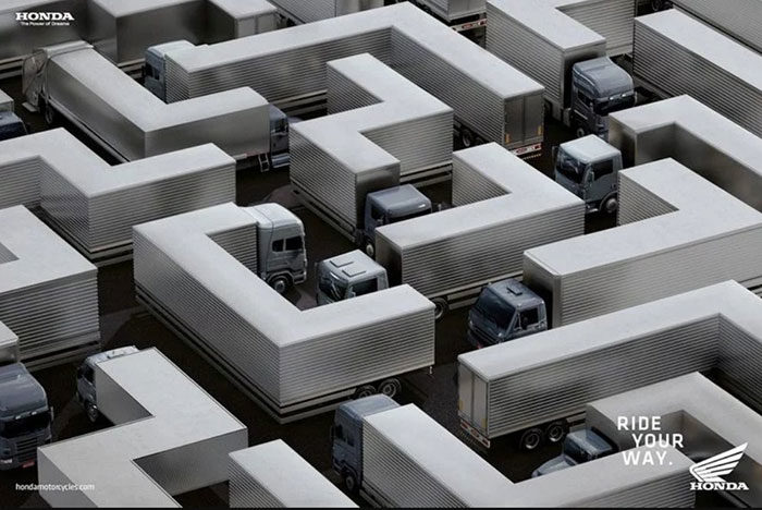
This is one of the best print ads for motorcycles. It was made by Honda, and it promotes motorcycles as a way of traveling faster through thick traffic where you can avoid bumper-to-bumper action and get ahead of the traffic and weave through the holes. There is a slight optical illusion in this ad, where trucks are twisted in such a way that they look like a maze.
Nivea
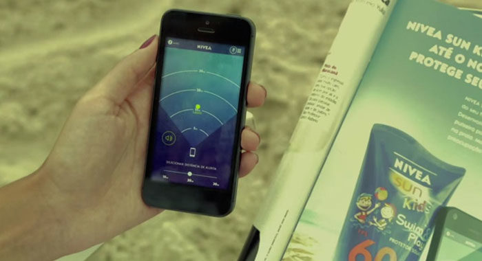
This print ad received the Mobile Grand Prix award at Cannes in 2014. It is an ad for a wristband which lets you know where your child is and it also lets you know if the child is too far away from you. A smart ad for a smart product.
Shhhhhhh

A very ingenious ad for JBL headphones – it promotes noise cancellation with a portrayal of two of the world’s most famous politicians, Donald Trump and Kim-Jong-Un screaming at the kid’s ears, but he cannot hear them because he wears noise cancellation JBL headphones.
French Ministry of Health: Children Obesity
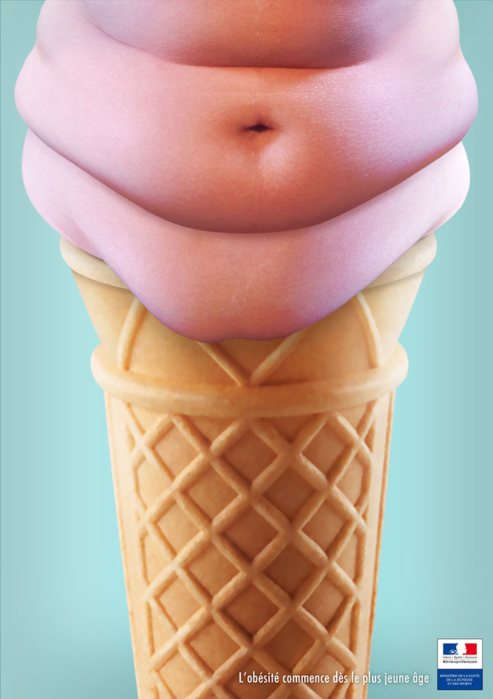
Another very smart print ad that promotes a healthier lifestyle among teenagers and youth. Issued by the French Ministry of Health, this print ad smartly promotes the idea of a healthier diet for youth. It features an ice cream that looks like the belly of a fat person, and it promotes a notion that eating unhealthy food will result in obesity and promotes healthier diet.
Breakfast means breakfast
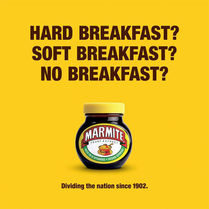
Another print ad that uses political surroundings to promote one of their products. This time it is Marmite, a producer of a yeast spread that continues to polarize – some people like it a lot, and some really hate it. It is the same with a certain referendum in the UK that splits the nation in half, and Marmite used that to their advantage.
Use animals to send an important message
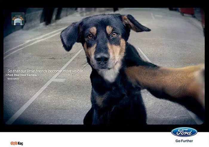
This is not a dog taking a selfie, but it is actually a view from the rear camera from a Ford vehicle. This print ad promotes safer car parking with the use of a rear camera, and it uses a dog to promote a larger safety – in this case for the animals that might get run over by backing vehicles.
Motorola
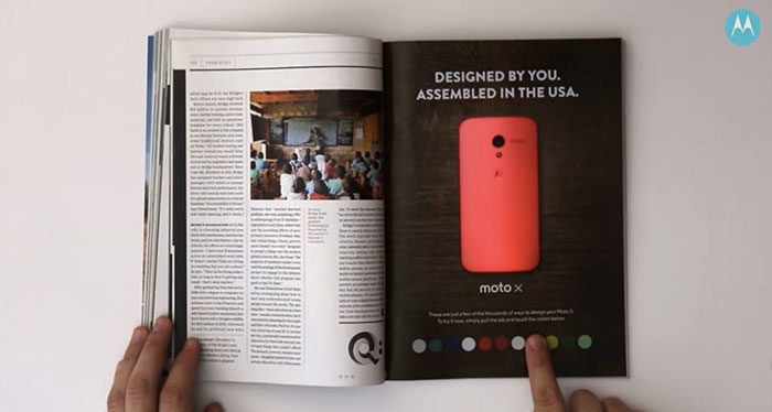
This is one of the best print ads for smartphones. The Motorola Moto X allowed the users to customize the “shell” of the phone in their own way, and this ad represents just that.
The Perils of Parallel parking
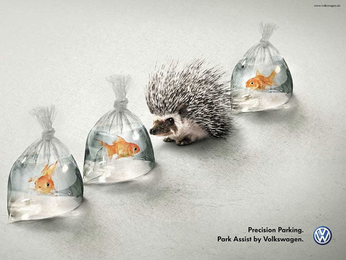
Another car ad that uses animals to promote safety system – this time it is Volkswagen and it promotes a safer car parking with the use of parking assist feature that helps reduce the risk of unsafe parking protocols.
Kentucky Fried Chicken: FCK
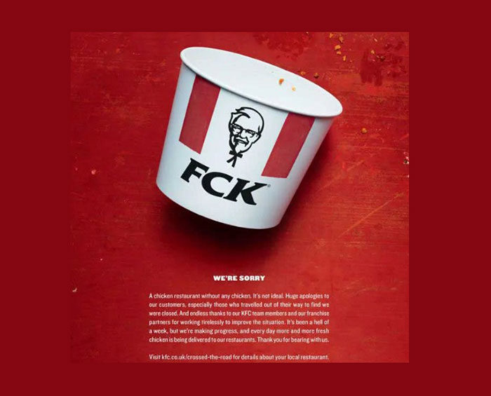
A smart print ad that plays with its own name of the company – it switches the letters of the KFC franchise into FCK, which promotes the company within the youth population and tries to make it more popular. It was a nice way to apologize as well.
Copywriter needed
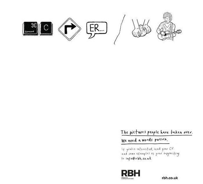
The ad seeks a new copywriter, and it says that there are too many pictures nowadays, but not enough writers.
Play with the magazine format
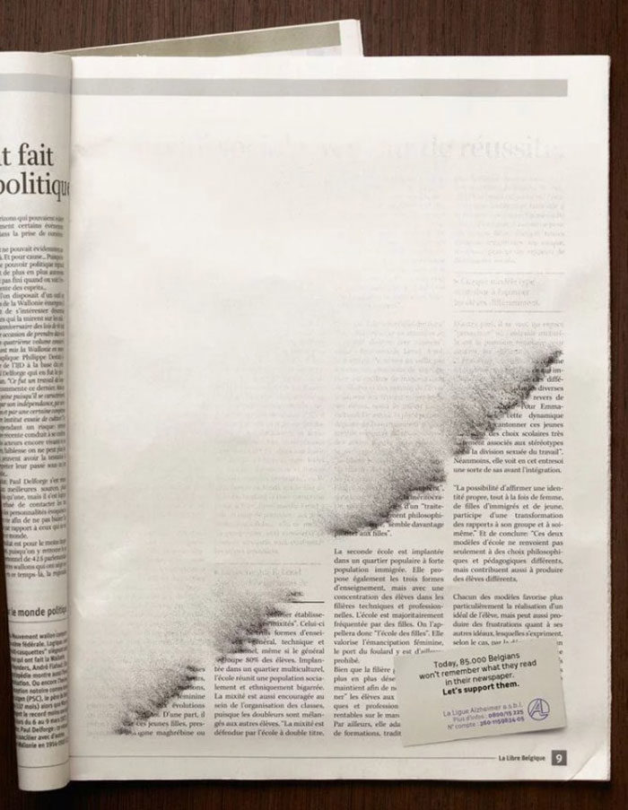
This ad is from Publicis in Belgium, and it promotes the fight and awareness against Alzheimer’s disease in a smart way.
Peugeot
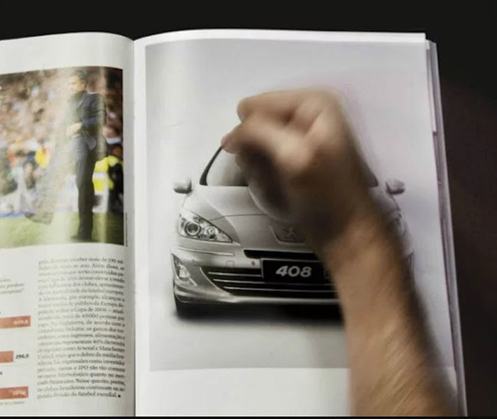
This is an interactive ad asking people to smash the Peugeot in the picture – if they did that, a small airbag would inflate.
FORE!
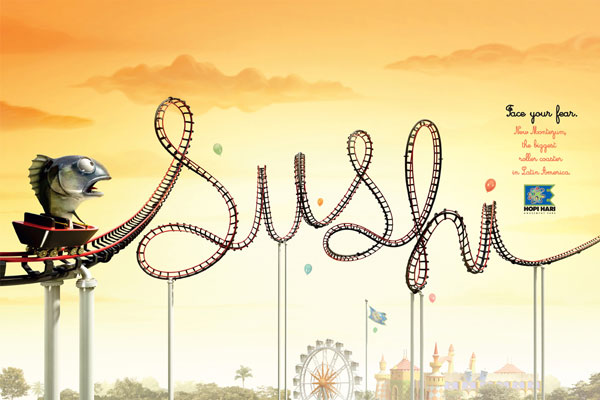
Face your fear.
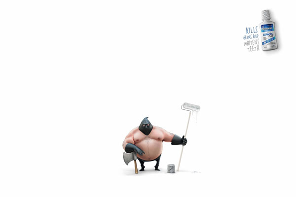
Kills germs and whitens teeth
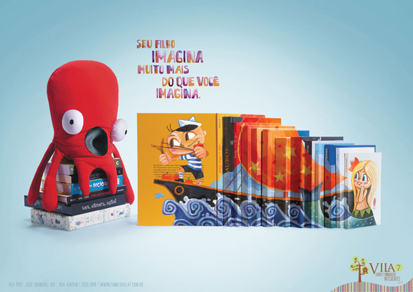
Your son imagines much more than you imagine.
Hot Park Water Park

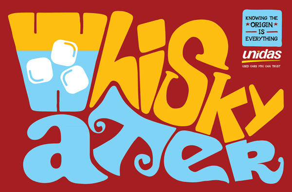
Knowing the origin is everything. Unida used cars you can trust
Horror Nights. Really scary

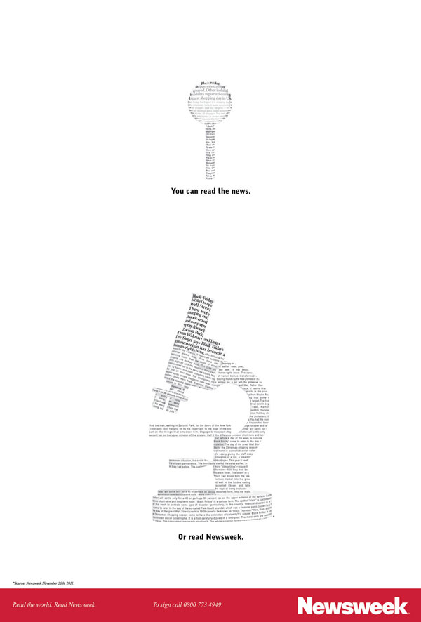
Newsweek
Nothing happens without a soundtrack.

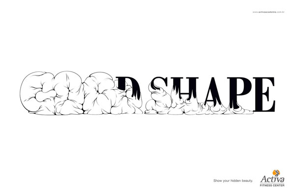
Show your hidden beauty.
For a kid a toy is never just a toy

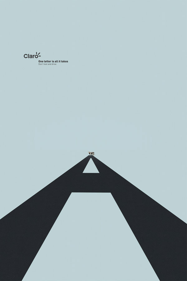
One letter is all it takes. Don’t text and drive
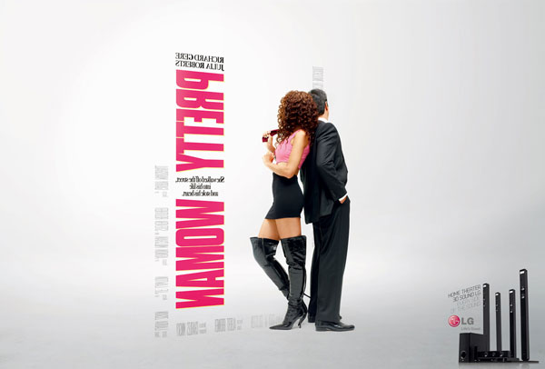
Home theater 3D sound LG. Every side of the sound
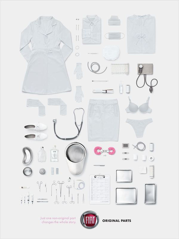
Just one non-original part changes the whole story
Don’t let the stains tell the wrong story

No logistic challenge is big enough

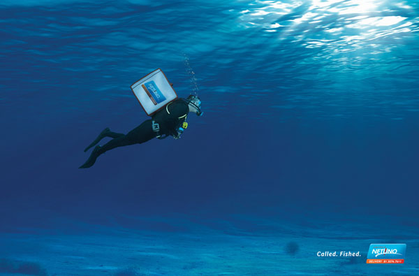
Called. Fished.
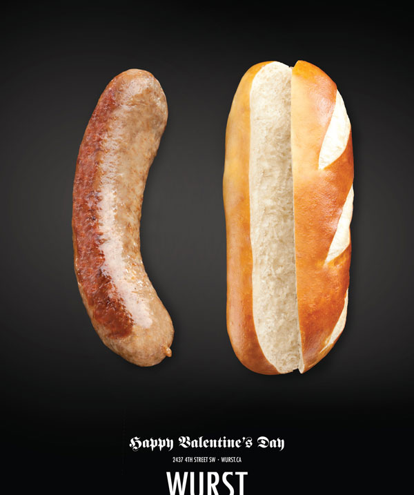
Happy Valentine’s Day
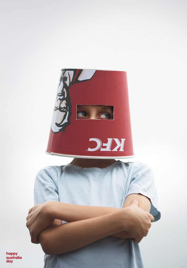
Happy Australia Day
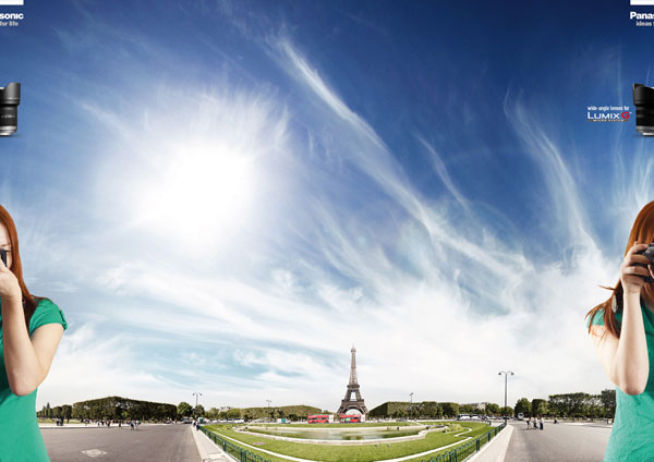
Wide-angle Lenses For Lumix G
Biothymus F Anti Hair Loss Scalp Serum

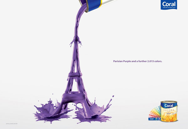
Parisian Purple and a further 2015 colors
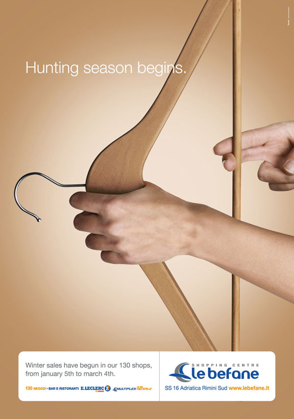
Hunting season begins
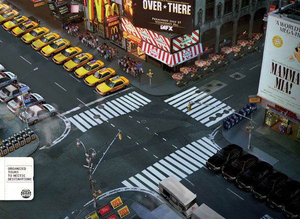
Organized tours to hectic destinations
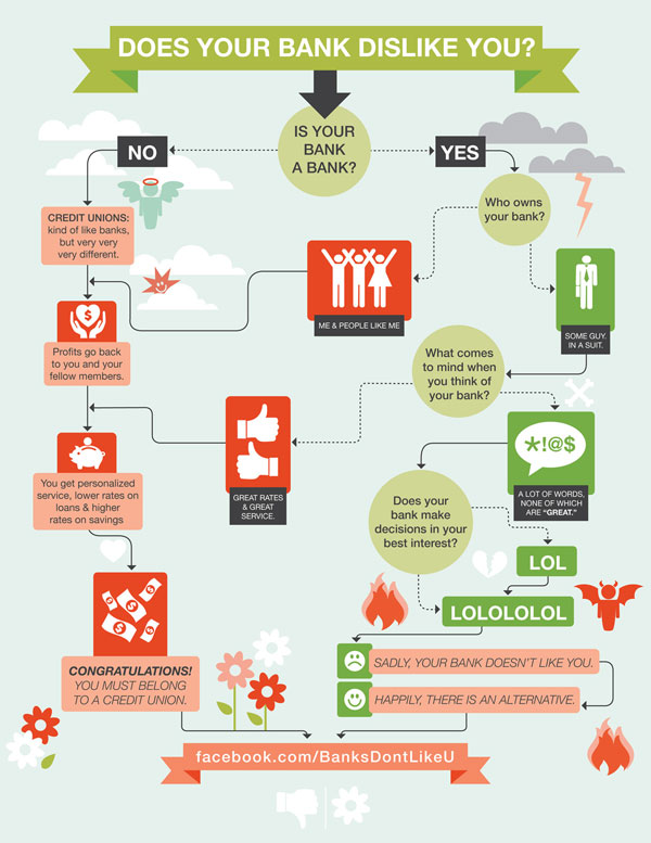
Does your bank dislike you?
Much more than trees

Don’t let your home become their nation

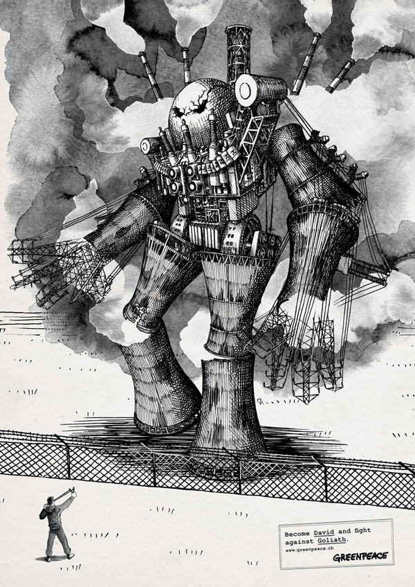
Become David and fight against Goliath
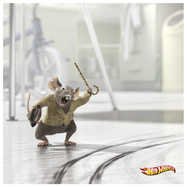
Hotwheels
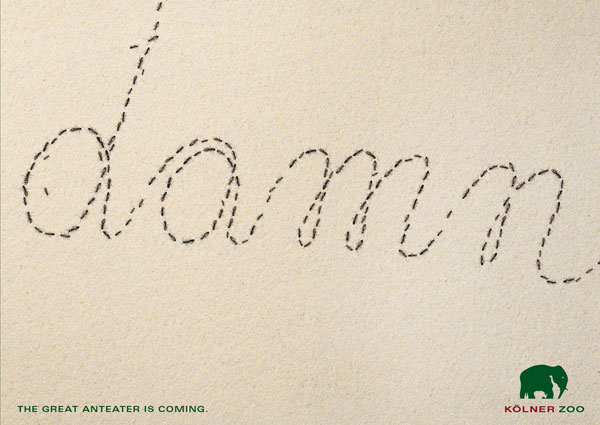
The great anteater is coming
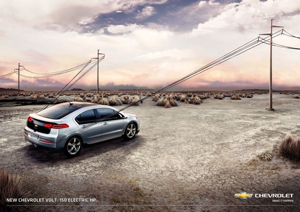
Chevrolet Volt: 150 electric HP
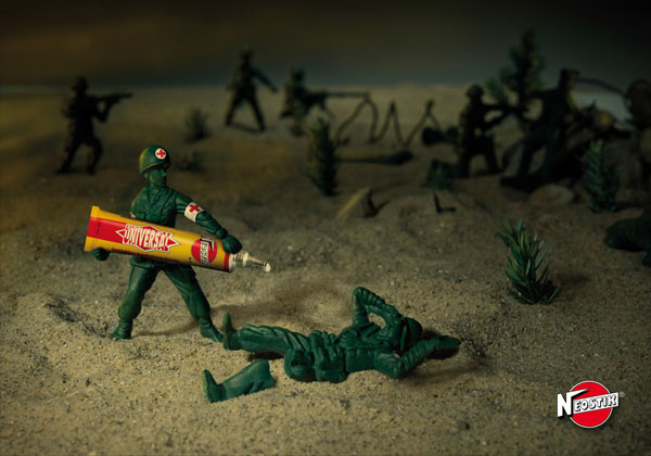
Neostik Glue
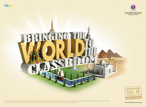
Bringing the world to the classroom
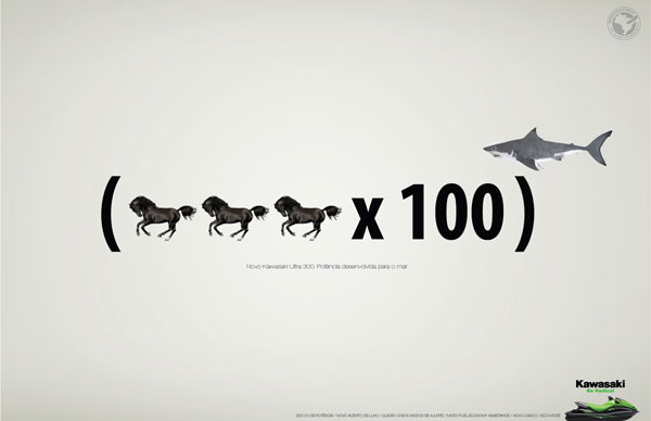
Kawasaki Ultra 300. Power developed for the sea
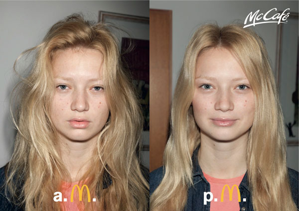
McDonald’s McCafe
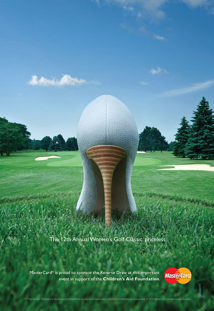
A very nice ad for Mastercard.
If you enjoyed reading this article about the best print ads, you should read these as well:
- Nike Print Magazine Ads That Boosted The Brand’s Popularity
- Creative Advertising Ideas That You’ll Surely Like
- Print Advertisements: 41 Creative Print Ads You Should See
The post The best print ads that you will see today (55 examples) appeared first on Design your way.
Source: https://ift.tt/34PT9QD

No comments:
Post a Comment