During the last two centuries, the use of logos has become mandatory in advertising. This is the case of the Jaguar logo, one that has a curious history of a peculiar change. These graphic elements seek to attract the unsuspecting looks of potential consumers, and in this way, make them fall in love so that they acquire any kind of products.
Some opt for abstract forms with hidden symbologies and messages, while others go with logos that literally represent the brand name. This is the case of the Jaguar logo, one that has a curious history of a peculiar change.
The Jaguar brand has taken its name literally, simply using a jaguar that sometimes is just delimited by a couple of lines. Indifferently, we can always recognize the big cat jumping with great fierceness. Today they are recognized as some of the best British cars around the world.
The secrets of Jaguar’s success were, without a doubt, the care for fast vehicles equipped with many luxuries. Being a manufacturer with a good number of years behind them, they have managed to maintain the quality of each of their products, typical of the English style. Let’s know a little about the history of this company and its incursion in marketing.
Jaguar and its luxury trajectory
Founded in 1922 by William Walmsley and William Lyons, two fans of motorcycles, it was originally called Swallow Sidecar Company. These specialized in the manufacture of the so-called Sidecars (the third sit that is attached to the side of the motorcycles), but soon they would expand their business to the manufacture of car bodies.
Their works for FIAT, Standard and Swift were the beginnings to finalize the dream of producing their vehicle in 1933, the SS1 (Standard Swallow 1). At this point, the company no longer had the same name but would be known as SS Sidecar and Coachbuilding, and subsequently, they remove the “Sidecar” from the name.
Thereafter, under the name of SS Cars Ltd, they would begin to produce a range of sports vehicles called SS Jaguar. In 1945, after the end of the Second World War, the company would be renamed to Jaguar for the first time, because the acronym SS could be confused with a Hitler organization.
The Jaguar company has gone through many mergers. In 1966 they would do it with British Motor Corporation, in 1968 it would be with British Leyland (although this agreement would end 16 years later), and in 1989 they would be absorbed by Ford (it was part of the Premier Automotive Group, with brands such as Aston Martin and Volvo).
Finally, in 2008, Ford would sell the company to the current owner, Tata Motors. In this way, the company has gone through different owners and some image changes.
Analyzing the feline
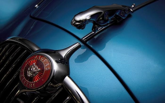
It is a pity that part of what gave the brand’s vehicles a unique character disappeared with the latest safety standards. The jaguar emblem previously installed on the hood represented a danger to citizens, although it didn’t lack elegance.
Of course, we can still see a similar decorative piece on the radiator grill. Anyway, whether or not it is sticking out of the hood, the Jaguar logo will always have that wild and unforgiving appearance, which reminds us that we are facing powerful vehicles. Beyond its animal form, what does this badge mean?
– Shape: seeing that jaguar jumping and roaring immediately indicates power and elegance. The animal looks imposing and strong, being a sign of safety with the consumer.
– Color: the most recent logo has a 3D appearance thanks to multiple shades that highlight the gray, silver and black. These are the colors used in the most elegant brands to look so bright and expensive. There is a variant in red that is installed on the wheels and on the radiator, this time to symbolize the performance of these parts.
– Font: Jaguar Cars typography is unique (and we can find two or three variants), giving a special touch to the different Jaguar logos.
The meaning behind the Jaguar car logo
Depending on where it is in the car, we can find it in different colors, such as silver and red. Indifferently, this always symbolizes high-quality technology. The color red is not only to show the performance of their products, but it is a standard in the world of motoring.
Changing an emblem to a Jaguar
The company’s first logos date from its beginnings as Swallow Sidecar Company. Of course, at the time, they had no plans to use a jaguar as a brand representative; it was a blue circle with wings. Within this circle, the name of the company could be identified, and it was contrasted by a red circle.
The current popular Jaguar logo did not appear until after the manufacturer began to identify with this name. It is still possible to find in some old vehicles the first versions of this emblem, which combined the feline both in a statuette and in a silver and red plating.
The iconic jaguar figurine was potentially dangerous in new models (also in old ones, but current safety standards were not present). The company did not want to remove it, so instead, they changed it from the hood to the suitcase. The second Jaguar badge did remain in the radiator.
A review of the different versions
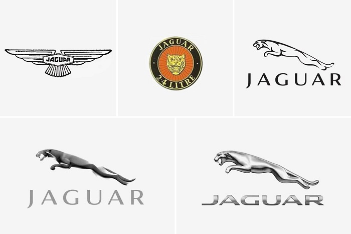
– 1922: the beginnings of the company did not have the gallant jaguar. At that time, all they had was a small logo with the letters SS. Thanks to the size of the badge, this was perfect to place on each of the vehicles that were produced. Even with the production of the first Chassis for the SS Jaguar, the animal still did not appear in the brand. They would have to wait at the end of a catastrophic event for this change.
– 1945: after the events of the Second World War, and to avoid possible confusion or future problems, the SS of the brand that could refer to the Nazis was eliminated. This moment was perfect to update the emblem of the company. The jaguar had already been previously used by some of their cars, which inspired them to continue using it. Even the meaning they give of “elegance, performance, and ambition” goes with what the company wants.
– 2012: this is the current version found in all the company’s vehicles. The Jaguar logo was simply modernized, keeping its posture of a jumping jaguar. The new silver, gold, and black colors highlighted it. The emblem of the radiator and wheels has remained intact.
Taking out the claws
Jaguar vehicles are pure British engineering at its best. It is very difficult to lose sight of these cars when we see them, not only because of their appearance but also because of their charismatic logo.
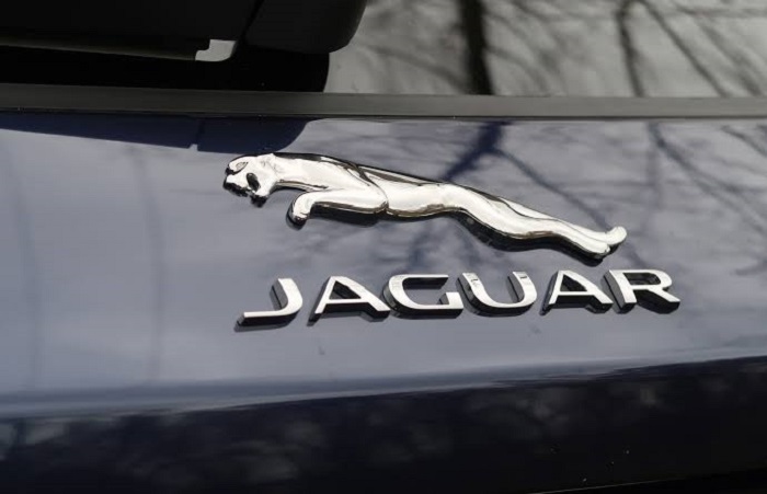
The company managed to preserve the jaguar statuette by placing it in another area of the vehicles, which allowed them to continue to stand out in the luxury market for their logo that has been with the public for more than 70 years.
If you enjoyed reading this article on the Jaguar logo, you should read these as well:
- The Amazon logo: Its meaning and the history behind it
- The Pepsi Logo: The old, the new, its meaning and history
- The Disney logo: All there is to know about the Walt Disney brand
The post The Jaguar logo and how it got a makeover after 90 years appeared first on Design your way.
Source: https://ift.tt/2W4Paf1

No comments:
Post a Comment