More than a century the Mercedes logo was the highlight of this company together with all the innovations that they brought in the automobile field. The evolution of the logo was made in more than 120 years and most of its life it looked like today’s badge. The triangle star is one of the most well-known logotypes that we know.
Carl Benz launched Benz & Cie in 1883 and Gottlieb Daimler founded Daimler-Motoren-Gesellschaft (DMG) in 1890. What they have in common is that both businesses laid the foundation for motorized vehicle transportation.
When Daimler died in 1900, Wilhelm Maybach the chief engineer got in charge and brought a racing enthusiast known as Emil Jelinek to be his partner. Mercedes-a, the daughter of Jelinek, a Spanish word that means grace was the inspiration for their business name later on.
The Mercedes logo
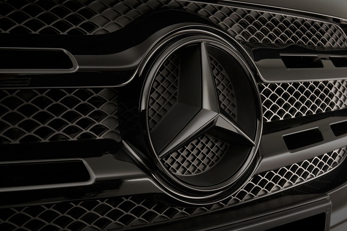
One of the most known brand identities in the world, the Mercedes logo shows integrity and a rich legacy that belongs to the automotive company. Some of the automaker’s logos change quite often because they want to make a more credible brand identity but others remain consistent for over a century.
The three-pointed star from Mercedes has come to represent quality, innovation, and tradition in the automotive industry.
Logo Description
The three-dimensional star logo of Mercedes-Benz represents the Earth, Land air and sea. Throughout its history, the Mercedes emblem became simpler and simpler and it always kept the founding values that the company stands for.
Shape
The current Mercedes Benz logo consists of the classical Mercedes star that is inside a circle. Sometimes you can also see the company’s name alongside or under the emblem. There are three versions of the Mercedes Benz logo that now are going around at the same time.
For sure due to its start, the Mercedes logo became very popular today. The imagery looks nice and you truly feel the brand personality behind it.
Colors
Colors that are associated with this brand are silver and black. Both colors stand for superiority and elegance together with power. Designers usually go for silver when they want to show creativity, sleekness and high tech.
The black color is more used for elegance and purity. These are the exact characteristics that Mercedes wants to be known for.
Silver is a favorite color of the elites and this is why it can be seen on the Mercedes Benz logo.
Fonts
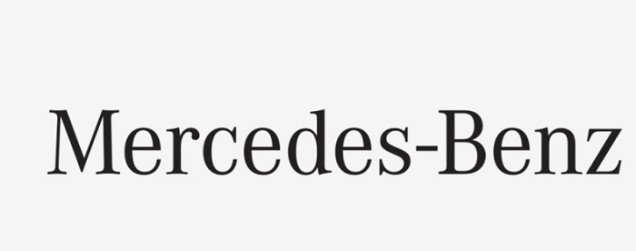
The print element that it had was only used in the Mercedes logo in the first third of the twentieth century. After that, they stopped using it. One reason could be that the brand was already well-known at that time. Because the font never performs the main function of a logo it is quite difficult to say any details about it.
What we know for sure is that this is a classic font that can be read easily and it has the same thickness in all of its letters.
Emblem

The Mercedes emblem was in a circle without counting the first year of its existence. First, the emblem was in an oval shape that was elongated in the horizontal direction but one of their competitors, Maserati also used an oval logo so they decided to elongate it in the vertical direction.
They also tried to change the start by adding four rays to it but this was not a smart move and they decided that the three-rayed star was the best one to go with.
What does the Mercedes-Benz logo mean?
Daimler is rumored to have said that the star represents DMG’s ambition to rule the land, sky, and sea. We do know that the logomark represents a rich history and that it goes into many industries.
Because it has a simple design and cool angles the Mercedes sign can be instantly recognized. It is a symbol of first-class performance and it will continue to be so in the past, present, and future!
The Mercedes Logo Origin
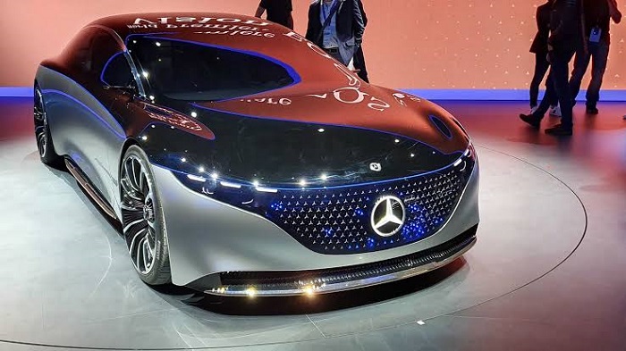
In 1909, Daimler’s sons Paul and Adolf remembered a picture that was sent by their father having a three-pointed star that was marking the exact location of his house. The idea behind that was that the star is going to shine over his factory and bring prosperity to it.
So, they took the star as the company logo and they trademarked the three and four-pointed star. At first, the logo had a blue color and then it was changed to its signature silver one after they participated at the Grand Prix at the Nurburgring in 1934.
The Mercedes Logo Evolution
Throughout the company, the Mercedes logo has had some changes. The first one was in 1902 and the most important ones took place in 1916, 1926, 1933, 1989 and 2009.
1902
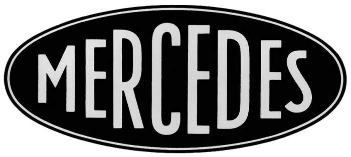
In 1901 when Mercedes Jellinek was 11 years old her father insisted that her name should be given to 36 cars that he wanted to buy from Daimler-Motoren-Gesellschaft. Daimler-Motoren-Gesellschaft used the Mercedes name for many of their cars and their registered the trademark in 1902. In 1909 they also registered the three-pointed star.
1916
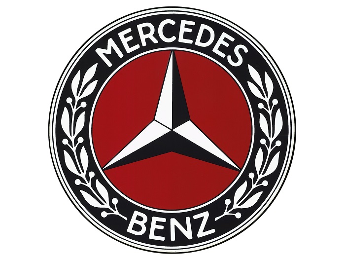
1926
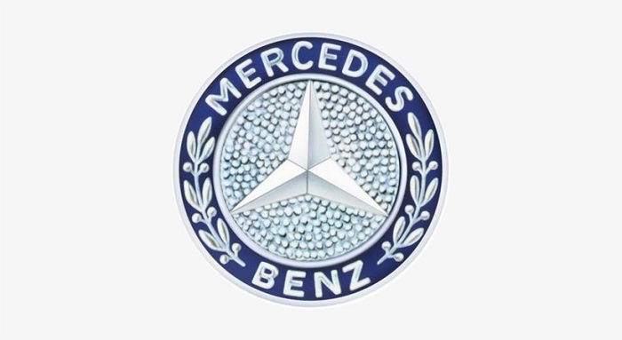
The logo came to life in 1926 as a result of the partnership between Daimler-Motoren-Gesellschaft and Benz & Cie. So, the logo like the company is a combination of two into one.
1933
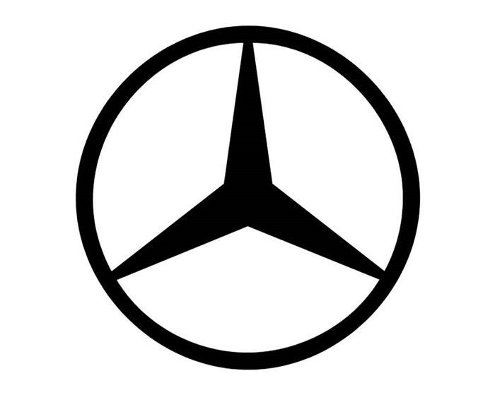
They simplified the emblem a lot this year. The rim of the circle together with the name of the company and the laurel wreaths disappeared entirely from the logo. What was left to the Mercedes logo was a simple black circle with a three-pointed star that you can see in the middle of it.
1989
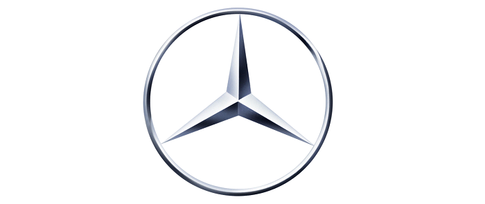
In 1989 the company changed the logo again but with just a minor tweak. The black was replaced with silver and the star was made with a more 3d effect.
2008
The silver color became part of the logo in 2008 and in 2009 we saw the most recent design of the logo. This version still represents the corporate identity that Mercedes-Benz has and it has been used in various colors for different products that relate to Mercedes.
In conclusion, the Mercedes logo does truly belong to one of the most known automakers in the world and is an example of power and respect that this brand shows and has.
If you enjoyed reading this article about the Mercedes logo, you should read these as well:
- The Adidas logo: What makes it so special
- Try these pretty fonts for fun and sweet projects
- The Amazon logo: Its meaning and the history behind it
The post The Mercedes logo and what you need to know about it appeared first on Design your way.
Source: https://ift.tt/2xE6dfW

No comments:
Post a Comment