There are many aspects to designing a website that a designer should take into consideration. A perfect website is made of many smaller components that enhance the UX/UI of any given website. These website components help in the overall aesthetical as well as functional value of the website. One such component is the Mega Menu. Mega menu design is a web design component that not all websites necessarily have. In fact, it is crucial to first understand which websites should have a Mega Menu designs and for what purpose.
Generally you would need a Mega Menu for websites that have many links. Mega Menus are one kind of navigation system that ensures all the options are visible at once. The mega menu can be laid out vertically as well as horizontally. This information can be split into sections or left without sections. One great example for this is the Amazon UK website. However, on the US site, Amazon makes use of a drop down menu style.
It is ideal to have mega menus when you have many sub divisions under one parent category. As the level of hierarchies increase, using drop down menu for such websites get more tedious and annoying from customer’s point of view. One of the most important considerations to be kept while including a mega menu design in a website layout is that it should contribute to the UX positively. Another consideration should be if it helps meet the website’s objectives.
The purpose of Mega Menus
The best places where Mega Menus are used generally are – online commerce shop, encouraging people to buy your services or contact you, increase following, community pages, to get more subscribers and selling tickets to an event. Now that we know why and where Mega Menu designs should be used, let us take a look at X Mega Menu Designs all designers can learn form:
1. MooseJaw:
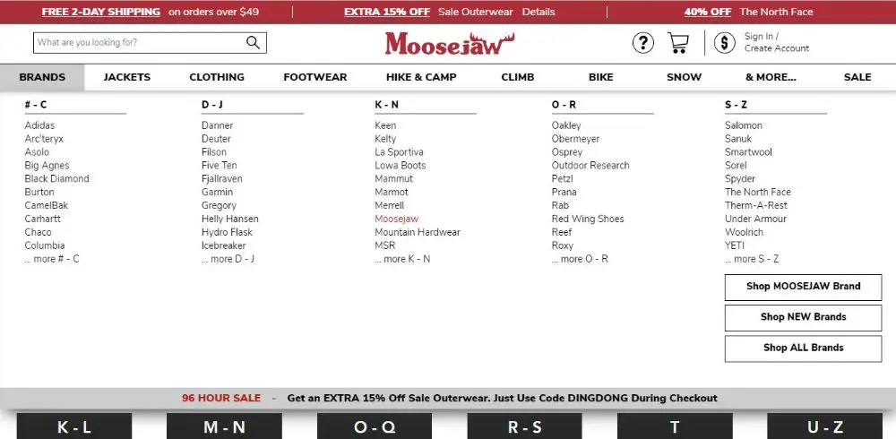
MooseJaw is a great website example for Mega Menu design. It is an online retailer website that specializes in casual wear, camping, hiking and other adventure sport equipment. When you visit the site you would see breadcrumbs that read Brands, Jackets and so forth. When you hover your mouse on them, it shows the mega menu list for each of targeted breadcrumb.
Suppose your mouse is on Brands, and the mega menu for that breadcrumb opens up. It has a list of all possible brands available on the website arranged and structured in alphabetical categories. Moving on, the next breadcrumb – Jacket has a mega menu that is organized by Gender and then age of the person looking for the product, and successively it is also categorized by purpose. This is a very systematic structuring of information on a mega menu for any eCommerce site that designers can take inspiration from.
2. Envelopes:
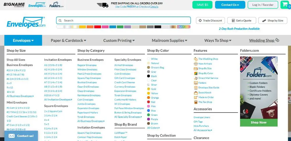
Envelopes is a website that is catered to selling mailing and envelope materials. When you visit the website you can identify the breadcrumbs at first sight. They also have a down arrow next to titles to indicate you are supposed to move your mouse there to see more content.
When you do so, you are greeted with sub menu options where the products are sorted by size, style, color and paper texture. You would see effective sub categorization for making the information easier to scan through and help visitors find exactly what they’re looking for.
3. Evernote:
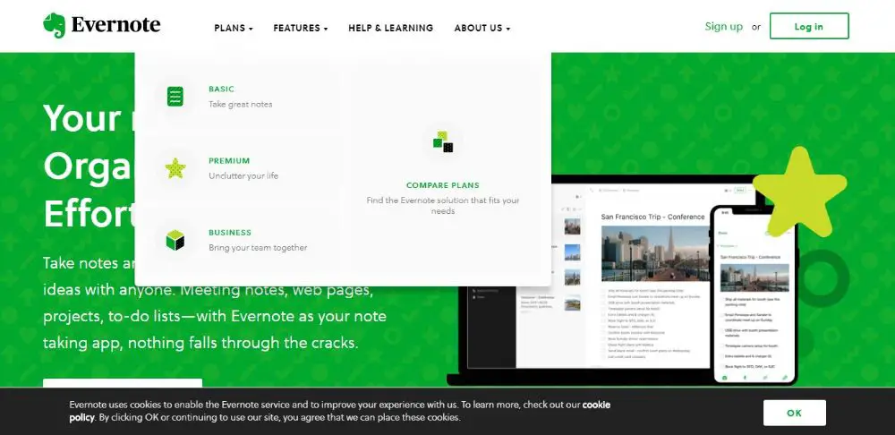
If you have ever felt the need for effective note keeping platform, you would have heard of Evernote. The website overall has a very clean and effective UI. The header of the website has the logo on the top left corner, and all the important breadcrumbs next to the logo in a horizontal line.
The individual breadcrumbs have titles with the downward arrow. As you hover the mouse on these breadcrumbs, you are greeted with different options related to that breadcrumb. Evernote makes sure to incorporate its green color throughout the website.
Hence, when you hover over to a breadcrumb, you would see the drop down list of sub items. When you start moving your mouse over these sub items, the background for them would turn green. This is a great way of reinforcing the same color association practice, also looks visually aesthetic.
4. The Sak:
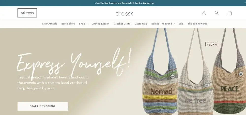
The Sak is a great eCommerce website that is dedicated to selling bags. It has a mega menu for selected breadcrumbs. This might look inconsistent at the beginning, but it is actually a great practice. Since all the breadcrumbs don’t have mega menu options, it eliminates the forced feel of including them throughout the design.
This is appreciated by the visitors. The breadcrumbs that do make use of mega menu design do so in style. The mega menu design adapts to the site’s dynamic effects. When you hover the mouse over a breadcrumb, an underline appears, before the mega menu is revealed. This is a very smooth animation and is done to perfection. A smaller visual cue like this adds to the user experience.
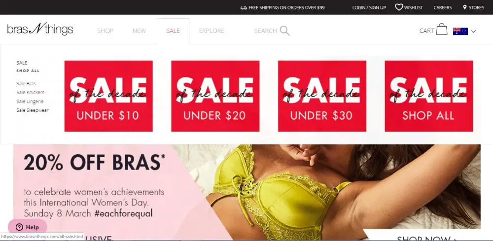
5. Bras N Things:
Bras N Things is a great eCommerce website that focuses on selling women underwear. The mega menu on this website is designed with fancy animations that add aesthetic value to the overall website design. It has smooth and exquisite mega menu navigation.
The second level of these menus have two formats – plain text or text with small images. The sale breadcrumb is smarty designed as when the visitor hovers over sale, he/she is greeted with 4 boxes with SALE written in bold and attractive font. Each of the four boxes talk about sale under $10, $20 and so on.
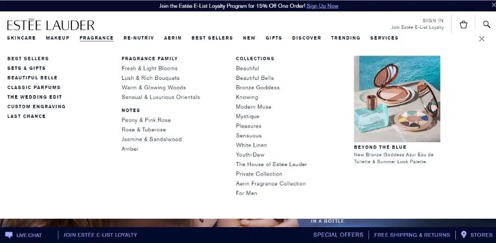
6. Estee Lauder:
Estee Lauder is one famous cosmetic brand. It has many popular skin care and cosmetic products. Hence it only makes sense that such website would need a great website design and layout. The website for Estee Lauder doesn’t disappoint.
The entire website has a simple website design technique with black text on a plain white background. Also a large banner image adds to the aesthetical value of it. The mega menu is simple yet effective. The major sub categories are highlighted from the rest by using bold formatting, which makes differentiating between categories easy. Overall it looks structured, hierarchy based and organized.
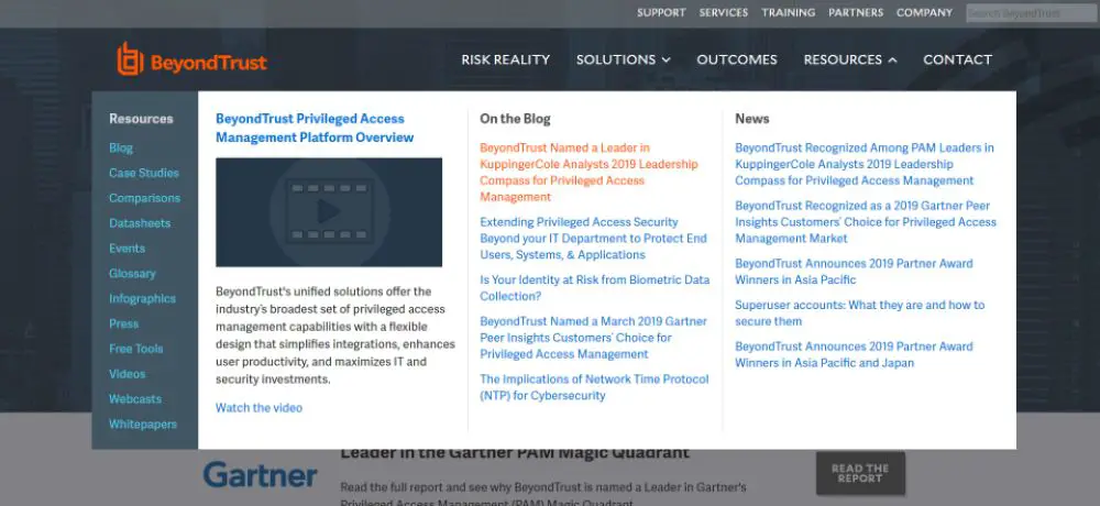
7. Beyond Trust:
Beyond Trust is an American based company that focuses on developing, marketing and supporting a family of privileged remote access, privilege identity management as well as vulnerability management products for UNIX.
It has a great mega menu with many features. It is divided into two horizontal menus. The options under the second menu are vertically arranged. The hierarchy is clear and easy to understand at first glance itself. Whenever you would move the mouse over the text, it would turn red.
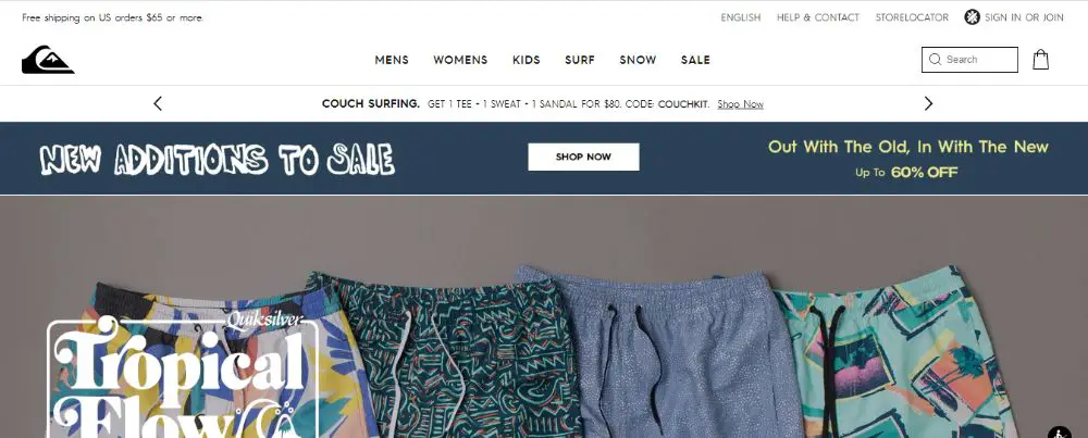
8. Quiksilver:
QuikSilver is a retail sports brand as well as one of the largest surf wear and sports equipment brands. The website is very impressive, with impressive banner images. It has a minimalist web design with white background and black text.
The same impressive web design is implemented in their mega menu design. It has a minimalist style, the content are centered aligned which leaves a lot of white space and breathable space. The text changes color to grey when you move your mouse over to any text. The hierarchy is represented by bold and capitalized letters which makes it easy to scan through.
9. FAO Schwarz:
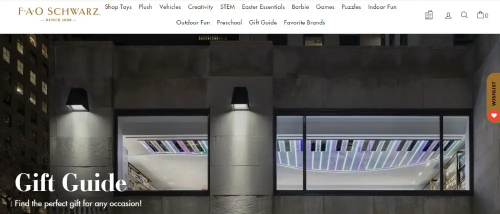
FAO Schwarz is an American toy brand. It is known for premium toys, life-size stuffed animals, brand integration, interactive experiences and games. The website has an impressive mega menu design, with content segregated by age group, brands and other categorizations that makes accessing them easy. They also have dynamic animations when you move your mouse over different breadcrumbs.
A smooth horizontal line passes by the text and the mega menu is exposed. The site also carefully uses mega menu only for the required breadcrumbs and sticks to regular drop down menus for the others. This makes everything look neat and tidy, and makes finding relevant information very convenient.
10. Piano:
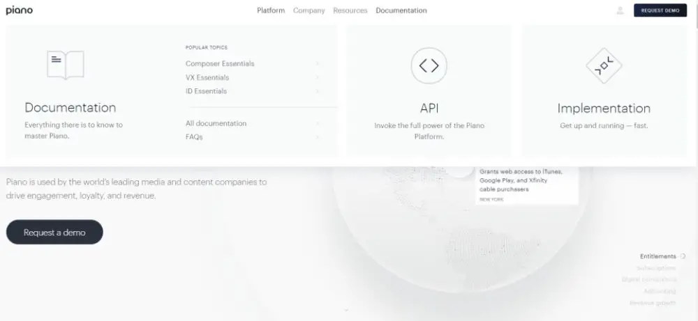
Piano is a company that is helping content operation and media companies grow. When you visit the site, you are greeted with a dynamic rotating Earth. The website has a flat web design, and the mega menu also uses most straightforward interactive effects with only two levels.
There are tiles in the mega menu, which are equally spaced and a representative icon with each option. This makes it very easy to understand what each option depicts in lesser time. Overall the mega menu is impressive and different than most websites’ approach towards creating a mega menu.
11. Build:
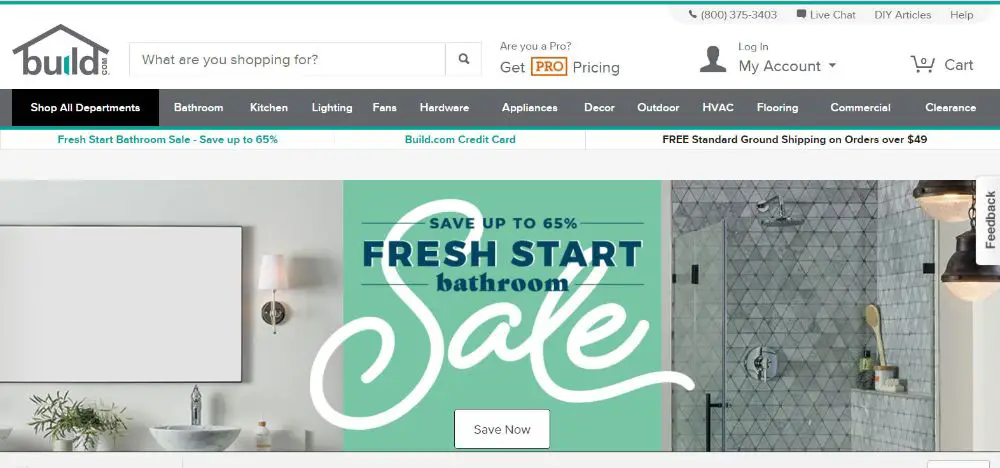
Build is one of the best websites for home shopping and décor. They sell all necessary home appliances be it for your kitchen, washroom, flooring, furniture, décor and more. Since the website has so many categories it is difficult to fit all the navigation into a general menu.
However, fitting it in a mega menu is also challenging, but they have come up with a smart idea of how to fit more content in an aesthetic manner using mega menu. The mega menu for this website is compact to take lesser space and makes use of icons in place of text. It looks good and is a practical approach as well.
12. Quincy Compressor:
Quincy Compressor is an eCommerce website with challenging content to organize. They have many inner pages of individual products to be categorized and sub-categorized for having a place in mega menu.
The industrial products especially are very difficult to arrange as they have complex numbers and names. The way they have handled this issue is commendable. They have three main categories, under which there are subcategories for each. The bottom of the page also has a product catalog available for users to download each month.
13. Blacks Outdoor Clothing:
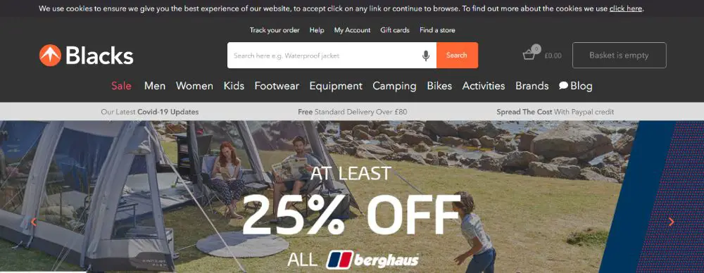
Black Outdoor Clothing is a cloth retail website that has many branded partners. Their website has all of the brands listed within the menu and hence it makes for them to use mega menu.
They have many products to offer, and all of the categories are systematically placed. The mega menus are super responsive and clutter free. The spacing between each item makes it breathable and easy to scan. Each category is differentiated to other with bold text and slightly bigger font which makes it easy on the eye.
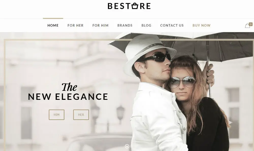
14. Bestore:
Bestore is an online fashion apparel eCommerce website which has a clean and impressive user interface. It is minimalist, clutter free and elegant. The website has a hero image carousel with impressive photographs and additional information. Their logo is centrally placed on the website, and below it are the breadcrumbs which are nicely spaced out in impressive fonts. Each breadcrumb has a dash over it, which turns to a peach color when you move your mouse over to a particular breadcrumb.
This helps keep a track where you are. When you move your mouse over to any of the breadcrumbs, you find a neatly designed mega menu with an related image on the right for easier reference. Overall the mega menu design is neat and sophisticated unlike some other websites which add too many categories and sub categories which makes the mega menu look overwhelming and cluttered.
These were the 14 Mega Menu Designs all Designers can learn from when designing their websites. Keep in mind to use mega menu designs only when necessary and suitable. If your client doesn’t have many products using a heavy mega menu design would make it look like they don’t have many services to offer.
Understand the purpose of mega menus and then design them so that they match the requirement of the client and make their website look appealing to the customers while making it easier for them to navigate through the site.
The post 14 Mega Menu Designs All Designers Can Learn From appeared first on Web Design Blog | Magazine for Designers.
via https://ift.tt/3beVbwo


No comments:
Post a Comment