Most of the companies these days spend day and night creating their website. While they have fairly mastered the technical aspects of creating a great website, they often find themselves stuck on one particular page, i.e. the “About Us” Page. This page is essential for any company or website owner to master, as it provides an overall view of what the website and the maker are talking about. Many visitors often go to the about us section of a website to see if the website has anything that adds value to them. It is one of the most frequently visited pages on many websites. A well-designed about us page isn’t just a necessity, but also an added advantage over the competitors as not many website designers pay much attention to this section of the website they create.
This is why we discuss 10 design tips for your ‘About Us’ Page for effective engagement:
1. Customer-Centric Approach:
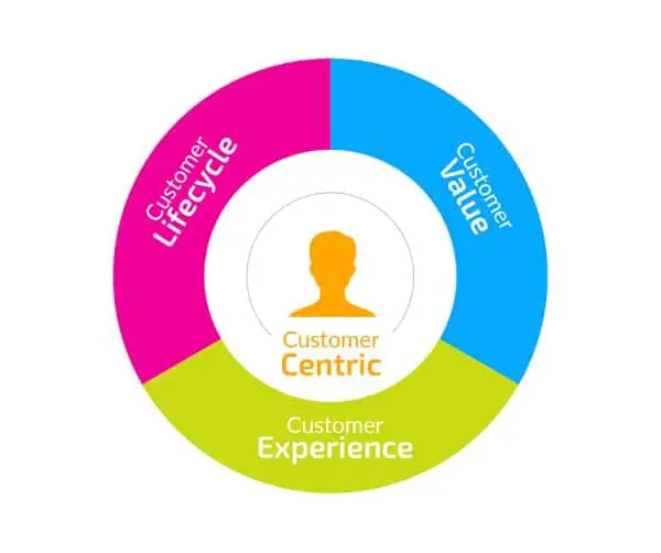
Irrespective of product or service you are selling, you are into the situation of a business. What most business tends to forget, overlook is the fact that it needs to be customer-centric and not self-centric. Your customers might only interact, make purchases; use your services if they think it’s providing any value to them. Hence, you need to ensure that your content and way of talking is keeping them in the centre, and not yourself/ business. Though the page is titled About Us, try using lines like ‘How can we help you’ instead of ‘Why should you choose us’. If you are in a sector that needs you to use a more formal tone of writing, and you can’t have an entire customer-driven approach, start your opening statements addressing your audience’s challenges and objectives. Addressing the essential questions as to why they came to your website in the first place and how can you help them solve that problem can be a good starting point. If you’re still having difficulty following this, let your work speak for yourself. Don’t boast with qualitative adjectives saying we are the best, show the numbers and infographics that distinguishes you like the best from the rest of the competition. Have an honest tone acknowledging, there’s a problem that needs solving always helps win your audience’s trust.
2. Let your customers do the talking:

If you are an existing player in the market who have grown their business over the years with a good reputation in the market, use that to your advantage. It is always more impactful and trustworthy when you have others vouch for your credibility and efficiency rather than boasting about them yourself. Pick a pool of customer testimonials on your About Us Page, that others can refer to gain confidence and trust on your services. Better yet, you should take an extra step and include photos and names of the customers that agree to help you with your testimonials; this gives them more authenticity and the audiences more ease of understanding the genuineness behind their compliments. One step more could be adding video testimonials if you have great ties with your customers. Always try and mention awards or recognitions, which shows you as an active member of society. Such proves always help people put you in light of customer-driven business and not self-centred.
3. Make the perfect blend:

There are various design elements to be played with. Most companies generally keep their about us page text-driven and use a bare minimum of different forms of content. Don’t make the same mistake, and find out different elements such as Infographics, Videos, Timelines and text as well to create a perfect blend of all elements that enhance and add value to your About Us page. This helps to break from the mundane, monotonous design that most websites follow for their about us page and capture their attention for a much longer time. It gives the audience more time and more elements to explore and interact with. It also eases the information absorption as the content gets divided strategically into smaller text blobs that are easier to read and even more attractive to see. This adds to the user experience of the website and impresses your audience. You need not overload the page with photos of all your onboard members, though that can give your customers a practical perspective of your entire Company. Try documenting your pictures where you’re doing something for the society, or nature. Feel good pictures, always attracts people to learn more about you than mundane work pictures. Having said that having some Behind The Scenes images of office work culture might be an informal approach but helps you build, more intimate relations with your potential visitors. Try adding videos or animations of short length, to sum up, your business procedure which also saves the time of the customer, and works as a better alternative to provide valuable information than plain text.
4. Weave and share your story:

You don’t need to have a heroic story to include this section of content in your About Us page. Despite the intensity of your journey, you should always mention it in your About Us page as it helps people connect and relate to your journey and value you for where you are today after that journey. Basic information you can include for this is how did you come up with the idea for the business, when did you establish it, where was your first office/shop, how you grew it over the years, a comparison between your first and now and many such elements. You need to set a tone of story telling where you genuinely are putting forth all your heart’s content to your audience. Being vulnerable and open to your limitations and challenges, and how you overcame them only leads to audience finding a deep connection to your struggle and trust you as they’d perceive you as humans who didn’t get successful overnight but did their part of the struggle as well. Having said this, you don’t have to include everything you have gone through with your audience. It’s still a website and not a personal diary. If you have been into the business for 50 years, for instance, your audience certainly is not looking for year by year breakdown of your achievements, challenges and journey. Highlight what you want them to focus on and crop your content accordingly in a way that it still covers the gist of the journey.
5. Trim out the Jargon:

Using technical jargon and clever lines might make you feel like you’re showcasing your in-depth knowledge about the field; however, it won’t translate to what you want at the end of the day. Jargon that people can’t comprehend are simply going to set them off from continuing reading what you have to say. Customer-centric and not self-centric, you need to understand that the tone of writing needs to be understandable by the audience. The easier it is for them to realize what you do, the more likely they are going to interact and get in touch with you. Though there is no perfect way to write, writing conversationally makes your content more accessible and friendly. Try not naming your name something ‘Journey so far’ or ‘Our Ethos’. Rather, try coming up with a title so vague that your audience forgets that you’re trying to sell yourself or talking about yourself.
6. Make sure it reflects your Company:
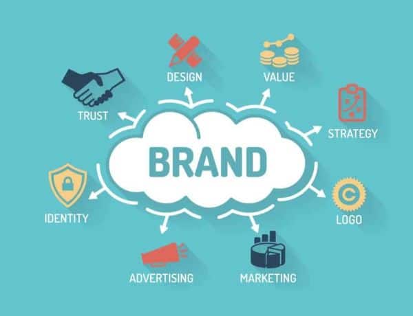
The core aspect of creating the About Us page is to talk about your business. It reflects your products/services that you have to offer. This is why it needs to be ensured that it reflects all of your Company and not just one aspect of it that might seem like a good selling point to lure your audience. You can have all design and content layout down to the finest grain possible, but if it doesn’t give clarity on what service or product you’re selling, which industry it falls under, your all efforts might go to waste. It is very vital to not deviate from the mission and objective of your business when creating the about us page. You might not have much imagery to document or showcase as your industry might not favor it, you can still use basic photos until and unless you ensure they are formatted the same way and follow the same design element that is used in rest of the pages. Consistency is the key.
7. Provide Contact Details:

Having a great About Us page that is transparent, friendly and customer driven might help establish trust in your business for an audience; it will still not be enough for them to be ready to spend their money over before interacting with an actual human through any medium. This is why you need to provide your contact details to put them at ease and to give them further assurance for their doubts and clarity by having an option to reach out to you. If you don’t feel like disclosing your full address, make sure to mention your city and state at least. It is a two-way street, and your audience might try to get in touch with you only as much as you are open for them to reach out to you. Always ensure that your contact details are up to date. Many businesses ignore this aspect or often overlooks it while shifting to a new office, or changing their numbers, and this can cause many problems. Obsolete contact details or mistyped contact details can both set off your customers to a point where they might doubt your genuineness even further if they get redirected to someone who claims it to be the wrong number. Try including your Skype details as well if necessary or possible.
8. Link your Social Media:

It can be of great value to link your social media to your About Us page as it allows the visitors to check your social presence which is the greatest free tool available for better showcasing your offerings and services. Once they check your various social media accounts and see how often people interact with your posts, and how often you update them they find it easier to trust you as a business that is genuine, profit-making, and up to date with the current trends. Another turn around to this is including links to your About Us page over all your social media platforms. Chances are you have a great following or a considerable following overall social media platforms; you could redirect them to your websites, increasing your engagement and website visits by reaching out to people you otherwise had no access to. This is known as a soft sell in marketing terms. Your visitors might browse through your site but not buy a product on the first visit, they might go to your social media accounts to check how often do people put forth their concerns and how quickly you resolve them, this can be used to your advantage and once they’re thorough with your work ethics, they’ll revisit your site and make their purchasing decision.
9. Consider hiring a Professional:

Hiring a professional in this regard doesn’t need outsourcing the entire work to the professionals. It is the About Us page, and you need to ensure that the message put forth is genuinely from you to ensure it feels that way. Sit down with a professional and explain them your mission and vision with the website. Provide a rough layout of content you want to include to the professionals and ask them if it fits the criteria to go on the page, with constant feedback and evaluation. Take their advice but actively participate in the process to make sure you don’t only have a content that is professional, impressive and clear but also friendly, honest and real. Professionals can help you cut down on content that might be perceived in a manner you didn’t intend to, and avoid all such ambiguity and false perception.
10. Make use of effective Design Elements:
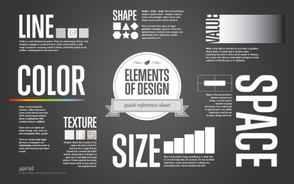
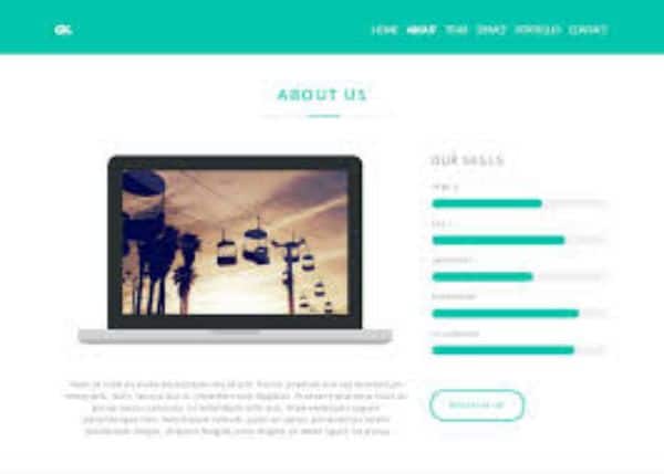
Once you understand the content and the tone you need to follow to ensure effective communication on your About Us page, consider displaying it in the best possible way. For this take help of existing design elements and making the best use of them. Use a colour palette that best describes your business and aesthetics. Try using handcrafted typography and basic photographs for toning down the overwhelming design element that might be a little extreme for the audience to perceive. Play with illustrations and a vibrant palette if your business adheres to it, and it complements your design language. Using certain animations and transitions adds depth to your page and enhances the user experience. Make use of all such design elements and more at your disposal to make the perfect About Us page.
With this, we conclude the list for 10 tips for your ‘About Us’ Page. Use them to design and create an about us page that propels your business forward.
The post ‘About Us’ Page Design – Tips and Best Practices appeared first on Line25.
Source: https://ift.tt/2CfsAqV

No comments:
Post a Comment