Designers know the importance of mastering the visual concept of balance for putting across the right message for the audience to perceive. Often, balance is considered to be achieved only when things are in symmetry or have equal weight on either side of the design. This is not true; you can achieve balance in other ways as well. For this, we should first understand what balance in design means. It is known as the distribution of elements of the design. It is a visual interpretation of gravity in design. Large, dense objects appear to be heavier, whereas small elements seem lighter. There are different ways of achieving balance in design. We will be discussing two such methods that are widely used: Symmetrical and Asymmetrical design.
What is Symmetry?
Symmetry refers to the visual quality of recurring parts of an image across an axis, along a path or a centre. The elements and compositions that are same on both sides and always look balanced. The best reference that can be drawn from nature to understand the concept of Symmetry is the butterfly. All opposing shapes are counterparts of each other and are in perfect proportion. Such perfect Symmetry creates a sense of harmony that looks visually pleasing and hence is often perceived very well.
There are various methods of achieving Symmetry of different kinds. Let’s discuss a few of them:
1. Reflection Symmetry:
Reflection Symmetry, also known as Bilateral Symmetry is the most common and popular form of Symmetry. In such Symmetry, the central axis can be positioned horizontally or vertically without influencing the Symmetry in any manner. Not only the vertical and horizontal axes but such Symmetry can also be found on multiple diagonal axes. Take, for instance, a snowflake which is symmetrical no matter where you put the central axis at. Since there are no variations on either side of the central axis in such Symmetry, it is also referred to as Pure Symmetry.
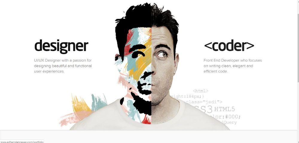
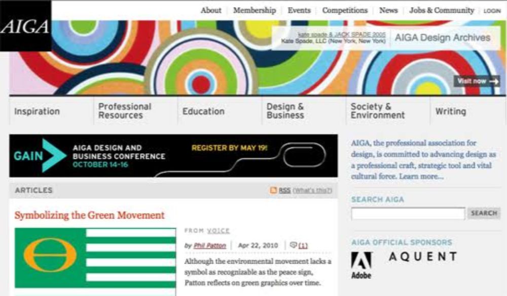
When we infuse Reflection Symmetry in our web design, we can do so in the layout. The basic principles remain the same. However, it is to be noted that you should take inspiration from such practices and not shy away from breaking away a little from how the elements on either side of central axis look provided they are proportionally similar. This practice helps create high contrast at times, as seen in the example of the website above.
2. Rotation Symmetry:
Rotation Symmetry is also known as Radial Symmetry. It is used to add movement in a design. The basic idea is to rotate an element to a certain degree that helps portray the motion of that element in the design by displaying it in two or more different angles hinting displacement and speed. It conveys a dynamic action. They need to be at the same distance, frequency and angle of visual objects to be in rotational Symmetry. If we take inspiration from nature, the best example of Rotation Symmetry is petals of a sunflower.
When we talk about web design or logo design, the best use of Rotation Symmetry can be seen in Mitsubishi’s logo design. The same pattern is rotated in three different angles connected at the centre, which resembles a flower’s design, and uses rotational Symmetry and creates a sense of movement.
3. Translational Symmetry:
Translational Symmetry is achieved by relocating an object to another position while maintaining its general or exact orientation. It is generally used for borders to hold the intricate patterns “in-line” on a flat surface or a two-dimensional surface. This doesn’t require all the elements to be of the same size. Many times altering the size of the recurring pattern in same orientation can be used to show distance, movement or proximity as well. It is the ideal way of creating speed, sound and action in your design.
When it comes to web design, designers often use it one a single element of the web page instead of designing the entire website in that manner. It is also an excellent practice for designing logos. The Public Broadcasting Service logo makes excellent use of transitional Symmetry fused with monochrome to show contrast in their logo.
4. Colour Symmetry:
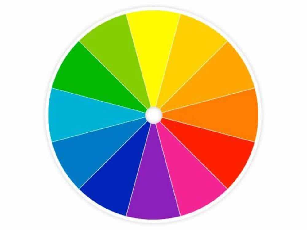
Symmetry is often considered and talked about only in shapes and their arrangements, but it can also be implemented in the colour aspect of it. The colour wheel itself is in such perfect Symmetry that each shade, each colour has a comforting opposite colour which leads to intelligent Symmetry. Colours as an individual design element itself have a significant impact on the visual aesthetics and language of the website. Hence to create colour symmetry in a website is essential to make the user experience soothing and comfortable on the eye. It can also help designers maintain an ideal balance between various elements such as interest points, uniqueness and character.
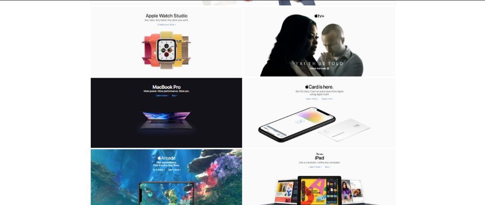
Apple achieves a successful colour symmetry using the most popular and classic combination of black and white or monochrome in their website design. The contrast in colours gives breathing space to individual elements as well as overall website experience. The users feel at ease when navigating the site as the information seems to be very organized and structured.
Now that we know the kinds of symmetrical balances, we can discuss the advantages of using them in design.
Convey a sense of trust: The symmetrical layout works great for designers that want to convey a sense of trust. It also gives a sense of stability; hence if you’re working for a bank; symmetrical design might be the right choice.
For pages with a single interaction object: Symmetrical balance works best for pages that have a single interactive object. Usually, the login/signup pages have such a page. By using a principal interaction object or critical message in the centre, you can have a central focal point.
When a page has two or more essential choices to choose from: Using asymmetrical balance allows the visitor to focus on all pages of the website equally. One best place where this can be of benefit is a shopping website which has products for both men and women. Hence one section of the page can display male section and the other female section.
Now that we have discussed the various kinds of Symmetry balances and how different designers incorporated them in design let’s understand what Asymmetrical design is all about.
What is Asymmetry?
Balance that doesn’t have Symmetry is known as asymmetrical balance. What seems like a chaotic manner of composition is an intentional one with a sense of balance somehow still present in the design despite using elements of varying weights which don’t mirror images of each other. Many methods can achieve this. For instance, you might put heavy elements on one end of the canvas, and balance it with lighter objects to the opposite side of the design. Such practices make the design look more dynamic and modern. Also, it might help you deliver your message with more significant impact.
It is to be remembered that darker and larger objects always have a heavier weight than small and lighter objects. Asymmetrical designs can attract more attention as they use complex relationships between two or more elements to create their composition. There is a harmonious balance that is achieved by using Symmetrical balance, but at times it becomes a little passive. While designers who correctly use Asymmetrical balance need not worry about grabbing their audience’s attention as there is more of a storytelling scope to them than symmetrical designs.
The famous painter Vincent Van Gogh painted his famous painting named “The Starry Night” which works as a great example of Asymmetrical balance. The bright moon on the top right position of the composition is balanced and complemented by the dark trees on the bottom left side of the painting.
Asymmetrical designs give you freedom of flexibility, unpredictability, and storytelling. Though such designs look more haphazard and chaotic, it shouldn’t be assumed to be easy to make. Creating a balance in such a chaotic design process can be more challenging.
There are various methods of achieving asymmetry of different kinds. Let’s discuss a few of them:
1. Arrangement by Shape and Value:
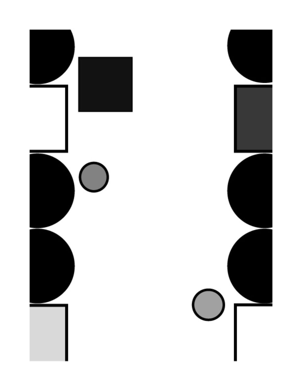
The visual objects of light colours and small size have less weight than larger and darker visual objects. This makes it possible to balance a design by using several smaller elements on one side of the design as compared to one more massive object on the other side of the design. Also, large empty areas of a composition can be complemented by smaller intricate details.
2. An arrangement using Texture:
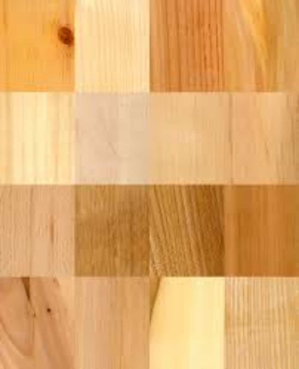
The Texture is one of the most powerful techniques used for creating a compelling and lifelike design. It is known as the surface quality or feels of an object. You would know how different materials like cotton, wool, and jute feel against your skin. This is known as the Texture of that material. In practical world textures differentiates two elements visually as well as by the material difference felt physical. However, in web design, since the design is digital, Texture can’t be felt by touch but can be portrayed by visual tweaks. The colour’s Texture can be tweaked as per smooth, harsh, or any other such effects. By showing a harsh contrast between an area where different textures are used, and another area where there aren’t any texture variations, a sense of balance can be found.
3. Arrangement by Color:
There are many ways to describe colours. There are primary colours, secondary colours, while there are also more refreshing colours and warmer tones of colours. Some colours are very vivid, and some are rather dull, while some fall in between as neutral. Having proper knowledge of this can help designers pick relevant colours in their design to increase their appeal. In asymmetrical designing, designers often use neutral colours for large areas of the design and contrast it with bright and vivid colours of the smaller areas.
4. Arrangement by Eye Direction:
When we talk about design, in general, many elements can provide a visual guide for the audience to follow, and see what the designer wants them to see first, and then second so on. Triangular shapes often work as arrows or pointers, and people’s attention is drawn to find such clues first and then look at the rest of the design. Also, when the design element is pointing toward something, it redirects the audience’s attention to where it’s pointing. It keeps the audience curious and hence is an integral part of design elements for asymmetrical balance.
Now that we know the kinds of asymmetrical balances, we can discuss the advantages of using them in design:
To make the layout stand out: Asymmetry design has a feature of storytelling, and hence, it stands out from the rest, which has a lasting impression on customers mind.
To show dynamism: Dynamic design is a design where the viewer’s eyes move through the design layout instead of seeing all elements as one. Asymmetrical designs portray a feeling of movement. This is why many sports brands use asymmetrical design in their logos and layouts.
To draw attention: Asymmetry design draws attention. It automatically guides the visitor to the focal point, and the gaze settles on the most critical aspect of the design first. By adjusting and positioning elements of a page, the designer can direct the viewer’s eye to different areas.
While both the design practices are unique and have their implications and advantages, they also have their limitations. You can thereby combine the principles of both Symmetry and Asymmetry design to create aesthetic design layouts. One way to do this is having an overall symmetrical layout and asymmetrical regions or elements in one region of the layout to create interest points and organizing visual hierarchy within a group of similar elements.
Hence mastering the skills of both the disciplines would help you design a great website, with an engaging and relevant layout, which is unique and memorable for the visitors.
The post Understanding Symmetry and Asymmetry in Design appeared first on Web Design Blog | Magazine for Designers.
via https://ift.tt/33glMoI





No comments:
Post a Comment