Being an illustrator is a profession that got more and more attention in the last decade. It takes a lot of forms and what is funny that illustrators have always quite a different career depending on what they choose to focus on. It’s mostly freelancer work where an illustrator moves from one opportunity to the next because it is done in an unpredictable way.
This type of work is also most of the times used as an editorial illustration that makes the subject of a magazine or newspaper to stand out.
Tips and Good Practices for Editorial Illustration
Want to understand how to get a better editorial design? If the answer is yes then you can use different grids and layouts to get the contrast needed. There are many more steps besides those but these are some of the basic ones because any decision you take will influence the way your editorial illustrations are going to look in the end.
Bring enthusiasm every time
It important that in any editorial illustration you enjoy the work that you are doing because this will be felt by the people that see it. Making something that passes the expectations of your client is something that you need to start enjoys doing because it will bring you only good.
You need to find enthusiasm for whatever story you are working at no matter if it is for a business illustration or an editorial illustration. This is why it is very important to pursue personal challenging work and small jobs that can be just as significant as high-profile ones for the same reason.
Pay Attention to Hierarchy
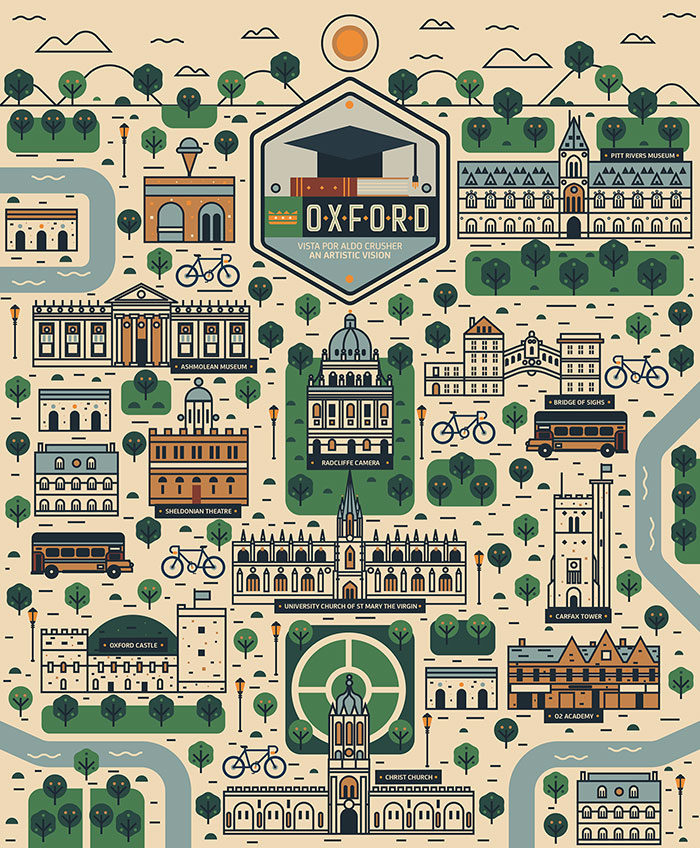
When you need to add a lot of visual details of different sizes or value you might feel most of the time a bit overwhelmed. This is why you need to decide the design layout for your editorial illustration that you might be working on.
These are some hierarchies that you might consider when you are doing your job. Hierarchy of color, value, scale and so on. All of them work together to create an overall visual hierarchy so as an illustrator your job is to define exactly what people are going to see first when they check your work. You basically guide them and tell the story of the illustration.
Don’t steal other people’s ideas
If you have certain modern illustrators that you follow for sure you can check out their work when you need some inspiration. But this doesn’t mean that you should also copy-paste their ideas.
Stealing ideas is not a thing to do if you want to become a good illustrator. Take pride in your work and come up with something creative, it is better to go on your idea rather than somebody else. Even more in today’s world where information can be accessed so easily, it is always simple to spot work that might have been copied from somebody else.
Let the grid guide you

The grid methods are important in graphic design and even more in editorial illustration. You need a good grid because it helps you create the resolution of your design. Grids enable you to stay organized, keep you consistent across issues and can help you enhance the legibility and readability of body copy.
The human eyes can spot any difference in patterns so if you make changes to a design and don’t align all elements it might be pretty obvious that something doesn’t look right.
Pay attention to details
If for example, you are in charge of producing a magazine that talks about your passion you need to check all details especially for editorial illustration. The more you understand the content the better you can design and showcase the main idea of it. Basically, the more you know the easier it is going to be for you to show what the audience is expecting.
Details are related to where the viewer can get more visual information about editorial illustrations. If you don’t get them right you risk the fact that the illustration gets messy and that the key message is not going to be understood anymore.
Remember that digital tools aren’t magical
If you have a new software this doesn’t mean your editorial illustration can become better. Even if you are working in analog it is quite hard to steer clear of digital tools entirely. If a tool can be motivating for some time this means it can be easy to get obsessed with a constant need for the new.
What we think is that the problem is how we use these tools especially if they have magical properties. For sure they are helpful but there is also a lot of credit towards the person that is in charge of this operation.
Use illustrations to explain abstract themes
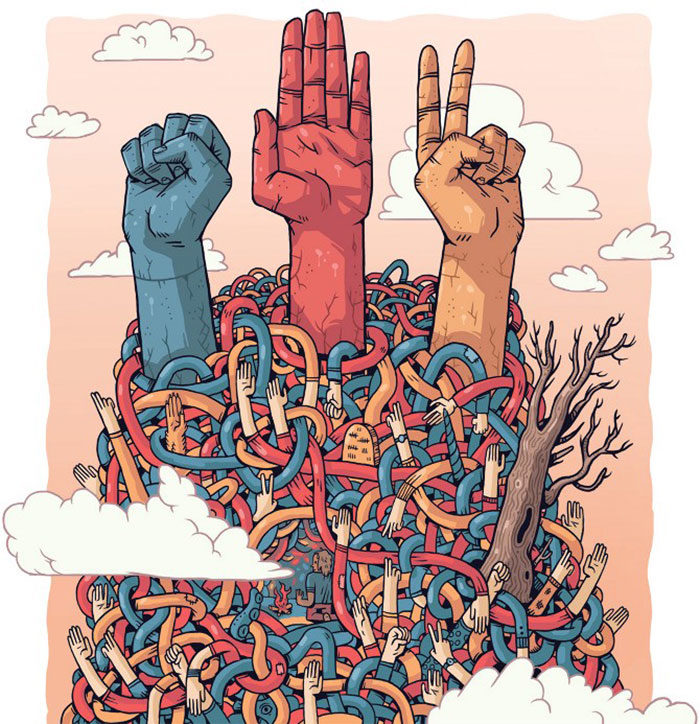
Probably some of the most challenging to explain in the editorial illustration are socio-political topics. Still, if you do it right people will understand with no problem. Moreover, illustrations are good especially when it is necessary to emphasize the emotion of your article, like in some serious article about violence.
You need to think about specific visual metaphors that will get to your point and that you will be able to express easily. Ask yourself how to do you express feelings and emotions? It all starts with your style and using certain techniques, like colors, radiating beams and so on.
Go Out Into the World
The online is for sure a great way to get inspiration for any editorial illustration because there are thousands of websites that you can check. However, there might be also another option that many people don’t really take advantage of in the real world.
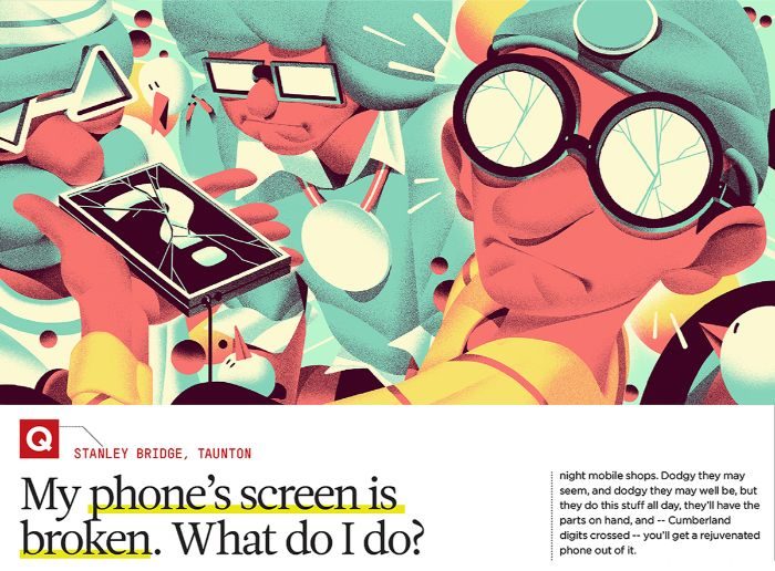
Put on your shoes and take your sketchbook and go for a walk. Make photos, visit streets that you have not been on before, check stores and browse old magazines. This might be a great idea for editorial illustrators that feel the need for finding something new. All are waiting for you, just take the step and see what you can discover yourself as well.
Tips on Getting Published
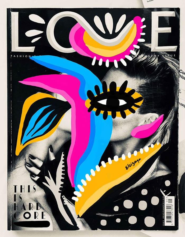
Many publishers are quite hard to get to because even if they want to check out the work that you want to present to them, they are either too busy either spammed by a lot of writers. This means that it is quite hard to get to them directly and it is quite difficult to take this reality on board when you are trying to approach them.

If you are a designer the best thing that you can do is try to research well the publisher that you are about to contact. Research the area that you are interested in and find out what a prospective editor might be looking for. Put yourself in his or her place and start from there.
Ending thoughts on editorial illustration
In conclusion, any editorial illustration works great with subjects that have a great idea behind it. Being an illustrator can be a very good alternative to photography or videos that sometimes require a lot of time. This for illustration is becoming more and more popular because it brings results and people really do enjoy seeing a well-made one.
What do you think, are you going to go for an illustrator in your next project?
If you enjoyed reading this article about editorial illustration, you should read these as well:
- Poster Printing: How To Print A Poster Flawlessly
- Illustration styles: definition and examples of this art
- 100 Days of Vector Illustration
The post Editorial illustration – Tips and great examples of how you should do it appeared first on Design your way.
Source: https://ift.tt/2WZ4mdX



No comments:
Post a Comment