When it comes to fast food, especially hamburgers, the amount of franchises in the United States is overwhelming. One of the most famous is, of course, Burger King. Its expertise in serving hamburgers of all kinds is even reflected in its image. The Burger King logo has worked to attract all kinds of consumers, being a sign of marketing success.
Over the years, the BK logo has undergone some adjustments to update it to modern times, but it remains recognizable to 1967 original, keeping as its main element its characteristic grilled hamburgers. Let’s learn a little about the history of how the company has managed to keep customers attracted over the years.
The beginnings of Insta-Burger
At the time of its inauguration in 1953, the name chosen by its founders Kieth Kramer and Matthew Burns was Insta-Burger King, all in honor of the machine with which they cooked their hamburgers, the Insta-Broiler. The rollers of this machine caused the characteristic lines that appear in the meat when grilled.
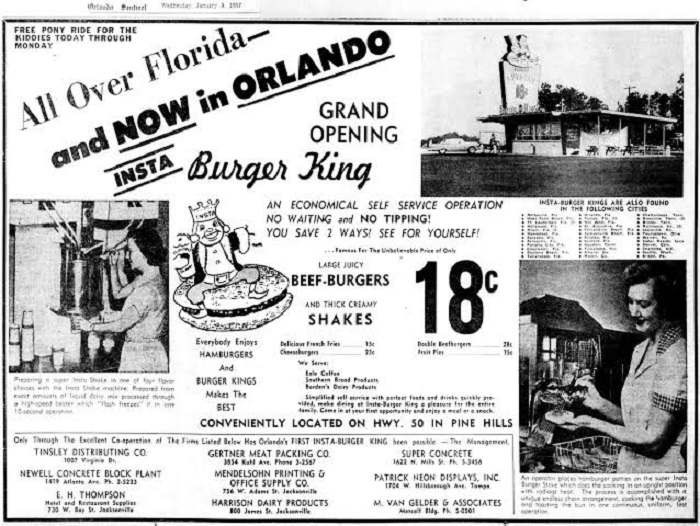
However, Burger King’s history would change dramatically just one year later, in 1954, when James McLamore and David Edgerton decided to buy the franchise. From this moment, it would be called as we know it today, although this did not mean that they removed the Insta- Broiler, or that they removed the main headquarters of Florida.
The success of the brand was so great that by 1955 they already had more than 40 branches in Florida. This was the perfect time to release a logo that would accompany them for a decade, which consisted of a cartoon of a king sitting on a hamburger.
Other Burger King’s achievements throughout the years of are:
- In 1958 they had the first presentation to the masses thanks to a television commercial.
- In 1967, the food company Pillsbury acquired the franchise for 18 million dollars. Additionally, they opened their first store in Puerto Rico.
- The first international branch would arrive in 1969, located in Windsor, Ontario.
- For children to be attracted to the franchise, they developed the Burger King Kingdom in 1976.
- Currently, there are more than 17,000 Burger King franchises in the world.
Burger King logo analysis
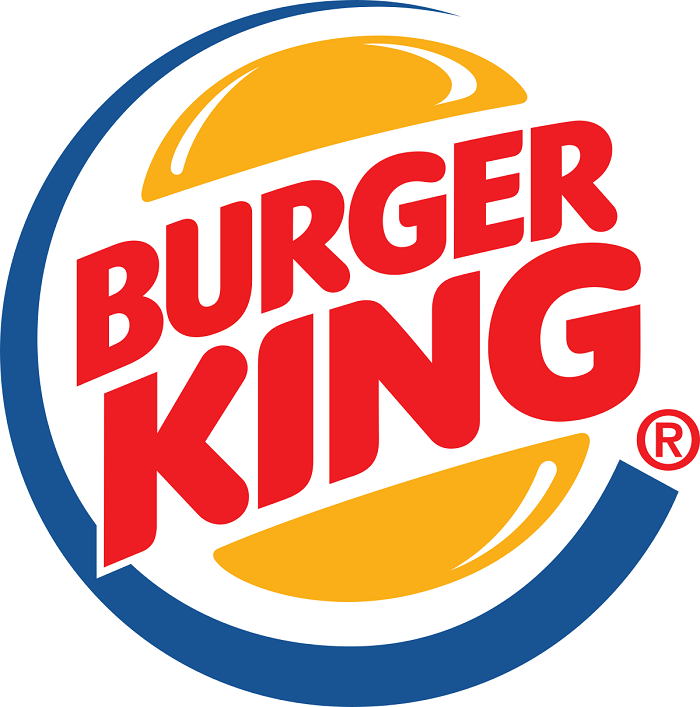
It’s hard not to know the Burger King symbol. The hamburger composed of a circle with the name of the franchise in the center is an icon of the current fast food market. The large letters in red are a custom style, where curves and a uniform line prevail. Because Burger has more letters than King, the latter is represented with larger letters.
The use of colors and shapes is brilliant within the franchise’s logo. This evokes feelings of hunger, and attracts the clientele with its strong colors, creating anxiety on people who want to eat their hamburgers. Thanks to its modern style, it is especially effective for attracting young people. Let’s analyze in-depth what each part of the composition means.
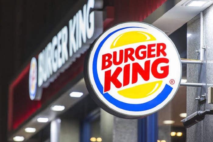
- Shape: it is not very difficult to understand the idea behind the shape, this is a perfectly circular bun in which the brand name is introduced, all enclosed in a blue circle.
- Color: within the world of fast food, certain colors are essential for logos. Red and yellow are some, as they create a desire to eat in consumers. Additionally, a blue detail has been added to give it contrast.
- Font: Burger King font, as we mentioned before, is a custom design of the company. It is easy to read because they are all capital letters, in addition to having a justified alignment so that everything is neat.
- Inspiration: it is easy to assume that the inspiration for the Burger King logo has to do with its famous Whopper burger, but the reality is that the image update was done to attract the younger audience. The designers behind this logo knew how to maintain the essence of the classic design, despite having been such a drastic change in a more modern trend.
The use of the new brighter colors also allowed it to look more modern and planned, and not like any fast food local logo.
In some ways, the image of Burger King has succeeded in both young people and adults. Perhaps it is due to the simplicity it has always had; no matter what the situation, it has always been able to adapt to the needs of the company.
The secret to attracting the consumer
Getting similarities between the logos of the different fast-food chains is quite simple. For example, the colors in almost all are divided into red and yellow palettes. As we indicated before, these colors generate anxiety on consumers, which attracts them to eat compulsively, even if they are not hungry.
In the case of Burger King, they also tried to make the form evoke hunger, which is why they use a hamburger. And it is that even the letters have been placed so that they look like two pieces of meat, hence the use of the color red and the rounded font.
The buns have been defined to be able to adapt to the standards required in the logos, making it easy to use in print and digital media. In its most modern version, it also has a blue circle that grows as it approaches the trademark symbol.
Changes through the years of the Burger King logo
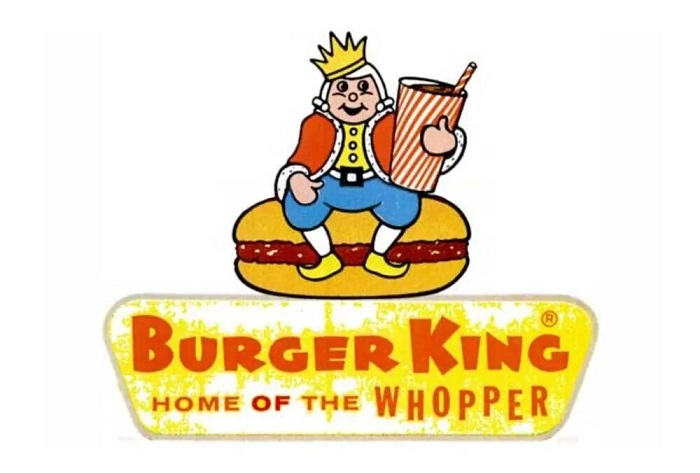
The first Burger King logo hardly resembles the current ones. While it worked perfectly to be recognized for more than a decade, in 1967 it underwent a drastic shift towards a simpler appearance. The more corporate vision likely had something to do, as they sought to draw attention to a young audience with business marketing tactics.
After this update, the changes have been rather few, simply by adding the blue ring and tilting the name slightly.
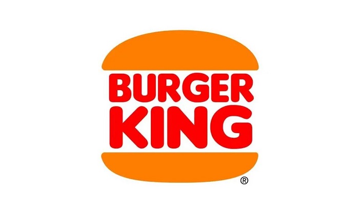
The first modern logo was quite durable, lasting between 1969 and 1994. This old Burger King logo already adopted the idea of the two buns that enclosed the name of the franchise, although its letters were very cartoony with inflated edges. During 2019 it reappeared in several cameos, one being in the Super Bowl and another in the Stranger Things series.
An update of this logo would arrive in 1994, which simply stylized the letter so that it had a more uniform appearance. You can still find some stores that use this emblem.
Finally, in 1999 a redesign was carried out by Sterling Brands, who retained the original ideas, but gave it a current appearance through a new color, a slight angle in the letters, and a reduction in the size of the Burger.
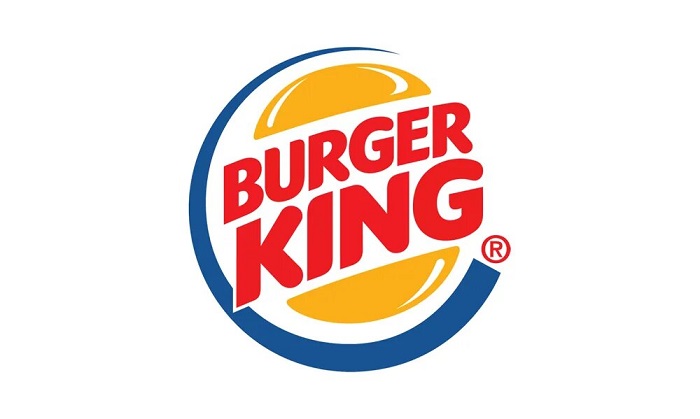
The font used remained true to that of the 1994 logo, with regular lines and thick strokes. Now the words Burger King stood out a little from the buns.
In short, the current Burger King logo is a perfect mix between minimalism and classic style. Despite being simple, you can differentiate the hamburger. Defined lines are ideal when they need to create wrappers and advertisements, so it cannot be denied that the marketing team of the fast-food chain had everything planned to succeed for many years.
If you enjoyed reading this article on the Burger King logo, you should read these as well:
- The Amazon logo: Its meaning and the history behind it
- The Pepsi Logo: The old, the new, its meaning and history
- The Disney logo: All there is to know about the Walt Disney brand
The post The Burger King logo and the history behind its brand appeared first on Design your way.
Source: https://ift.tt/33mtzR4

No comments:
Post a Comment