It’s the law and responsibility of the website to provide accessibility and an ADA compliant website should be an indispensable part of website design. One of the important elements of web design is accessibility. An accessible website is one which accommodates all users regardless of any category of ability, be it physical or mental. Web accessibility means to ensure that the website design must be such that disabled people can use them. Websites accessible to disabled people are regulated by the Americans with Disabilities Act (ADA). ADA included wheelchair accessibility in properties like retail stores, business premises, shopping malls and much more. Similarly, ADA compliant websites should also be easily accessible to people with disabilities.
Many people in America live with a disability. ADA is a civil law created to protect people with disability from discrimination. It became essential for websites, too digital media has become a vast field. ADA says that public places which create a barrier for the disabled people are bound to get removed for facilitating comfort and accessibility to them.
Similarly, disabled people must also be given accessibility to websites. The disabled people use various devices like audio scanners and text readers to read or interpret, communicate or translate information from the website. The motive is even if the disabled people can’t engage directly with the website features, they must have the right to utilize the tools presented to them. ADA compliance has become one of the talked about topic. One man in Florida had filed a lawsuit against a company as their website was inaccessible, which in violation of ADA. The man filed similar cases against 70 other companies. This shows that ADA compliance is now a significant thing.
These are 10 ways for making a website ADA compliant, which are as follows:
1. Add Alt text for images:

People who have visual problems, depend on screen readers to read the content present on the website. The screen readers can comprehend all the HTML text present on the page, but they can’t detect the images. By adding an easy yet compelling line of the image alt text in the code, the screen reader can explain what the image depicts to the site visitor. Alt text copy is one of the main elements of content creation and designing.
Moreover, alt text optimizes the page. Without alt text, the visually impaired users won’t be able to access the entire content of the page, and that would lead to non-compliance of ADA. As screen readers can’t comprehend the images, a proper alt text describes the images correctly. And as the images search engine bots cannot crawl images, the alt text serves to the best SEO. The videos on the site consist of visual and audio elements to convey the information. There must be captions for the audio which should sync with the video as that would help the users who are deaf or have impaired hearing.
2. Focus on font:

While designing an accessible website, the font style and size are a significant consideration. For ordinary users, the choice of font is more of personal preference and aesthetic taste. But for visually challenged users, the case of interpreting the text is different. The screen readers help the visually impaired users to interpret the text but using appropriate font would help the users from the is beginning. Bad choices of font style and size can give the user headache or eye strain.
Make sure the partially impaired users do not find it challenging to go through the content. So, if possible, ditch the fancy font and use functional fonts which are easily readable. Keep the background of the web page light the font dark that would help the users with sensitive eyes from eye strain. Health & Human Services (HHS) of US Department of unofficially advises using Times New Roman, Verdana, Arial, Tahoma, Helvetica, or Calibri font. The other legible fonts are Georgia, Quicksand and Open Sans.
3. Better UI:

The pop-up ad or window sometimes becomes impossible to close and is quite irritating. There are times when the form is way too long and elaborate that you might find it challenging to finish it. All the situation is an inconvenience for the users. For the people with disabilities, the situations as mentioned earlier are more than just a botheration.
If the user experience is terrible, then it would be difficult for people with disabilities to access the service or data. So, the designer has to create minimalistic and intuitive navigation with clear buttons and page elements. Always split the entire contents into easily interpretable chunks to not overwhelm the visitors.
4. Think about contrast:
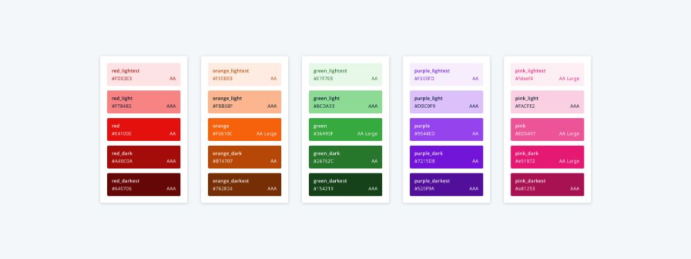
For making a ADA compliant website, whenever you design a website, use color contrast so that it is easy to differentiate from one another. If the colors on the site are the same or similar to the menu buttons, it would be challenging for the people with disabilities to distinguish the features.
Using the same or similar colors would not have enough contrast to the other colors and thereby making it hard for the visually impaired users. Using contrast color would help people with poor vision read comfortably.
5. Use text, color and icon together:
![]()
When you navigate the site visitor, and you want them to act, you must show multiple ways to achieve that. Use HTML text, informative icons and color so that it is easy to interpret. Every user interprets in different ways, and so every way for interpretation must be clear.
For the user interface icon, the task it performs and the image that it portrays should state the task. If the user didn’t interpret through the icon, the text would convey the same.
6. Functionality:
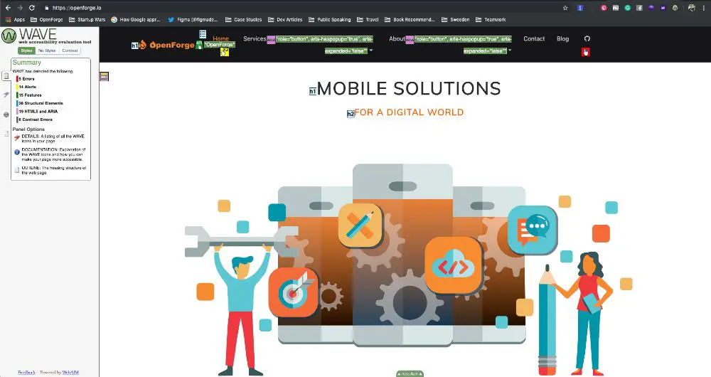
One of the important things about the ADA compliant website is that it should be easy for the website visitor to navigate. Easy navigation means to navigate the whole site without the use of a mouse. The best way to check the functionality of the site is by browsing the site using only the keyboard.
When the user navigates the page through the tab key, it would reveal the content flow and allow to access if there are any mistakes. Moreover, keyboard navigation would show the assistive devices that interpret the webpage. This would allow the designer to recognize where all the HTML text needs to be on the page.
7. Videos and moving images:

Websites consisting of videos and moving images engages many visitors and gets hooked to the page for a longer time. When people with disabilities go through websites, it should be made sure that the sound must be audible, and the captions must be there.
If there are carousal on the website, there must be an option to pause for the users to view it entirely and interpret the same. The people with disability would need more time to read to interpret the images. Avoid having excessive flashes and bright colors as that would trigger the conditions of certain sensitive people. Webpages must not have anything that flashes more than three times in one second. This is important for creating a ADA Compliant Website.
8. Code:

When you plan to create or redo your website, ADA compliance must be the priority as code is the foundation of the website. Coding is the technical area, so it is better to consult with an expert web. Content must be robust so that it is reliable and interpreted easily by the users. Two ways to make sure that the code is robust and accessible: using correct HTML element and content flow from top to bottom is in a logical order and hierarchy. If you create your website responsive, the code would be robust.
The content must be easily accessible and presented in distinctive ways without neglecting or losing information or structure. With responsive design comes the compatibility of the web page with laptops, mobile devices, desktops, and assistive devices which makes it easier for the users to access the web page on any device.
9. Labeling:
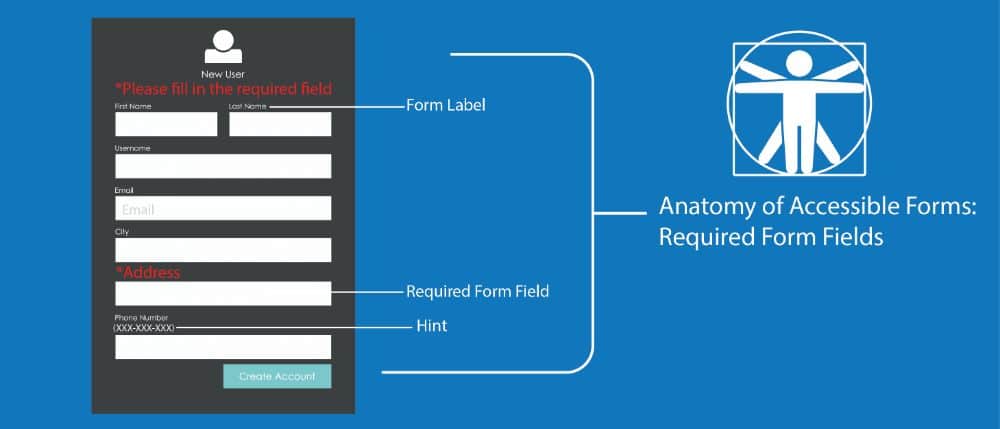
One of the most important things while creating an ADA compliant website is to label every information. When it comes to users interpreting the data, each user perceives the information in their distinctive ways. So, Crucial instructions need listing at all place wherever user input is necessary.
Inputs like check out page or contact form are labelled. This makes it easy for the visitors to interpret the function. Labeling helps people with disability to interpret the function at their pace.
10. Post-launch compliance:
It is not only important to follow the compliance of ADA but also be consistent to follow it in future. Complying with ADA guidelines while creating a website does not finish your task. Complying is one of the continuous tasks. Once you finish designing a website, make sure to stay updated on any new compliance requirements or the upcoming ones.
The significant component of ADA compliance is accessibility for the disabled to give them equality. It means specific legal consideration must be there while creating a website. There are chances that the business becomes vulnerable to lawsuits and appeals by not adbiding to ADA guidelines. There are people in America who have a disability and have trouble seeing with glasses or lenses or are blind. So, if you are not allowing accessibility, then it would mean you are turning away your potential client before you have introduced your business to them Many may look down the accessibility thing in website.
Conclusion:
It is not about the disability, but it is more about equality as ADA compliance makes sure the disabled get their fair share of access to information and data without much hassle just like the other people. Non-compliance of ADA guidelines can end up your business in lawsuits.It is just a matter of understanding and a sense of priority for the disabled people who find it hard to get access to information just like other people. It is our responsibility as a business to cater to every customer without being biased and give the best to them, keeping equality in mind.
Making a website which also accommodates those users who find it difficult or has specific needs due to disability improves the user experience. If you minutely look at it, it is not just about complying with ADA guidelines or about earning more money but about doing the ethical thing. World Wide Web Consortium(W3C) has numerous tools to check your website for potential accessibility issues. When dealing with ADA compliance never consider it as a complicated matter. However, it is something that you can do yourself as it is the right thing to do. Setting ADA compliance aside, consider whether you want your site accessible to all clients if yes, what measure would you take? Having an ADA Compliant Website makes sure you do the right thing with legality attached to it
The post 10 Tips for Designing an ADA Compliant Website appeared first on Web Design Dev.
via https://ift.tt/35PUzex

No comments:
Post a Comment